Introduction:
Hello my friends, it’s time for another switch review, and today we’ll be taking a look at (and through) the icy-clear Gateron North Pole. I’d been eagerly waiting for these to come out and picked some up as soon as they were available. I’ve been using them for a few months now, and I’m ready to share my thoughts. This review is dropping quite a bit later than I’d originally intended, but hey – this gave me plenty of time with the switches, and I can tell you now that they’re among my favorite linears to type with in my whole collection.
There are lots of clear switches, but none of them are quite *this* clear.
A disambiguating side note for any international readers: in the US, this is a single switch product and is only available in one spring-weight from most vendors. The few vendors that have multiple weights distinguish them by the rated measurement. In some other markets, though, Gateron’s “North Pole” is a series of switches much like “Pro 2.0” and is similarly available in the three most popular linear “colors” of black, red, and yellow. The switches themselves are still all-clear, and ostensibly contain the springs from Gateron Blacks, Reds, or Yellows. If I understand correctly, the “North Pole” switch sold in the US market is sold as “North Pole Yellow” in other places, alongside the other color-coded weights. I’ve also seen these included in the Pro 2.0 series in some places, which is logical enough given the housing appearance.
The Basics:
- Type: Linear
- Sub-type: Slow-curve
- Brand: Gateron
- Manufacturer: Gateron
- Housing: Polycarbonate
- Stem: Proprietary “Ink” material
- Spring weight: 50g / 55g / 68g*
- Factory lube: clear oil, generous application
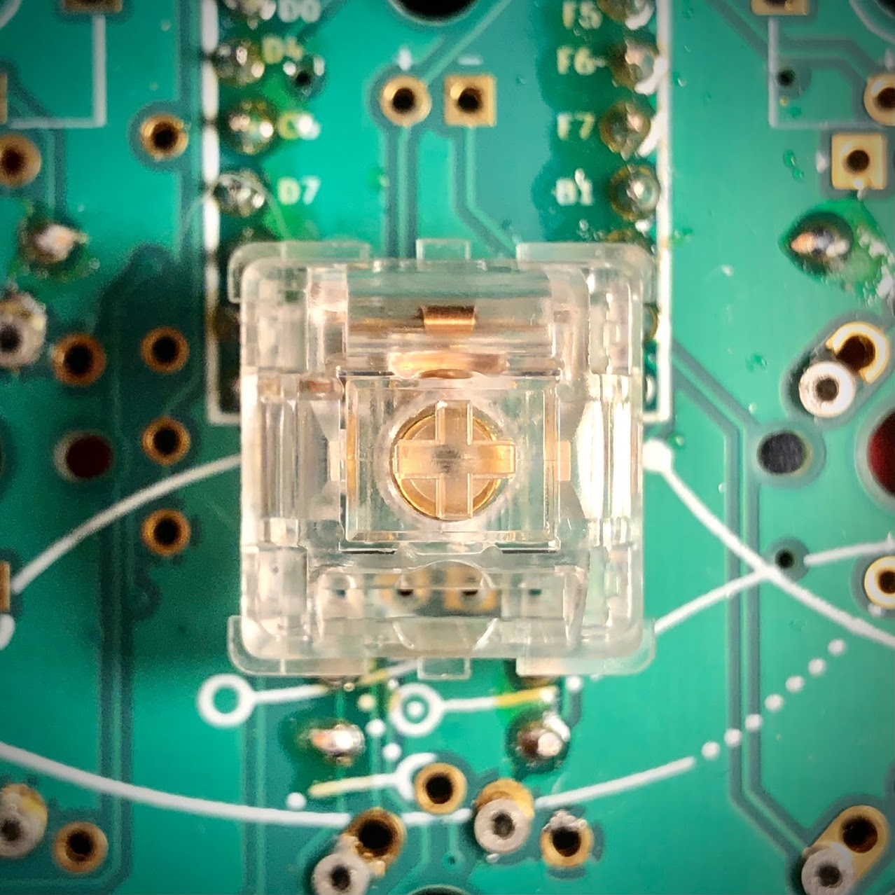
- Mounting: PCB / 5-pin
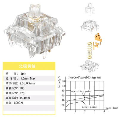
Factory spec sheet for the Gateron North Pole (Yellow); *real-world measurements further-down
Context & Background:
There’s a lot here – if you just want to know about this switch, scroll on about half-way down the page to the next divider line.
An Everglide Aqua king; more or less why we’re here today, if indirectly.
Appearing on the scene well after the novelty of all-clear switches had run its course, I think this switch is a great talking point in the debate of priorities between being first and being the best. I couldn’t properly talk about this switch without first mentioning Everglide’s Aqua Kings and the fad they kicked-off – but I’ll start a little farther back than that.
The first wave of switches to hit the market after the MX patent expired were more or less facsimiles of the existing Cherry MX line, with occasional tweaks and minor experiments along the way. Blues, Reds, maybe Yellows if you’re feeling adventurous. Then came Zealios, Halos, Creams – within just a few years the field exploded into every imaginable color, weight, and style. Novel derivatives made the MX mechanical keyboard experience all the more tune-able to one’s tastes, even including aesthetics.
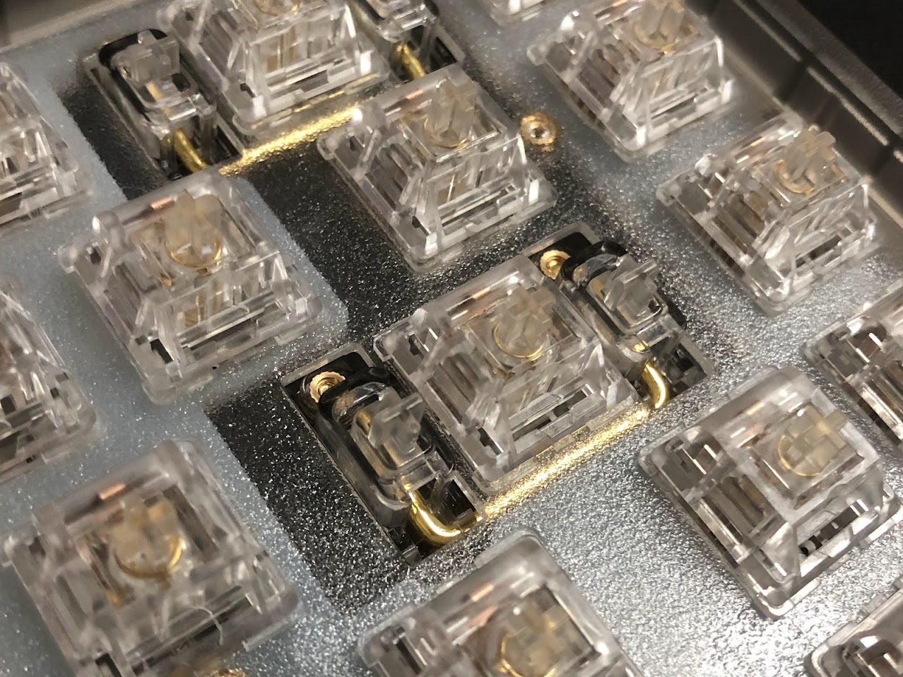
A jar of Aqua Kings, backlit
These days you can find switches in just about any color and finish you could want, but not very long ago the idea of a switch not following the established Cherry conventions was indeed pretty novel. (Hence NovelKeys, right?) Today’s switch landscape is a veritable zoo of plant, animal, and food-inspired names; more interesting than simple colors, but no more informative. (Still, I’ll take variety over standardization just about any day.)
After the rise of JWK and the like, tailoring a keyboard build to a specific color theme was all the more easy – but there was *one* look that no one had yet executed successfully: totally clear switches. The demand was there – I remember a popular keeb video having a thumbnail depicting an RGB rainbow of switches in a board, that rainbow shining through the stems – or at least appearing to. I think these were actually optical switches using the MX mount, not actual MX-compatibles – and the video wasn’t about clear switches – but just the notion served to make that thumbnail successful at its job of attracting traffic. For years I’d see that thumbnail from time to time and think, “why hasn’t someone done this in MX switches yet?”
The thumbnail in question. I think these are actually Flaretech Opticals, as seen on the Wooting One.
Turns out there was indeed a reason. Without putting words in anyone’s mouth, I’ll say it like this: stems are the most sensitive part when it comes to tolerances, and many clear plastics are challenging to shape precisely at that size. Some of them shrink. Some of them warp. Some of them are easier to shape but sacrifice significant durability – so experimentation here was pretty limited, at least for a time.
Aqua Kings, mounted in a KBD67 Lite with its stock polycarb plate and paired with KBDFans’ polycarb stabilizers.
Even with all the variety that quickly hit the scene post-2015, the list of materials used for switches was quite short – stems even shorter. With a few odd examples out, just about every stem on the market was made of POM. It’s suitable to the role and remains the most popular stem material for that reason – but there came a point at which folks started experimenting with other plastics and blends. I’m not sure who stepped away from the tried and true formula of Nylon and/or polycarbonate housing with POM stems, but the first I was aware of would be the Tangerine and its UHMWPE housing. I believe the massive success of that switch series kicked off a lot more wide-spread experimentation with materials.
C3 Equalz × The Key Company Tangerine switches; some earlier examples of bright colors, and the use of UHMWPE in switches.
(UHMWPE stands for Ultra High Molecular Weight Poly Ethylene, which is a soft and very slick plastic. It’s hard to shape precisely, but that slickness has a lot of value for switches.)
It wasn’t long before UHMWPE stems went from a low-run group-buy experiment to a stock category all their own. In just a few years the industry all but mastered the fickle material with its tendency to shrink, warp, and peel; giving us a whole suite of genuinely slick switches. It is in this environment – this hotbed of experimentation that the all-clear switches stood a chance at success. I don’t know who tried it first, but the first to get it right (or at least right enough to sell) was the brand Everglide, who uses JWK to manufacture their switches.
After a couple of low-number experimental runs and revisions, Everglide debuted the Aqua King V3 – easily the most hyped (and similarly over-hyped) switches since Creams, themselves the first all-white(ish) switch. Now – it makes sense for the first ever commercially available all-clear switch to make a splash (no pun intended), but I think the Aqua King rollout is emblematic of the shortcomings tied to influencer marketing from the consumer’s perspective. Many trusted reviewers were given Aqua Kings to review, and almost universally showered praise on them. One top reviewer said they were the smoothest, lowest-wobble stock switch they’d ever tried – and I believe him. The problem is that reviewers got cherry-picked samples, and the public didn’t.
A TTC Honey / Heart linear; another (almost) all-clear switch. One of the more unique examples, this one is a complex mix of materials.
Everglide’s Aqua King (also sometimes called Water King) uses a polycarbonate stem along with a polycarbonate top and bottom housing. From what I understand, PC can have a very smooth surface, be very firm, but that it’s also challenging to shape precisely on a small scale for various reasons. While I applaud Everglide for doing as well as they did with these, the brutal truth is that Aqua King V3s were horribly inconsistent, despite being reportedly much better than the prior two versions that only saw limited distribution. The hype momentum was real, though, and those switches sold like hotcakes – all the while maintaining overwhelmingly positive reviews. While its true that the good ones were some of the smoothest, most stable stock switches ever at the time, not even half the bag would be like that – and a good chunk of it might not even be usable at all.
Aqua Kings were really cool, but in my view, never evolved past anything but novelty. They got a revision that helped a bit with consistency, but even those are still one of the most inconsistent switch sets I’ve ever purchased. Their visual novelty did lots of heavy lifting, and I think the name including “King” while the word was at peak meme-usage sure didn’t hurt – but I think the most un-due momentum for them came from influencers and subsequently their fans. This isn’t to place any blame on the influencers; I’m confident all of them were sharing their honest opinion of what they had on-hand, and it is pretty a-typical for switch review samples to be significantly different than what customers get.
A TTC Frozen Silent linear, another one of many ice-themed clear switches. These have a milky bottom, unlike most of them.
With all the hype, of course every other manufacturer had to take a shot at making a clear switch – to not do so would be leaving money on the table – so a whole wave of clear switches came along shortly after the Aqua Kings. Some took a similar approach using polycarbonate, while others tried a clear version of Nylon. Some brands tried clear blends of UHMWPE. Most of these examples reference water or ice in their names, and most are good switches. I’d say just about all of those are less smooth and stable than Aqua Kings, but also significantly more consistent. After a year or so, just about everybody had one – but not Gateron.
Some reporting from ThereminGoat revealed they’d been working on one for a while, but they weren’t talking about it. That gave me the impression that they were interested in the idea, but wanted to wait until they really had it right before releasing it.
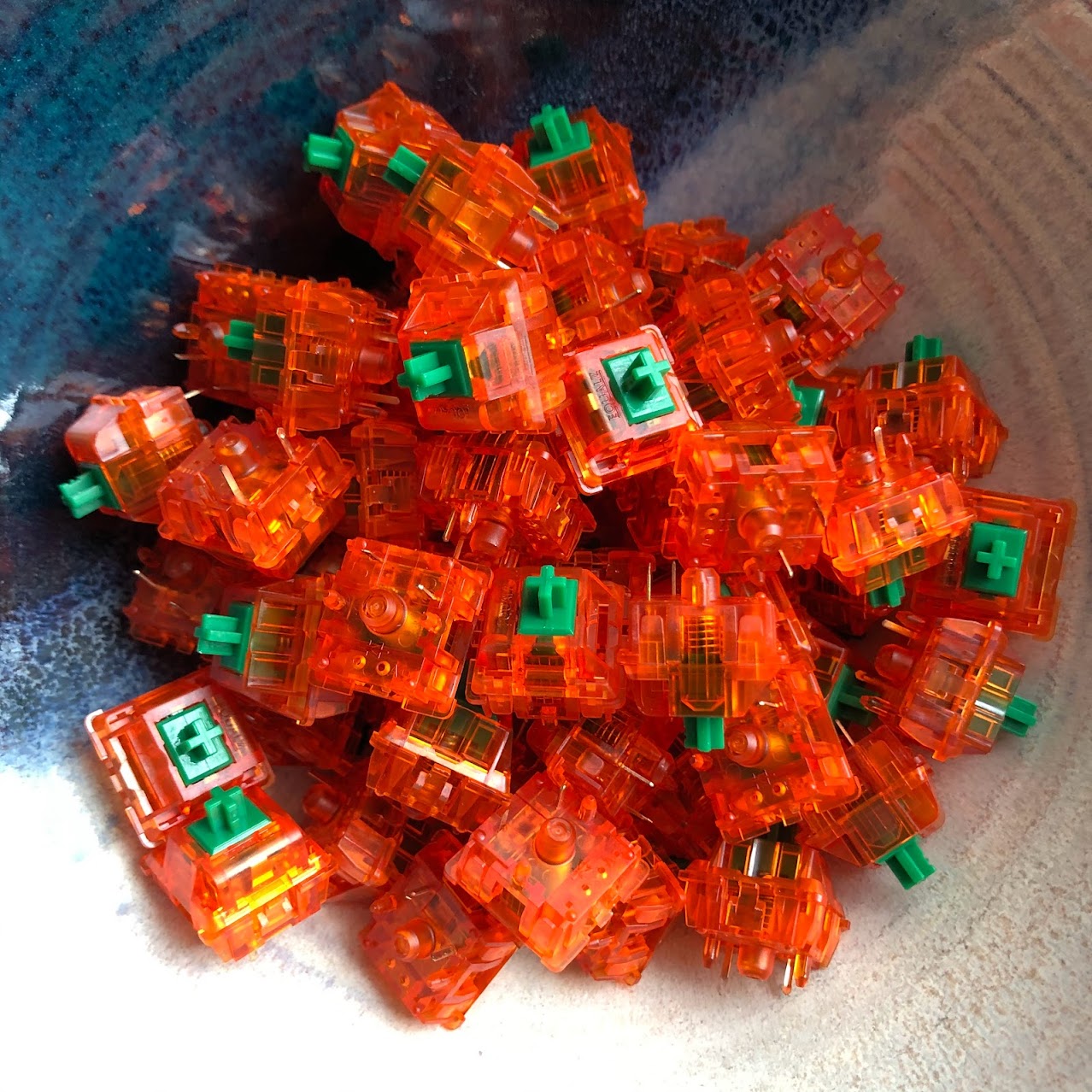
A Zeal Crystal tactile; another all-clear switch from Gateron that actually predates the North Pole. These are a bit more expensive, and are built around the CAP architecture instead of being derivative of the KS-9 Pro 2.0 design like the North Pole. These have a polished Nylon stem as opposed to Ink plastic, and also a Nylon bottom as opposed to polycarb.
In my opinion, this patience and persistence very much paid-off. When Gateron finally released the North Pole, the all-clear-craze was long-past, but the demand for smooth and stable switches remained – so do they measure-up all novelty aside? Unlike other manufacturers who tried things like polycarbonate and polyamide for clear stems, Gateron settled on their proprietary “Ink” plastic, which they’ve been using for the housings of their highest-end switches for a few years now.
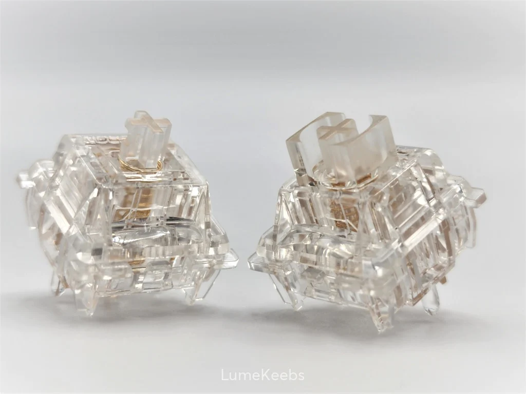
Product image for the North Pole series from LumeKeebs, showing both the un-shrouded “yellow” stems, and the shrouded, short-travel “red” stems.
As Gateron’s Oil King took its own shots at the Aqua King, the North Pole takes all the more – and I think they land, too. This switch targets all the same performance points the Aqua King was touted to have:
- It’s all-clear, even more clear than all the others
- It’s really darn smooth from the factory
- It’s very stable
More than any of the copycats and indeed more than the “originals”, I think these are the “real” Aqua Kings – that is, I think these truly and reliably succeed at being the kind of switch the Aqua King was hyped to be.
That’s the important stuff you need to know right there, but if you’re reading this chances are you’re into details – so let’s dig in!
Aesthetics:
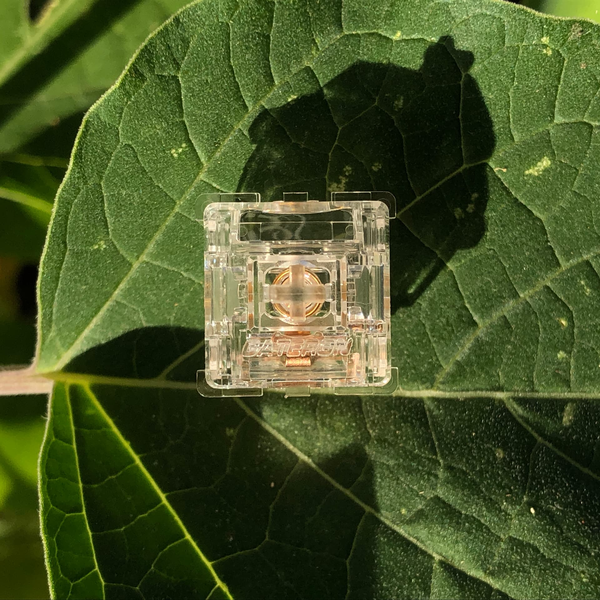
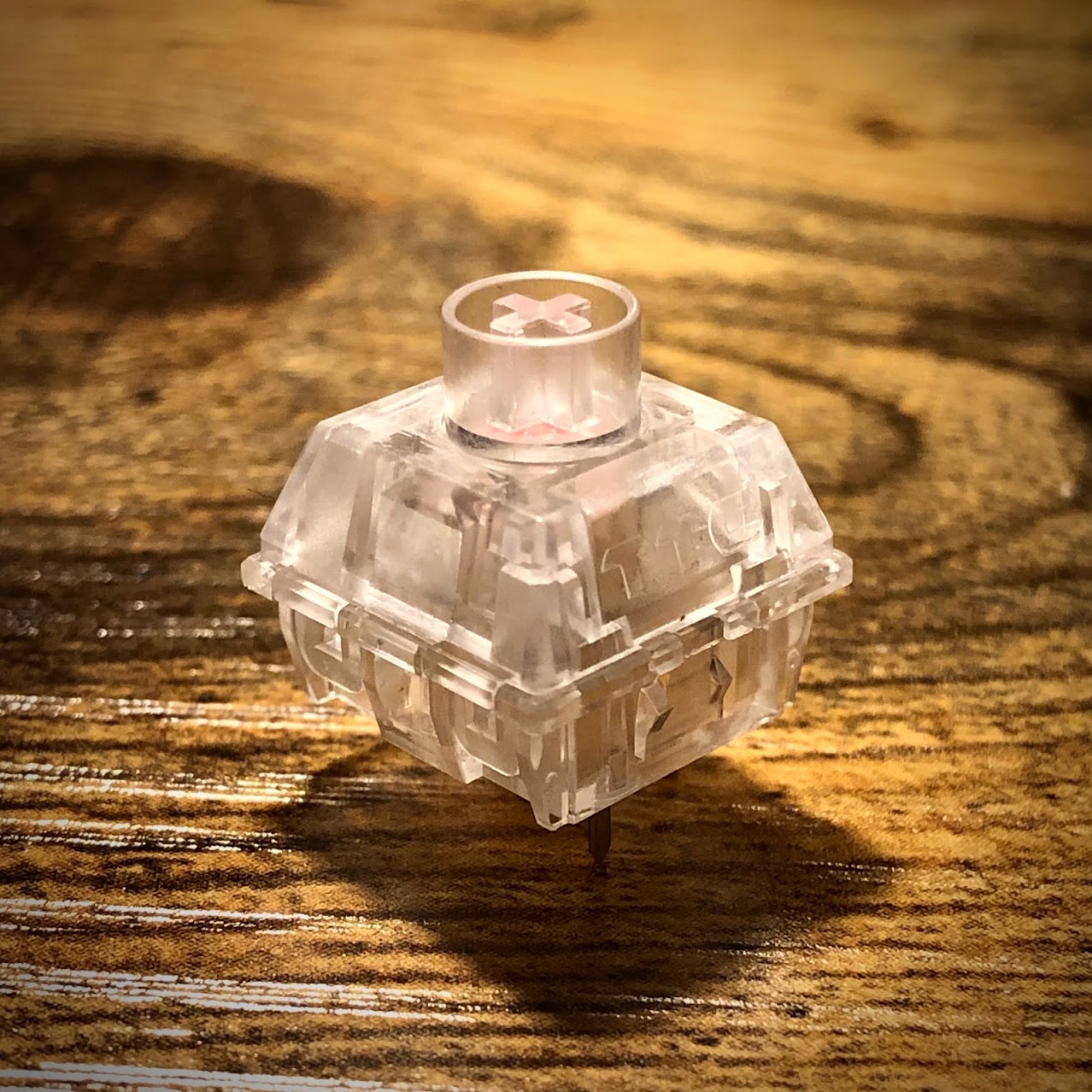
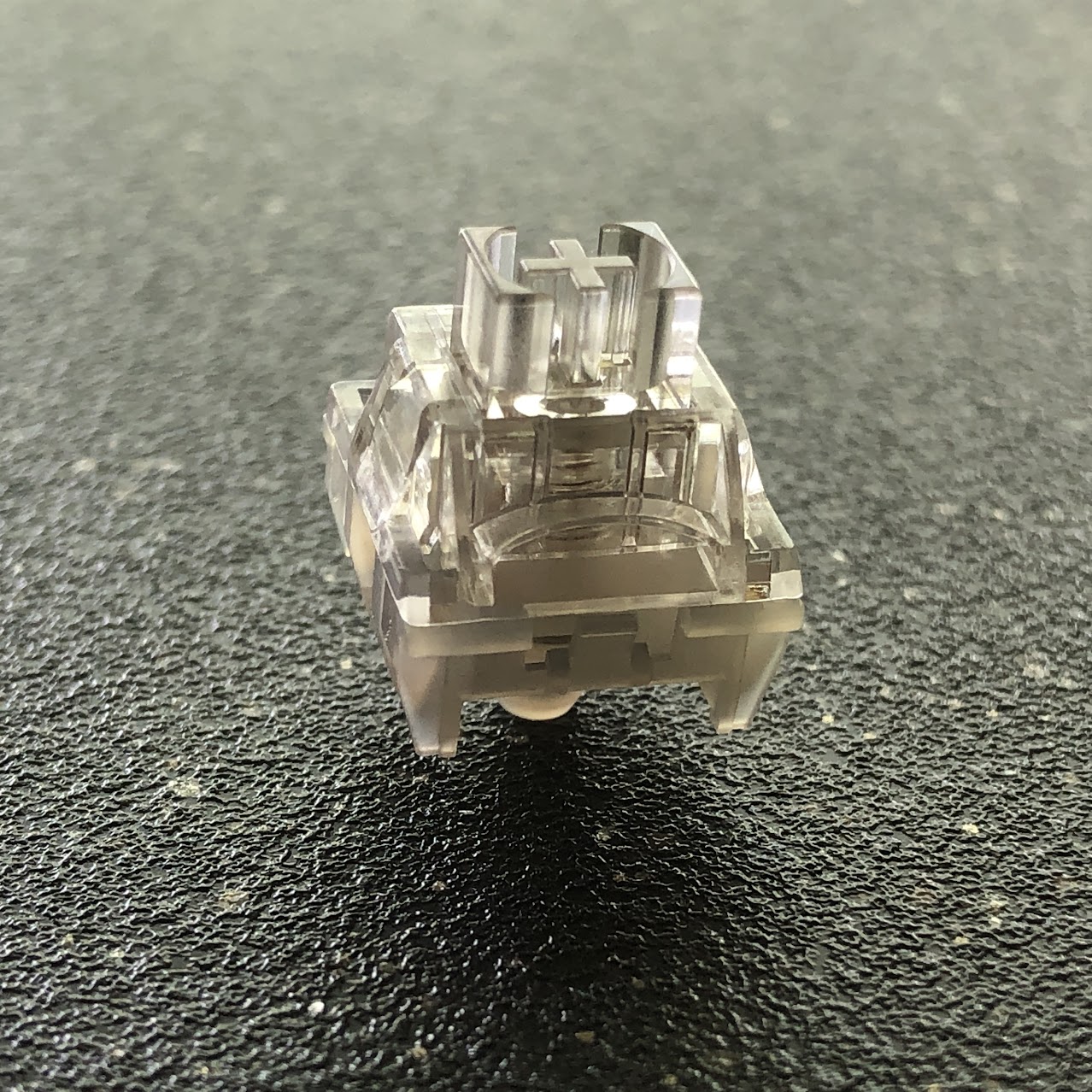
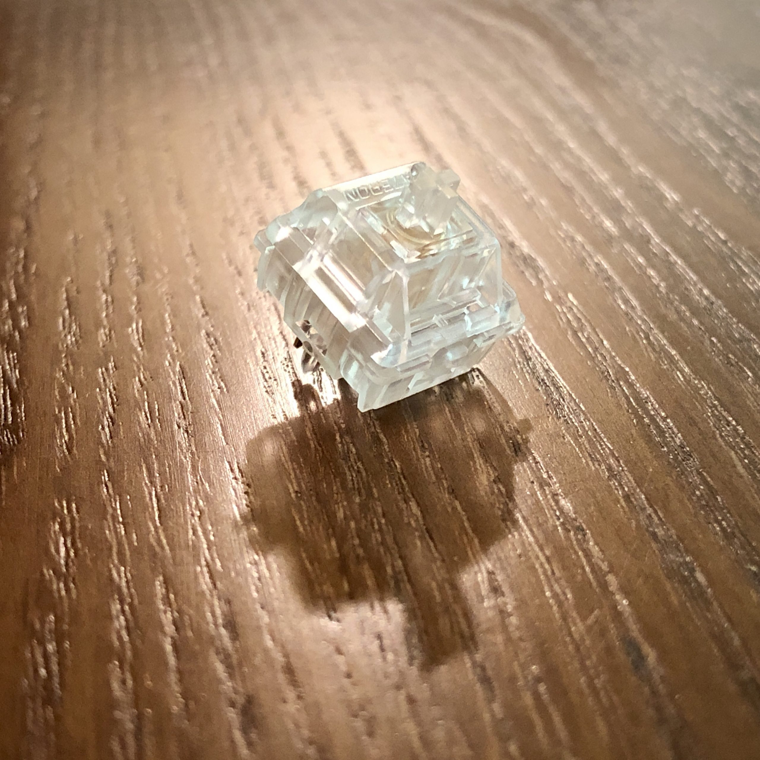
No surprise, these are clear – but even amongst all the other clear switches, these manage to stand-out aesthetically. They aren’t just made of colorless plastic you can see through, they are about as crystal-clear as they possibly can be – they look like wet ice. Not only does this make them visually striking in general, but it also helps them transmit RGB light in every direction. Just look at this one catching the evening sun!
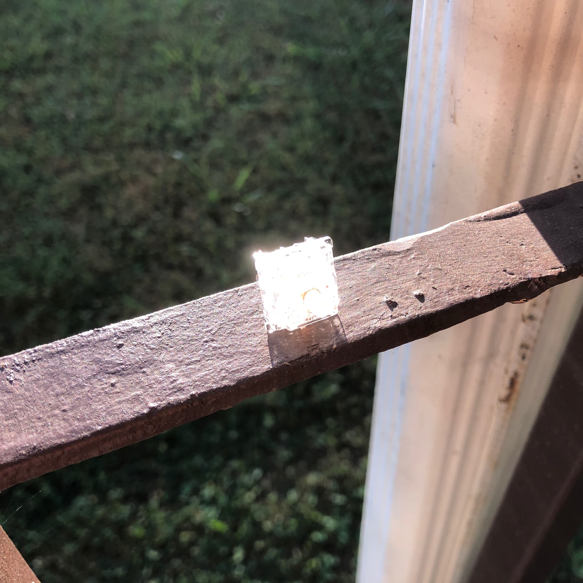
Normal exposure; this almost crystalline switch is practically blinding as it transmits the evening sun directly into my face. Let’s bracket that down a little…
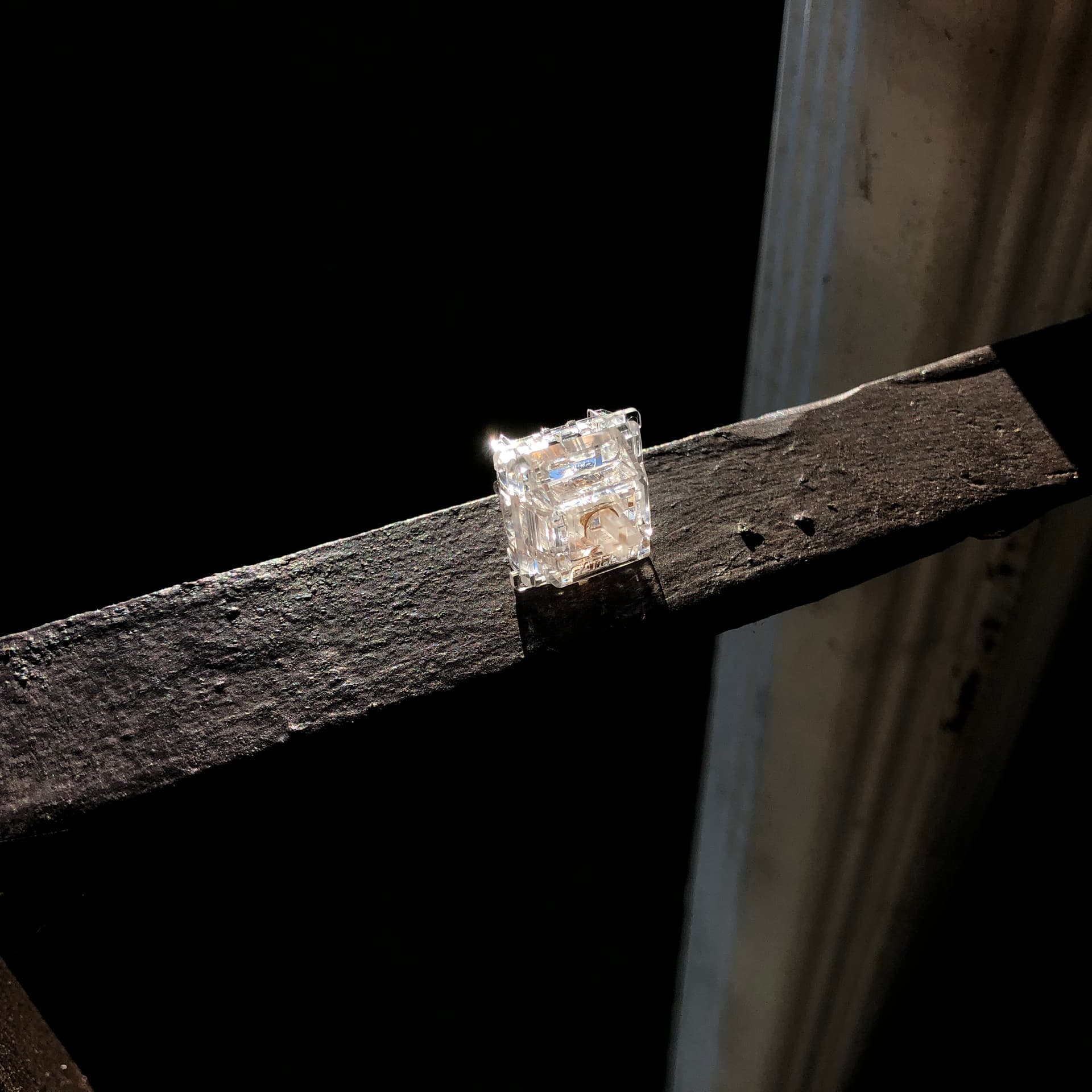
There we go. Much lower exposure; the broad-daylight background is blacked-out, and the colors of the sky show through the switch. Looks like a wet ice-cube on a hot day.
As another reviewer pointed-out, these have a weighty feeling in the hand compared to most other switches – and while the actual difference is small, it’s enough to feel. I think this lends to the “ice cube” aesthetic, and lends an impression of substance and quality. Even ignoring all the other aspects, if all you’re looking for is the most clear of the clear switches, well – look no further – I don’t think anyone else is going to get one looking more transparent than this.
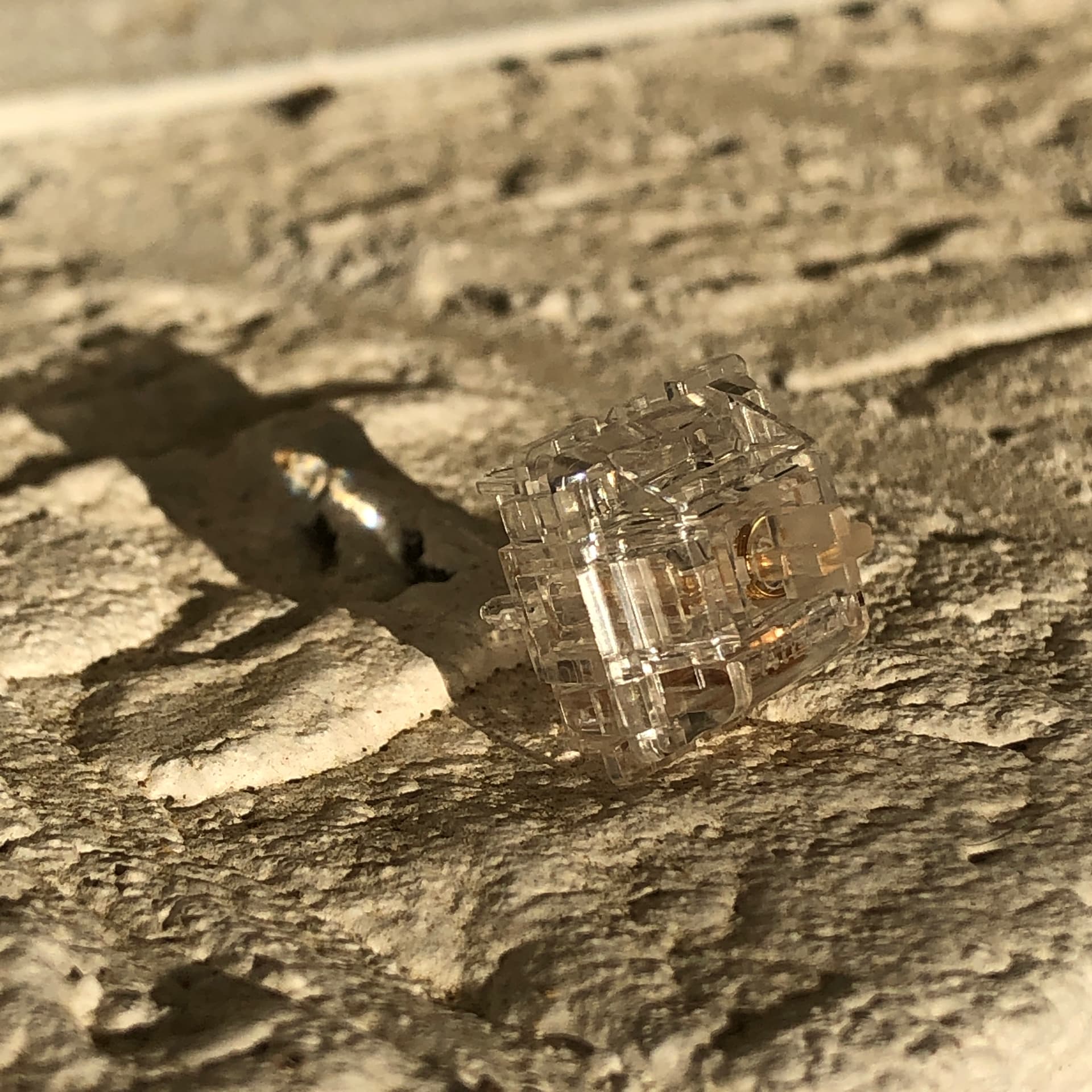
These are clear. Like, really clear.
Given these switches manage to stand out in a sea of all-clear switches, and really nail the “wet ice” look, I give these a subjective A when it comes to aesthetics.
Sound:
When it comes to sound, North Poles are pretty interesting. The bottom-out impact is fairly sharp, but not very loud, and all the sounds are clean. That is, free of un-intentional sound; no rattles, scratches, or wiggles. Just clackity-clacks.
Overall, the sound signature of these is on the deep side. Maybe not quite as deep as an Aqua King, but pretty close – deeper than Inks, certainly deeper than average. There’s a sharp clack when you hit bottom as I mentioned, but it’s paired with a deeper thud that’s not present with most “clacky” switches.
Top and bottom-out impact sounds are remarkably similar.
For me cleanliness is a high priority, or at least valuable – and thats why I give these a subjective sound score of A-. That is, generally very clean and pleasant, marred by the occasional crunchy or wiggly spring.
Feel
When discussing the feel of switches, I’ll be breaking that factor down further into Smoothness, Stability, and Weighting.
Feel – Smoothness:
North Poles are glassy smooth; effectively zero grain. If you like to skate, these might be worth a look. They have the potential to stick-slip at very extreme angles or during very slow, gentle presses – I’ve never perceived it while typing.
If you check out ThereminGoat’s force-curve graph of the switch (which I believe is captured with fairly slow movement), I think this bears-out:
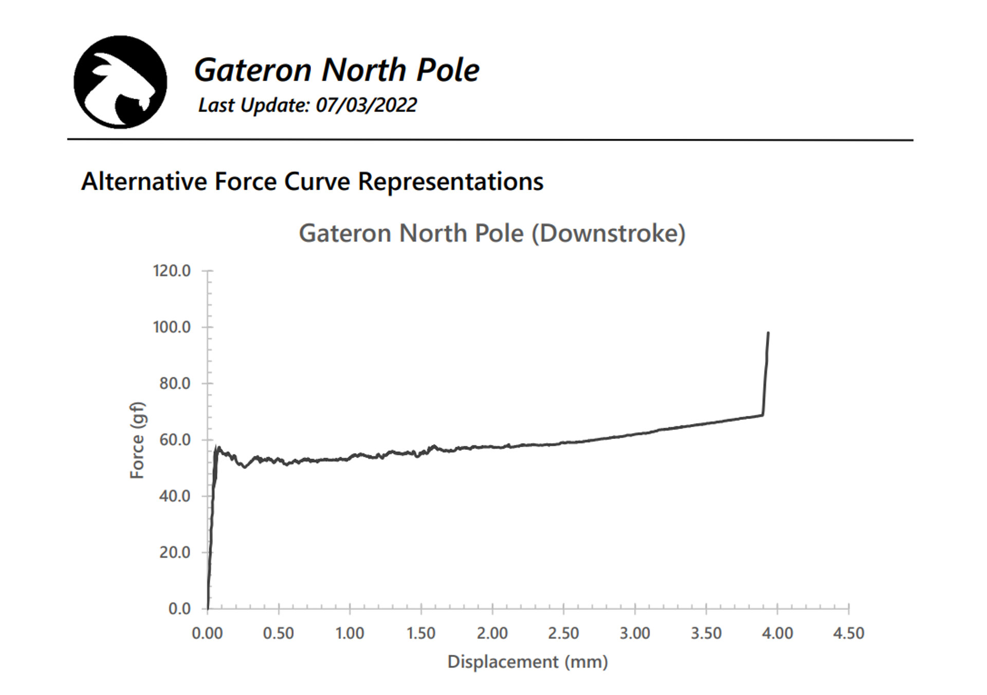
ThereminGoat’s real-world measurements for the Gateron North Pole switches.
The more compressed the spring, the less “noise” is visible in the measurement. I believe what we’re seeing here is the mild slip-stick effect (not grain) being increasingly overcome as more force is required to continue compressing the spring.
I *speculate* that if we had a way to take measurements at the speed of typing, that certain aspects of the graph would present differently depending on the switch – and in the case of the North Poles, I think the whole graph would look more like the last third measured the traditional way.
For real-world use, I give these an A+ for smoothness.
Feel – Stability:
Resting position wobble /10: N/S – 0, almost none | E/W – 1, very little
Bottom position wobble /10: N/S – 3, some | E/W – 1, very little
Travel Stability: 9/10, Excellent
Housing Fitment: 8/10, Very Good: A
Cap Fitment: No apparent issues: A
Overall, these are very stable switches – especially considering no upper stem walls / dust shroud. I’d give these an easy A for stability, kept from perfection only by the slightest inconsistency.
Feel – Weighting:
This is pretty subjective, but for me, these are *just right*. More than just about any other linear I can think of, I find these fantastic for typing.
In terms of bottom-out weight, these actually sit between Yellows and Blacks at 68.7g.
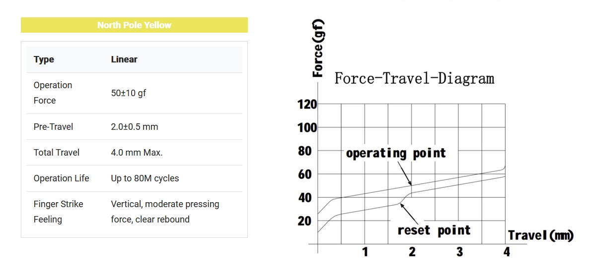
Factory spec sheet for the Gateron North Pole (Yellow)
According to the spec sheet, these are supposed to start moving at 40 grams (just like Yellows and Blacks) and linearly increase to 67, actuating midway at 50.
*In reality, it looks like it starts moving somewhere between 50 and 58g, depending. I think beyond a certain speed it doesn’t take as much force to overcome the slip-stick effect, and below you end up having to crest that first before returning to the spring’s natural force-curve. I think it likely that slow-moving measurement devices exaggerate the slip-stick effect, at least compared to how it would present in typing – but I think that’s useful none-the less.
I don’t think slip-stick is the only factor at-work here, but take a look at this with the above in-mind:
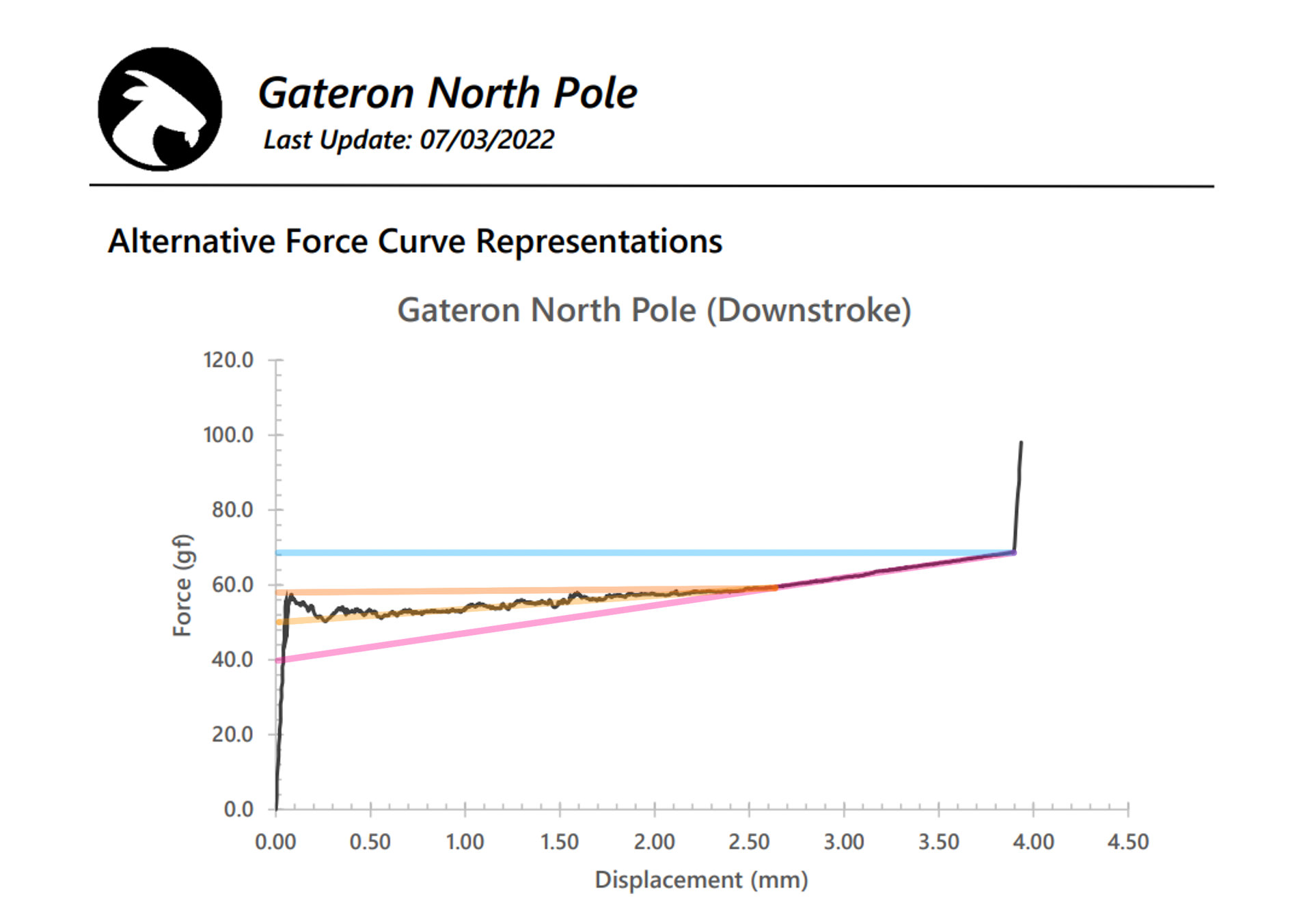
Slip-stick side-branch: ThereminGoat’s real-world measurements for the Gateron North Pole switches, with lines added to illustrate certain areas or relationships: Cyan shows the bottom-out weight. Orange is drawn from where the noise tapers-off, back across the peaks of the graph; this is a sort of “upper limit” for the noise. Yellow is drawn from the same point where the noise tapers-off, back across the valleys of the graph; this is a sort of “lower limit” for the noise. I think the end of this line also represents where I think the switch starts moving under normal fast typing conditions as opposed to the slower speed of measurement. Magenta is a straight line continued back from bottom-out through the same point where the noise tapers-off; this line happens to land on the factory-spec starting weight of the switch, 40g. I think what’s between orange and yellow is the additive noise of the slip-stick effect, which I think might change with different measurement speed. Between yellow and magenta is other resistance on-top of the spring; surface friction, oil viscosity, whatever it may be.
Either way, this switch has a very flat force-curve, essentially increasing only ~10g the entire travel. I think this “fast-curve” spring paired with the glassy-smooth operation and thicc housing collisions make this a delicious switch for typing. I give these a subjective A+ for weighting.
Reliability & Caveats:
This is a section where I talk about functional reliability, and consolidate any other caveats that may have come up in any other sections into a list of suggestions for potential improvement.
Consistency: In terms of this, I’ve encountered the occasional instance of a crunchy spring that can be heard and felt, but for the most part these are quite clean and consistent for a stock switch.
Functional Reliability: Gateron claims an extra-long lifespan of 80-million actuations in terms of the contacts. I don’t have any specific information about Ink plastic, but I don’t think there’s much reason to believe these will be any less durable or reliable than the average premium Gateron.
When it comes to overall reliability I’ll give these a solid A for the long life and only the most mild of consistency issues.

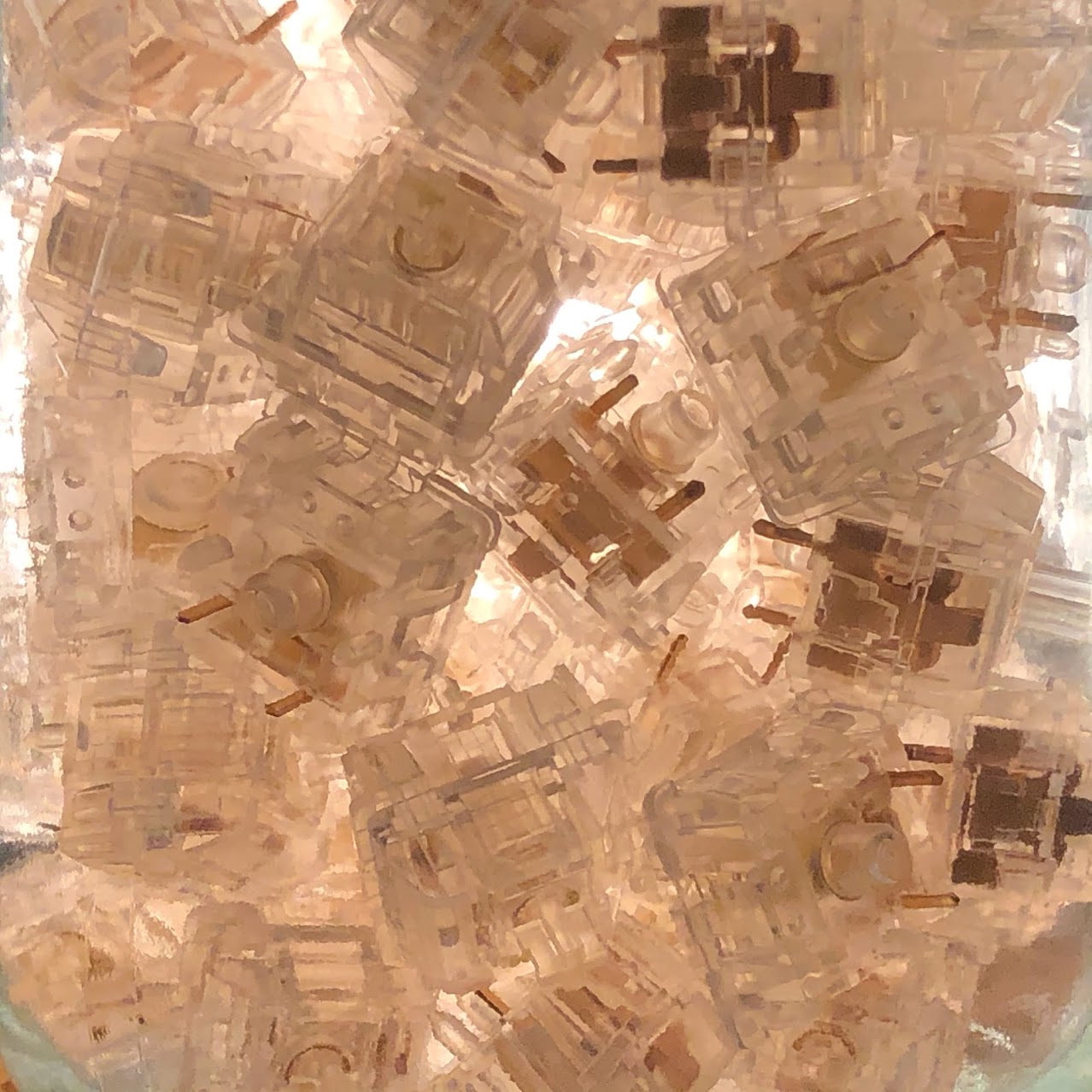
Another official image showing a tall jar full of North Poles.
Other Caveats: While these are very smooth in-motion, they also have some degree of slip-stick. I genuinely don’t thin this impacts normal use at all, but a very slow or gentle press may reveal it.
Suggestions for improvement: I don’t think I could contribute anything here that Gateron isn’t already thinking about; these switches aren’t perfect, but I do genuinely think they’re excellent.
When it comes to compromise, I think we’re looking at another solid A here. Unless you plan to be slow-pressing your switches more than anything else, you’re in for a great experience with these.
Value:
At around 68 cents each, North Poles are by no means cheap or inexpensive. These are a premium item and carry a premium price. By the same token, you do get more for your money here – so I do think the higher cost is worth it for me, and will be worth it for customers willing to pay more for specific qualities.
I give North Poles a solid B+ for value; well above average, but can only score so high being nearly 70 cents a switch.
Recap & conclusion:
Aesthetics: A
Sound: A-
Smoothness: A+
Overall Stability: A
Housing Fitment: A
Cap Fitment: A
Spring Feel: A+
Reliability: A
Compromise: A
Value: B+
Overall subjective score: A
To come back around, I think these switches are a perfect example of the staying power that taking the time to get something right has compared with the power of being first on the block. North Poles never got the crazy hype that Aqua Kings did, but they have a lot more staying power – and I think they more successfully execute on the original mission statement of the Aqua Kings themselves. I don’t think they’re the only ones, either – but I do think they’re the best.
Alright! That’s all I have to say about Gateron’s North Pole (Yellow) switch for today – thanks so much for reading, and have a good one.