Introduction & Background:
Hello, good reader – I got some new keycaps in the mail today, so I feel like talking about profiles.
It seems like there’s all sorts of new profiles out there these days; there’s a thread about it and everything. This being the first in the series, I’ll be including something of a primer on profiles, focusing mostly on familiar ones – which you can skip by scrolling to the next horizontal divider. Onward!
EMA profile product image from the manufacturer’s website – complete with a righteous speck of dust on the left shift – these are the keys I’ll more or less be focusing on today, with a bit of a rambling introduction first.
When I first got into keyboards for their own sake – or even just as not the least important part of my PC – I didn’t know what “profiles” were, and I’d never heard the word “keycap”. I later learned that keys have a top part called a cap, and that those keycaps come in different shapes – and those shapes are generally called profiles.
I learned the shape I’d been using pretty much my entire life up to that point was called OEM. The shape of keys on most keyboards I’d owned up to that point – most, except the wretched thing that was so bad it convinced me to go for something better in the first place.
The aforementioned “thing”. My first PC keyboard not in OEM profile, and my last non-mechanical or otherwise not thoughtfully-designed keyboard. Sold under many names including Logitech, I bought this from Walmart as an Onn SoftTouch somethingorother. I’ll give it to them – it is …soft. Soft like rubber gloves on spoiled melon rind. Oh – and don’t let that texture fool you. Those keys are slick like Teflon in the rain.
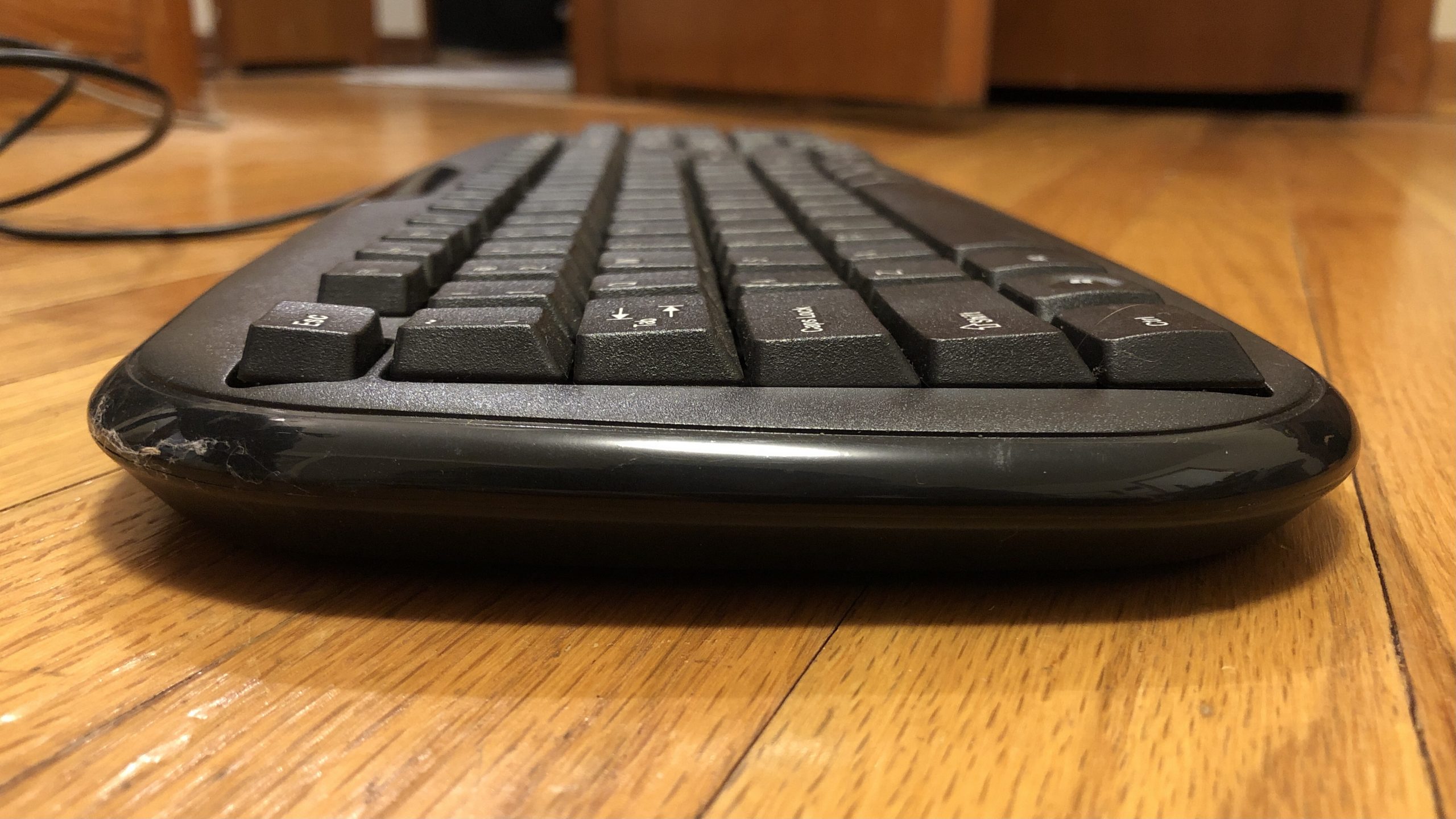
Side view of the… thing. This is not OEM profile as we’re talking about it today – or any particular profile – but we can note that the top row is just a bit taller than the rest and angled slightly towards the user, while the next four rows are identically angled back slightly, with the final closest row to the user being convex the whole way down. Stuff like this might actually be more common than “OEM” these days when it comes to actual OEM hardware, but that profile is still king when it comes to commercial gaming keyboards.
The DELL keyboards in the library. The beige keyboards with the HPs and eMachines and the really funky Packard-Bell shenanigans – more or less, that’s all OEM. Ducky, Filco, CoolerMaster, SteelSeries – pretty much all the modern gaming keyboards not also marketed as low-profile are going to be in OEM profile.
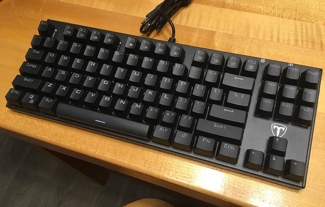
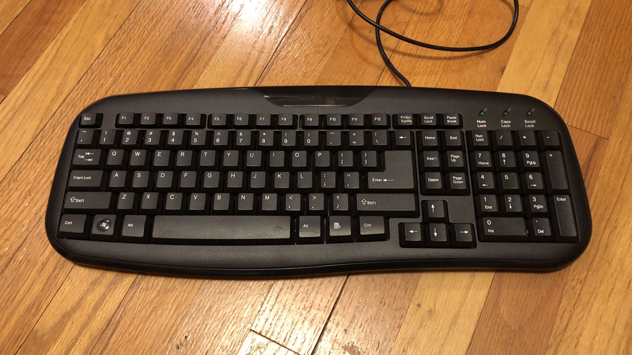
If you haven’t seen one of these, welcome to Planet Earth – this is a keyboard. Specifically, a Dell L100 – one of the most ubiquitous input devices of the last couple decades – and a great example of OEM profile in the wild, and outside the MX-compatible space. Also a good example how each company is a little different – just look at that bottom row.
Another example of OEM profile – this time on an MX keyboard; an original Ducky One, with the Akko × Ducky version of the Horizon keyset from just before they parted ways. While this one isn’t intended for back-lighting, the tooling it’s made from is – note all the legends placed in the top-center, right above the North-facing LED.
Much later, I learned that particular “profile” is something of a small can of worms in that it’s less an exact standard and more of a loose grouping – but for most practical purposes, it’s fair to lump them together. Not everyone’s “OEM” is the same, but they do tend to follow a particular set of criteria: cylindrical, sculpted, and when it comes to MX specifically, tall and wide enough to accommodate switches regardless of their mounting direction. In other words, it has room for an LED right under the letter in case the keyboard has back-lighting – which wasn’t really a thing when Cherry designed MX switches and their companion keycap profile.
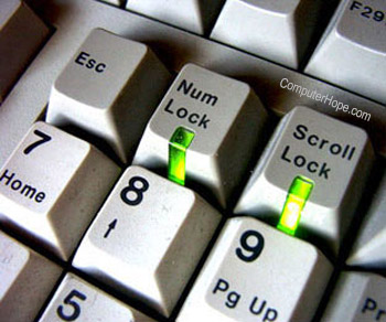
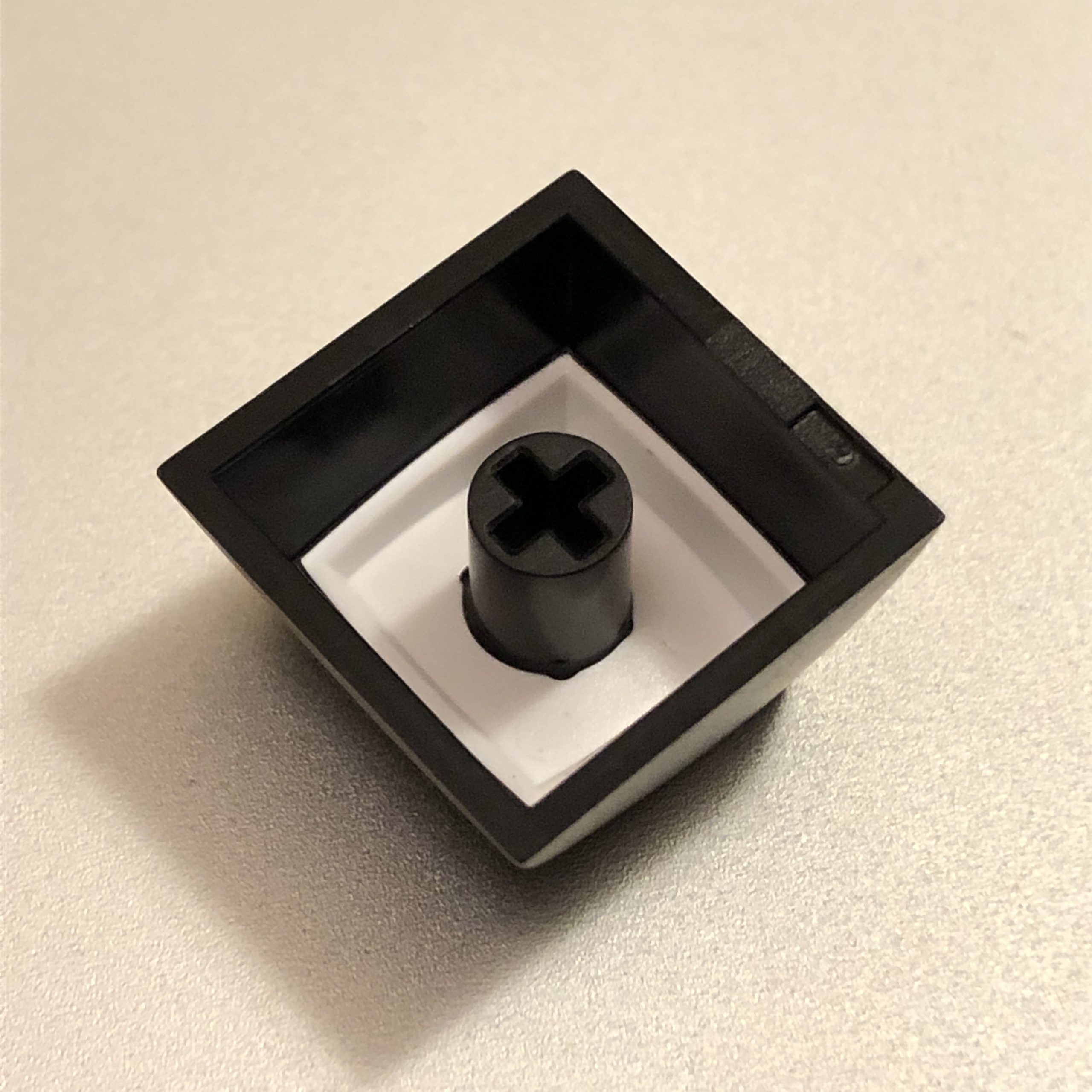
“South-facing” MX LEDs performing their original function under Cherry profile keycaps, as seen in an extremely helpful photo from ComputerHope.com
They did design the switches with a slot right in them to fit 3mm LEDs – for indicators – which with the original keys, had windows in the bottom-middle of the cap, facing the user. Later on, someone had the idea to flip the switches around and have LEDs in that slot illuminate translucent letters instead – but that required taller keycaps. No, that’s not where OEM came from to begin with – but it is at least one reason why it’s the default shape of choice for commercial MX keyboards.
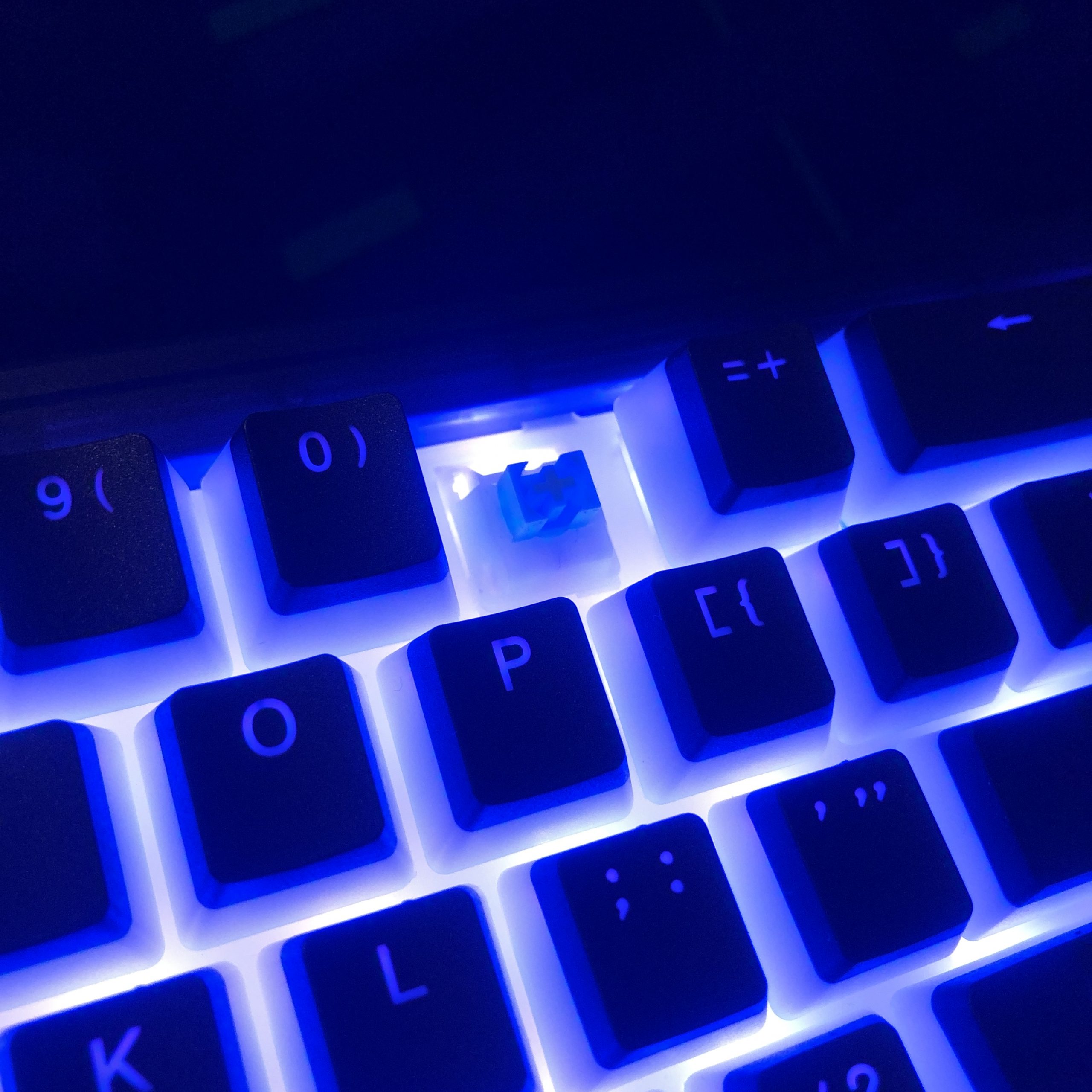
“North-facing” MX LEDs performing their modern function; letter back-lighting and ambient RGB under some taller-than-Cherry OEM profile keycaps. While the pictured setup actually uses tiny surface-mounted lights on the PCB, these caps are tall and wide enough to operate with a traditional domed 3mm LED on the switch.
So that’s the og Cherry and its ubiquitous cousin OEM – but those are the baseline of the MX-compatible keycap universe. While I may end up writing an entry on Cherry profile, the meat and potatoes of this series is going to be about everything but OEM and Cherry.
Going back to when I first got into all this business – there were a fair number of other choices available at the time, but not exactly easy to find in a non-hobby-customer sort of way. You might luck out and find something cool in-stock at Pimp My Keyboard, which at the time was mostly SA and DSA profiles (more about those in the glossary if you’re not familiar). I’m not sure about DSA, but I know SA specifically has its roots in retro computing going back as far as the late 70s, and the MX-compatible tooling for SA was adapted from some older tooling used for a different mount.
Say all that to say – there were choices in 2015 – but there weren’t very many, and while some were pretty cool, none of them were particularly fresh.
I’m writing this in December of 2022, and right now, there are more profiles available to the average consumer than I can list in any reasonable amount of time. Caps are available in a nearly uncountable array of shapes and sizes, with new ones emerging on a seemingly weekly basis – which brings us to today’s specimen.
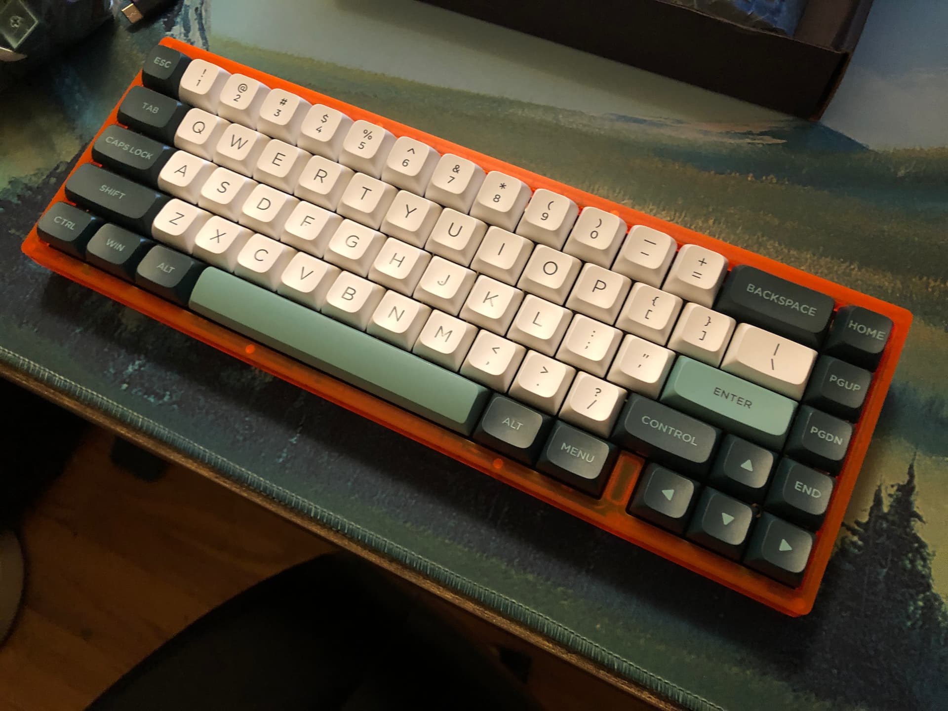
EMA Profile
This is more of a first-look and comparison article and not so much a review – once I’ve had some time with these under my fingers I’ll be glad to tell you what they’re like in practical use – but for today, I have plenty of comparison images and a few thoughts to share.
Browsing GH the other day, I saw a new listing for a profile I hadn’t heard of before: EMA. They soon showed up on Drop as well, and the set on that site is doubleshot PBT and has 140-something keys, and was going for 30 bucks during the preorder. I decided to poke around and see if EMA sets showed up anywhere else, and it turns out the profile is a fairly recent creation of IDOBAO – a name familiar to many a budget keyboard enjoyer.
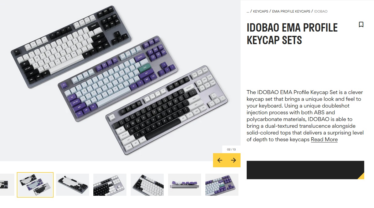
The listing for EMA, as seen on Drop. Three mixed colorway choices available, but some folks were asking about all-black or all-white sets.
The thing about this profile that caught my attention when I saw this listing were the broad top surfaces. I’ve enjoyed other profiles with broad tops like MelGeek’s MDA, and a friend of mine had recently picked that as a favorite when I let them try a bunch – so I’d been on the lookout for that or something similar.
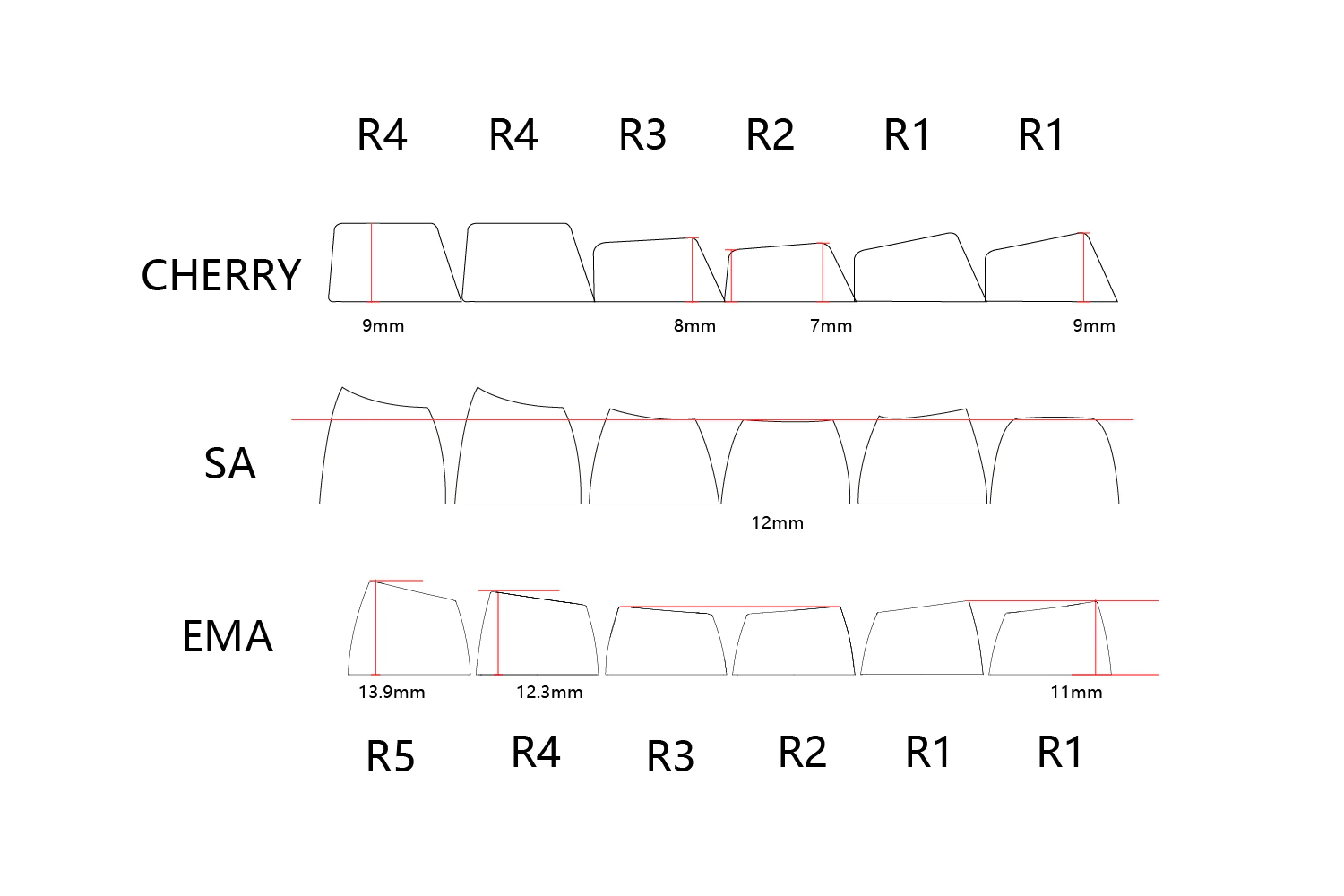
A graphic from IDOBAO showing EMA, SA, and Cherry profiles from the side and comparing the rows. Note that Cherry’s numbering system is actually reverse from this one, so what’s actually up there is 1,1,2,3,4,4 (and there is a 5, you just don’t see it too often).
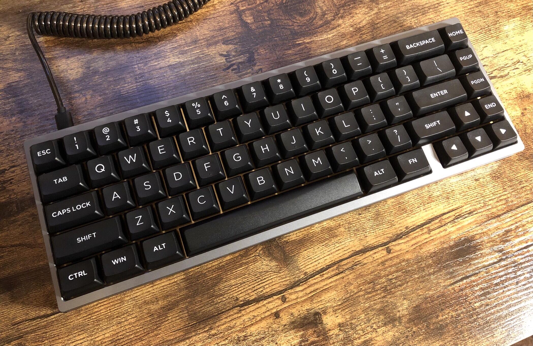
The ones on Drop were a mixed colorway, but I found an all-black one I was much more interested in on Idobao’s site on sale for less than 20 bucks – so I snagged a set and promptly forgot about it before they even made it into a shipping container.
Well, here they are.
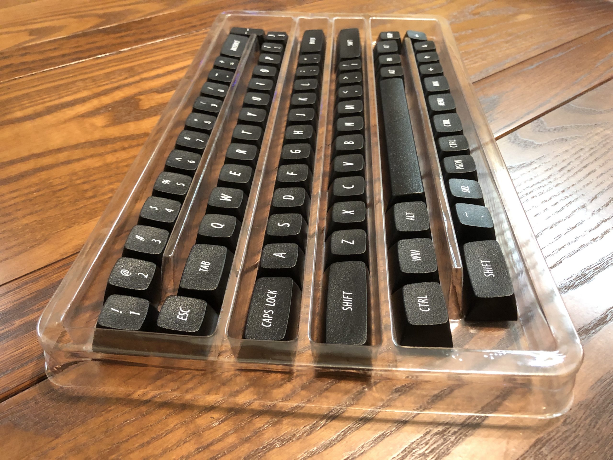
Oh yeah! These things. While the PBT ones on Drop were in group-buy, the ABS ones on Idobao’s site were in-stock – so while it took a minute for them to get here, it was still faster.
Checking them out, the first thing I notice is the texture. The second thing I notice is they have no homing keys.
Gasp! No bumps, bars, or scoops to be found.
Well. That’s something of a deal-breaker for me personally, but I didn’t really get these with myself (or a touch-typist for that matter) in-mind. These are here a.) to satisfy my curiosity which I then share with you fine folks and b.) as potential candidates for use on a bluetooth couch-keyboard for a friend who likes broad-topped keys. That being the case, no-homing isn’t necessarily a no-go.
If you’re wondering, the larger kits that ran on Drop and also available on Idobao’s site)do have traditional homing bars – so I’d expect subsequently-made examples (or at least the PBT ones) to include them.
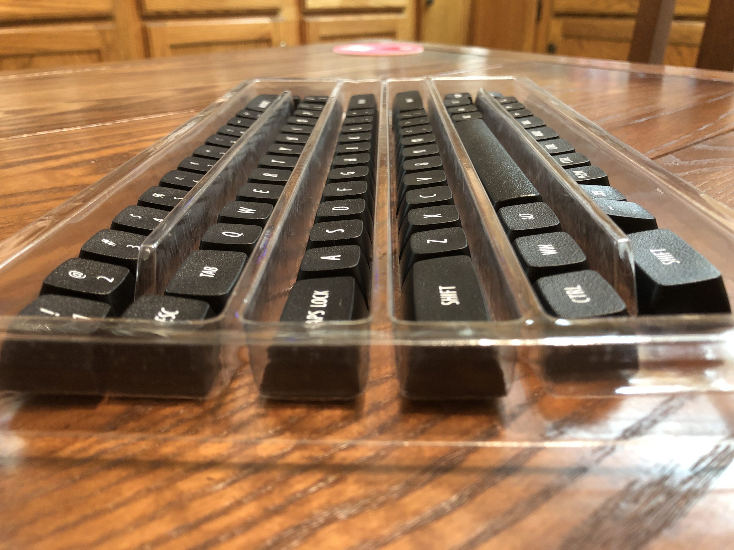
From the side. Here you can see the sculpt on each of the rows, including the space bar. Most obvious when looking at those couple on the right that are from a different row than the rest next to them.
Some profiles have a space bar that’s symmetrical front-to-back, but most have one that shares the sculpt angle of the bottom row – and this one’s no exception. In those cases, I tend to flip them around because I type like a heathen with my wrists resting right on the desk, and I still want my thumbs to be comfortable – so I’ll definitely be doing that with EMA. To quote Busta Rhymes, “flipmode is the greatest.”
Speaking of flip – here’s the underside. Pretty elegant, if you ask me – especially compared with older doubleshot caps with purely utilitarian business going on down here, usually lots of weird looking lines that run together. Lately other aspects of the tooling have been getting aesthetic consideration, like this nice, neat underside here – pretty good considering how reasonably priced these are.
From what I can tell, EMA is Idobao’s second foray into new keycap profiles, after the notably less conventional MA.
I found this photo on an ebay listing – I know it’s supposed to be about the kinda weird MA profile keycaps, but how about that funky rug?
So, starting from that, EMA is a step towards the conventional – but it manages to be its own thing. On that note; there are quite a few profiles born from the idea of striking a balance between the big spherical retro chonkness of SA and the sleek, practical low-profile of Cherry. This profile appears to be another of them, but setting itself apart in that space with rather broad, nearly-flat top surfaces while retaining a fair bit of angled sculpt from row to row.
A lower angle to more appreciate the presence of row sculpt – and the near absence of surface sculpt. These are spherical-topped keys, but the sphere has been nearly flattened.
Comparisons
There are plenty of other broad-topped profiles; CXA, XVX, and MDA come to mind. The first two are closer to Cherry in terms of height and angle, but the other is a bit closer to what we have here today – but even more broad. MDA is almost as wide at the top as it is at the bottom. Wouldn’t you know it, I bothered to take some comparison photos and managed to bring up the two profiles I have on-hand but didn’t include. Ah well – just imagine flat Adam Driver as a keycap and you pretty much got it.
Just kidding; I do have some photos, just not right next to EMA. On the left is XVX in what I think is a PBT blend, and on the right is CXA in ABS. They are extremely similar, but not identical. They’re a bit shorter than EMA, and more scooped at the edges, especially CXA with it’s smaller corners.
Here’s a blurry photo of XVX on a KBD67 Lite R3. I think the green colorway actually looks really nice, especially with the Bob Ross deskmat. The nuclear-orange case is like a hiking safety vest. What keeps me from using this, though, are the homing dots right in the middle of the F and J keys – my fingers don’t like that. If you can get down with the homing nips, though, these are very reasonably priced.
Here is CXA on a KBD67 V3. Note the curve in the space bar; that’s another feature that sets it apart from XVX, EMA, and most other profiles for that matter. I still have mine flipped around, but this curve literally takes the edge off for the standard orientation.
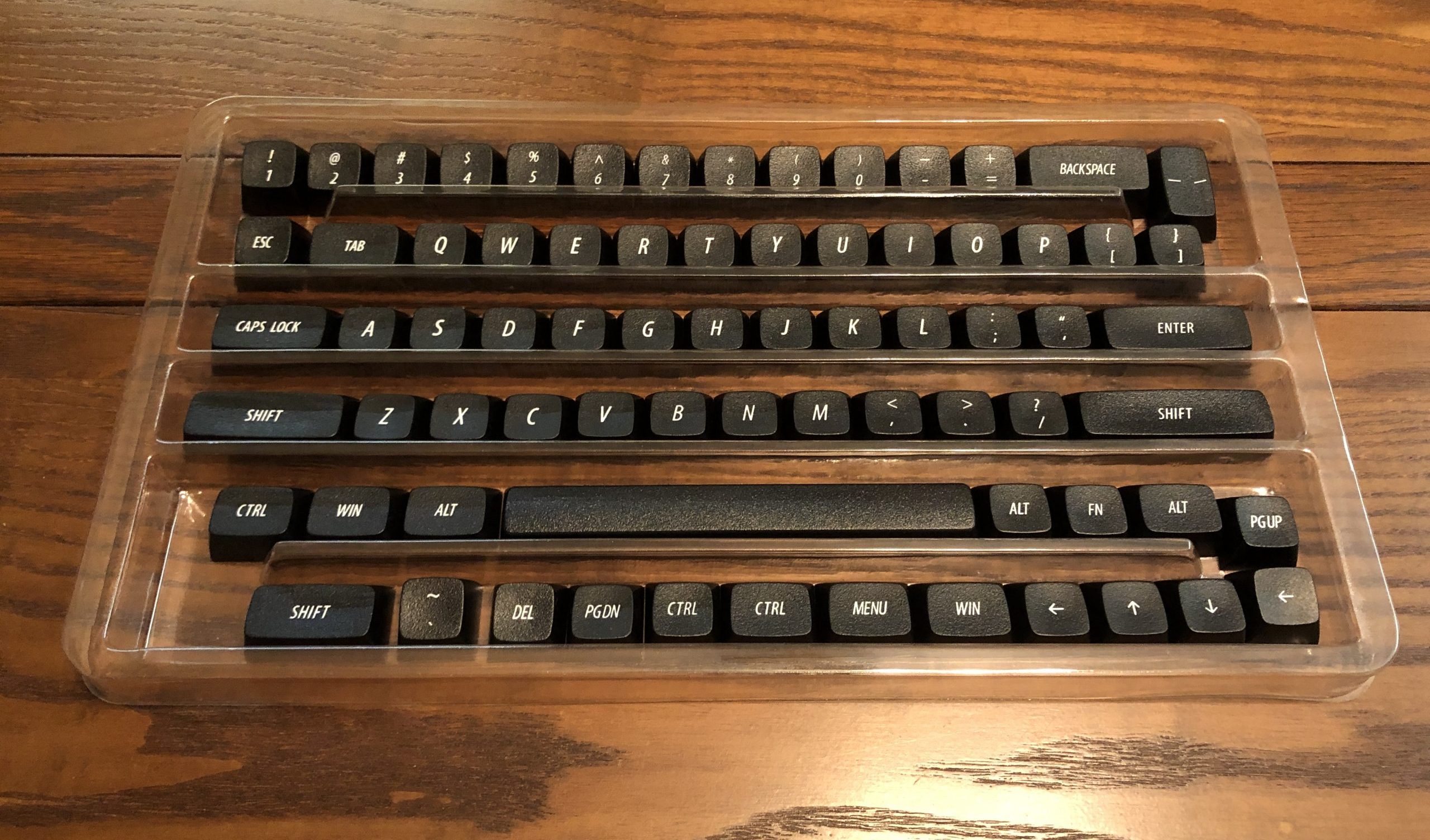
Alright – ones I forgot to include in the group photo aside, let’s get to the fun part – direct comparisons. Group photo!
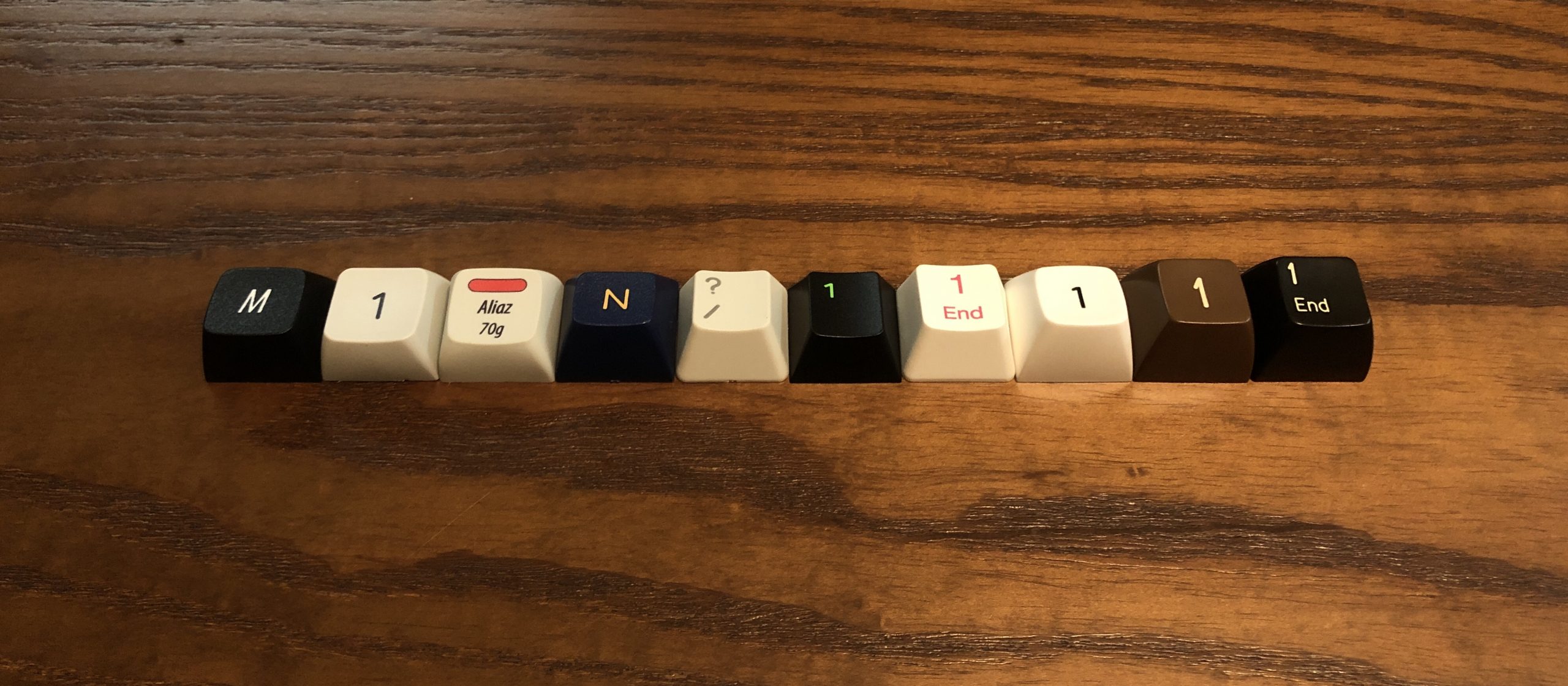
From left to right: EMA, MDA, XDA, DSS, DCS, Cherry, OEM (Akko), MT3, SA sculpted (R2), SA uniform (R3)
These are all taken from the same row, whichever key from it I happened to grab first – aside from XDA, which is the same on every row. SA sets come in a variety of row combinations ranging from fully sculpted to uniform, with all rows being the flat-angled one from sculpted row 3 – so I’ve included an extra SA key from that row for comparison as well.
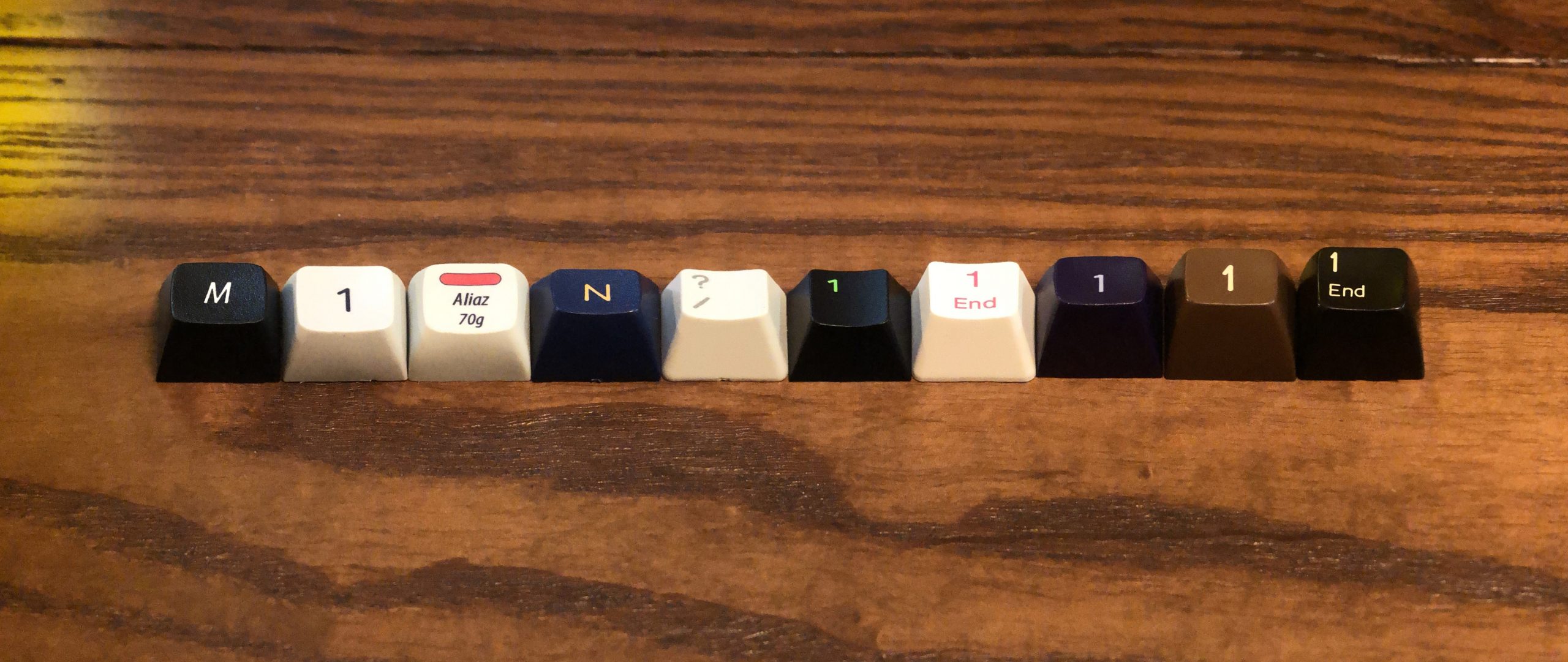
Let’s take another look at that lineup, but this time with a forced-perspective panoramic stitch effect for better side-to-side comparison. There’s a little distortion going on, but you get the idea. I also swapped-out the white MT3 key for a purple one. I think this gives a good overview of how these profiles differ from each-other.
EMA is about on-par with XDA when it comes to surface-area, but XDA has a flat and uniform row sculpt as opposed to EMA’s angled rows. MDA sits between them in terms of angle, but has the most broad surface area. They’re fairly flat, but not quite as flat as EMA.
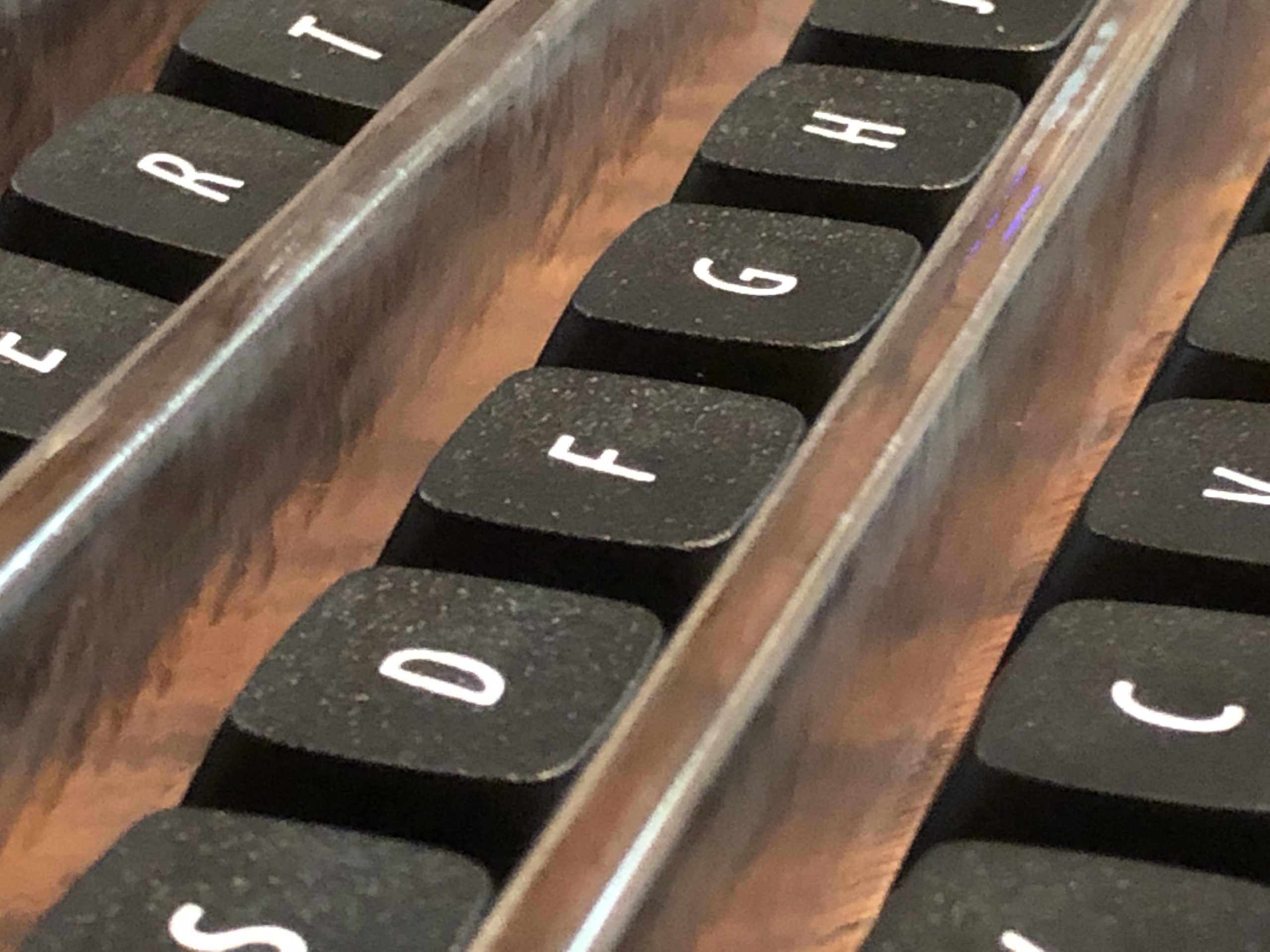
Focusing-in on MDA (middle) as it relates to EMA (left), XDA on the right. Note the texture on the EMA cap vs the comparatively smooth others next to it.
It’s mostly comparison photos from here; I’ll be reviewing the set at some point, but for now, here are a bunch of close-ups from various angles comparing EMA with other profiles:
EMA R1 from the side, with equivalent row keys from other profiles receding. Here you can appreciate the subtle spherical sculpt to the surface of the key.
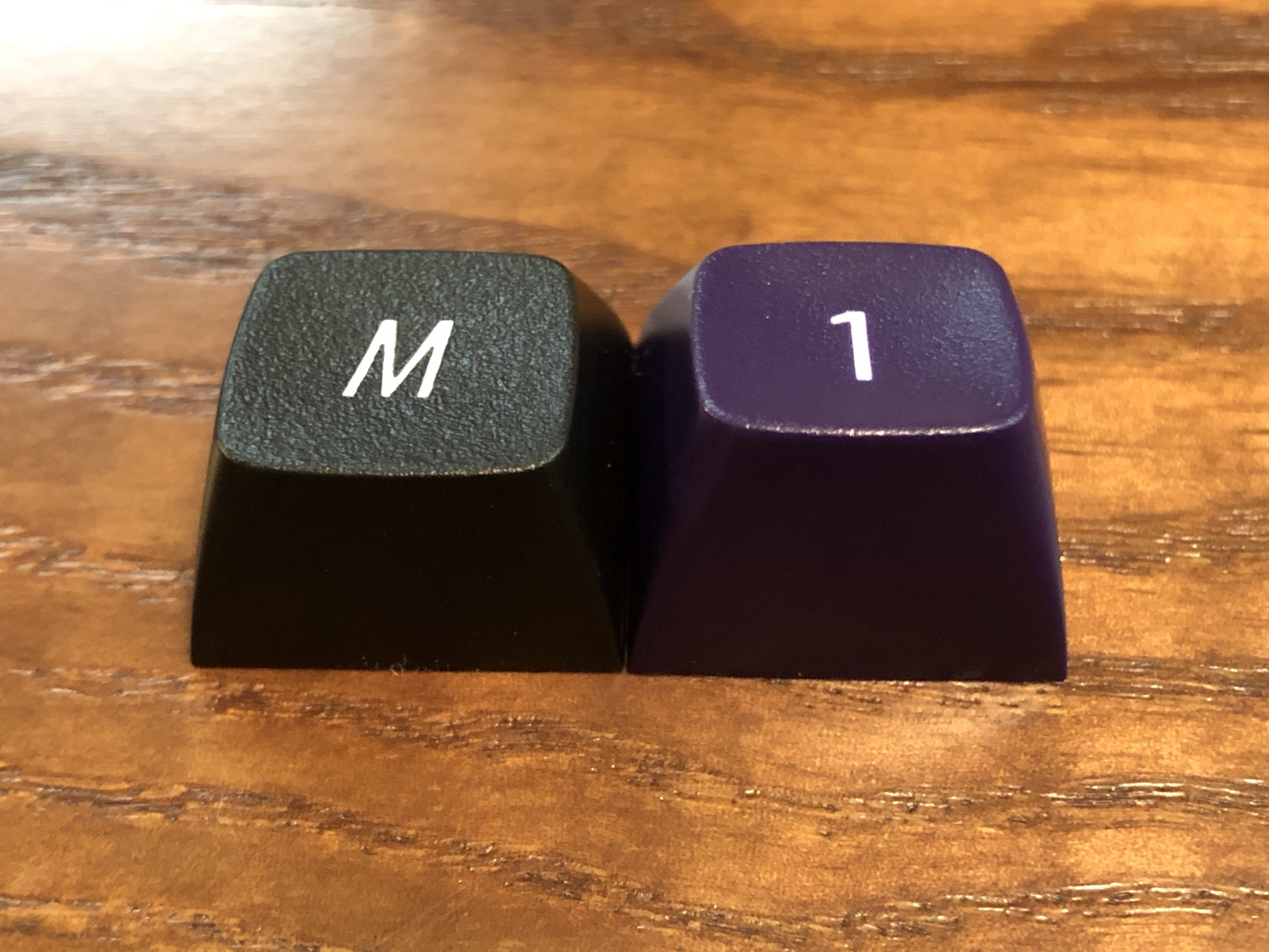
EMA on the left, MT3 on the right.
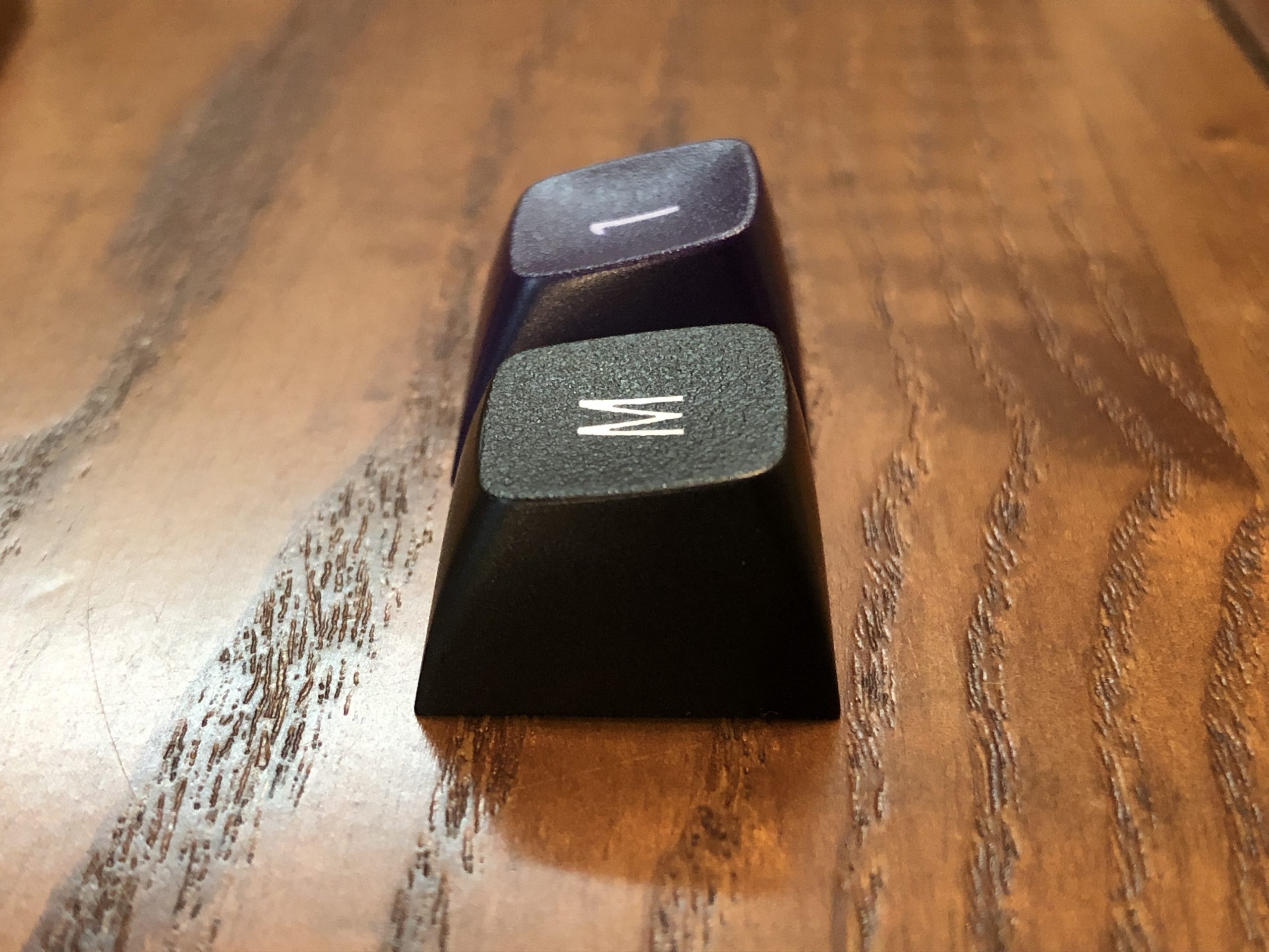
EMA closest, MT3 behind. Here it’s easy to appreciate how much more angled and scooped MT3 is, and how much larger EMA’s surface area is.
Adding DSS to the left, EMA, MT3. MT3’s scoop is a bit deeper than DSS, but from this angle DSS’s sculpting is more obvious because its top edges are affected by the sculpt as well, dipping between corners, whereas MT3 and EMA look flat from straight on.
From above; DSS, EMA, MT3
From the side; DSS, EMA, MT3. Here it’s easy to appreciate how angled DSS is, even more than MT3.
And another angle for good measure; DSS, EMA, MT3.
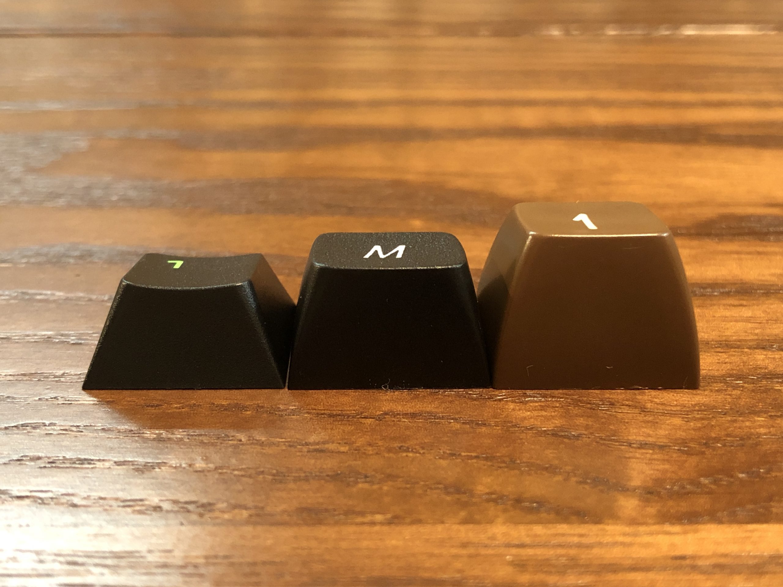
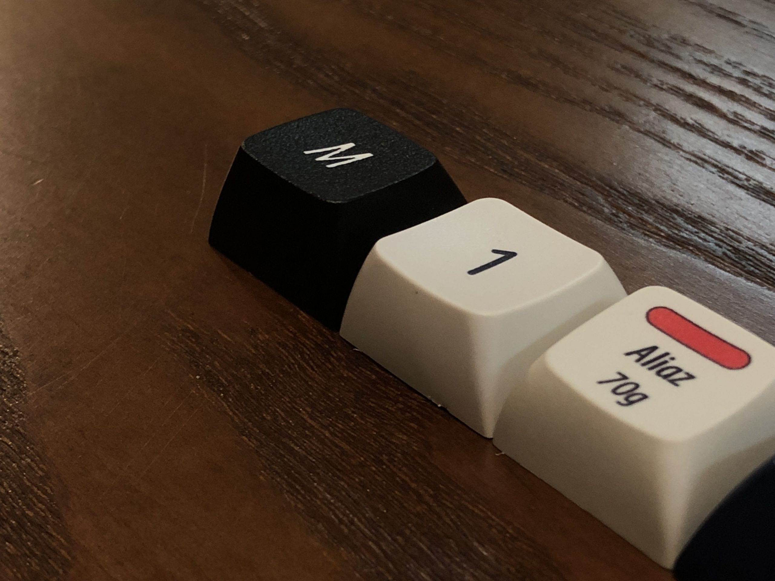
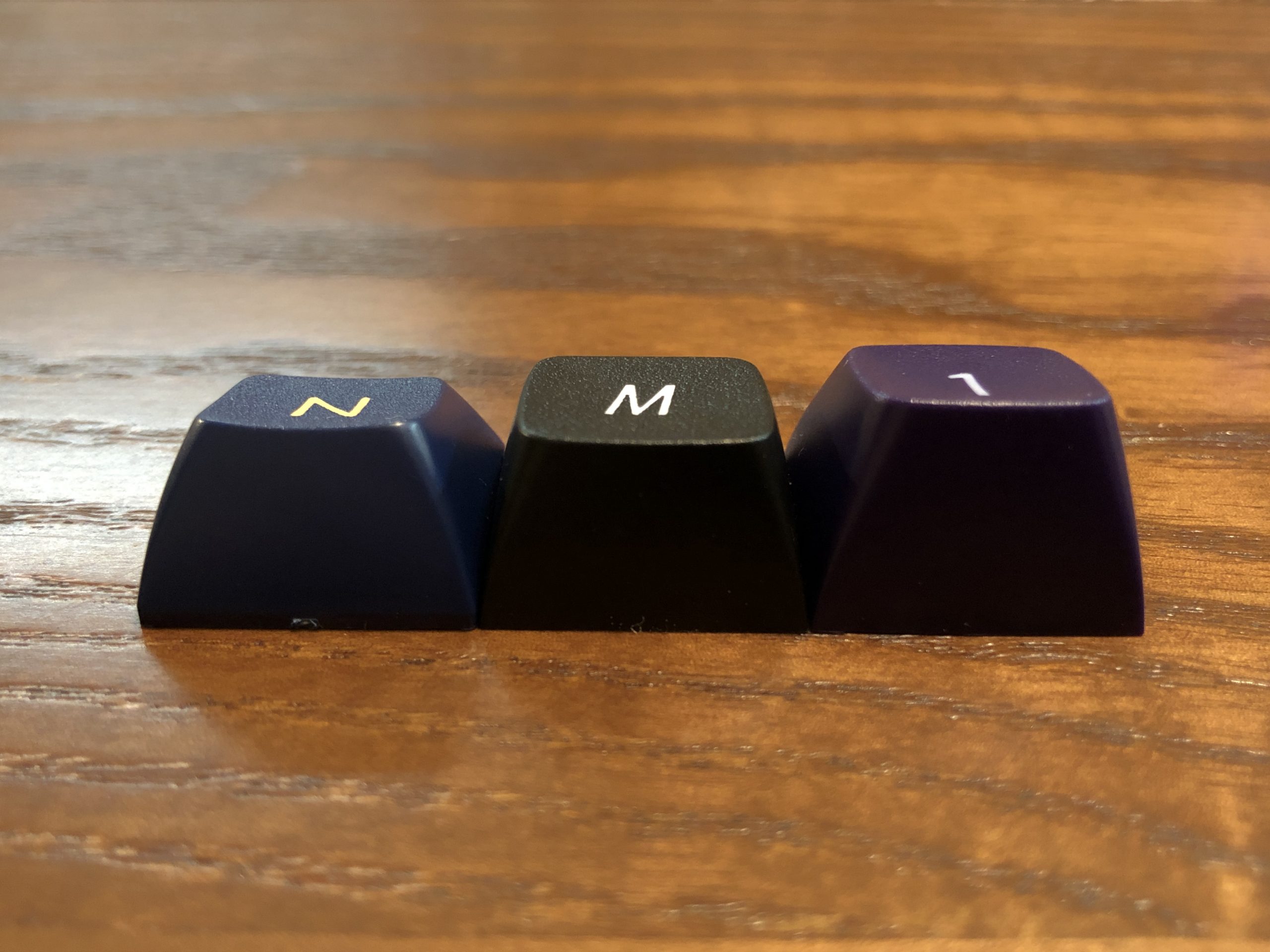
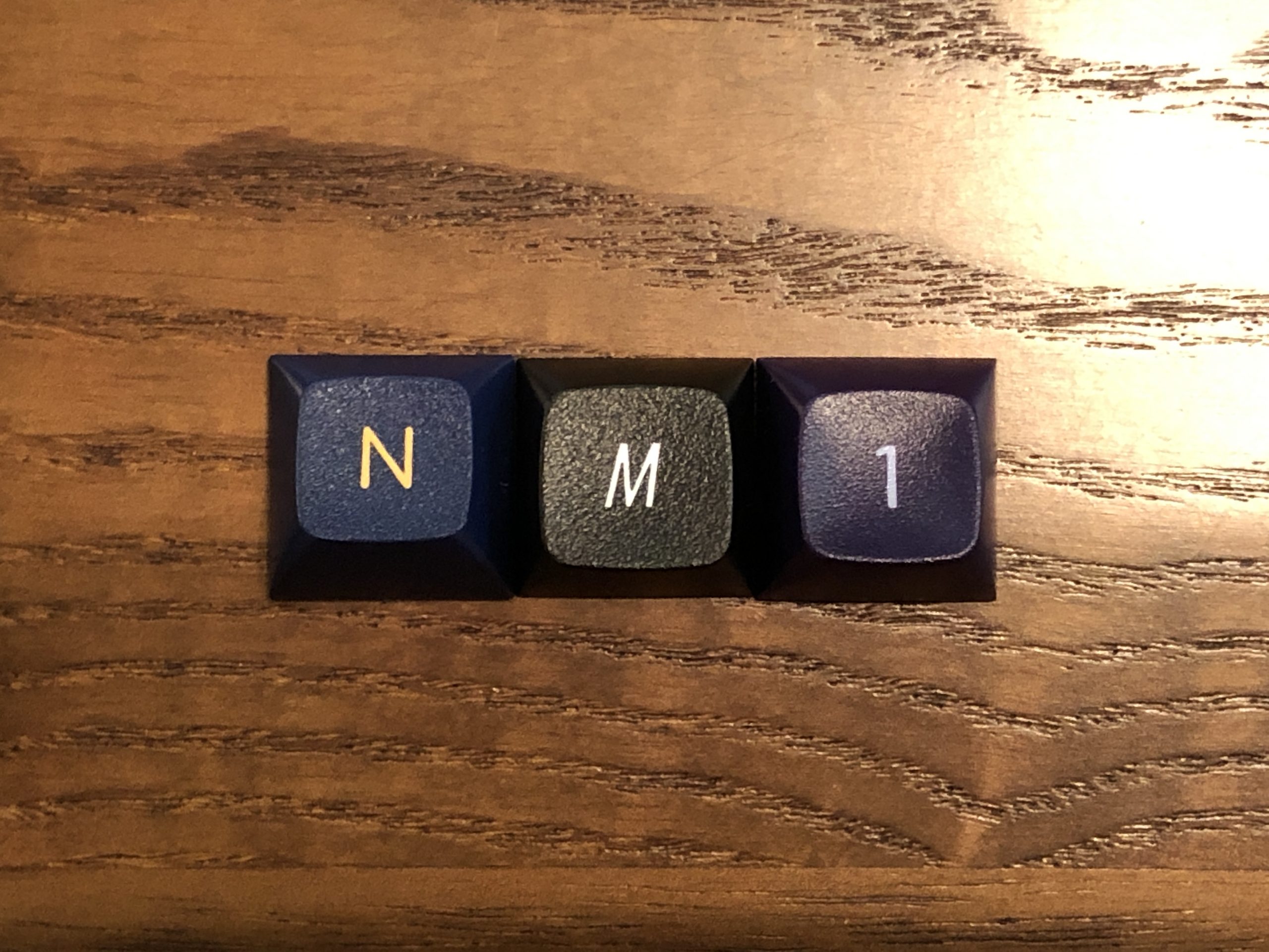
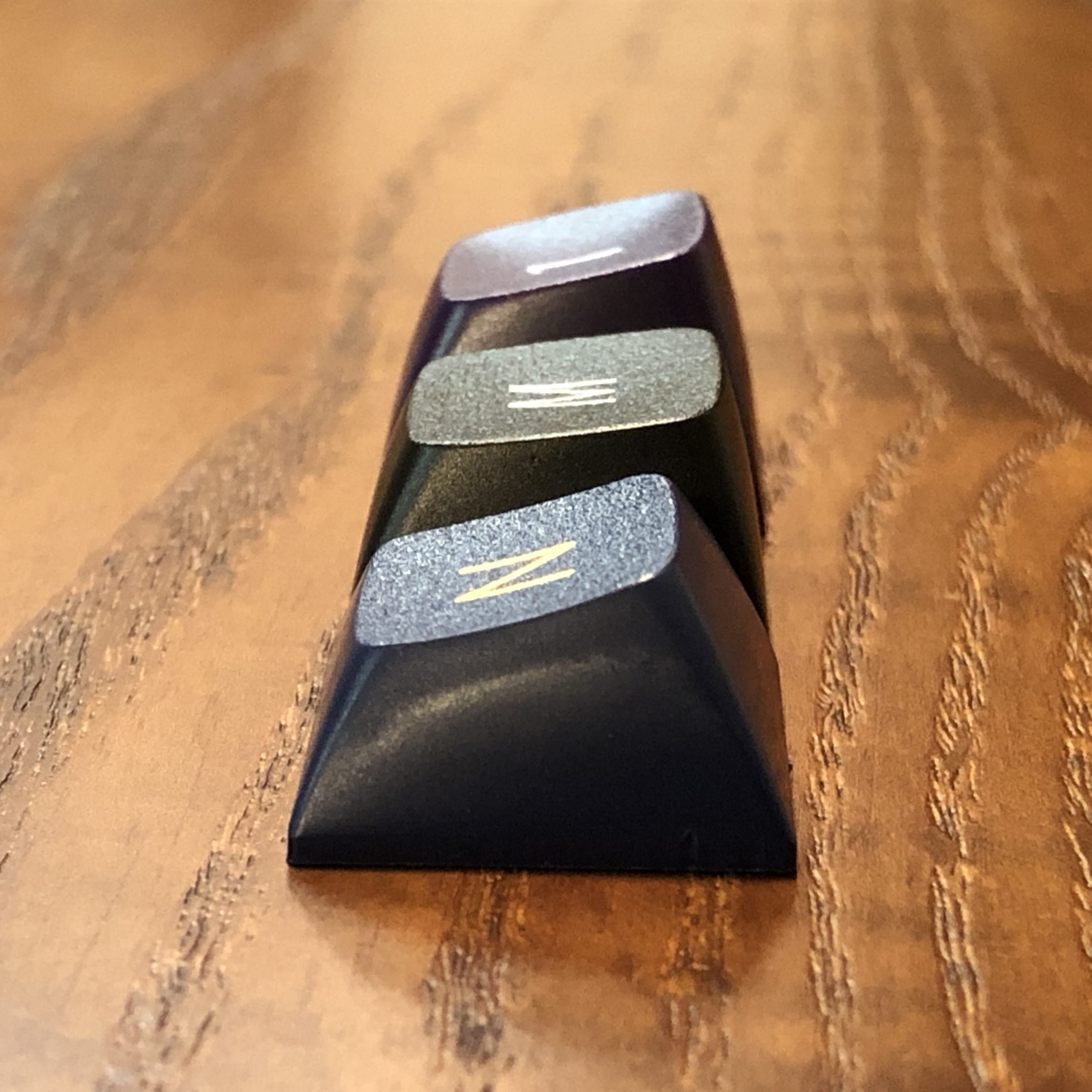
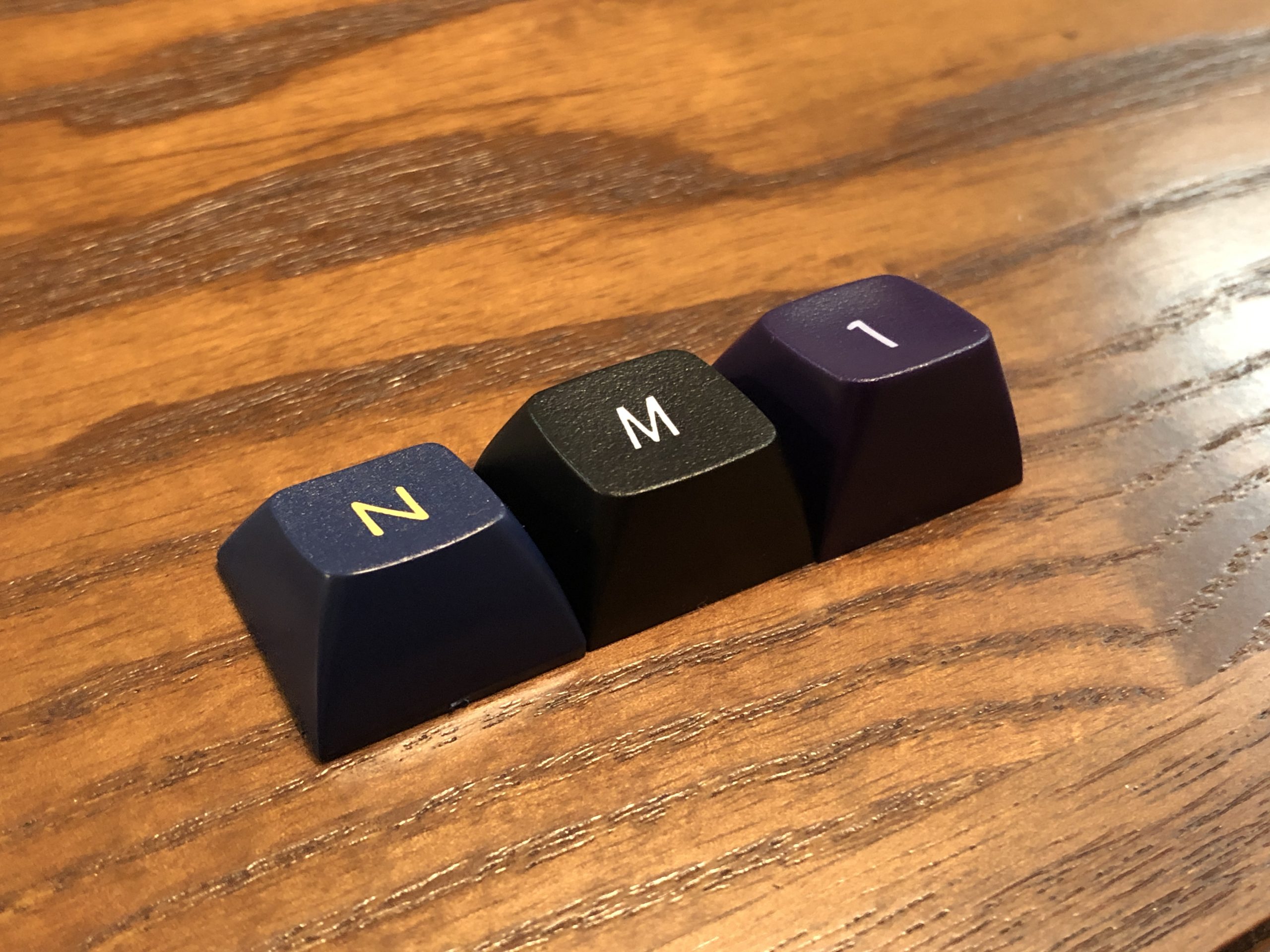
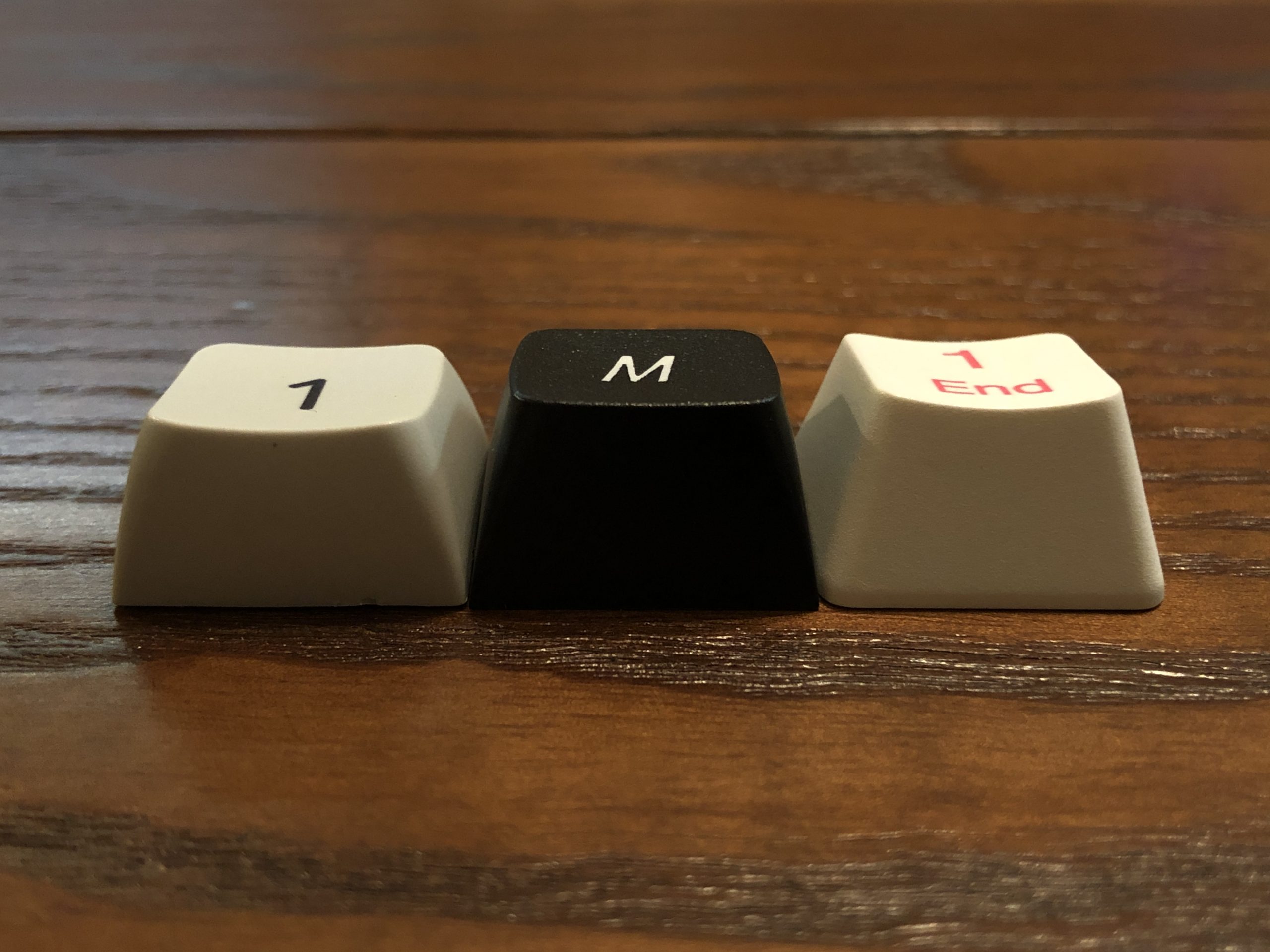
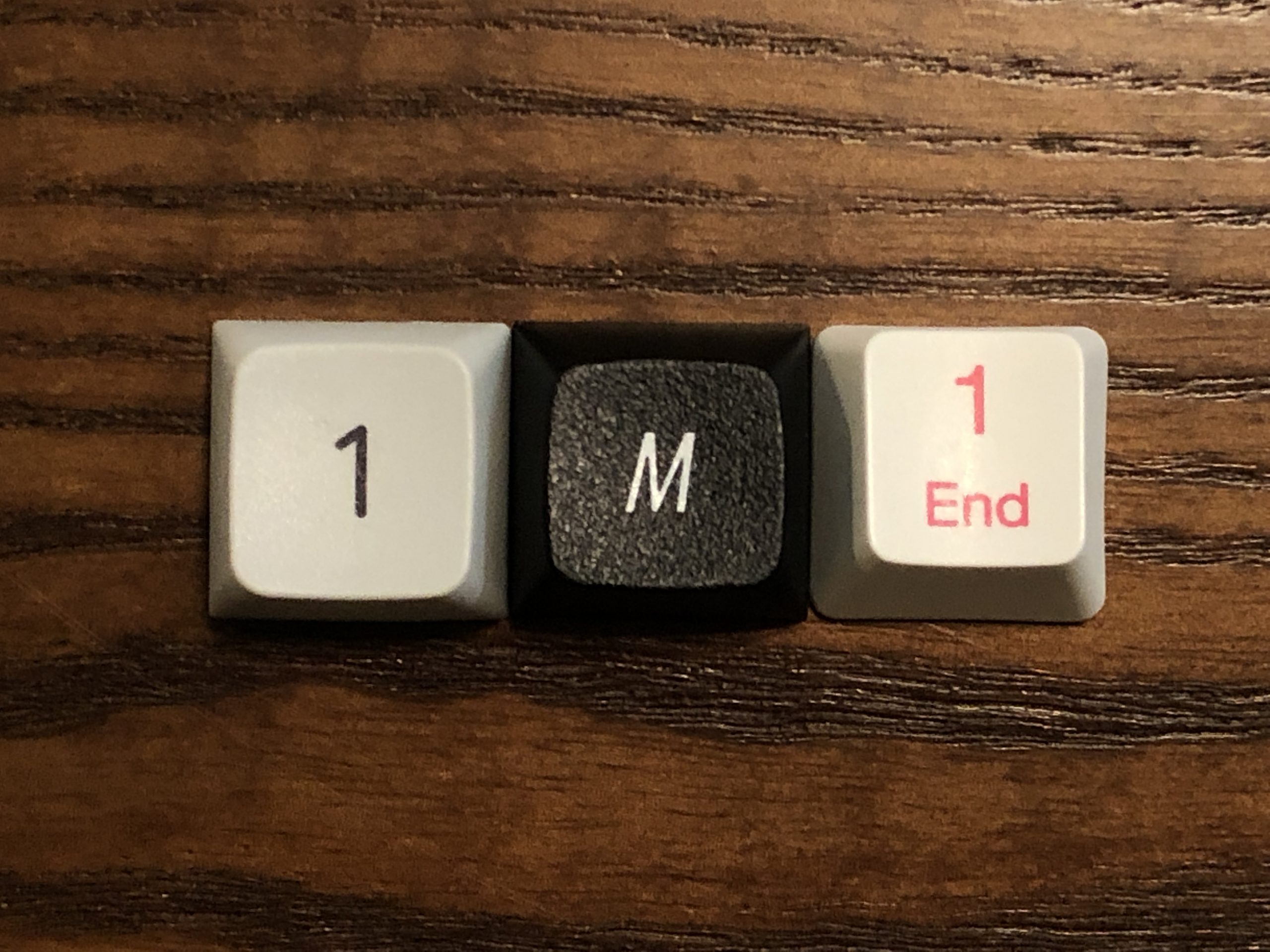
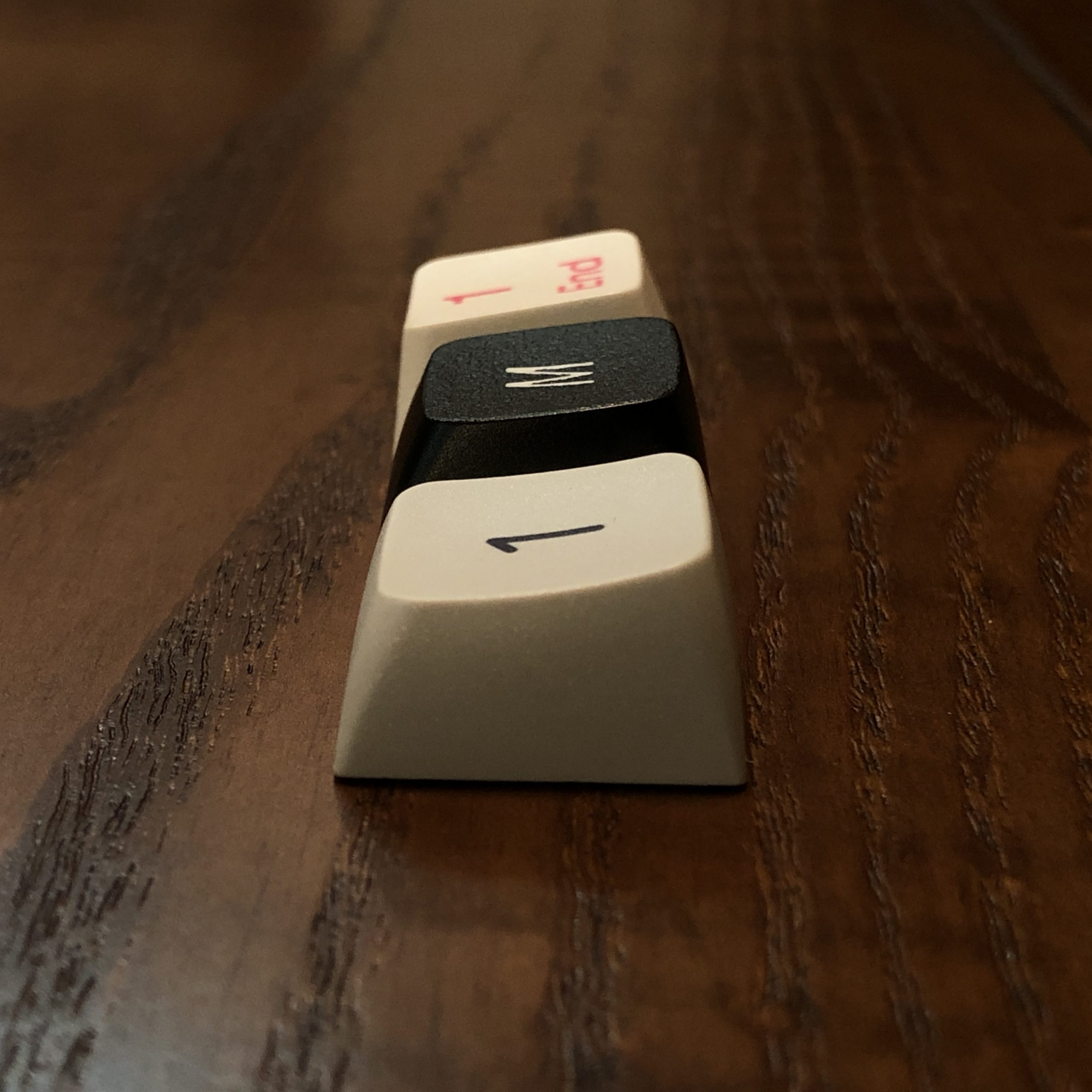
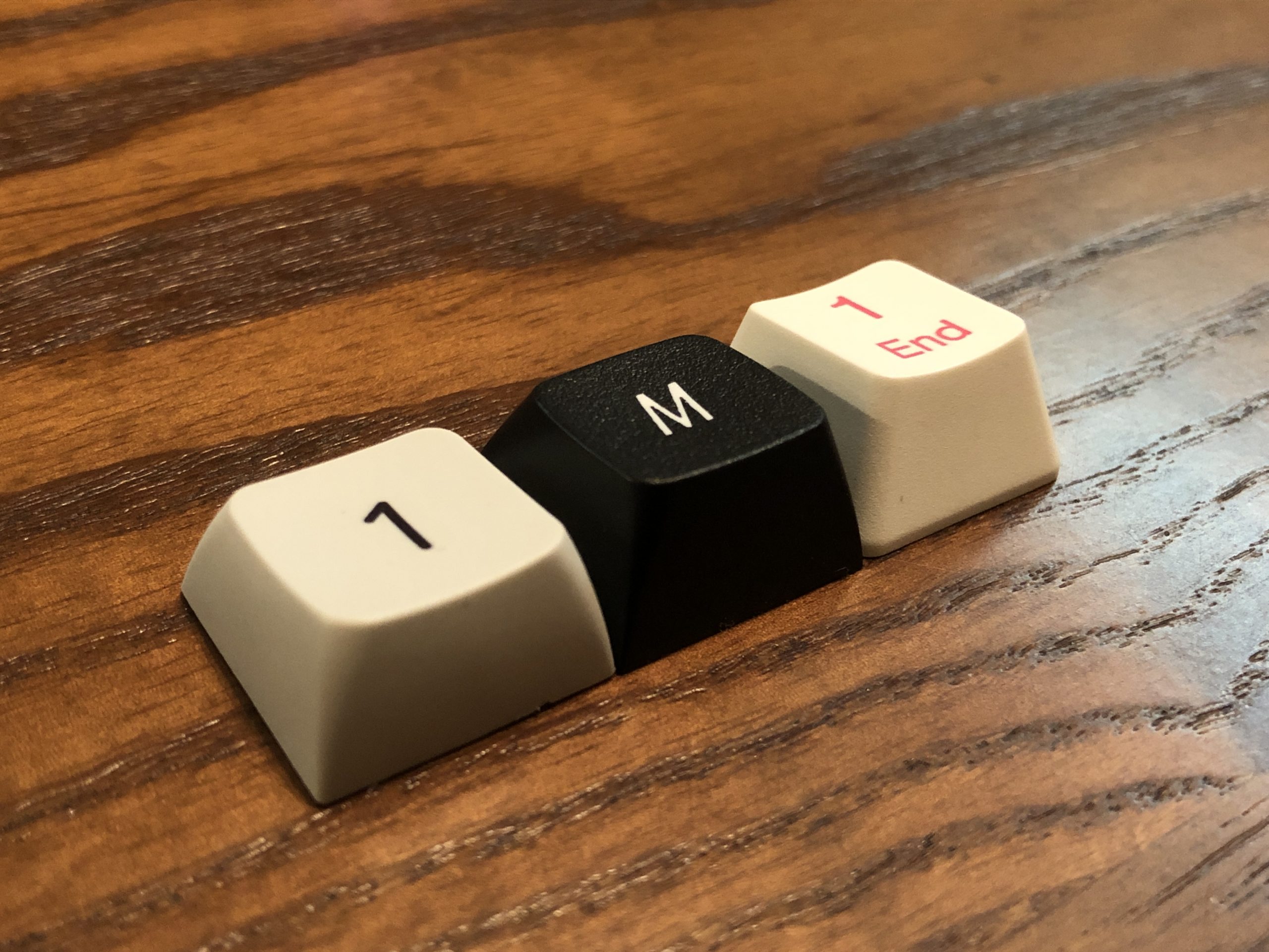
Cherry, EMA, SA from the front
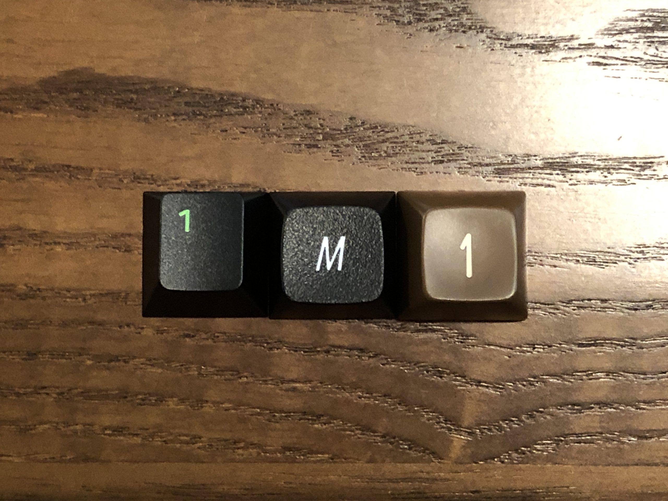
Cherry, EMA, SA from above
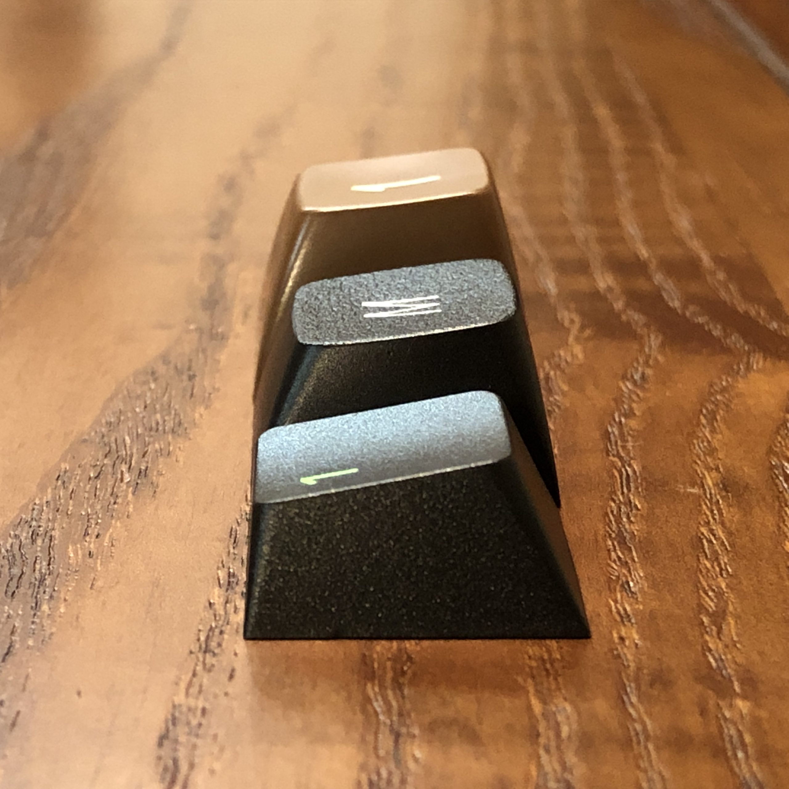
Cherry, EMA, SA from the side; Cherry having a quite different angle while the other two are more similar.
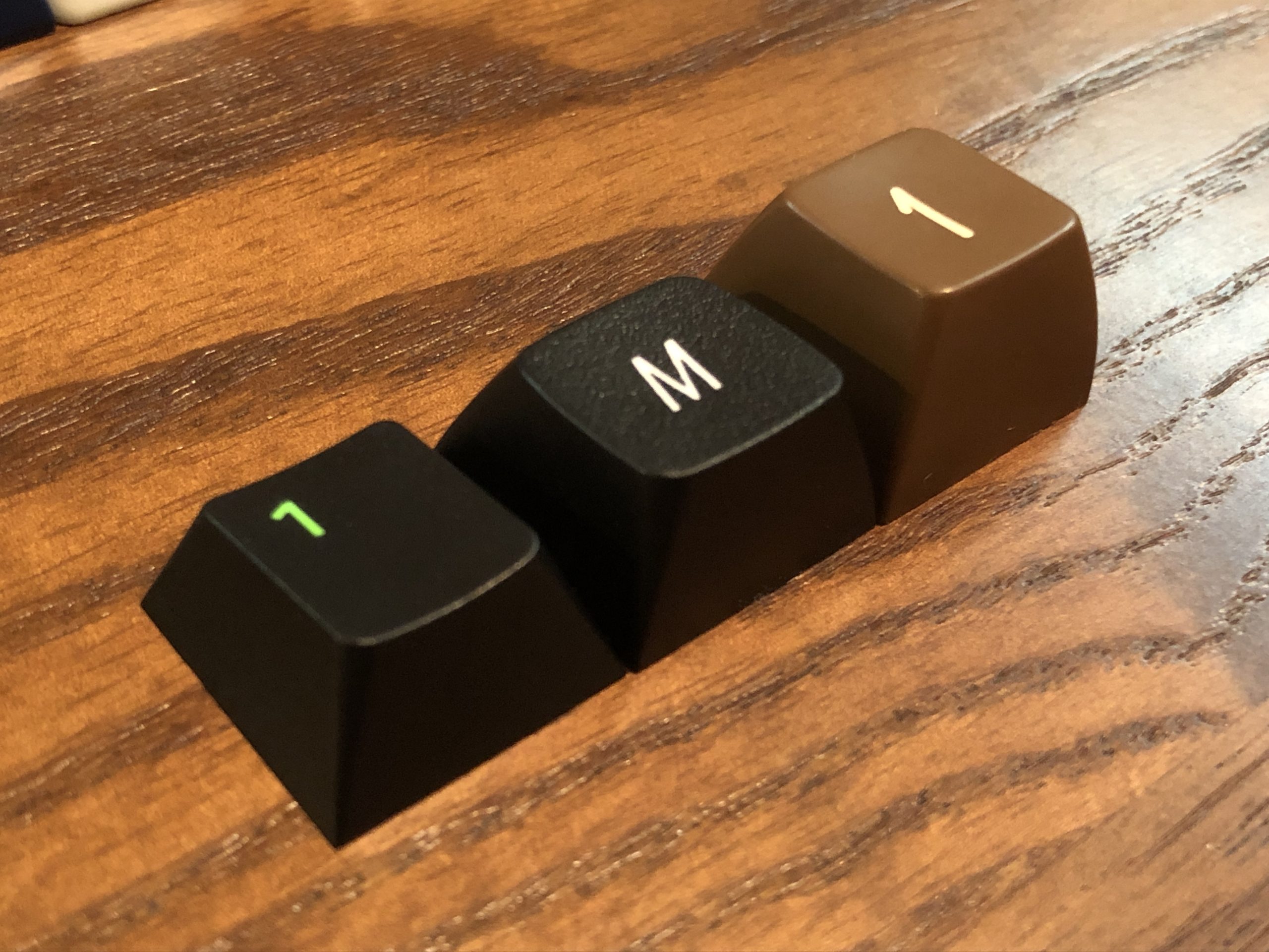
Cherry, EMA, SA
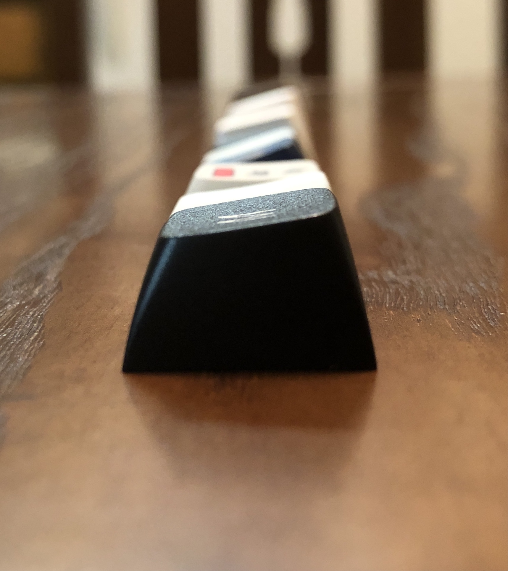
MDA, EMA, OEM from the front; darker exposure to make lighter surfaces easier to see
MDA, EMA, OEM from above; here it’s easy to appreciate how big MDA’s top surfaces are.
MDA, EMA, OEM from the side; here it’s easy to appreciate MDA’s almost horizontally-cylindrical sculpt, barely spherical.
MDA, EMA, OEM
You know, this might be the most middle-of-the-road profile I’ve ever seen. Neat.
Well – that’s about all I have for you today. I’ll be back at some point in the un-scheduled near future with more ramblings, reviews, and other such information.

Be seeing you.