Introduction:

Hello my friends, I’m back with another keyset review for you. Today we’ll be taking a look at DCX Cyber, a striking Cherry-like ABS keyset from Drop; in good company being inspired by the aesthetic of cyberpunk.

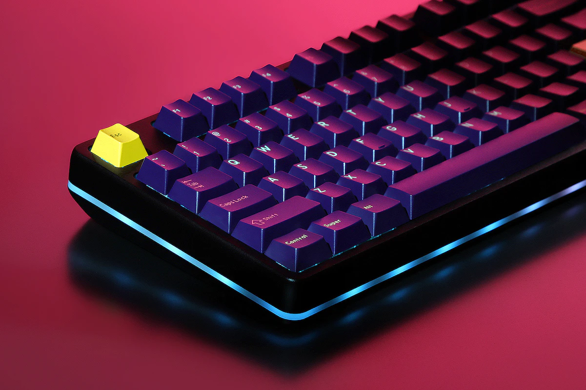
This rad photo is from the DCX Cyber product page.

Cyber is my first Drop Cylindrical X set, so this review will also cover the profile itself, taking into account lots of existing customer feedback. This one’s un-sponsored; I bought the set for myself and have been using it for a few weeks. Let’s dig in!

TL;DR: They look good, they feel good, they fit properly; these are solid keycaps and this colorway is rad. I’d say these are closer to a 9/10 than a 4/5, but not quite a 10. If you’re a details person, read on.

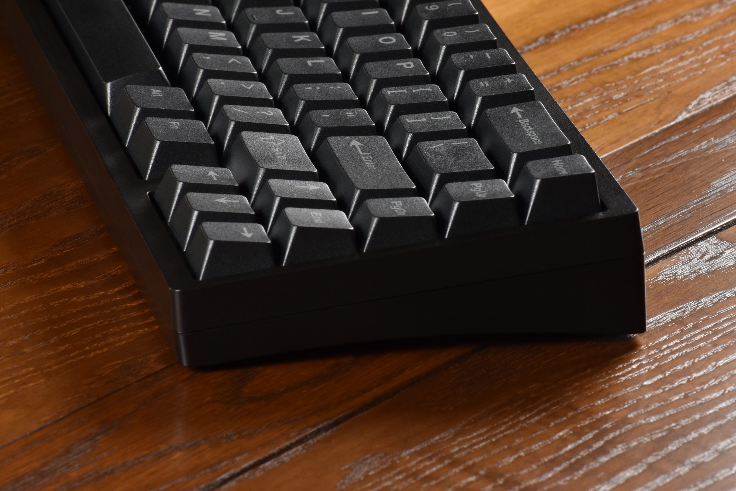
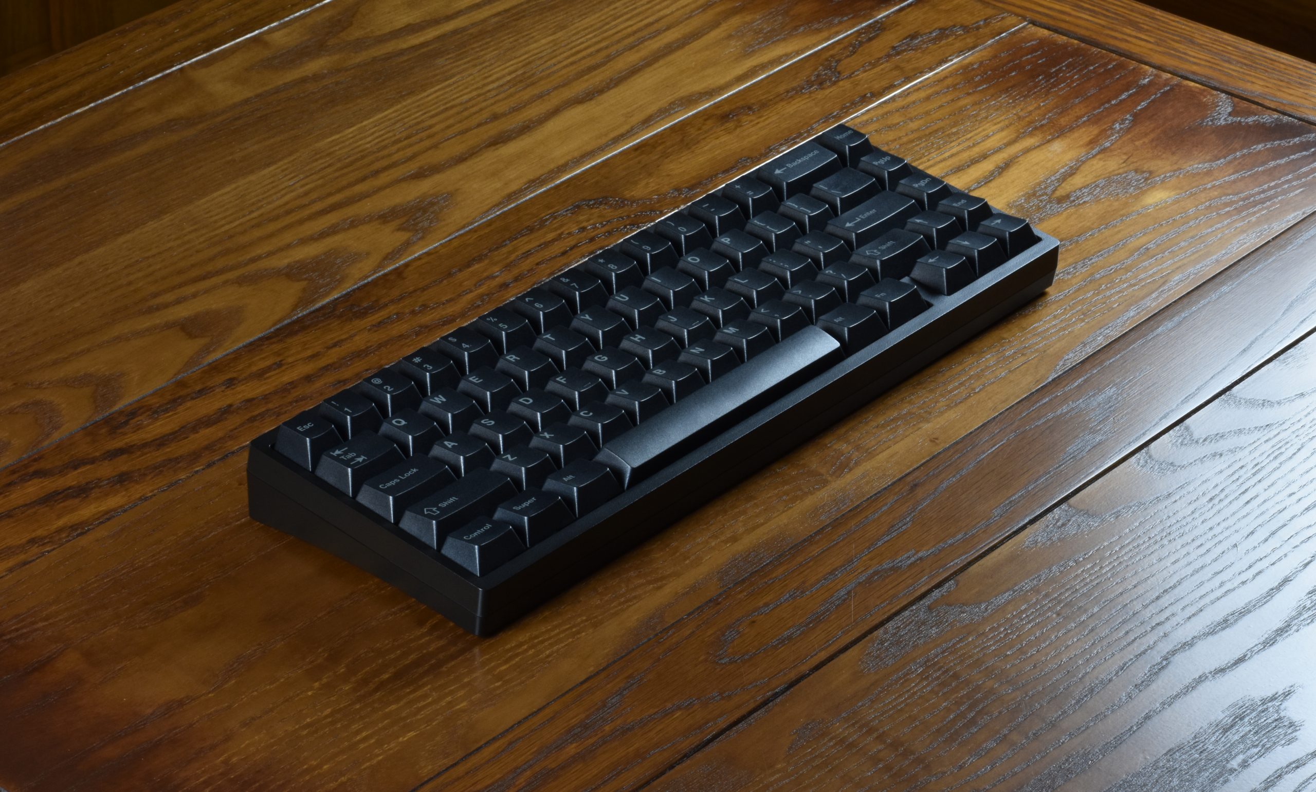
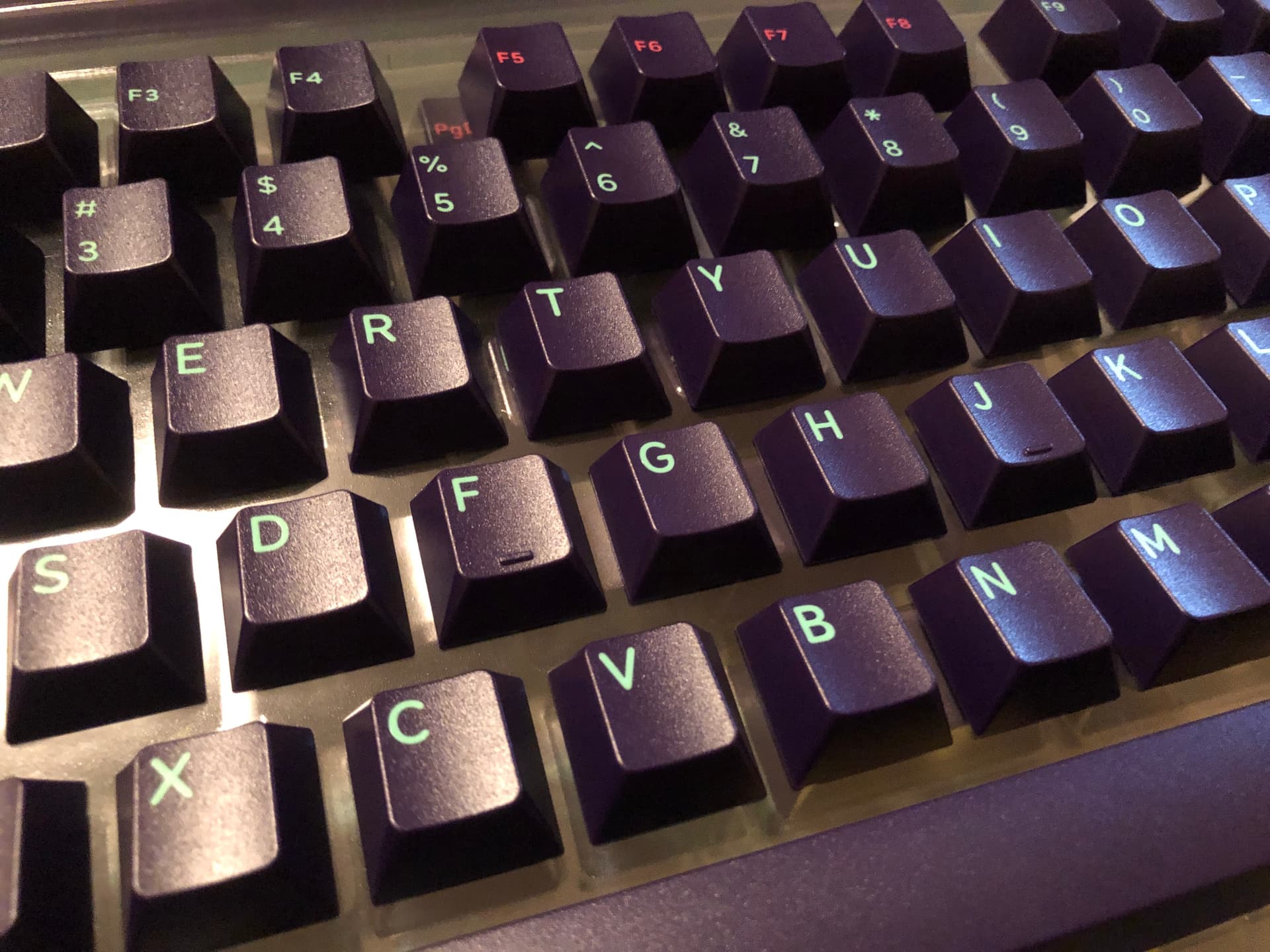
Here’s my set on a purple Portico, sitting on a Bob Ross deskmat:
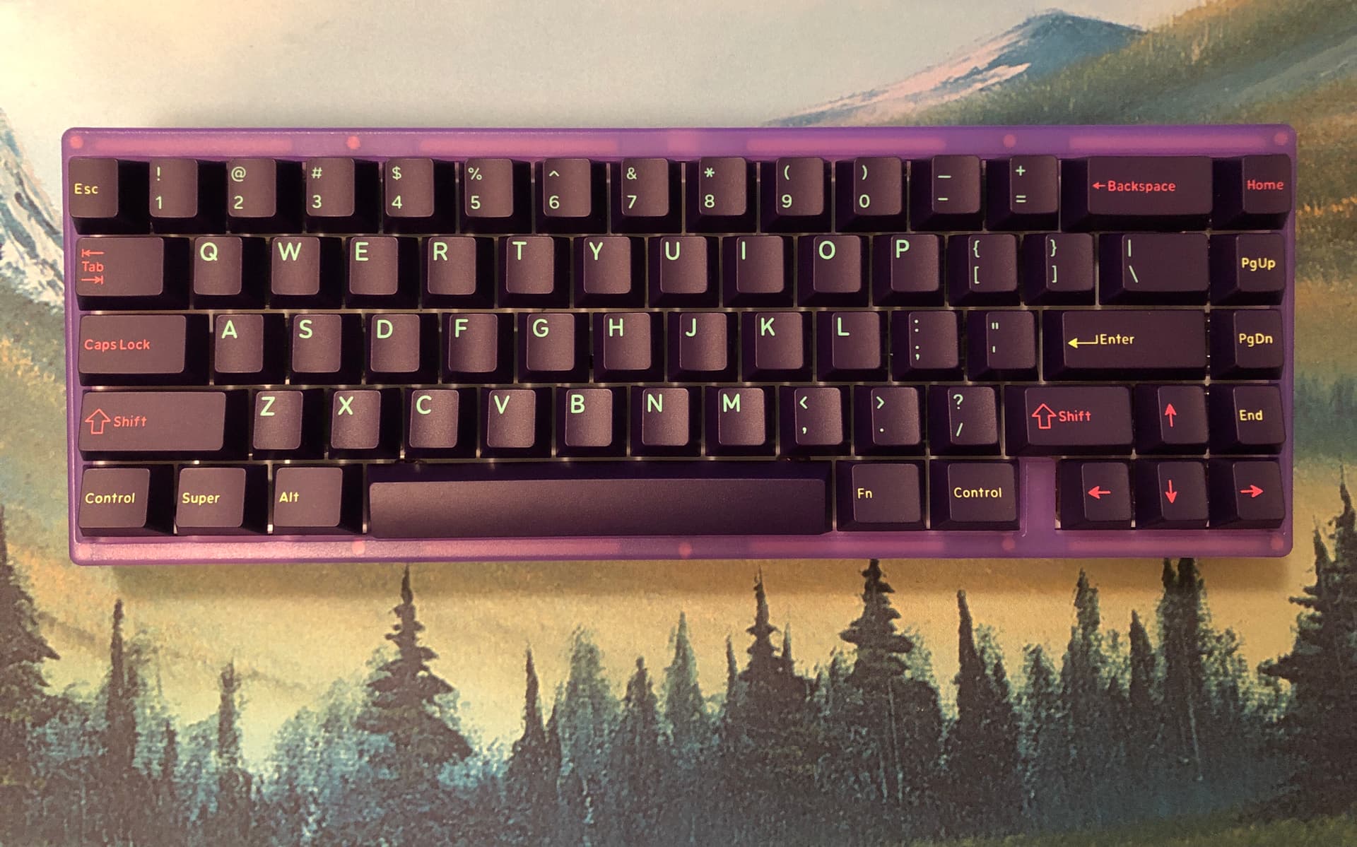
Mm. Dat purple.


As a footnote, DCX wasn’t always called DCX, and there was a momentary kerfuffle about it. If you find that sort of thing interesting, I have most of my thoughts about it here.


Let’s talk about Cyber.

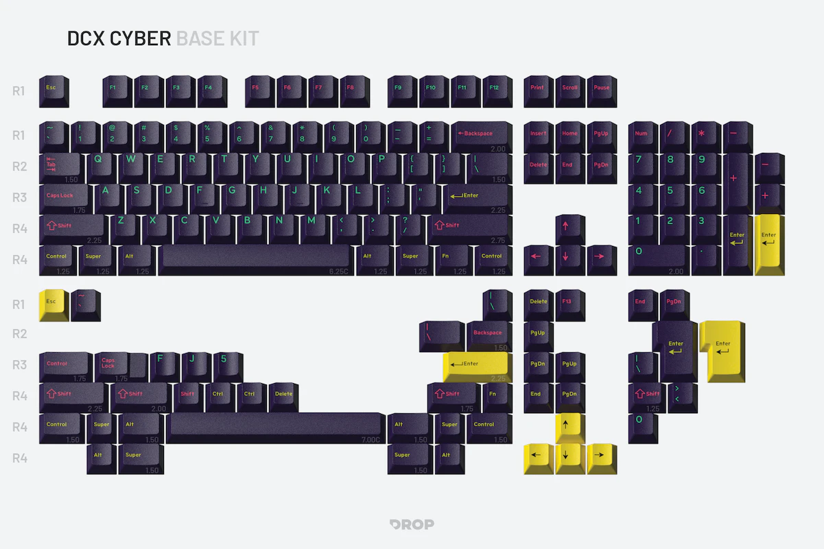
Kit image from Drop’s website; for R1 there’s only this base kit, but I think it does have at least a respectable amount of coverage and some nice accent options.

This colorway in particular is rich and striking, and I think it looks fantastic on a board. As a point of novelty, the distribution of the colors is not identical to its MT3 counterpart – this set is a thoughtful re-interpretation of the colorway in context of DCX rather than a straight key-for-key port. I think it works really well.

Quality and material feel is on-par with the ABS MT3 sets, coming from the same manufacturer. That is, generally exceptional quality with rare lapses in quality-control, accounted-for with a customer-friendly return policy. Maybe not perfect, but I don’t think a patient customer can possibly loose-out here.

Text in screenshot reads: RETURNS—NO QUESTIONS ASKED We get it. Sometimes what you ordered just doesn’t work out. If that’s the case for you, don’t fret! All customers (both US and international) may return this item in new, unused condition within 30 days of delivery.

Pretty darn reasonable, if you ask me. If you’d like the details, you can find them here.

These are ABS and everything that entails, so if you’re not down with shine over time, stick with pure PBT – it’s just the nature of that type of plastic. While they will shine, just like any reasonably thick ABS set they won’t wear-out… unless, I dunno, you have the most caustic hand oils in the world and type 24/7 for literal years.

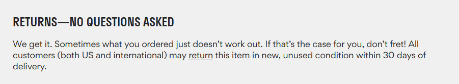
One more image from the product page, showing a side view of the DCX profile rows.

In terms of the profile, it took me just a little bit to get fully acclimated coming straight from Cherry, but it’s plenty familiar and approachable. By that I mean I had zero problems, vanishingly-little awkwardness, and it took a few hours over a couple days to get back up to my average WPM after moving to the profile. From there it’s been feeling completely natural to me. DCX is genuinely distinct from Cherry, but probably the closest thing to it that isn’t a clone of the profile at this point. From what I understand about the design goals here, this is basically a perfect success. Noice. For me, this profile is a welcome alternative to existing options, offering its own distinctions while largely maintaining established conventions, and this is probably the most fun colorway it comes in right now.

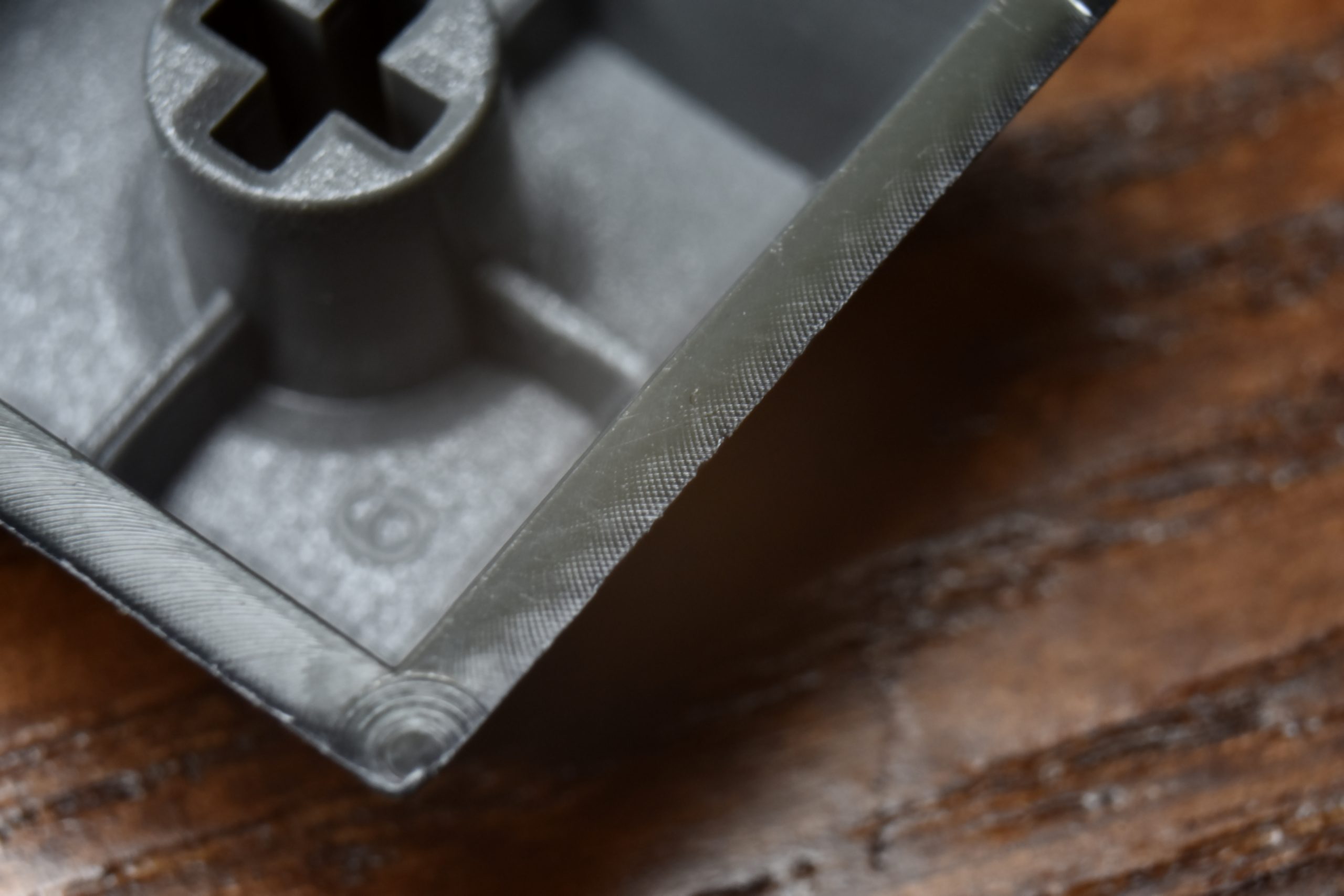
A few notes about the tooling: Drop went out of their way to address a pain-point present on many popular high-end keycaps: visible sprue marks. If you’re a flipped-space enjoyer like myself, you might be familiar with GMK’s unsightly blemishes on the “back” of the bar, and for that matter most other keys like the F-row. Not here – injection marks are under the caps and not visible from any normal viewing angle. I appreciate this every time I see it, and seeing it on a premium keyset makes me even happier.

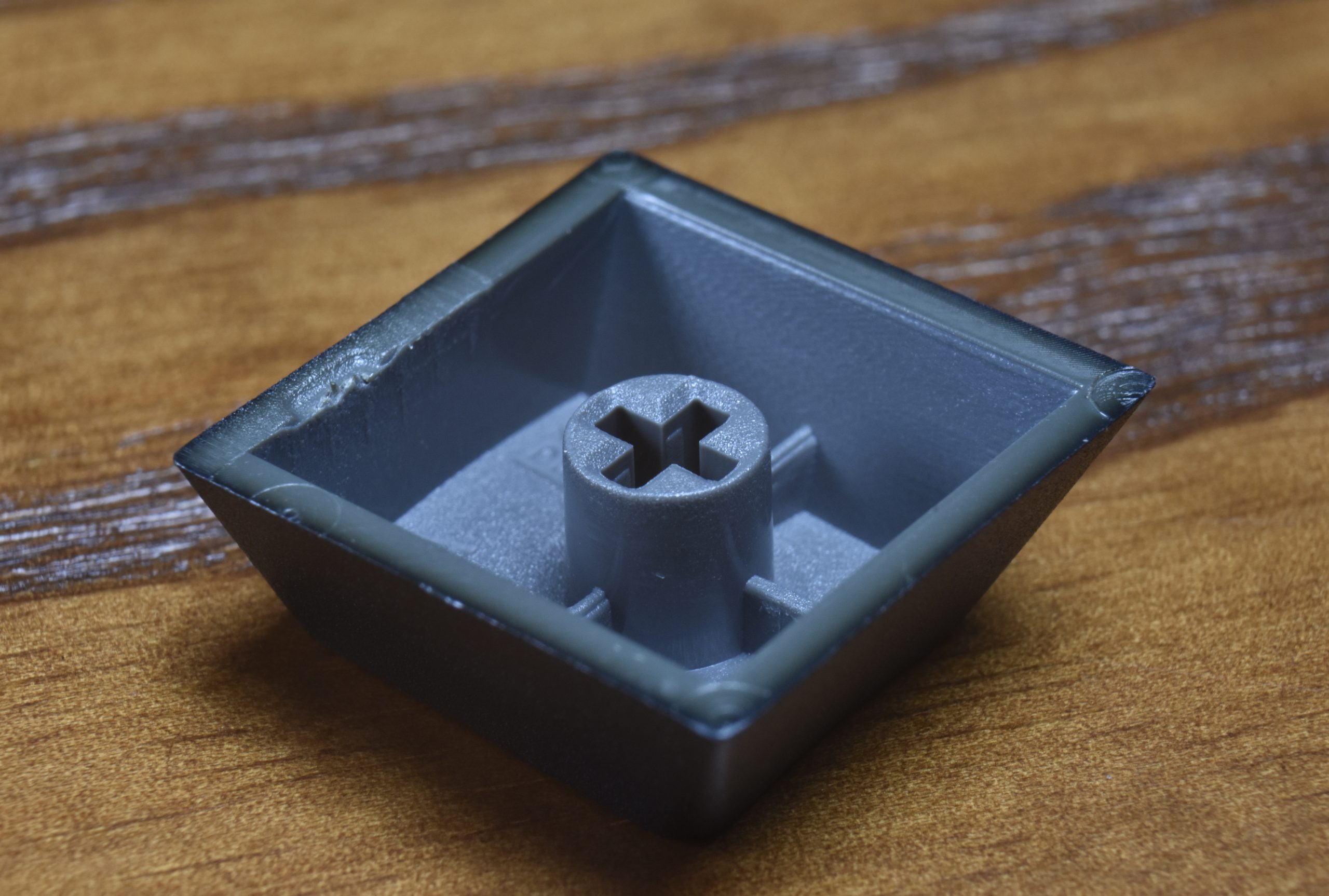
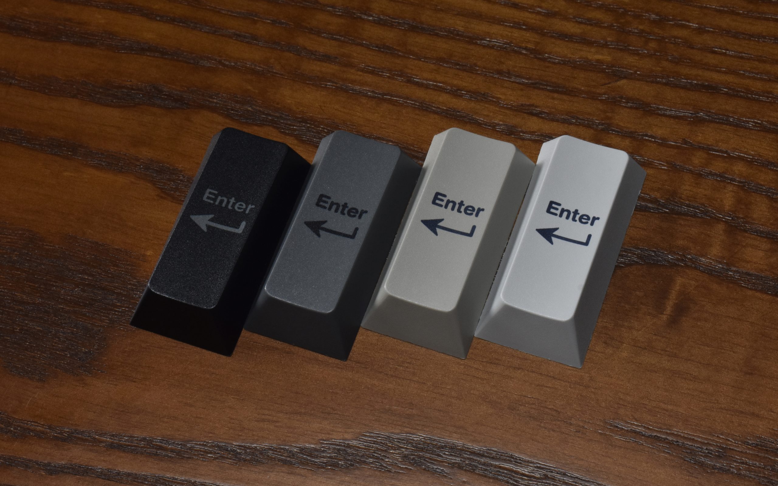
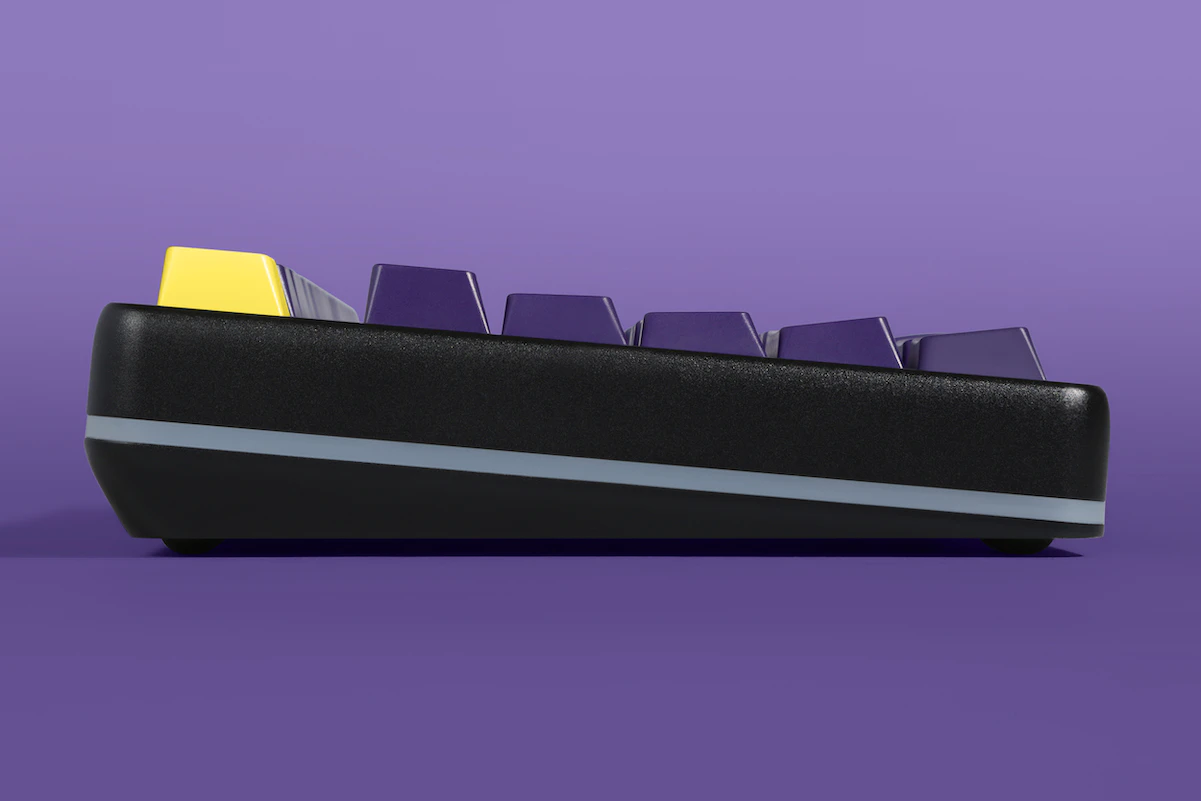
A close look at both sides of the DCX arrow keys.

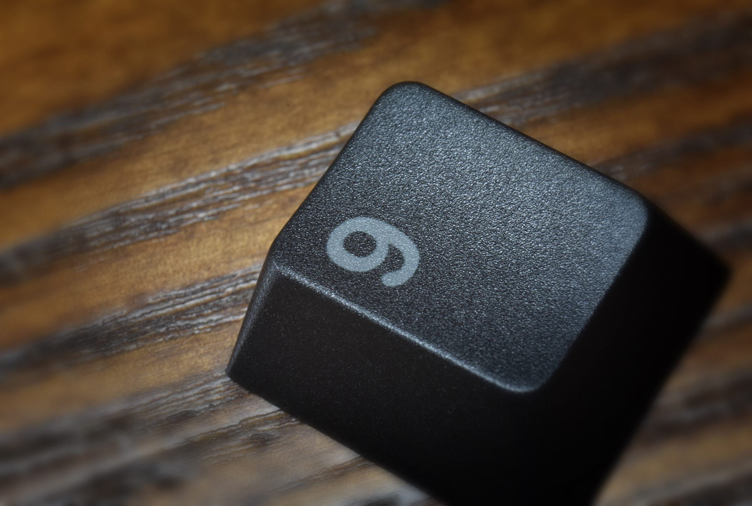
Legends are generally crisp and reasonably uniform. I haven’t found any blemishes on my own set, but at least one user has posted photos of color-bleed from one shot to the other. I get the impression this is a rare occurrence, but it’s documented, so I’m mentioning it. The typeface is thinner than Cherry’s, but shares the familiar and timeless rotary-machine-tool quality of rounded corners. I’ve seen mixed feelings about the kerning (distance between letters) on the Shift keys, and this comes down to different schools of thought when it comes to how to approach kerning: visual weight vs absolute distance vs bounding box.

That is, you can space letters taking into account how natural it will look, but not necessarily adhering to uniform spacing. Alternatively, you can space letters with an exact uniform distance between the actual boundaries of each letter – this tends to be more of a good place to start and then adjust for visual weight. Finally, you can evenly space letters based on the boundaries of an imaginary box drawn to touch the extremities on all sides. This is a pretty traditional way to do it in context of letter-press typesetting and machine tooling, but it often creates awkward-looking relationships between some letters, especially lower-case ones.

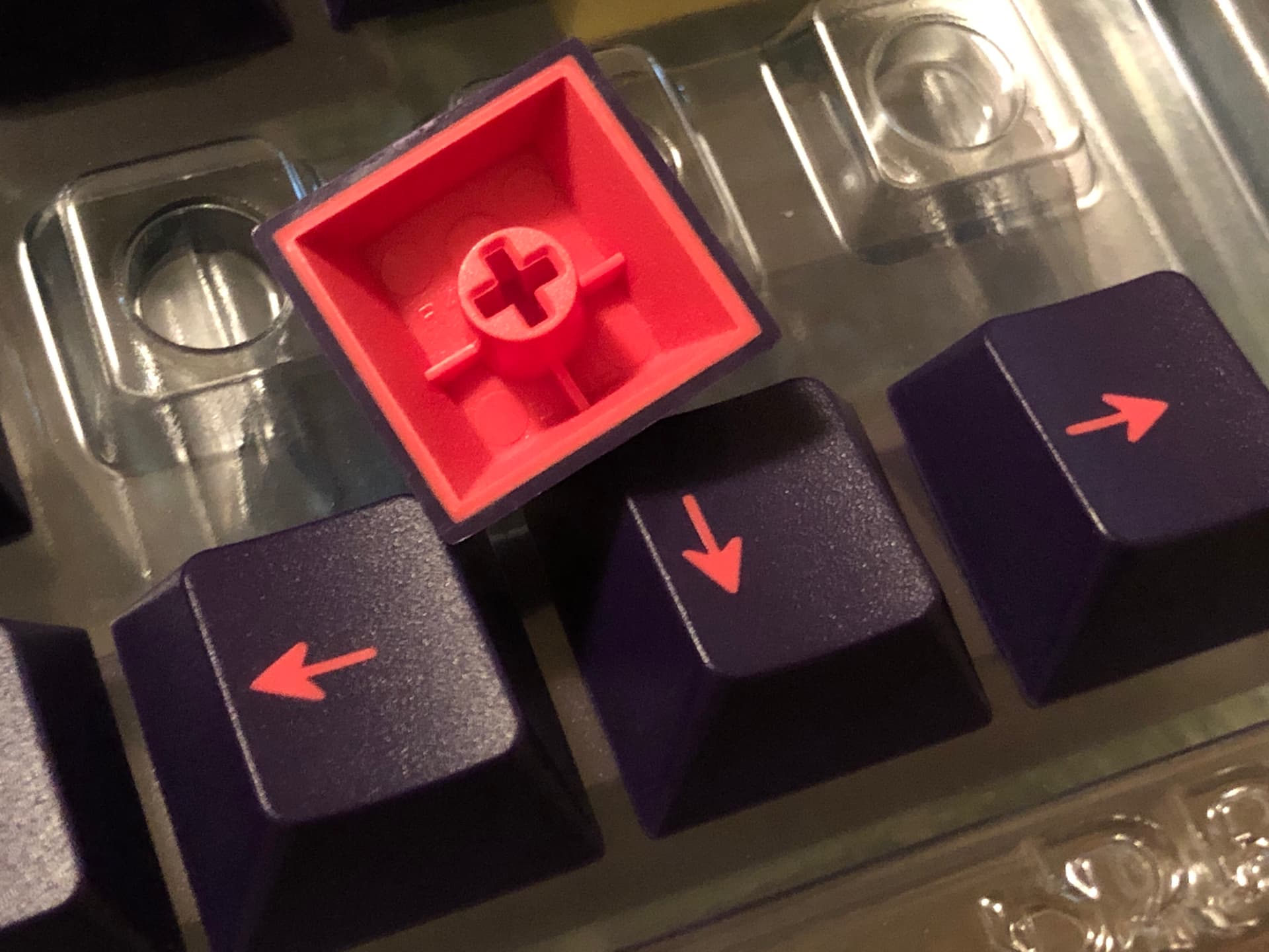
To me, this looks like traditional mono-spaced, machine-tooled lettering – there *is* a logic to the spacing, but it does also naturally strike plenty of people as a little derpy depending on the letters being used. See “Shift” key below:

The nested plastic trays that DCX ships in.

The packaging is very good, if a little understated on the outside for such a loud colorway. Inside the black-on-black cardboard box are a series of nested trays that hold each individual cap in-place; no scratches or gouges from sliding in troughs or bouncing in bags. The cardboard part is good physically speaking, like 7 or 8/10 for that sort of thing, but the plastic part inside (IMO the important part) is 10/10, excellent, industry-leading, heck-yeah, everybody-else-take-notes kind of good.

Well – MelGeek’s MCR keycaps actually come in pretty much equivalent excellent packaging – but all the other major manufacturers I’ve gotten caps from are behind when it comes to the trays that sets come in and/or the space they take up. Per-key trays are nothing new, but those have traditionally been big, flat blister packs that stink to store – these neatly stack and fit in a nice small box. Perfect. (As an aside I’d love if MT3 moved to something like this; I like not having the shreddy paperboard while also reliably protecting the caps.)

A fairly close look at DCX Cyber, sitting in its packaging tray.

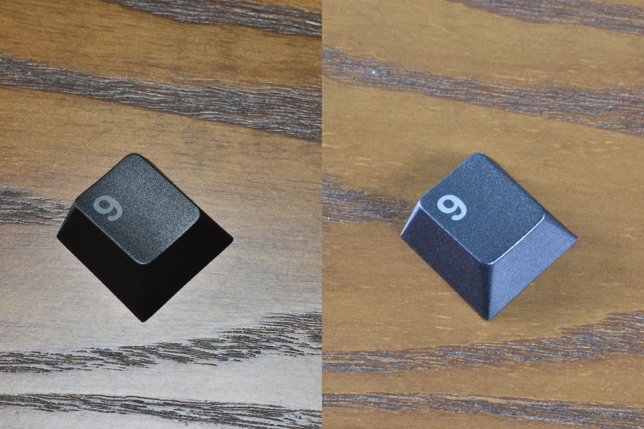
Truly minor nitpick; there’s a hint of inconsistency with some of the color. I’m not sure if that comes down to surface, pigment, the color of the other shot being underneath the whole cap, something else entirely, or some combination, but it’s there. — I should put an *asterisk on this; I’m literally trained to spot this sort of thing and work in a field where it’s important. In my experience most people will probably not perceive a difference like this, I’m just mentioning it for the few folks it may actually matter to. I can see it, but this set is just so fun to look at that I don’t care at all – but a specifically obsessed person (or the rare tetrachromat) might appreciate more rigid consistency. FWIW I think the consistency here is notably better than at least one of the top / most well-known keycap manufacturers; it’s quite good.

To wrap this all up, I think Drop and Terra Plastics have done a fantastic job developing this profile, and I think MiTo has done an excellent job with the colorway and its composition. This really is a killer set, fitting a rad name like DCX Cyber.

Now… I just need to find the perfect yellow keyboard.

Introduction:

Hello my friends, today we’ll be taking a look at NovelKeys’ “Cherry Charcoal” dye-sublimated PBT keycap set. This is an un-sponsored review; I bought the set for myself and just wanted to share my thoughts.

An image of Cherry Charcoal from its sales page on NovelKeys’ website

As the name implies, this keyset is sculpted in Cherry profile. Said another way, these will be pretty much the same shape as GMK keycaps – just made of a different material and colored using a different method. If you’ve never used Cherry profile before, chances are it will still be pretty familiar to you – the shape is a lot like the standard one found on just about any and all keyboards from the 90’s and early 2000’s – just a little less tall and wide.


Kit Coverage:

Starting with one of the most objective things about the set, let’s talk coverage. Like NovelKeys’ other house PBT sets, this one only has one main kit, and it comes with 180 keycaps. This should cover most layouts, including Alice / Arisu boards thanks to an extra “B” key. In addition to the wide coverage, the kit also comes with accent keys in three different colors in addition to the base-colored ones. These sets have unusually generous coverage by any standard, and I think it’s great everything comes in one kit.

Here are the images from NovelKeys’ sales page:

All the reverse dye-sub keys in the kit

Included dye-sub accent keys


Packaging:

Well above-average in quality in the world of keysets. I’ll put it this way – you’d have to spend more than twice as much to expect better packaging with your caps.

The box, peeking out from behind some switch jars and a pack of Gaterons.

We’ve got a black cardboard box with a printed paperboard sleeve featuring themed branding for the set. Inside the box are four layers of plastic trays, each sandwiched between layers of black filter foam. I’d call it a decent balance between space-saving and protection, leaning more towards protection. Presentation is also nice. I mean, hey – overall this is better packaging in almost every conceivable way than you’ll get from either of the two top-shelf manufacturers GMK & Signature Plastics.


Material Quality:

Sets sold as “PBT” come in a variety of blends, composites, and qualities. Many pure sets feel extra dry, almost bony – while some blended sets feel more or less like ABS down to their tendency to shine after a while. For me, these hit the sweet spot: between the feel of desert-dry bone and amorphous plastic is the feel of time-worn stone, and that’s the feel the surface of these caps has. More dry feeling than ABS, but not so dry as bleached bone. Texture is on the fine side of normal for PBT; the grain is fairly small and it’s not rough. Enough to feel but not enough to get caught on.

Charcoal on a black KBD67 Lite

The caps have an ample thickness; an average of 1.4mm according to my calipers. Like many other aspects of these sets, I’d call the amount of material on-offer here well balanced. Plenty to give the impression of quality, but not so much that anything else is sacrificed for it (like straightness or compatibility, for example).

Like pretty much any pure PBT set, these are shine-free and should stay that way for a very long time. I’m talking about those glossy spots that form over time from wear and finger oils; the caps do have a base level of shininess like most plastics, as you can see above.

I type a lot, to the point where I gloss-up a GMK space bar within the first day. After nearly a month of use, this NK_ set doesn’t have any more shine than it did in the box. I’ve been using another of NK’s PBT sets, Taro, as my daily driver and switch testing set for about three times as long, and it still looks brand new. These sets do a fantastic job of bridging the gap between aesthetic quality and workhorse durability.


Molding Quality:

When it comes to PBT, I think this is the make-or-break quality point. Excelling here stands-out, and failing here places a set in one of the lowest rungs: warped and useless. PBT is notoriously difficult to mold accurately and reliably when compared with something like ABS, and countless manufacturers have failed in valiant attempts at making straight space bars from the material. In days past, manufacturers just considered the feat impractical enough so as not to be worth trying – this is why so many vintage keyboards have pristine keys but a yellow space bar – PBT doesn’t yellow, but ABS does. Thanks to consistent demand from the custom community, modern manufacturers have kept trying, and at least a few have nearly mastered it – at very least to the point of being competitive with the average ABS bar. So where do these sets stack up?

The underside; here you can see the sprue mark, stem, support ribs, and penetration of the black dye into the already-dyed-grey plastic.

An extra-close look at the tooling marks.

Well – I’m happy to report that the molding quality on NovelKeys’ latest PBT sets is excellent. Sprue marks are on the bottom-inside rather than any of the outer surfaces – always a plus. Cap walls are nice and flat where they should be. The space bar is flat! Stems are straight and do a good job gripping switch stems – at least most of them. Depending on the brand of stabilizers you are using, the space bar may not grip the stems well enough to stay seated; for example, they lose grip on the C3 Equalz V2 stabs on my Portico – much like Infinikey (IFK) sets, but they seat onto Owlstabs just fine. If you have stabs with small-ish stems, fear not! There is a safe solution:

This stuff! Photo from ThockPop, who sells it in a convenient size.

PTFE (Teflon) thread tape – the stuff that probably came with your last shower head. Alongside OKLB’s compatibility washers, I consider this stuff absolutely essential to keep on-hand for any keyboard enthusiast. I also consider it to be the only material safe to use for shimming keycap stems – even plastic wrap can break them, but PTFE tape just mushes out of the way when it has to. Between two and four layers pressed onto the stem is enough to make the space bar work exactly as intended on the C3 Equalz V2 stabs.


Printing Quality:

Another hallmark of PBT keycap set quality is printing clarity and alignment. Dye-sublimation will never be as crisp, clean, and consistently accurate as double-shot molding, but the closer it gets, the better. Cheap or poorly-executed dye-sub legends tend to be blurry, muted, crooked, and off-center – and sets like that are a dime a dozen.

This set relies on a technique called “reverse” dye-sub, where the legend color is actually the main color of the plastic, and the background color of the cap is actually the sublimated dye. Any dye-sub set with legends a lighter color than the background must be done this way because dye-sublimation can only darken a material, never lighten it. For the most part, this just meant that nobody even bothered trying to make dye-sub sets with lighter legends than backgrounds – but eventually the custom community pushed this innovation into viability.

A close look at one of the keys to show the legend clarity

The last time NovelKeys tried doing a house PBT set, they chose a manufacturer that uses a double-shot injection technique – unfortunately for them, this manufacturer cut some corners and sacrificed fully-functional stems for super-crisp legends. It takes carefully-developed tooling to reliably produce a double-shot PBT set, and this company made a fatal compromise that resulted in multiple stems being unable to hold the caps on straight. NovelKeys quietly sold out of those and never spoke of them again, and I don’t blame them.

So – how did these turn out?

Great!

While not the very most crisp I’ve ever seen in the medium, the edge clarity of the printing on these keys is quite good. Above average, at least – especially for reverse dye-sub. Alignment is very good – no registration issues of any kind have stood out to me as I’ve been using the set for the past few weeks.


Color:

The main color is a nice, rich black – both in the common use of the phrase and the printing-industry specific one. That is, the black dye has color in it, giving it a deeper appearance and in this case giving it a “cool” (as in color temperature) quality. Depending on the lighting conditions, this keyset either looks a neutral jet black or a slate blue-black.

Our example key shown in different lighting conditions to illustrate how this can change perceived color.

For most of the keys in this set, the base color of the PBT plastic is a cool, “battleship” middle-grey, and the sublimated dye is a cool slate-black. There are also three sets of accent keys; one set with the same color plastic but normally dyed instead of reverse – that is, black legends on the grey background. Another accent set is ivory-white with black legends, and the last set is a very warm light ash-grey that’s between the ivory and battleship in terms of shade, but markedly warmer than any other greys in the set.

Seen here, the four colors available in the set. The darkest is reverse dye-sub, the rest have the legends sublimated.


Caveats:

This is a section where I’d normally consolidate all the nit-picks I’ve had throughout a review and assemble them into a succinct package of suggestions for the retailer and/or manufacturer – but in this case I really only have the one: the space bar stems don’t grip some brands of stabilizer stems very well. This is pretty common with PBT sets in general, and something I’ve seen consistently with brands like IFK (which has also made me wonder if they’re the manufacturer for this set), and thankfully it’s pretty minor here and completely addressable with just a smidge of non-adhesive PTFE tape.


Value:

Here’s where it all comes together. By now you’ll probably know how good the set is and if you want it – time to figure out if its worth the price. How much are these, anyway?

$95 in-stock.

Considering the coverage, quality, and performance of this set, I think that’s a spot-on retail price.

With cheap PBT sets, you’re always getting into a gamble: Is the printing good? Is the space bar warped? Are the stems straight? Does the set support my non-standard layout? With these, you know what you’re getting: full-coverage, clear printing, good color, and controlled quality.

I really can’t think of a keycap line I’d sooner recommend for daily driver sets: these have all the durability I’d want from a work-horse but also much of the aesthetic flair I’d look for in a luxury or premium set. I think right now, NovelKeys’ PBT sets are as close as one could possibly get to having truly the best of both worlds. All that in mind, I consider $95 to be a solidly fair price – and at that price, I consider NovelKeys’ PBT Cherry profile sets like this one to be an excellent value.