Introduction:
Welcome – it’s time for another in-practice switch review, and this time we’ll be taking a look at Akko POM Browns. Here I’ll be comparing them to other browns and light tactiles, comparing the factory force-curve illustration to the real data, and exploring some surrounding context. I’ve also included plenty of original photos, credited images, memes, and a few sound recordings. Here’s our focus for today:
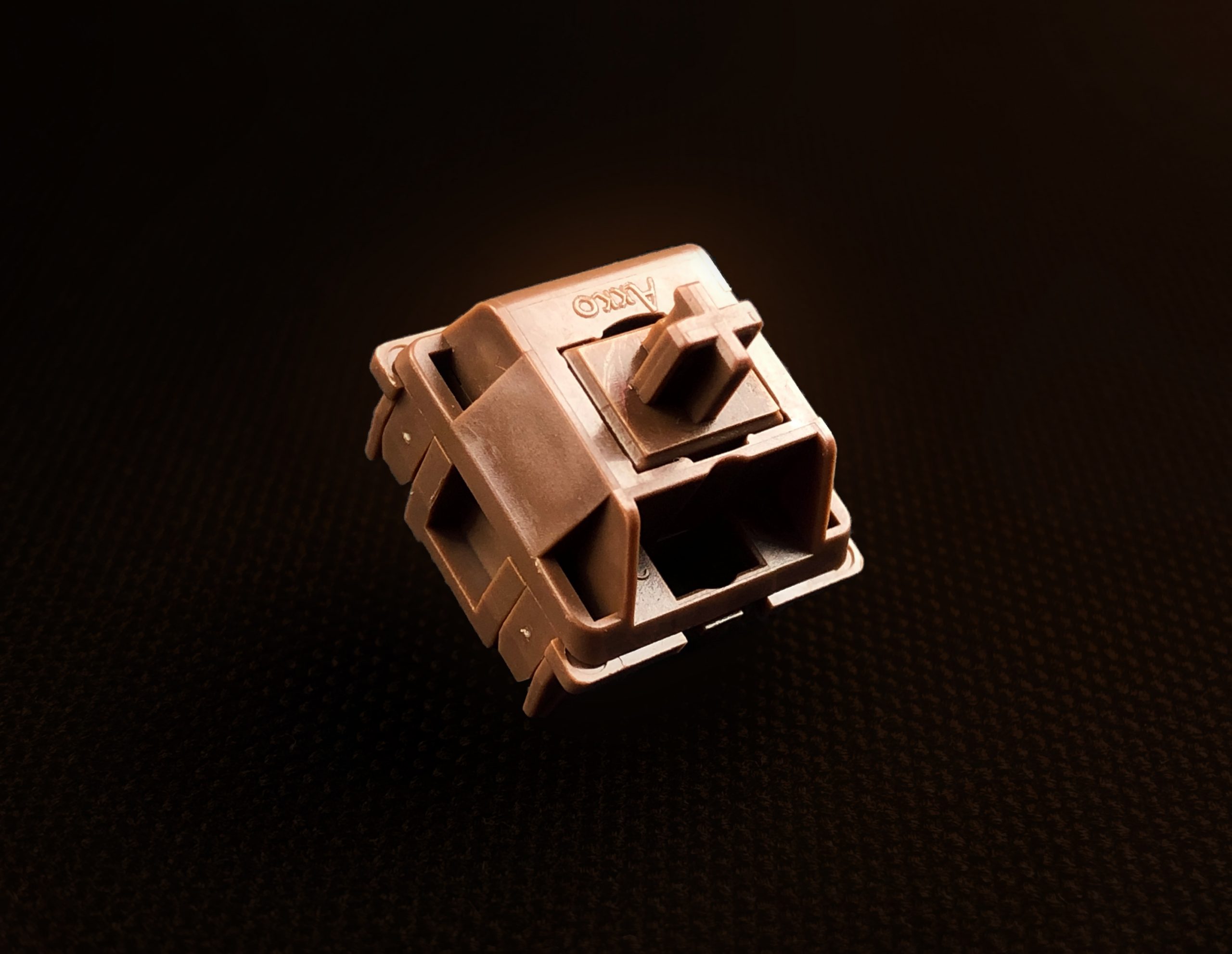
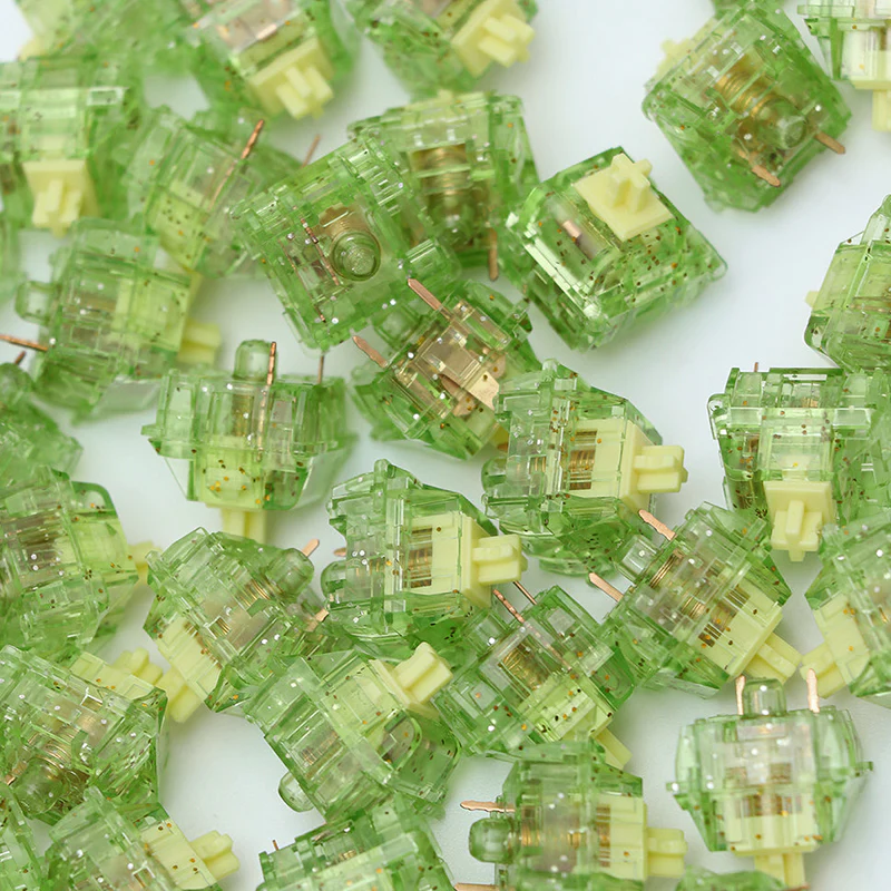
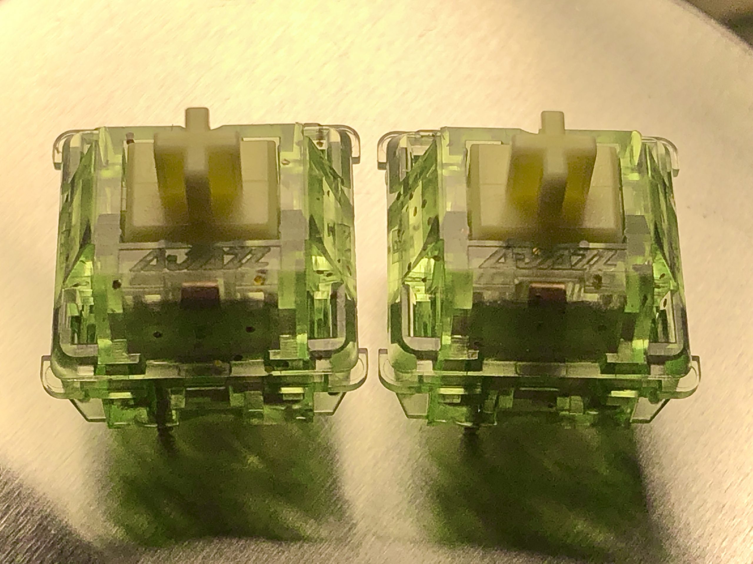
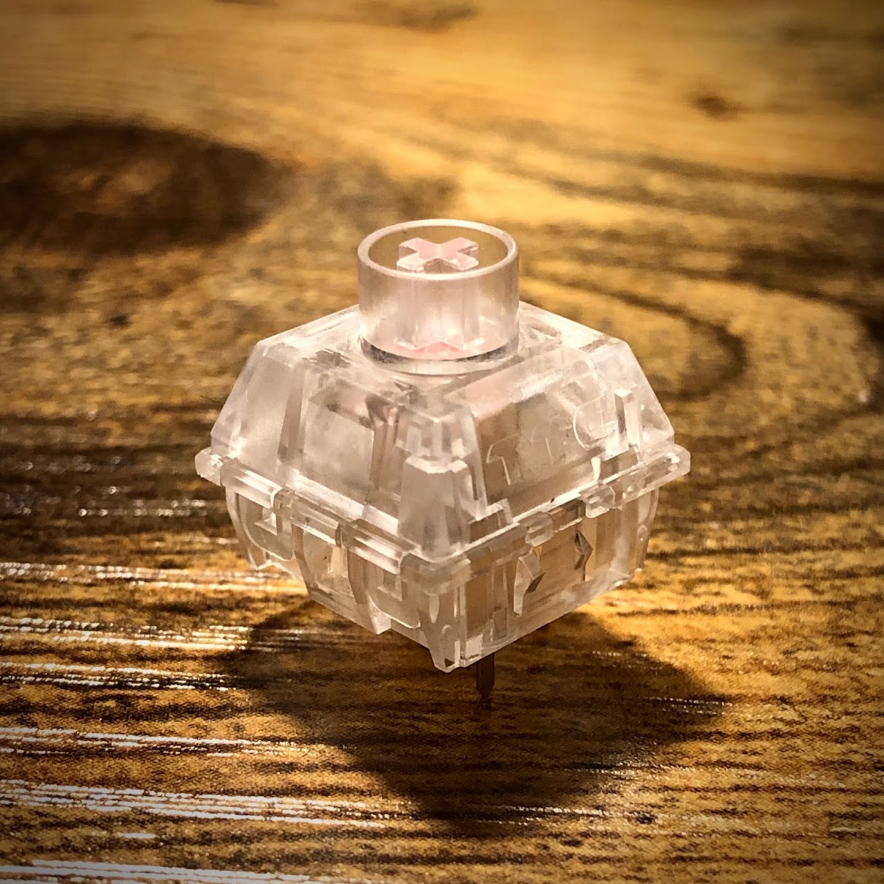
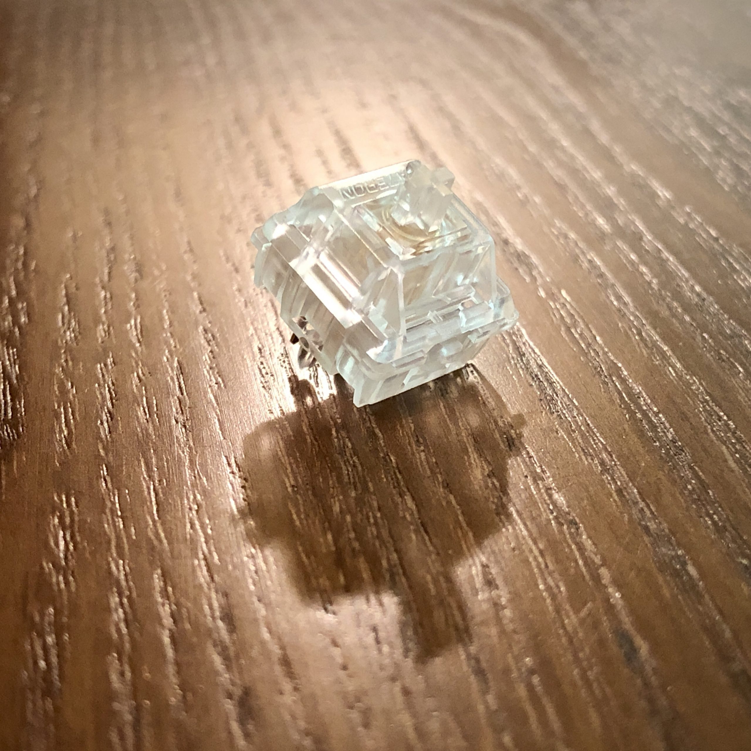
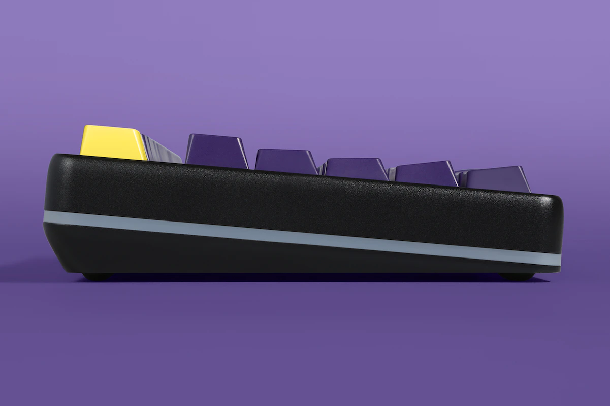
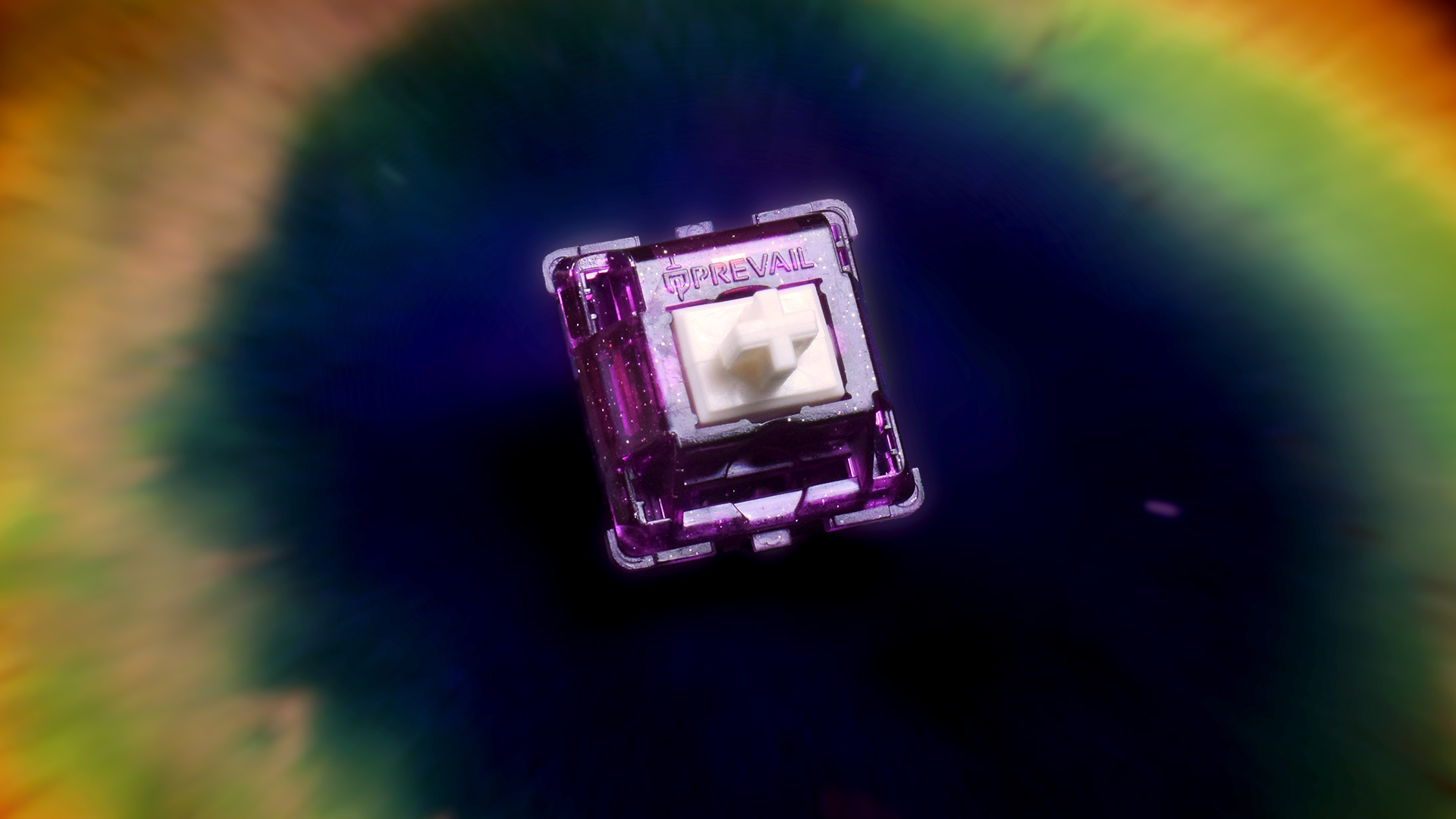
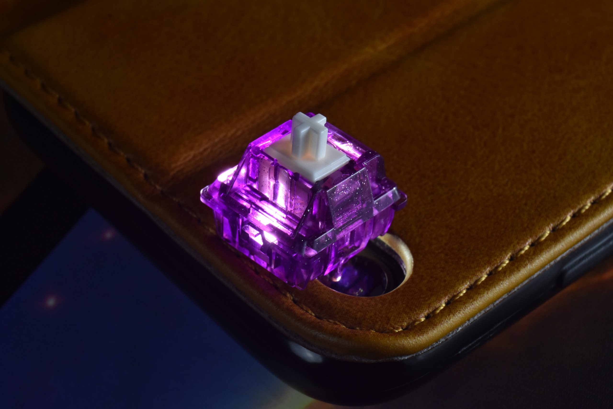
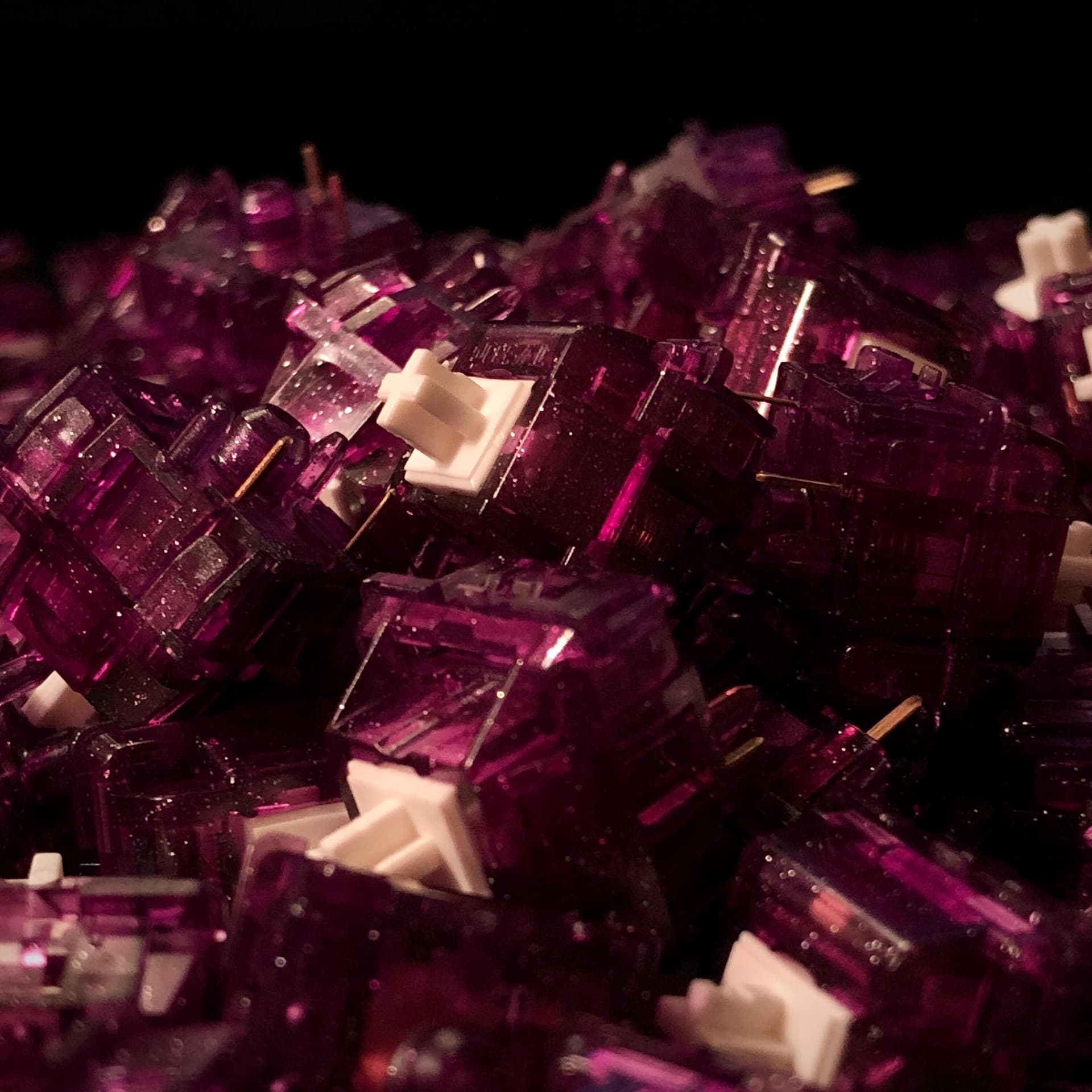
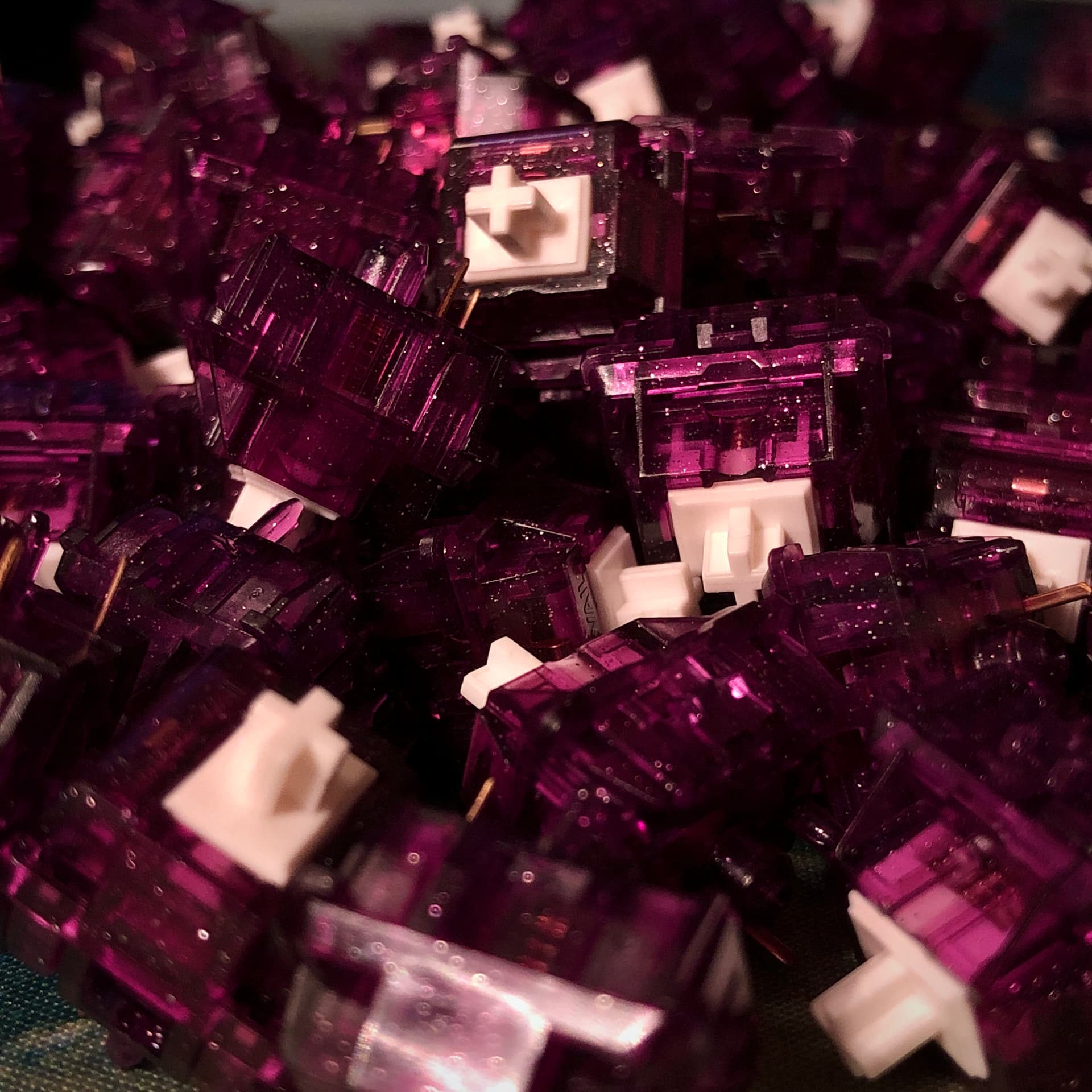
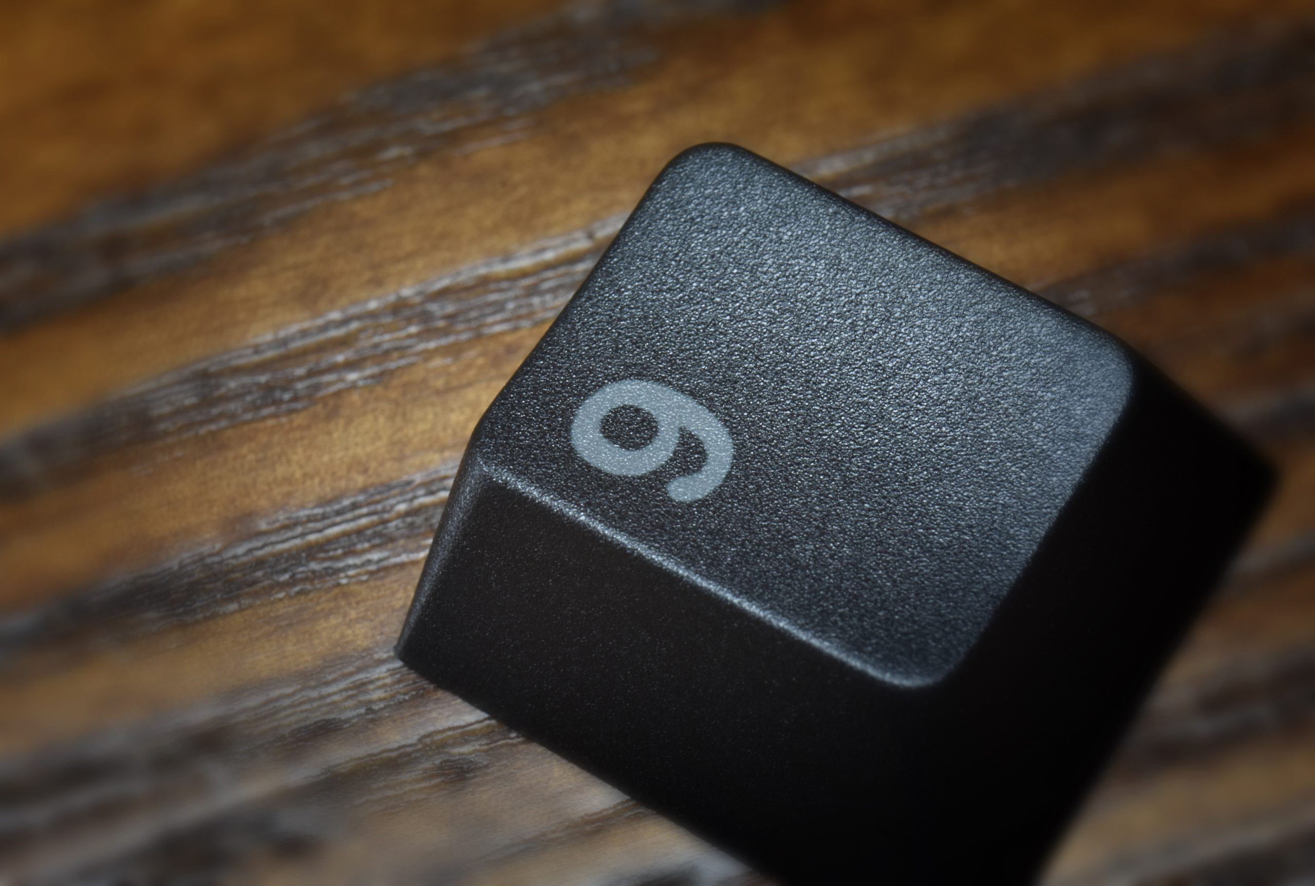
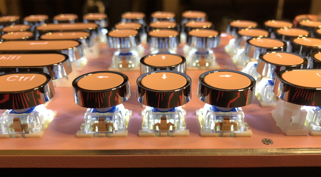
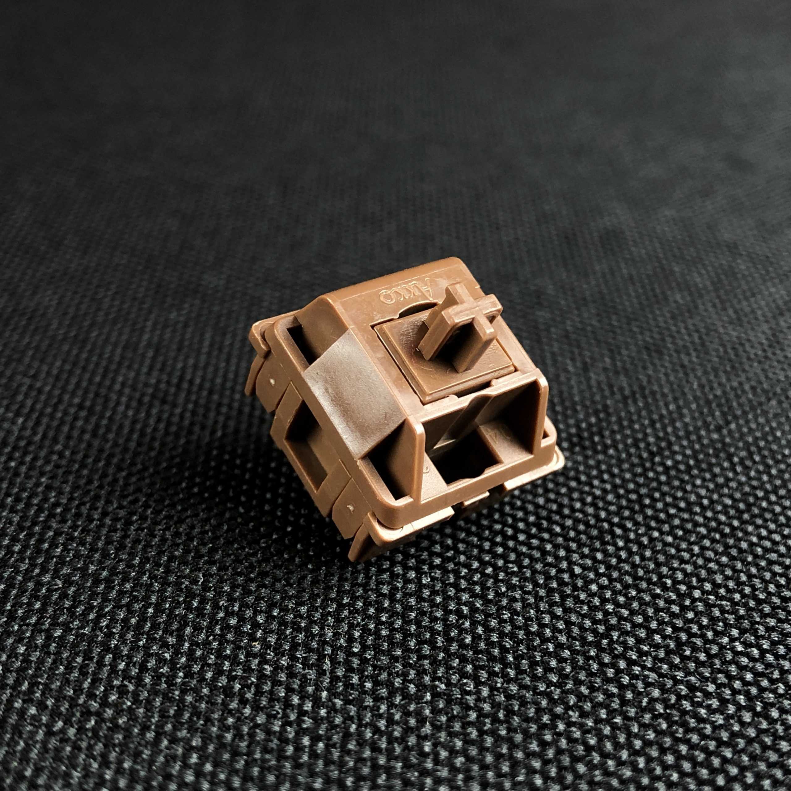
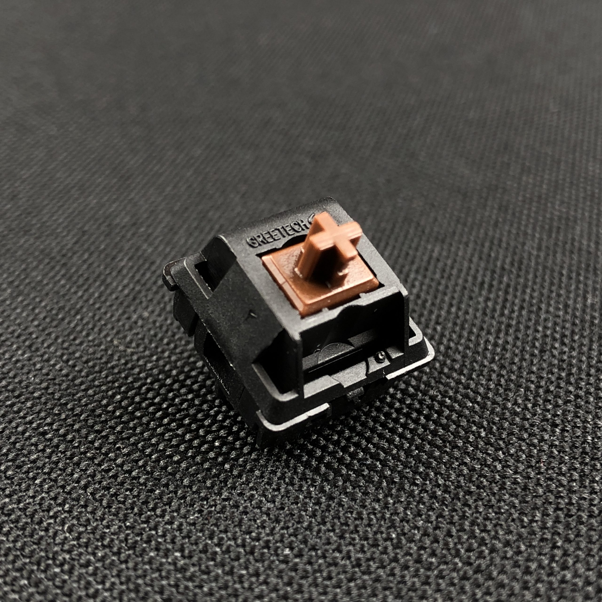
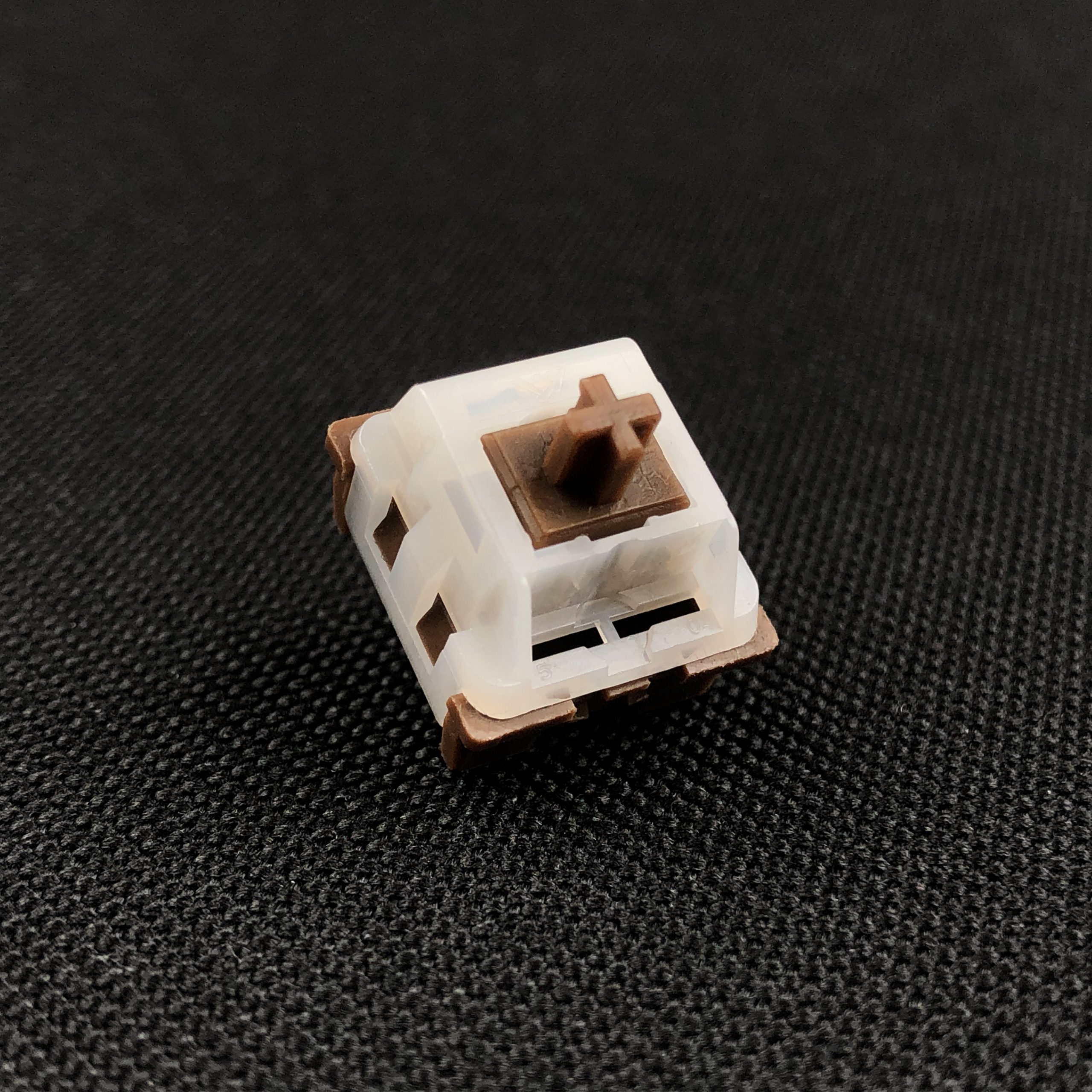
In all its milk-chocolatey glory.
If you just want to know if these are good are not, yes – they’re excellent light tactiles, and exemplary “browns”. If you like any of the other brown switches, there’s a good chance you’ll find a lot to love here. As the name suggests, these are all-POM – but I really wouldn’t say these are much like other well-known POM switches like NK_Creams.
If you’re still reading, chances are you’d like some details.
The Basics:
- Type: Tactile
- Sub-types: Light, Early-middle bump, Short-travel*
- Brand: Akko
- Manufacturer: KTT
- Top & Bottom Housing: POM
- Stem: POM
- Actuation / Travel: 1.75mm* / 3.65mm*
- Spring (Start / Actuation / Bottom): 35g / 46g / 50g
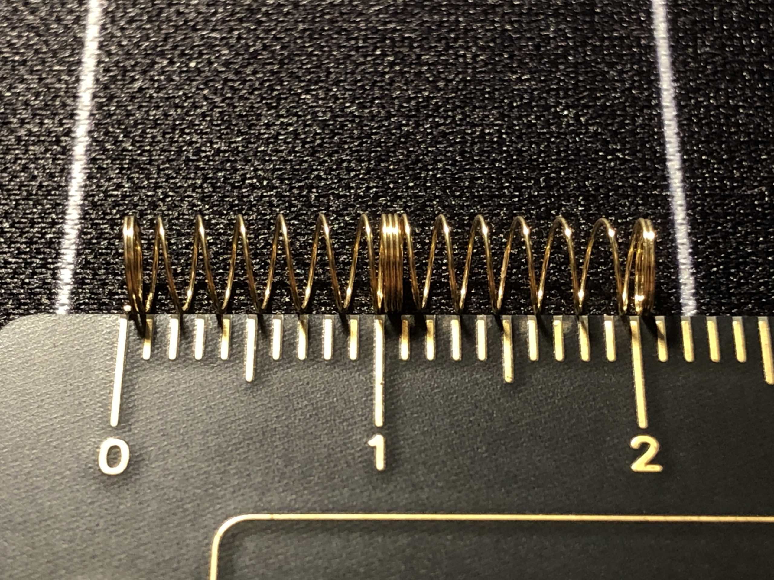
- Spring size: 18mm
- Factory lube: Yes, light
- Mounting: Plate / 3-pin
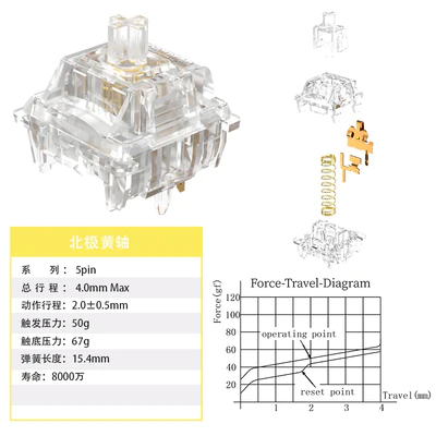
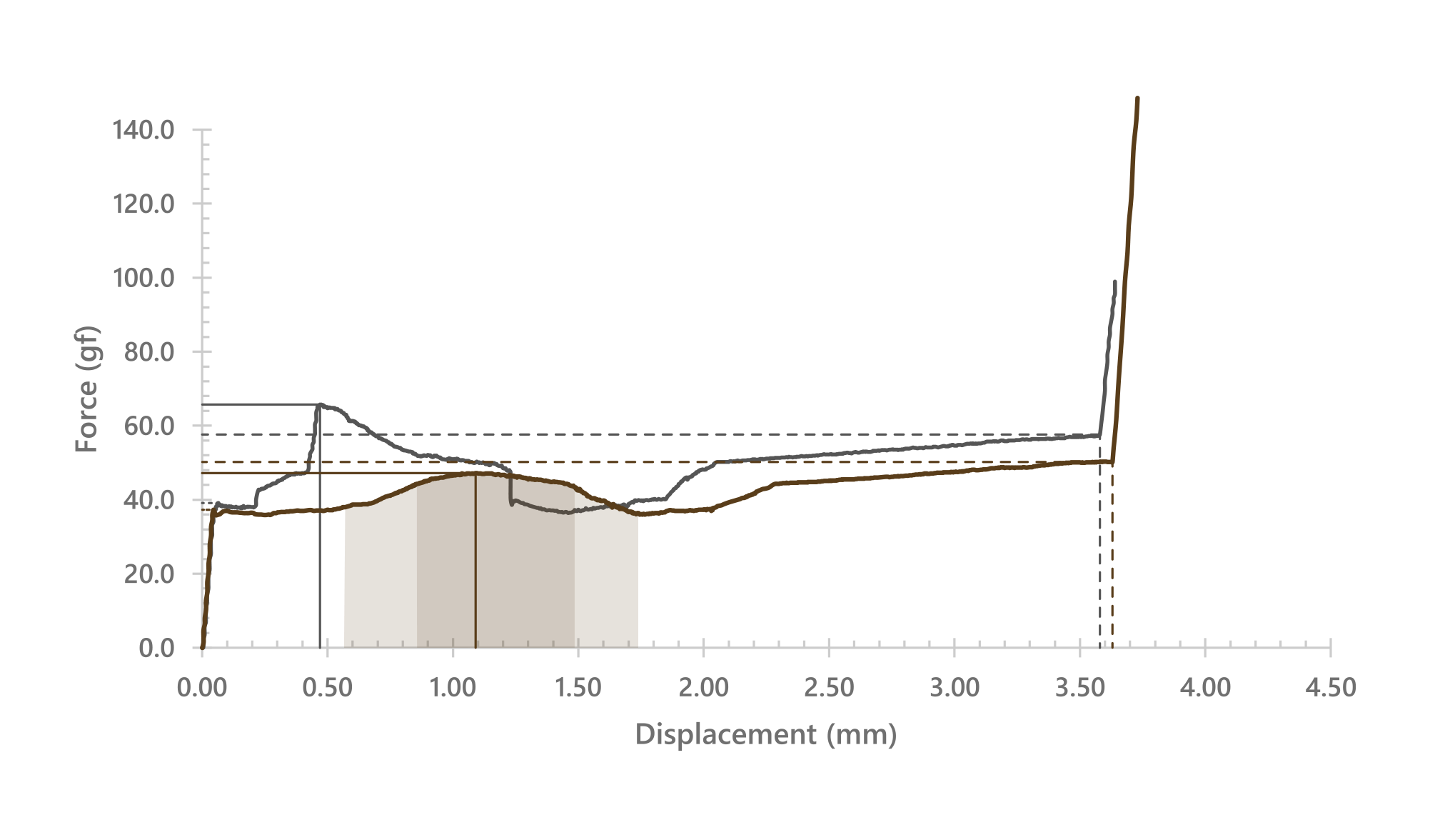
*Note about travel specs: The factory sheet for these lists 1.9mm actuation and 4mm travel, but real-world measurements show something closer to 1.75mm actuation and 3.65mm travel. While the graph reads around 35g at actuation, it takes around 46g to clear the bump before it.
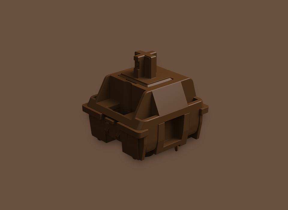
A render of the POM Brown from Akko
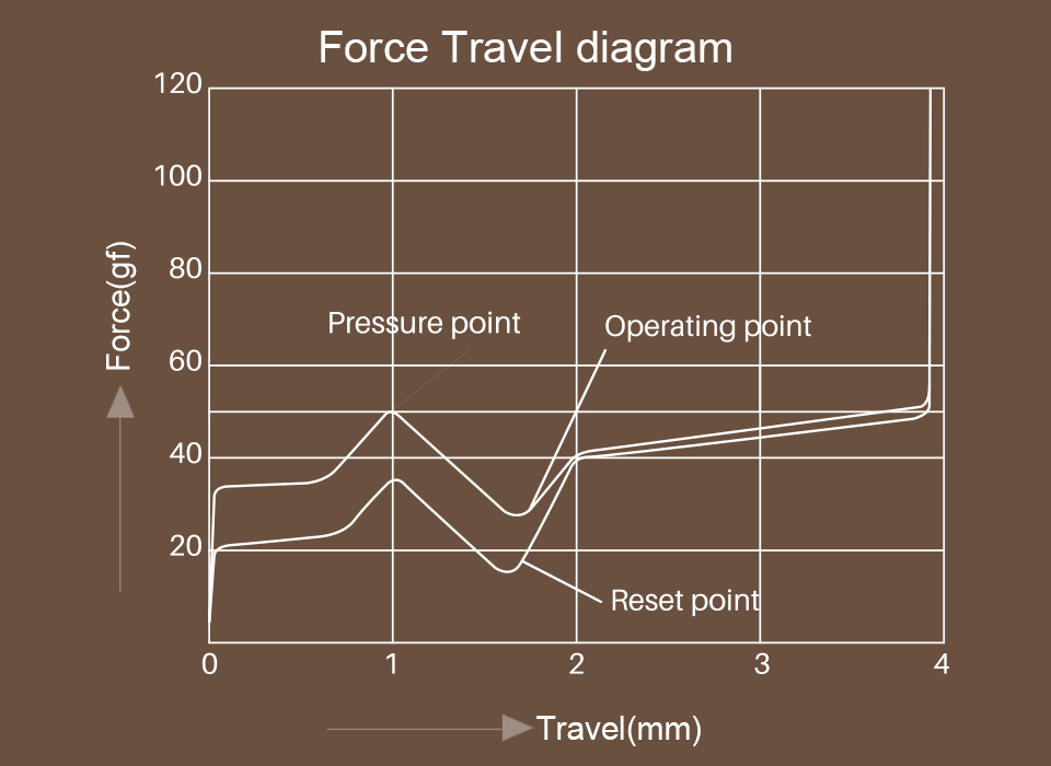
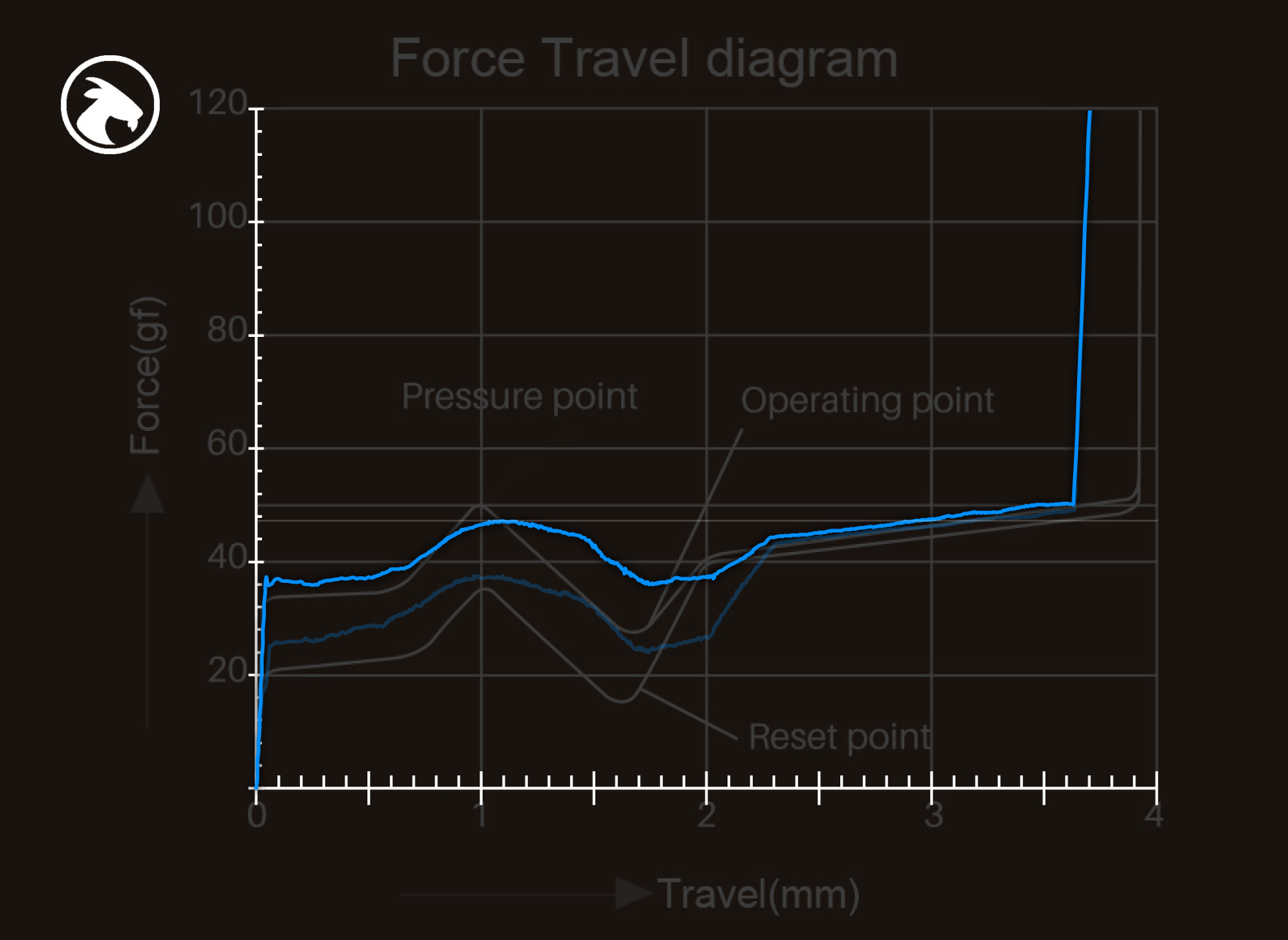
The factory-supplied force-curve graph; always pairs well with a grain of salt. This diagram depicts a very sharp transition that doesn’t exist in the real switch. Read on for a direct comparison.
Context & Background
On reflection, there’s really a lot here – so I’m going to break it down further into three categories. There’s a Venn-diagram of overlapping categories / lineages representing these switches, and they all have at least a little bit to say about what the Akko POM Brown is and where it sits in the massive sea of MX-compatibles.
Official promotional photo from Akko’s website
Context & Background: Browns
It would be hard to talk about these without mentioning their lineage with other “brown” switches, all of which owe their namesake to the Cherry MX Brown circa 1992, which itself set the format for light MX-compatible tactiles to follow. I suppose if we’re being fully honest here, there’s a high likelihood that Cherry’s choice of brown for their first non-clicky tactile was inspired by Alps Electric’s own SKCL Brown from the late 80’s. Either way, “brown” has been synonymous with non-clicky tactiles in the mechanical keyboard world for quite some time, now.
From Cherry’s marketing: “The characteristic of this tactile switch is characterized by a noticeable feedback. The noiseless guidance of the CHERRY MX Brown trains the sure instinct and helps to act tactically and strategically.” …right… the MX Brown actually came about after an OEM requested something like a Blue but without the click for their quiet-ish ergonomic office keyboards.
While I’d say the Akko POM Brown sets itself apart in a few notable ways, I’d also say it remains true to its roots in the process. Someone shopping for the “brown” experience is not likely to be disappointed with these, and someone introduced to the “brown” experience with these is not going to be led-astray in terms of what to expect from others.
I’d have a hard time talking about browns without acknowledging the memes…

M’yes…

MX Brown bad… (but not really)

am cry

Caption

Fair
we live in a society
Despite the sometimes admittedly funny browns bad meme-ery flying around, MX Browns and their clones remain one of the most popular switch types by the numbers, and have been hailed by tech critics and keyboard enthusiasts alike. Between Chyrosran22, Glarses, and the popularity of heavier tactiles, MX Browns may have learned what negative attention looks like – whether serious or in jest – but what we really have here is a poster-switch for one of the more nuanced subcategories: light tactiles.
Context & Background: Light Tactiles
In the world of MX-compatibility, MX Browns were the first non-clicky tactile – and retroactively, they became the first light tactile. The vast majority of MX compatible tactiles have a heavier, more pronounced tactile bump than any given brown – so what began as the only tactile ended up being on the very mild / light end of the emerging field. They would also be an integral part of the first popular MX frankenswitch, the Ergo Clear – which itself is now a commercial product available from Cherry. When the field was young and choices limited, users wanted and found a way to obtain something between the MXes Brown and Clear.
Official product render of the Cherry MX Ergo Clear commercial switch
Many of the aforementioned memes deride browns for the mildness of their tactile bump. Some say it’s indistinguishable from the surrounding scratch, calling it a “muddy linear” – and I can relate to this criticism when moving straight to browns from something heavier like Zealio V2s, Holy Pandas, BOX Royals, Bettys, et-cetera. It takes me a few minutes (or more) to get used to the lighter tactility / spring weight; when I first make the switch, my WPM and accuracy both tank for a bit. However – once I’ve acclimated, I find light tactiles to be both comfortable and rewarding to use. They’re easier to type on for longer periods – and assuming you aren’t hammering them, they’re also going to be more quiet than a given stronger tactile.
Each subcategory of switches has its own benefits and quirks, and light tactiles are no exception. I just mentioned a bunch of benefits – so now let’s talk quirks. Outside the realm of preference, I think the most regular complaint I see about light tactiles is some kind of noisiness – distinct from loudness. Noisiness is about chaos and complication. If a switch has lots of errant sounds like rattle, ping, and scratch, I’d call it “noisy” regardless of how loud the switch is overall – but not regardless of how loud those errant sounds are compared to intended / normal sounds like clicks, clacks, and yes, even thocks. If a switch is free or nearly-free of those errant sounds, I’ll call it “clean” regardless of how loud it is.
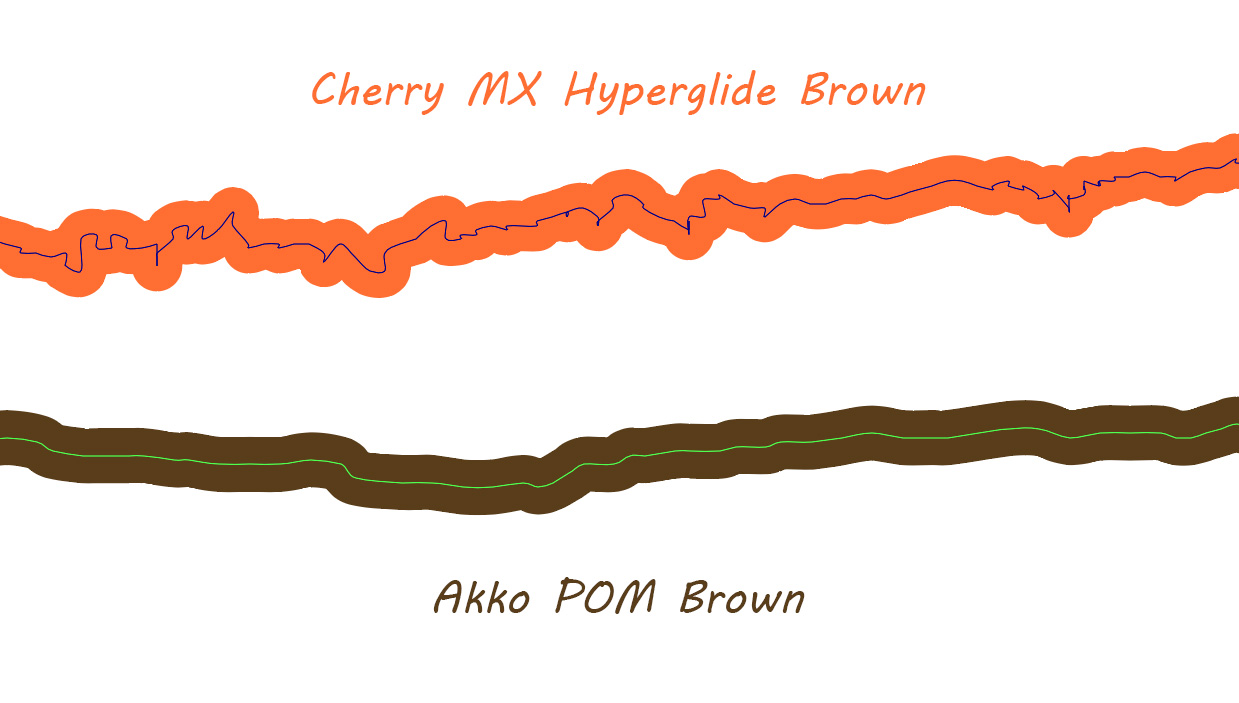
More on this comparison image later, but it’s one great way of illustrating “noisy” vs “clean”; these are equivalent scale force-curve measurements from two switches, zoomed-down to a fraction of a millimeter.
Coming back around to light tactiles: I’ve experienced it as rare to find a stock one that isn’t some degree of noisy – often metallic leaf or spring noise but also rattle and scratch – and I mention all of that here because I think the POM Browns stand-out in that way. We seem to be moving in the direction of cleanliness being normal in switches, but we aren’t there yet, and certainly not with light tactiles. That being the case, I find the POM Browns a breath of fresh air with how little effort it takes to enjoy them: none.

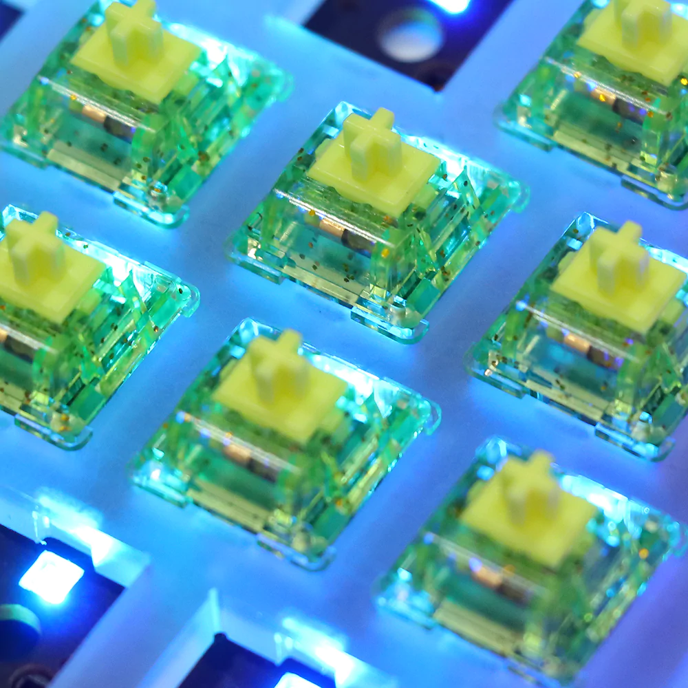
How it feels to install Akko POM Browns into your keyboard | Image credit: iStock
Context & Background: POM
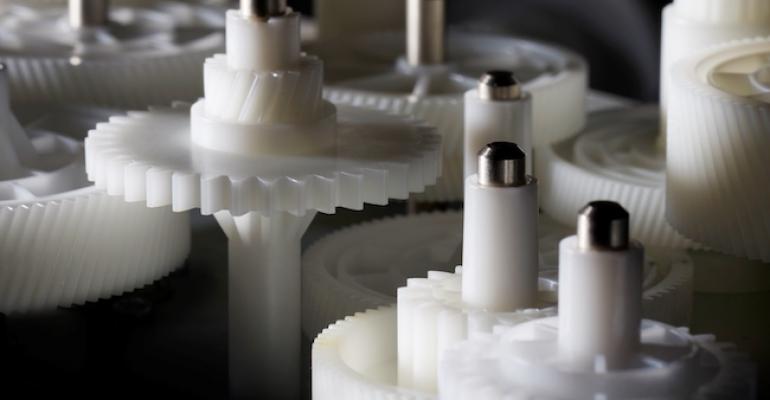
Probably the most common (or at least commonly-seen) application for POM: plastic gears. There’s a very good chance you’ve seen these – and even if not, it’s almost certain you utilize them every day, whether they be in your car, your work computer’s optical drive, or your Xbox at home. | Image credit: Polyplastics Today
Polyoxymethelyne, most often known by the acronym POM, is a family of semi-crystalline thermoplastics known for its wide range of operating temperatures and high strength. It is used in meshing parts like gears, joints, sliding mechanisms, and so-on. In the world of keyboards, POM is the material that composes the vast majority of MX compatible switch stems. Cherry uses it and so do most of the clones – and while experimentation with blends and other plastics is common with switch stems now, POM stems are still by far the most common.
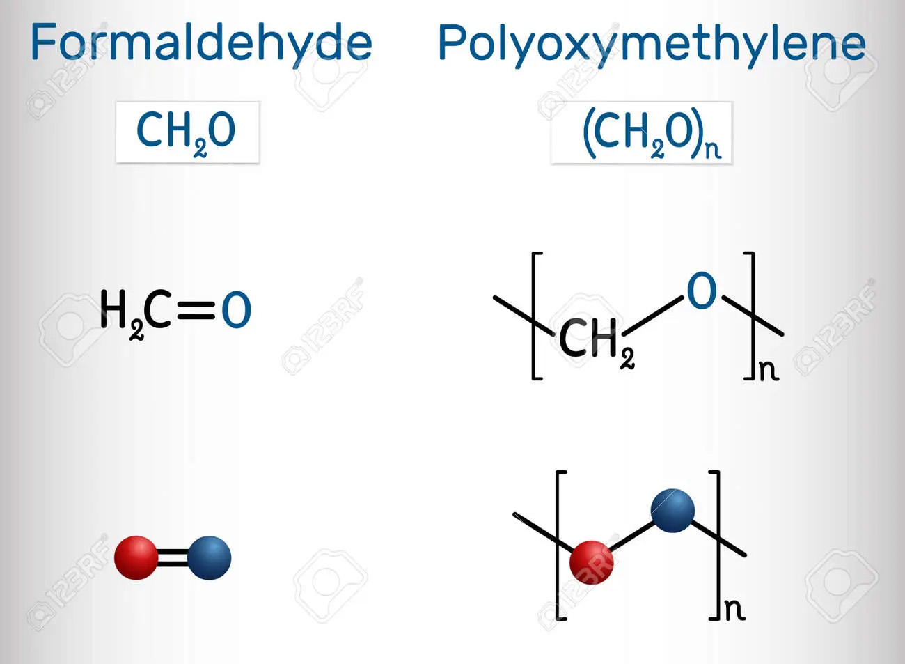
A molecular diagram showing POM and its relation to formaldehyde. | Image from 123rf.com
Before stem material experimentation was common, there were a few notable early examples of housings using different materials than the standard Nylon / polyamide and polycarbonate: TKC + C3Equalz Tangerines with ultra high molecular weight polyethylene, and NK_ Creams with polyoxymethelyne. The UHMWPE Tangies may have been known for their smoothness, but the POM Creams were known for their sound.
Early on there was lots of hype about POM housings being “self-lubricating”, and while there is something to this in terms of the plastic wearing-smooth and sort of making dry lubricant in the form of its own powdered material on the surface, this doesn’t have the effect most keyboard enthusiasts think of when they think about lubing switches. That being the case, most people do lube their Creams, and lubed Creams enjoy glowing praise that’s long outlived the aforementioned hype – though it still appears as a bullet-point on some sales pages, because of course it does, you can’t just leave bullets on the table like that
The NovelKeys Cream – of of the switch scene’s first hype-beasts, and the first all-POM switch. | Image credit: ThereminGoat’s Cream review
One thing original Creams were not: smooth from the package – but what they did do is popularize POM as a housing material. They also set the aesthetic format used by Akko’s POM series; a matching color across all the plastic components. Since they came out a few years ago, quite a few more have followed in their wake. Some are more or less clones, but most actually sound and feel pretty different, being composed of different POM blends and/or using tooling with different surface qualities, et-cetera. Once such example is today’s switch, the Akko POM Brown, along with its pair of all-POM siblings.
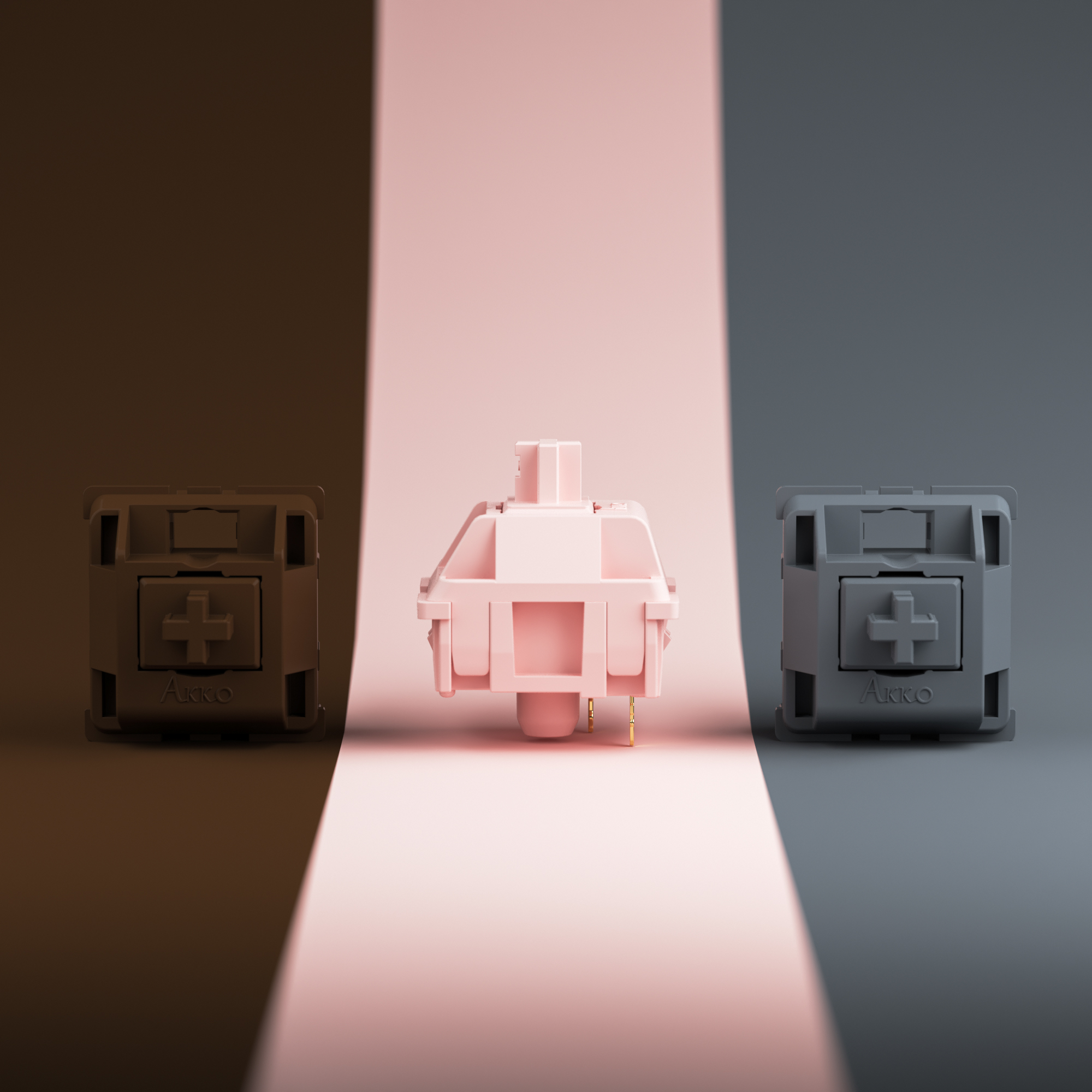
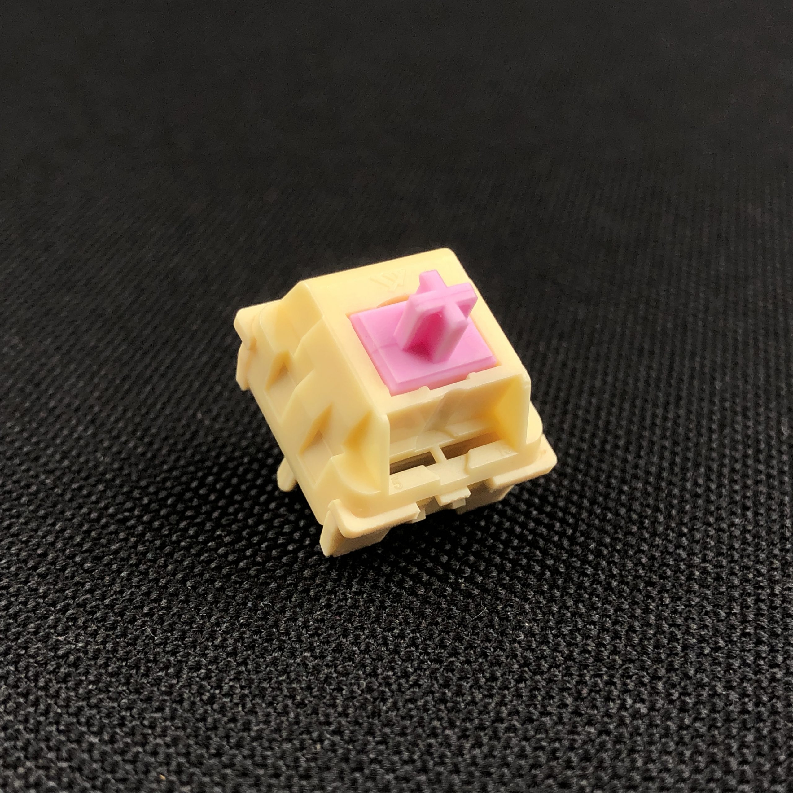
Akko POM Brown, Pink, Silver | official promo image from Akko’s social media
As the name implies, Akko POM Browns contain only one plastic: polyoxymethylene. While the switches that popularized this format are known as scratchy and grainy in their stock form, this just isn’t the case with KTT and Akko’s all-POM examples. This may be in large part due to the factory lubrication treatment they all get, but I also think the tooling and type of POM might play a role. Either way, these join some lesser-known-in-the-West switches like MMD Ice Creams on the growing list of smooth-from-the-box all-POM switches on the market.
A sample of the MMD Ice Cream switch; an ostensible NK_ Cream clone that’s actually pretty different, and also quite good, coming pre-lubed from the factory. | Photo (and samples available) from SwitchOddities.com
Section Dinkus
I said it was a lot – but now you have a sense of all the information packed-into the simple name POM Brown – which is, but is also more than light tactile made of stem stuff.

“WHAT is a DINKUS?” you may rightfully ask. This is a dinkus – also known as a section break, flourish, or divider. These are typographical page elements that indicate some kind of pause or break, usually represented by a trio of asterisks [ * * * ]. I’m just taking the opportunity to use the word “dinkus” anywhere I can by placing these at the closing of longer sections – and now you can, too. | Image credit: Gordon Johnson on Pixabay.com
Aesthetics
Someone I know said these look like “they were carved out of a Tootsie Roll” – I agree.
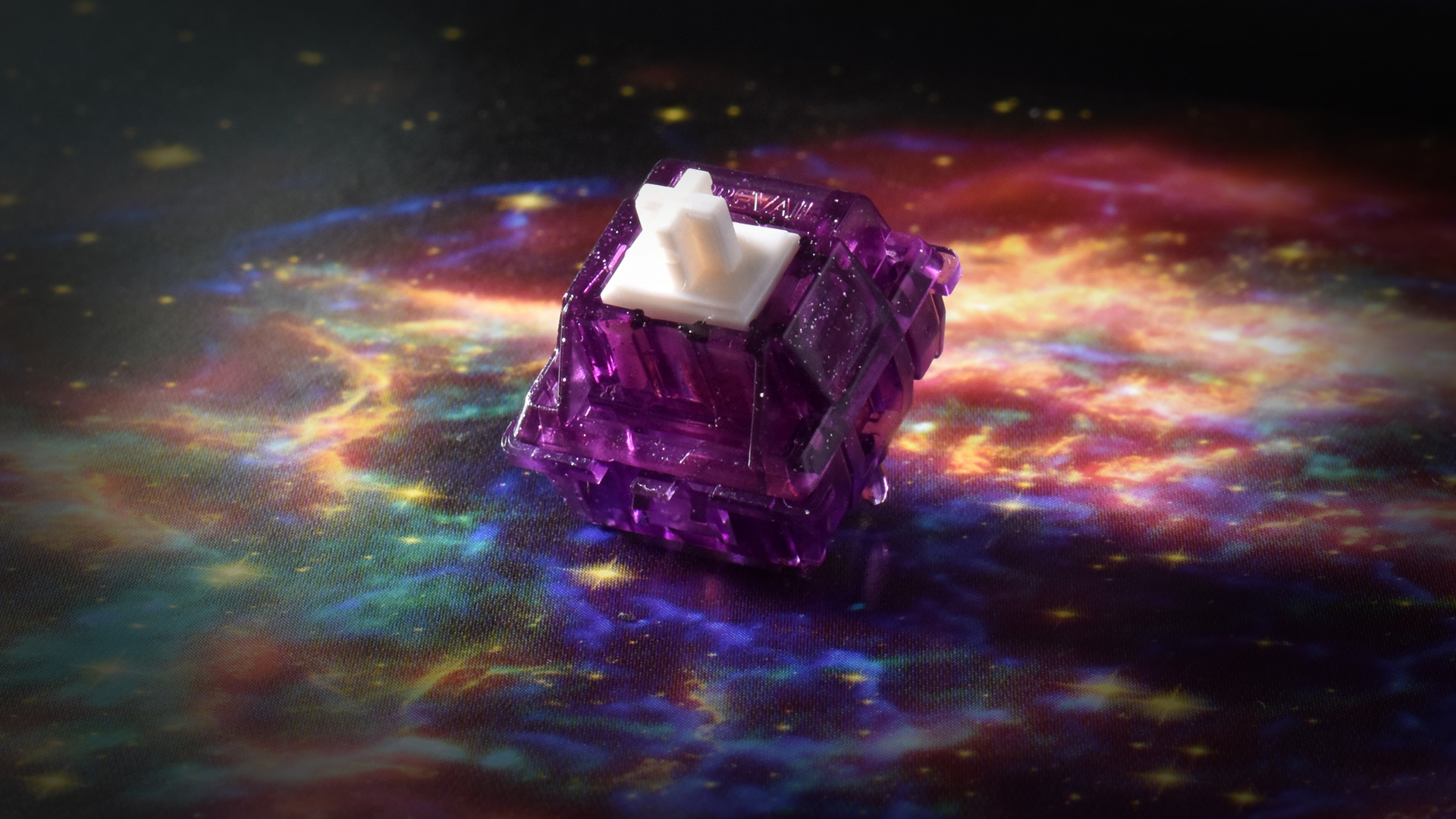
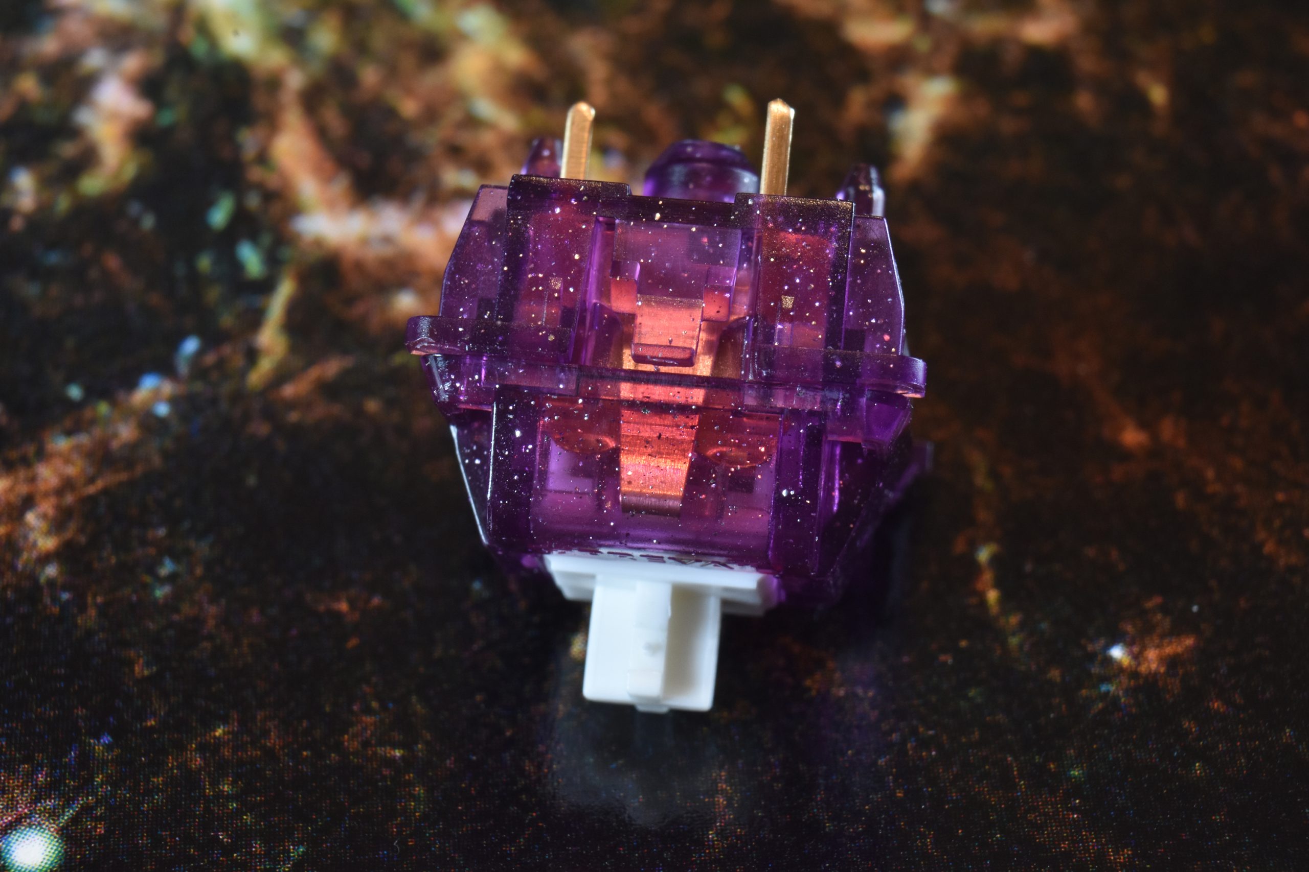
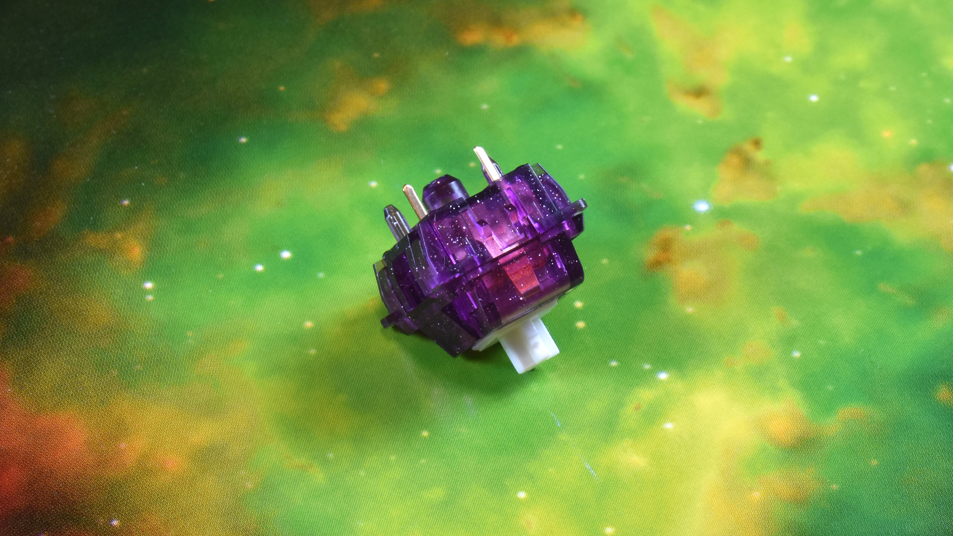
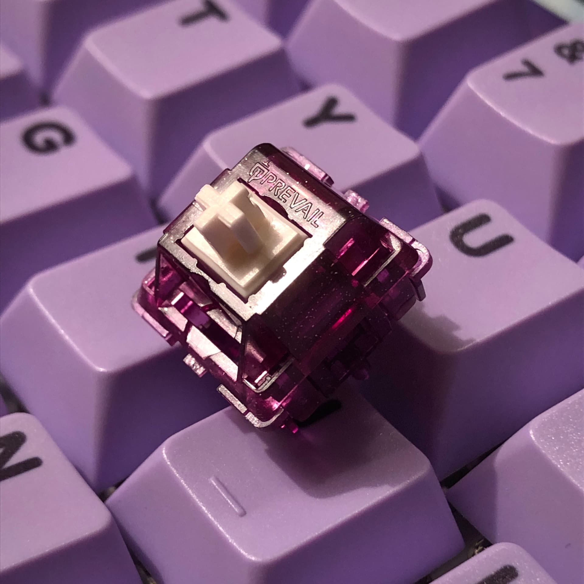
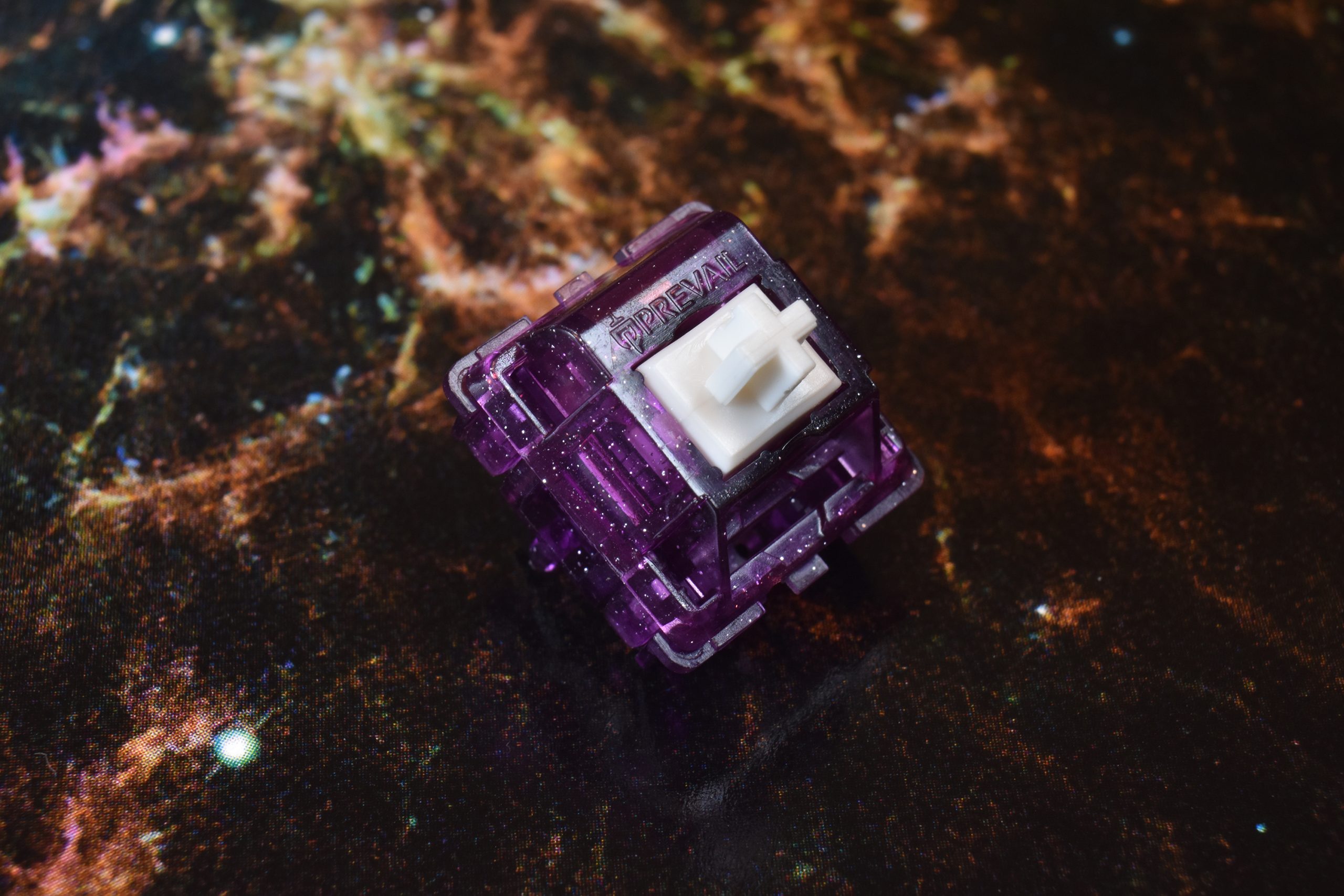
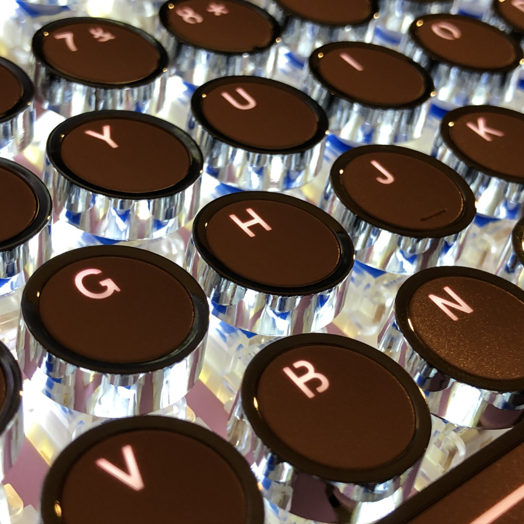
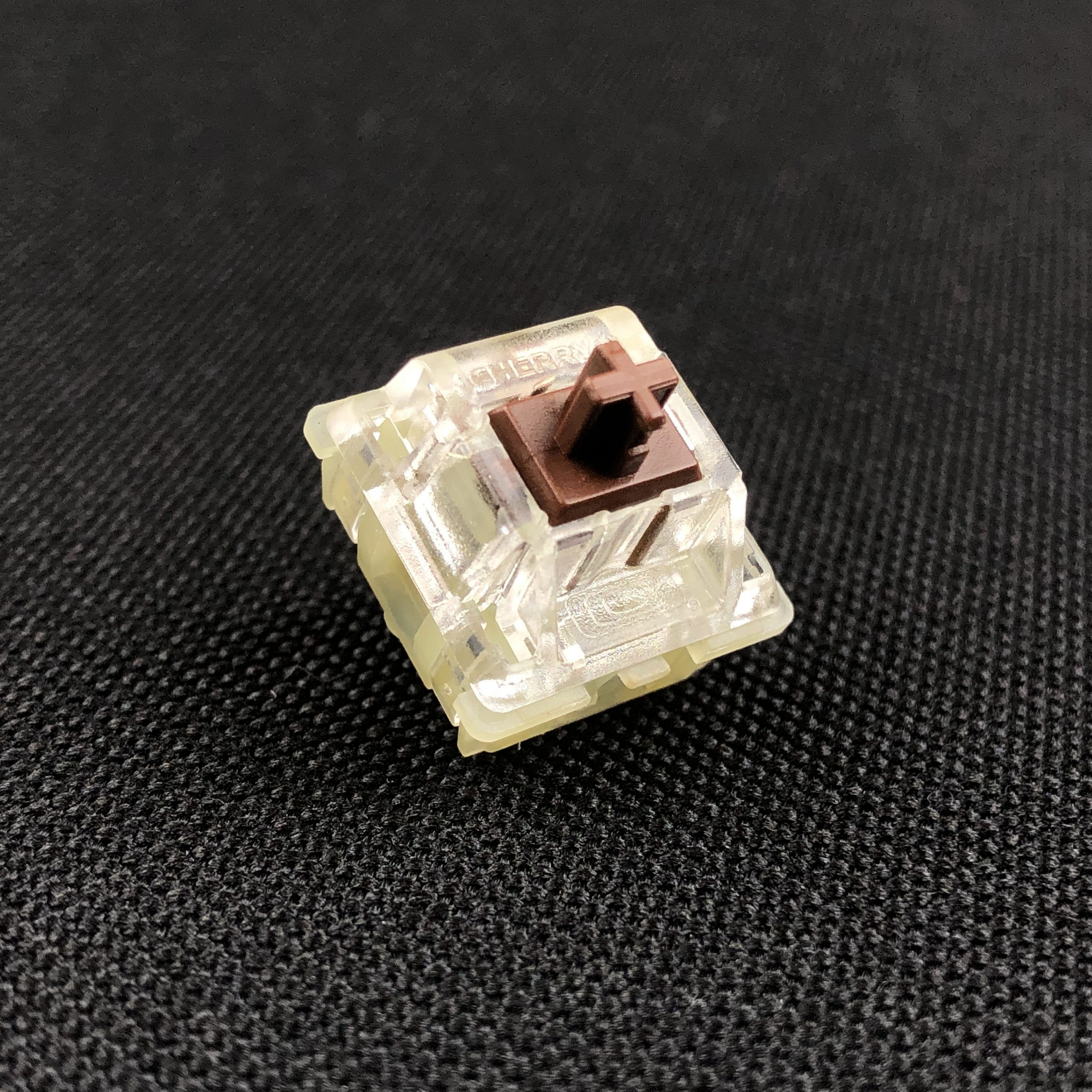
The Akko POM Brown is, unsurprisingly, brown.
Not just the stem, but the entire switch is a matching opaque milk-chocolate color with a medium-glossy finish. This could be an item on that Japanese game show where contestants are tasked with discerning real objects from chocolate facsimiles.

Yep, that one
As mentioned above, this all-matching-color convention follows the Cream series of switches, so-far opting for pink, silver, and brown for the light linear, light speed linear, and light tactile switches respectively. All three switches do have a “creamy” appearance, especially the pinks and browns.
Owing to their delicious appearance, I give these a subjective A for aesthetics.
Sound
While they have the characteristic “snickity” sound of MX-pattern light tactiles, they are notably free of ping, ring, and rattle. In fact, these are some of the most clean-sounding light tactiles I’ve yet used. They have a sharp, fairly high-pitched clack. While I don’t consider them harsh in the POM plate build I’m using, it’s easy for me to imagine folks who don’t prefer brighter sounds in their boards to be put-off by these.
Alongside aesthetics and cleanliness, sound character is really where the Akko POM Browns set themselves apart. Whether or not that’s a good thing comes down to personal taste; these are markedly more clacky than the average brown. It’s possible to type quietly with them, but you have to try harder – especially compared with the Pros Gateron and TTC – switches I’d otherwise consider peers of this one above most other browns. The sound is more clean than most light tactiles, but has a sharp, if not loud quality that may grate on some users.
I have them paired with a soft POM plate (just to keep the all-POM theme going a little farther) and some fairly thick ABS keycaps. I like the sound enough that I’ve kept these switches in the board at least twice as long as I’d planned. Alright, enough words – here’s some sounds from that keyboard;
With some Equalz stabilizers that have a little tick on the Enter key:
With some TX stabilizers that don’t tick, but have too much Nyogel on them – there’s also a NuPhy GhostBar in-place of the DCX one for this recording:
Enjoyment of sound is of course subjective (as are all my scores), but owing to the outstanding cleanliness among light tactiles, I feel I should give these at least an A for the sound category.
Feel
If you’ve ever used a brown MX compatible switch these will be familiar, however their bump profile is a bit different. It starts a little sooner and sustains a little longer than the traditional Cherry MX or Gateron Browns. They’re a light tactile with a smooth and gentle bump you can still feel while typing.
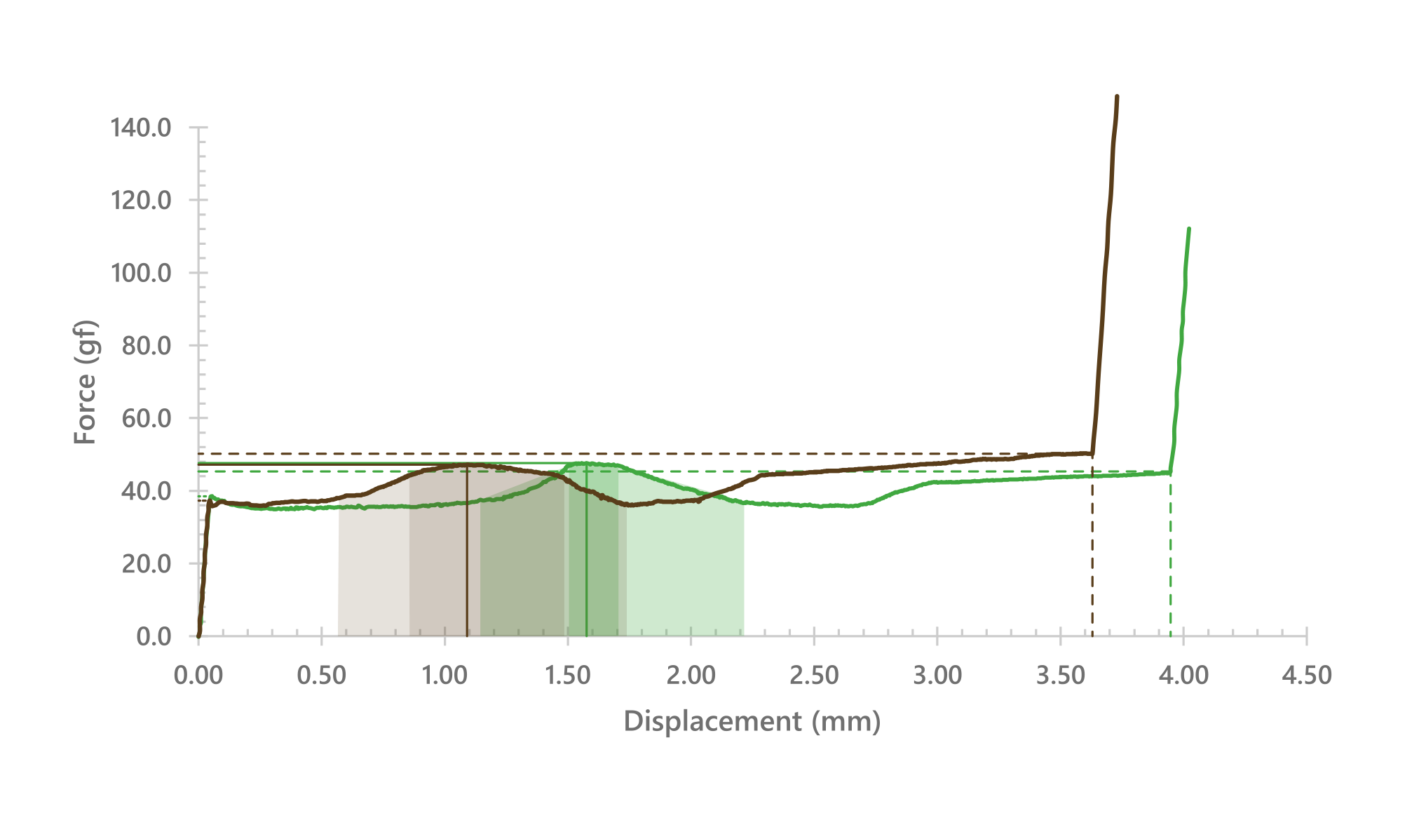
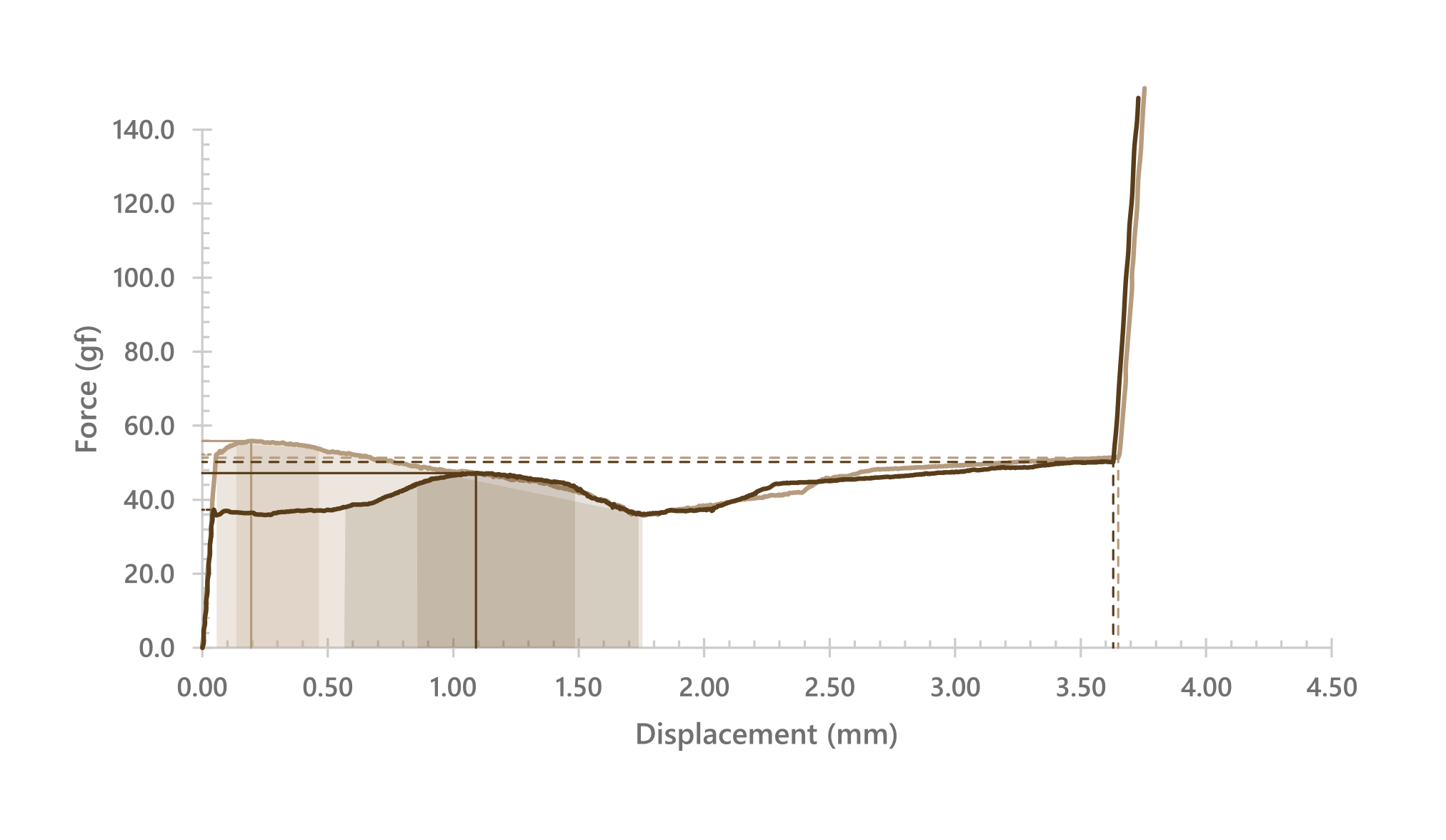
This would be a great time to compare TheraminGoat‘s real-world measurements with the factory-supplied force-curve graph:
ThereminGoat’s measurements, overlaid and scaled to the factory graph; note the small difference in peak force, and the big difference in bump shape and travel distance! Even the factory graph shows it as less than 4mm, but the real measurements reveal it to be even shorter.
Feel: Smoothness
These are smooth switches; there isn’t much grain in the sound or the feel. Here’s a visual aid comparing the first small part of travel of a Cherry MX Hyperglide Brown with an Akko POM Brown, zoomed way-in on the graph so you can see that grain (or lack thereof) I mentioned:
See all that noisy squiggling in the top line? That’s scratch. In more orderly forms I call it grain. Now check out the bottom line – notice the relative lack of harsh or abrupt changes. | Measurements by ThereminGoat
Not even the Gateron Pro V2 Brown is as actually smooth as this. It might feel more buttery, but there is measurably less grain on the Akko. I’ve hardly scanned every light tactile graph out there, but this earns an A+ in my book.
Feel: Stability
Resting position wobble / 10: N/S – 2, very little | E/W – 3, some | Very Good: A
Bottom position wobble / 10: N/S – 2, very little | E/W – 2, very little | Very Good: A
Travel Stability: 8/10, Very Good: A
Housing Fitment: 8/10, Very Good: A
Cap Fitment: Excellent: A+
Off-center Performance: Excellent: A+
Overall: As stable and solid a light tactile as I have yet experienced. I can imagine better, but haven’t tried it. Easy A.
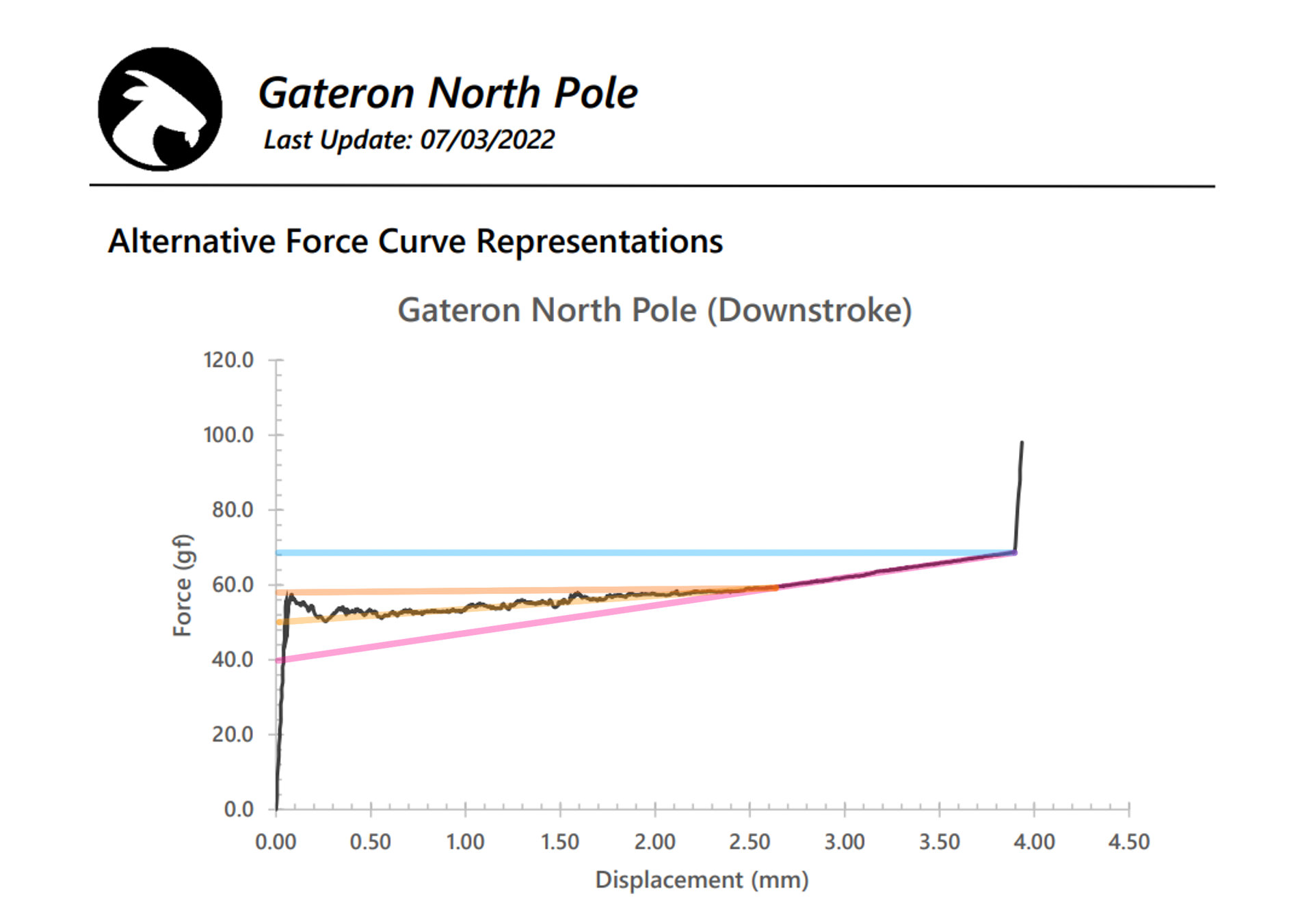
Feel: Weighting
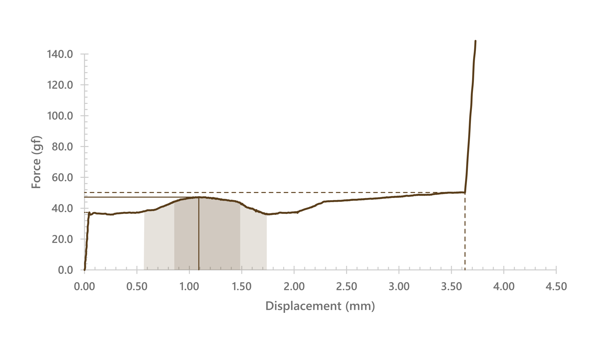
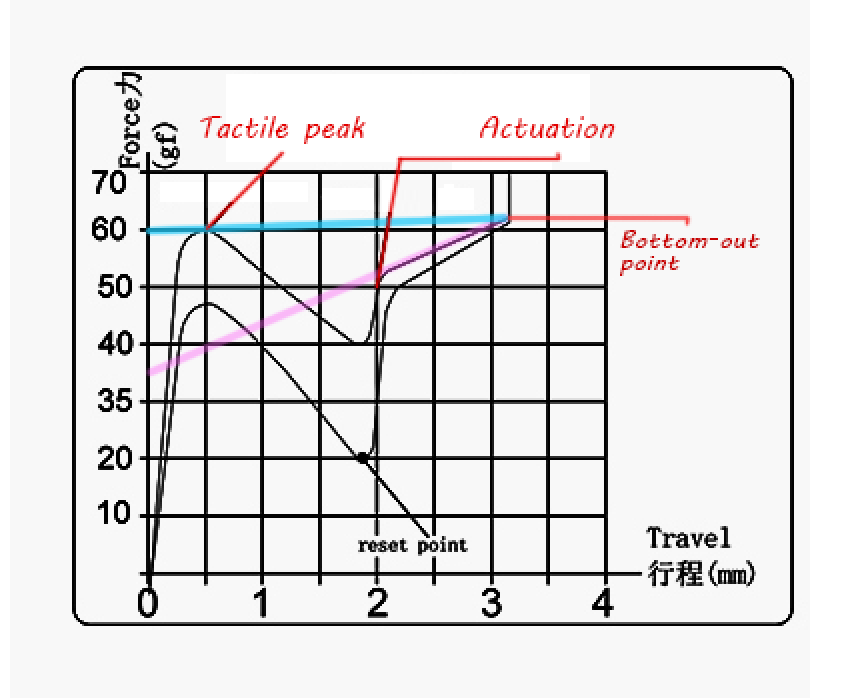
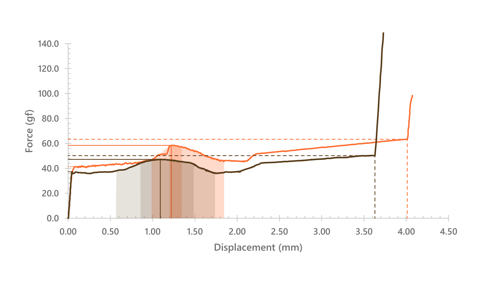
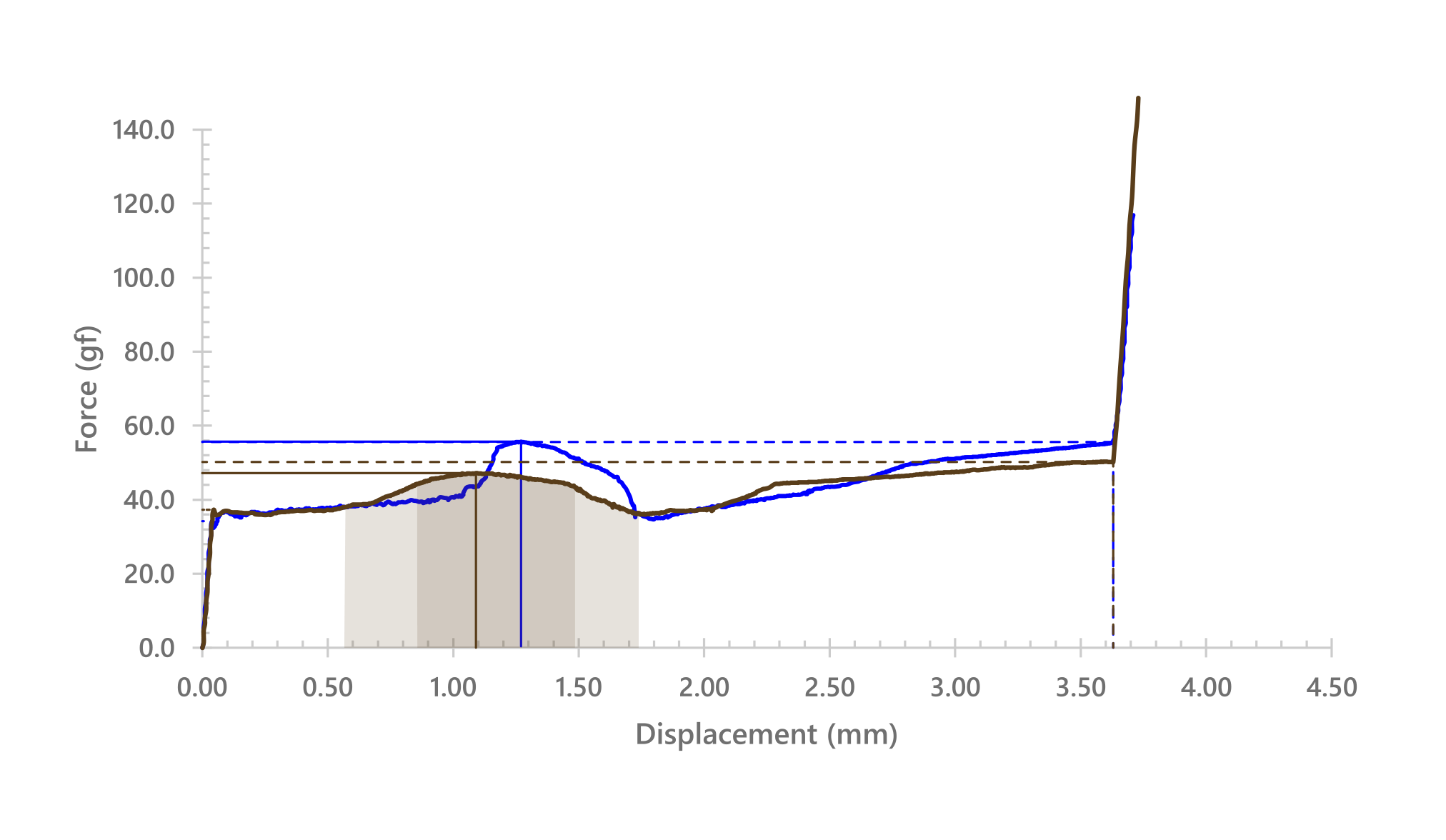
ThereminGoat’s Force-curve graph data for the down-stroke of the Akko POM Brown with visual annotations added by myself; lines to help track the starting break-away point, tactile peak, and bottom-out point. I also added some shaded areas to help illustrate the bump and its peak; that part is to some degree down to my interpretation, so take it with a grain of salt.
Travel starts at ~35g, the bump peaks just after 1mm at ~46g and falls back down to ~35g again at ~1.75mm where it actuates, then climbs back up to ~50g at bottom-out, ~3.75mm.
Along with the otherwise very low level of noise in the travel, this makes for a gentle yet positively confirming tactile experience. I mentioned this once before, but the bump starts a little early compared to the classic MX Brown:
Force-curve graph for the classic Cherry MX Brown (pre-Hyperglide); note the more concentrated bump with more steep front-end. The bump and its peak both start later than on the POM Brown.
Here’s an overlay to help compare:
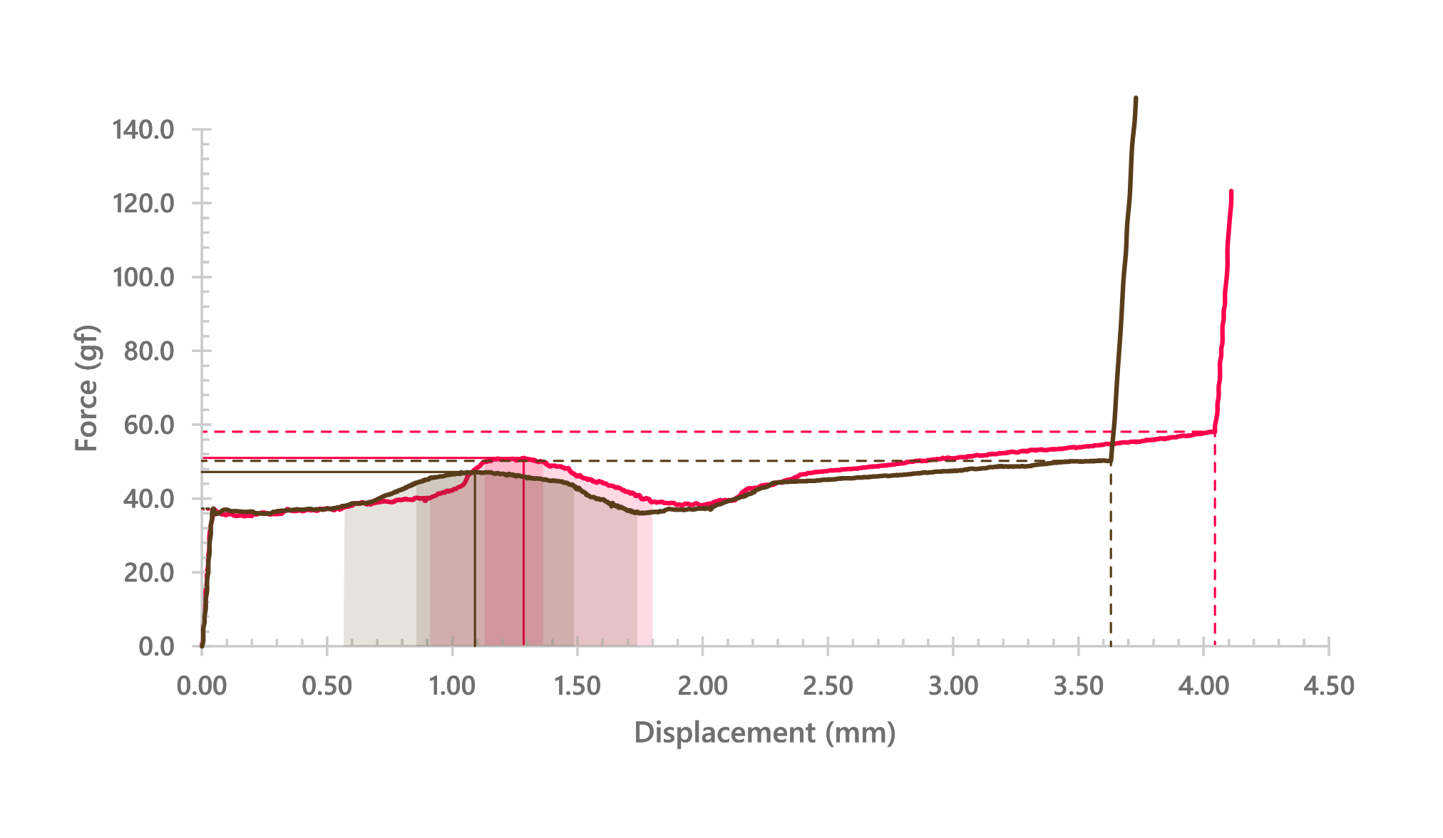
Akko in brown, Cherry in red
The Akko is on the whole a more gentle switch than the Cherry, but because there’s less scratch and other noise, that more gentle bump comes through more clearly. This is what I mean when I say these are browns refined, if decidedly on the branch of long-pole. That is, shorter travel and with a louder clack than otherwise.
I think the Akko POM Brown is a very well-balanced light tactile, and on that note, I give it a subjective A for weighting.
Feel: Familiarity
This is a new section I’m adding, as it’s something I like to discuss when recommending switches. Are you looking for something like what you’ve tried, just better? Or are you looking for something novel to tickle your fancy? Is the switch approachable for newbies, or only lovable by a select niche?
When it comes to the Akko POM Browns, I think they’ll be very approachable for most users, though the shorter travel and sharper clack may be a turn-off for some. They’re a little different, but mostly they’re a cleaned-up take on a well-established theme. These get a B+.
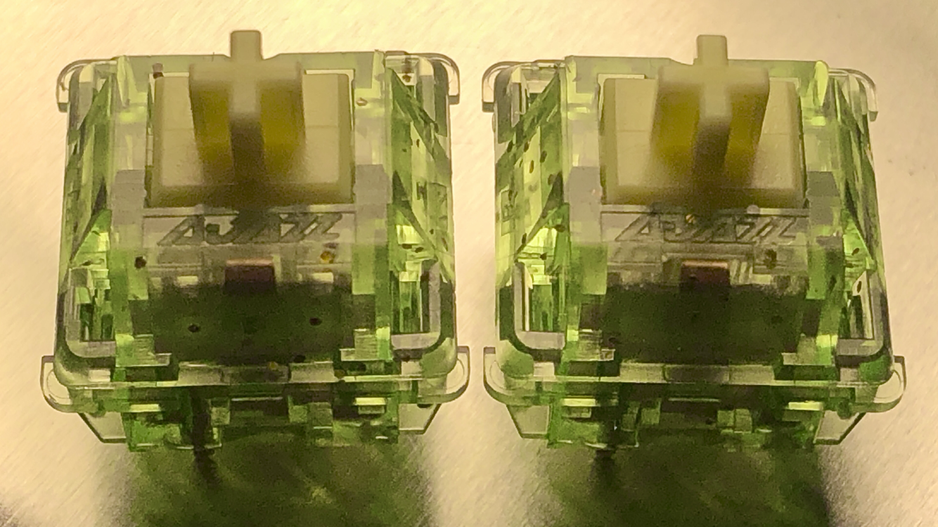
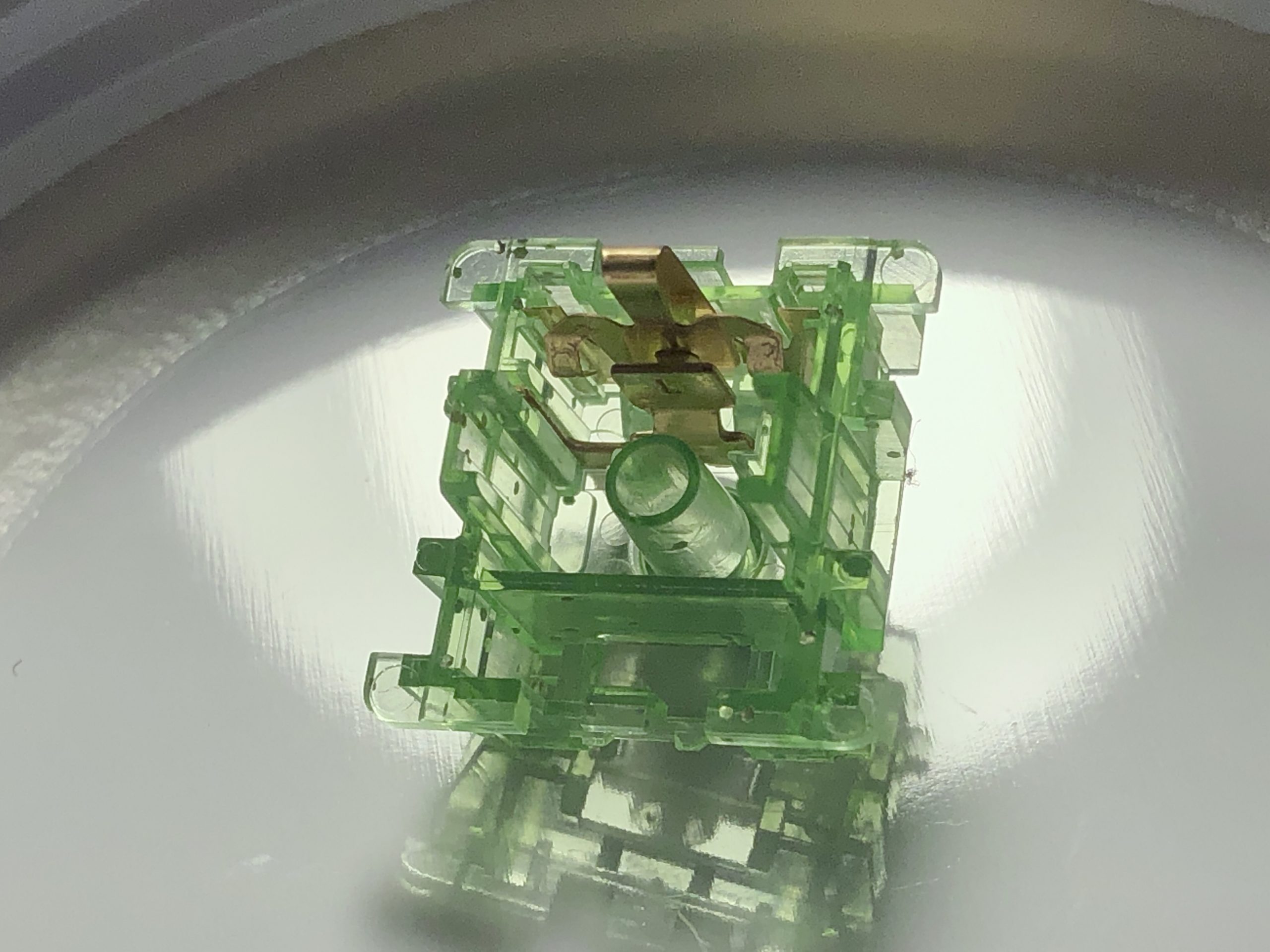
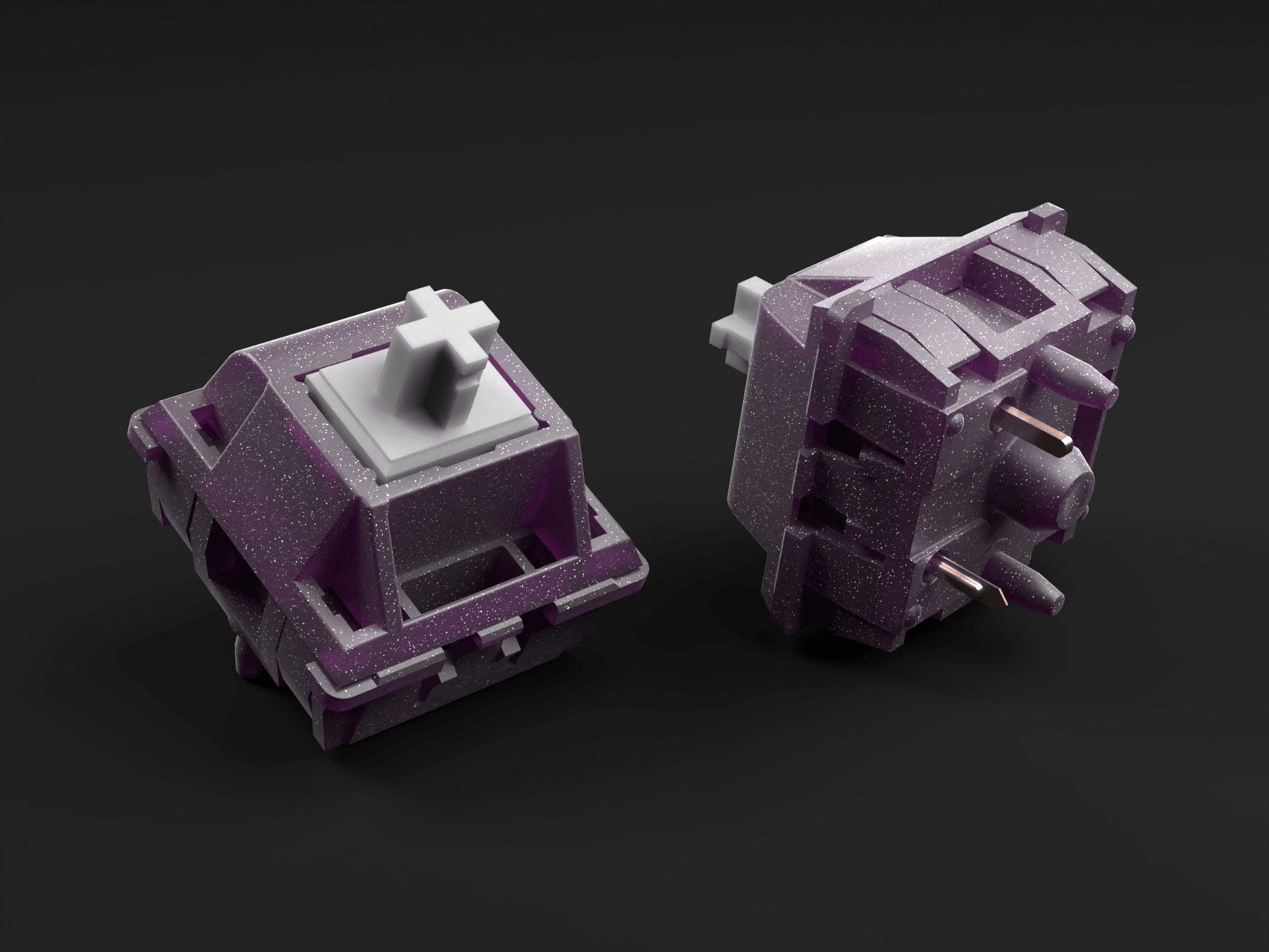
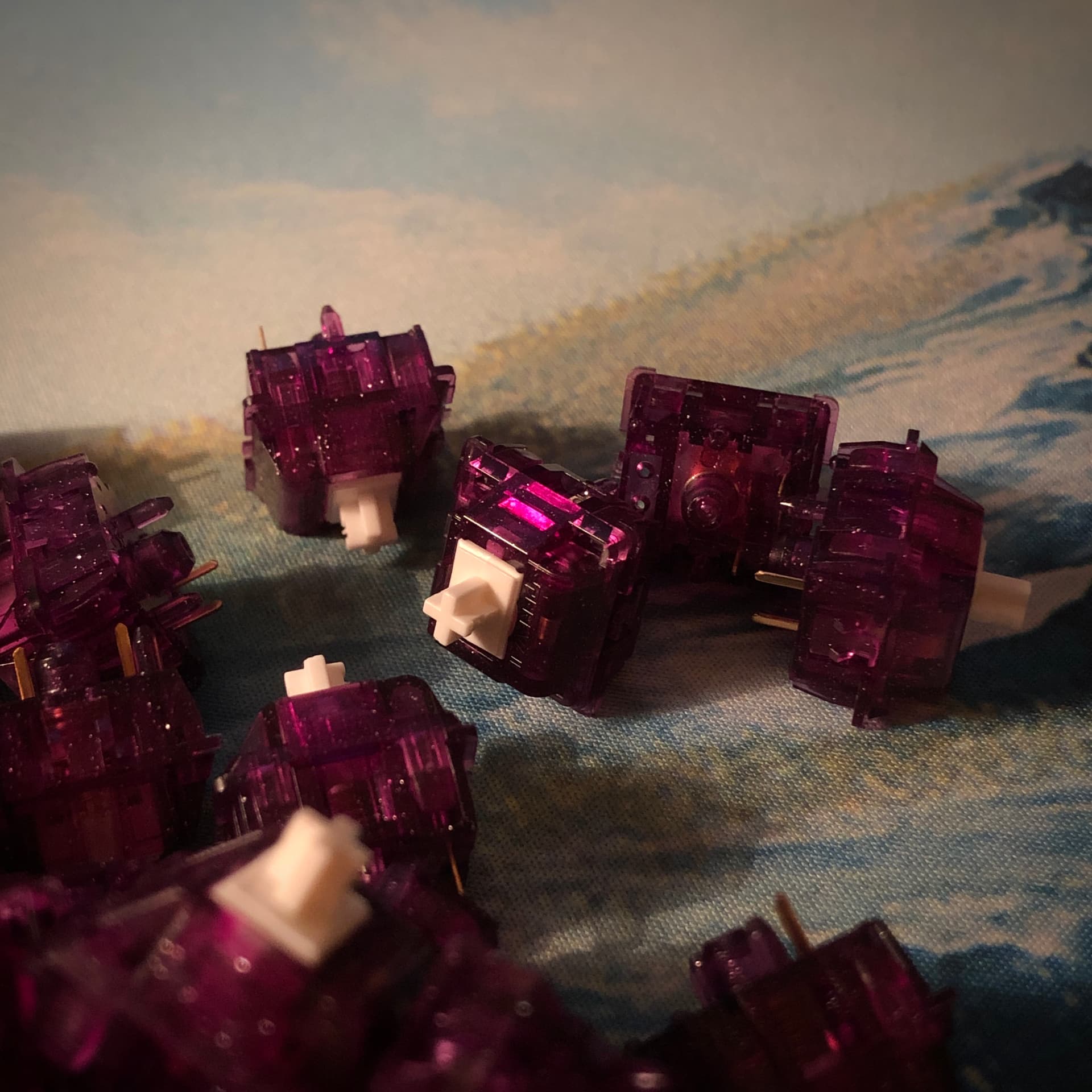
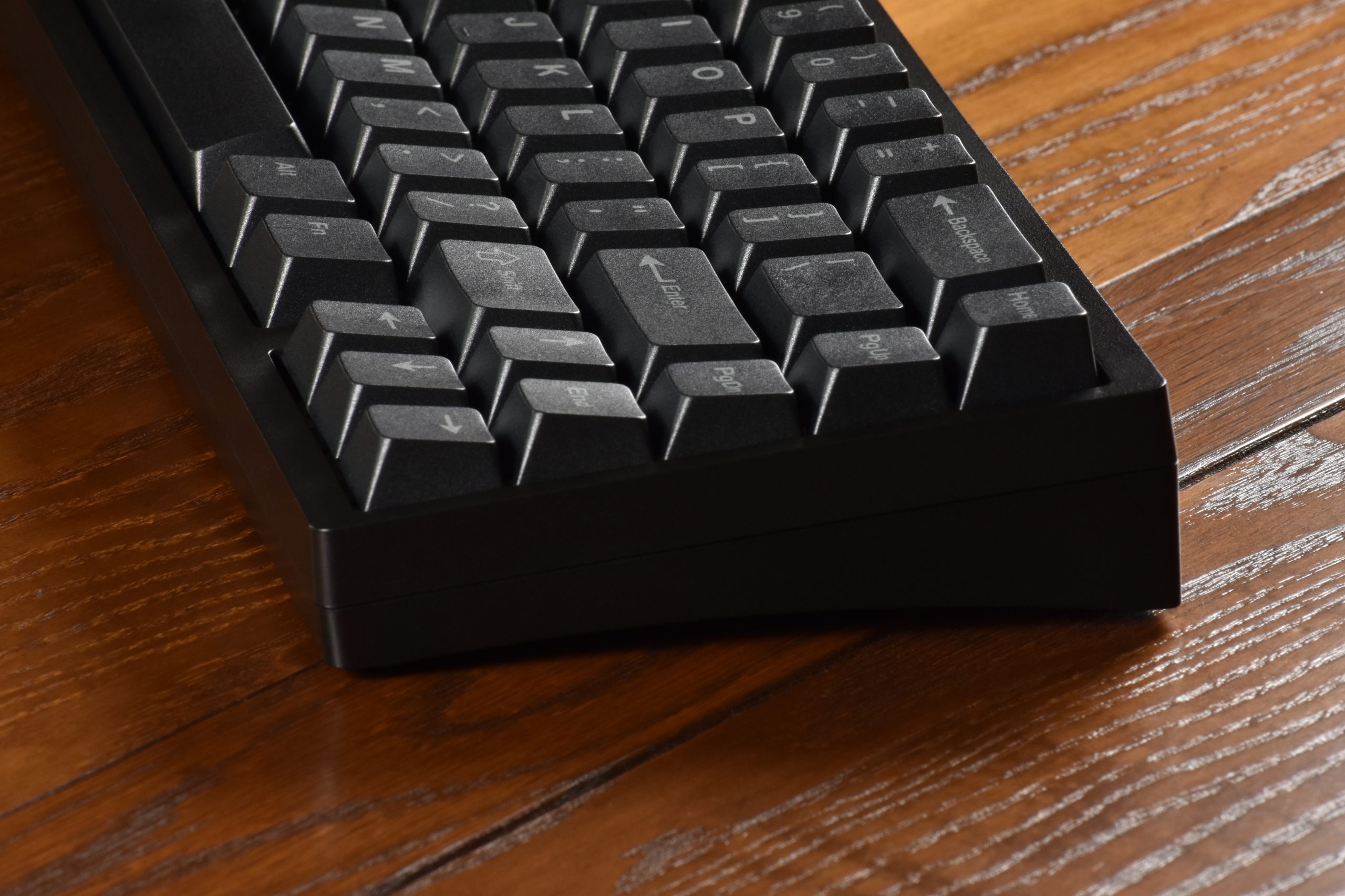
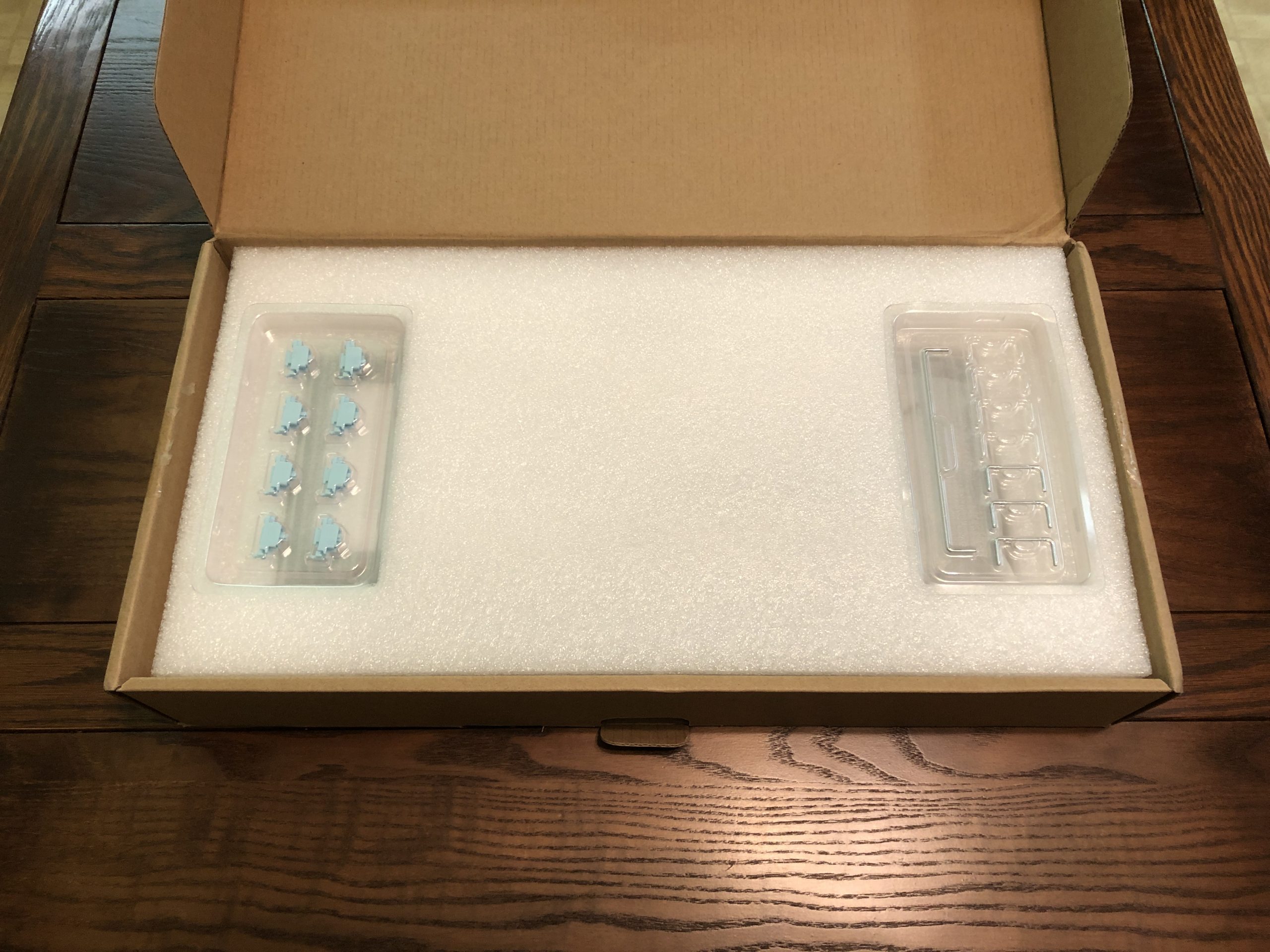
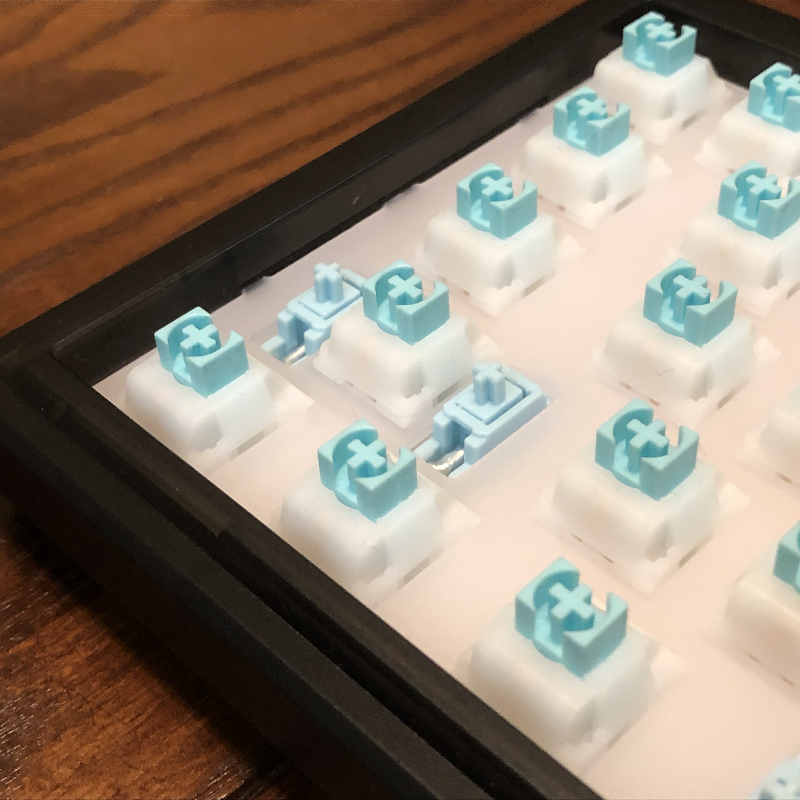
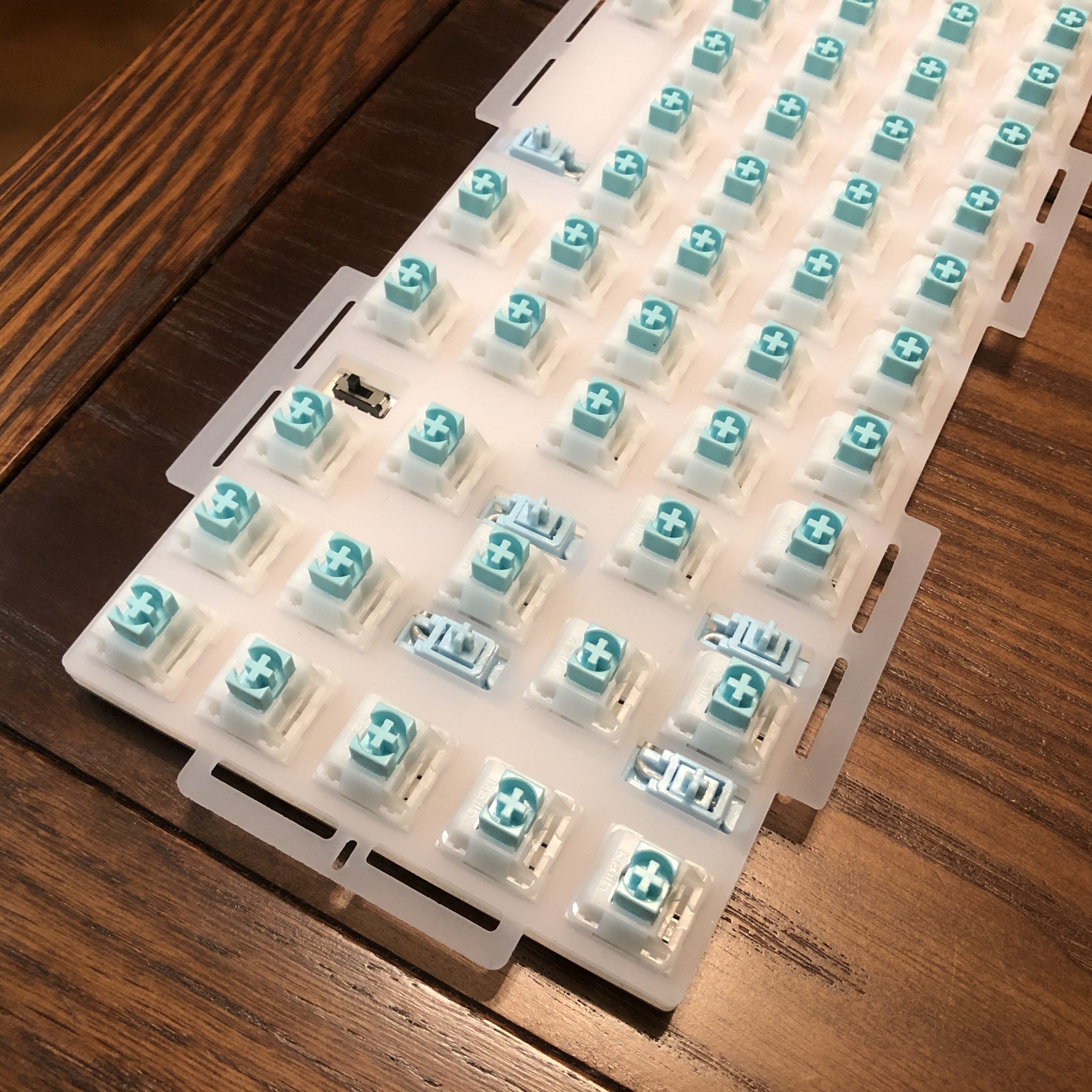
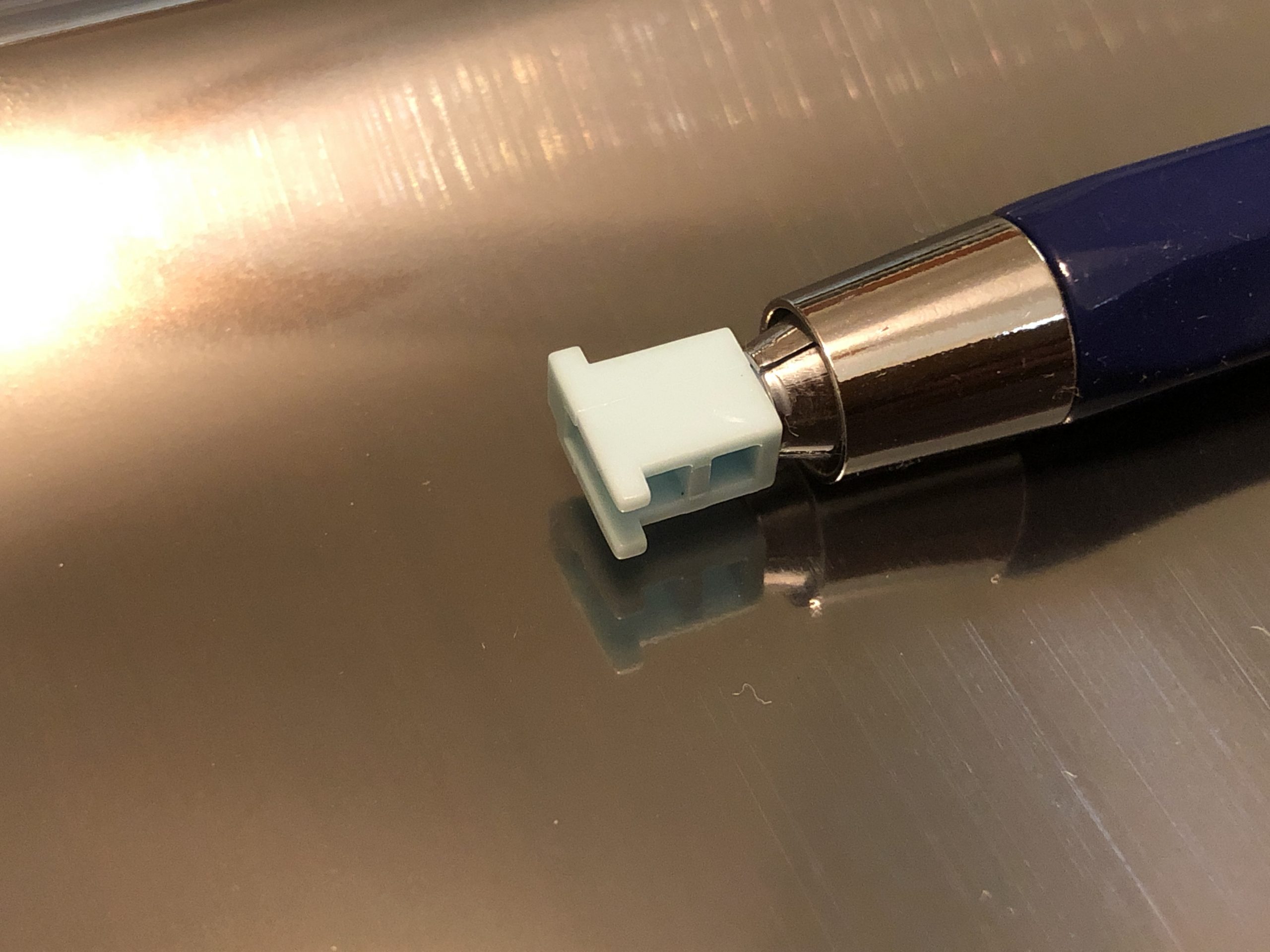
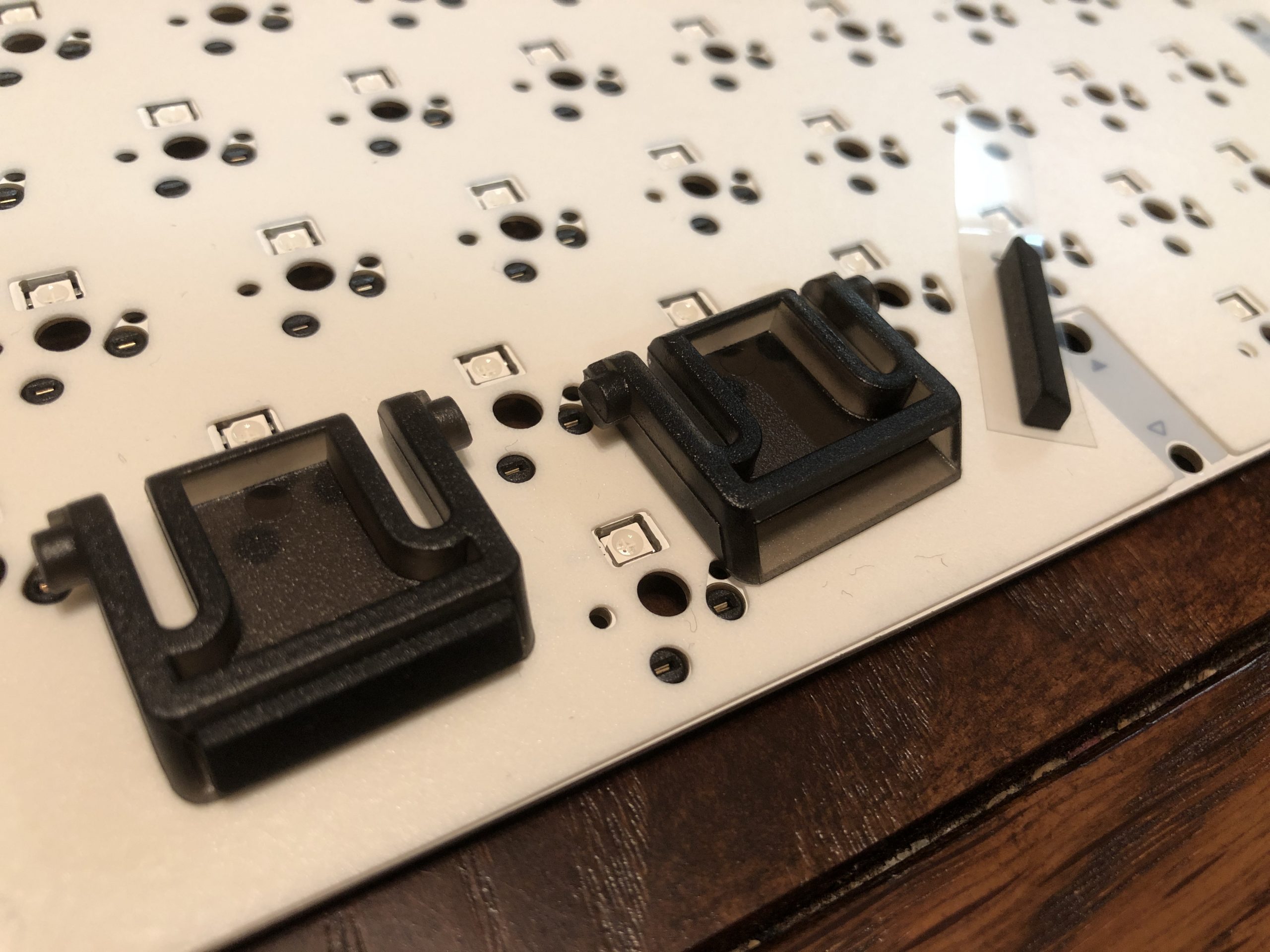
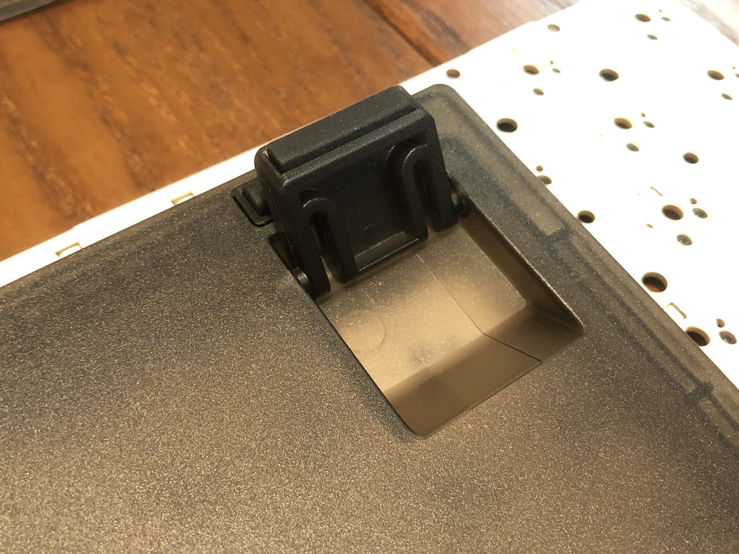
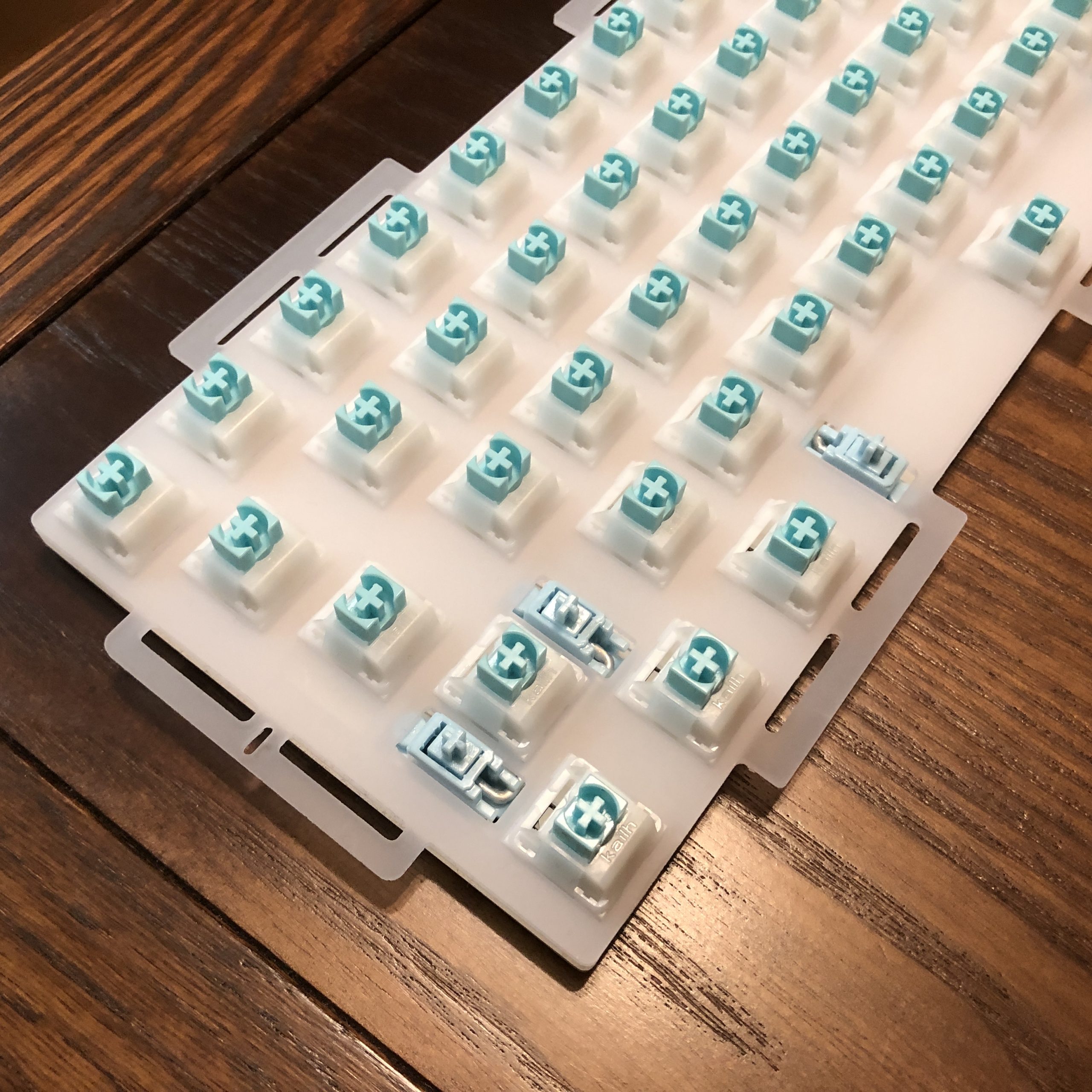
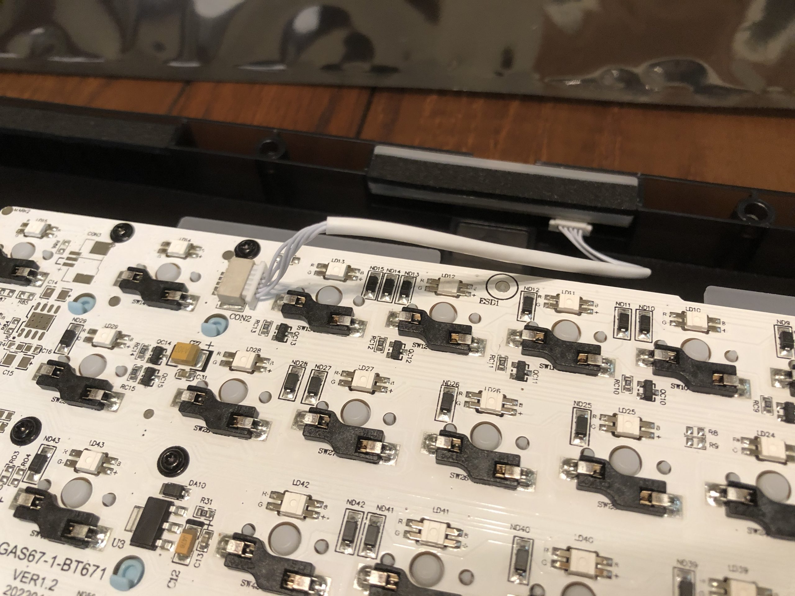
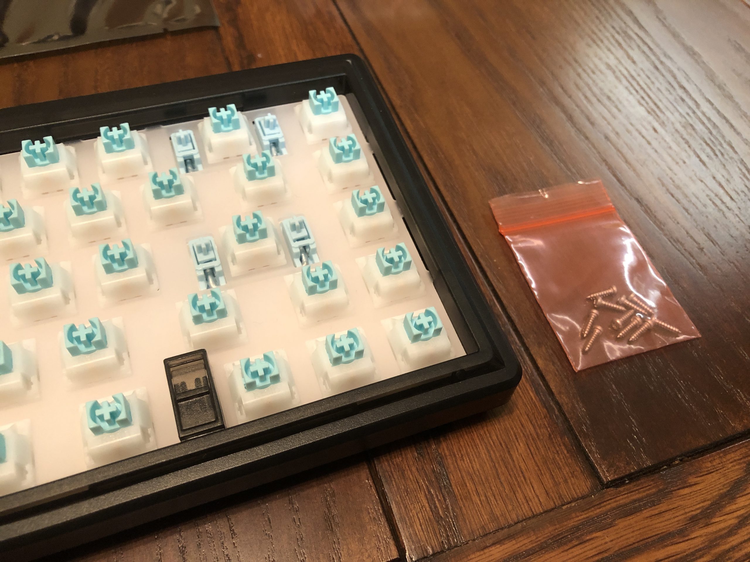
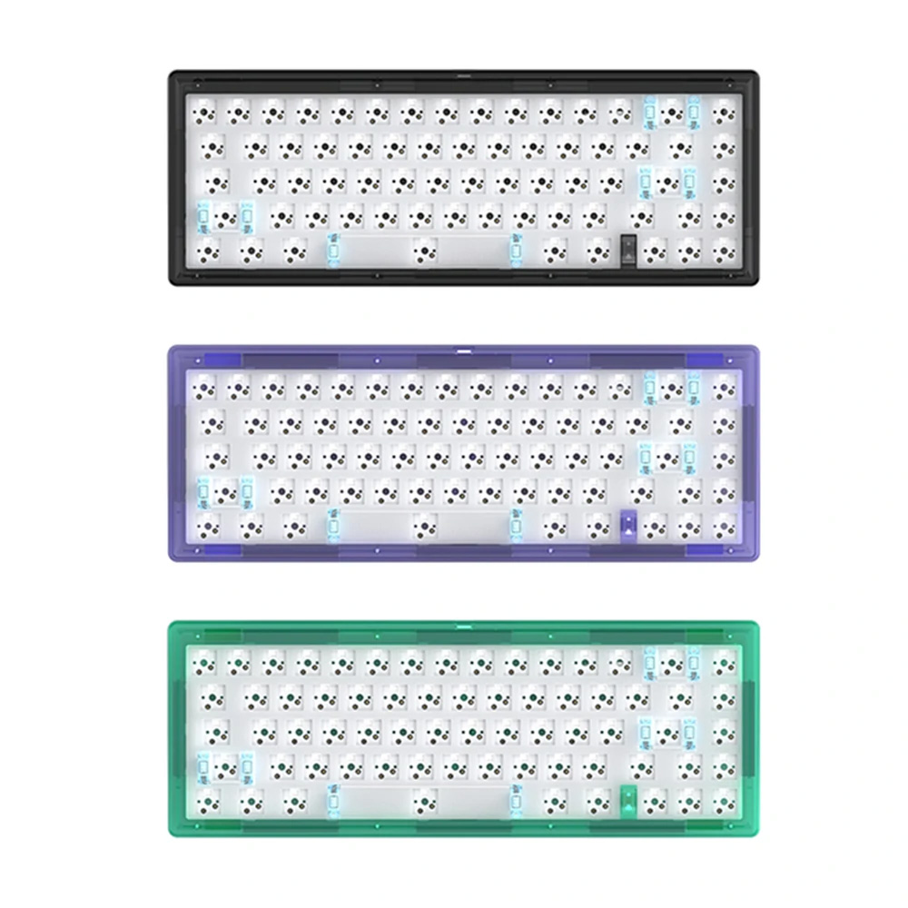
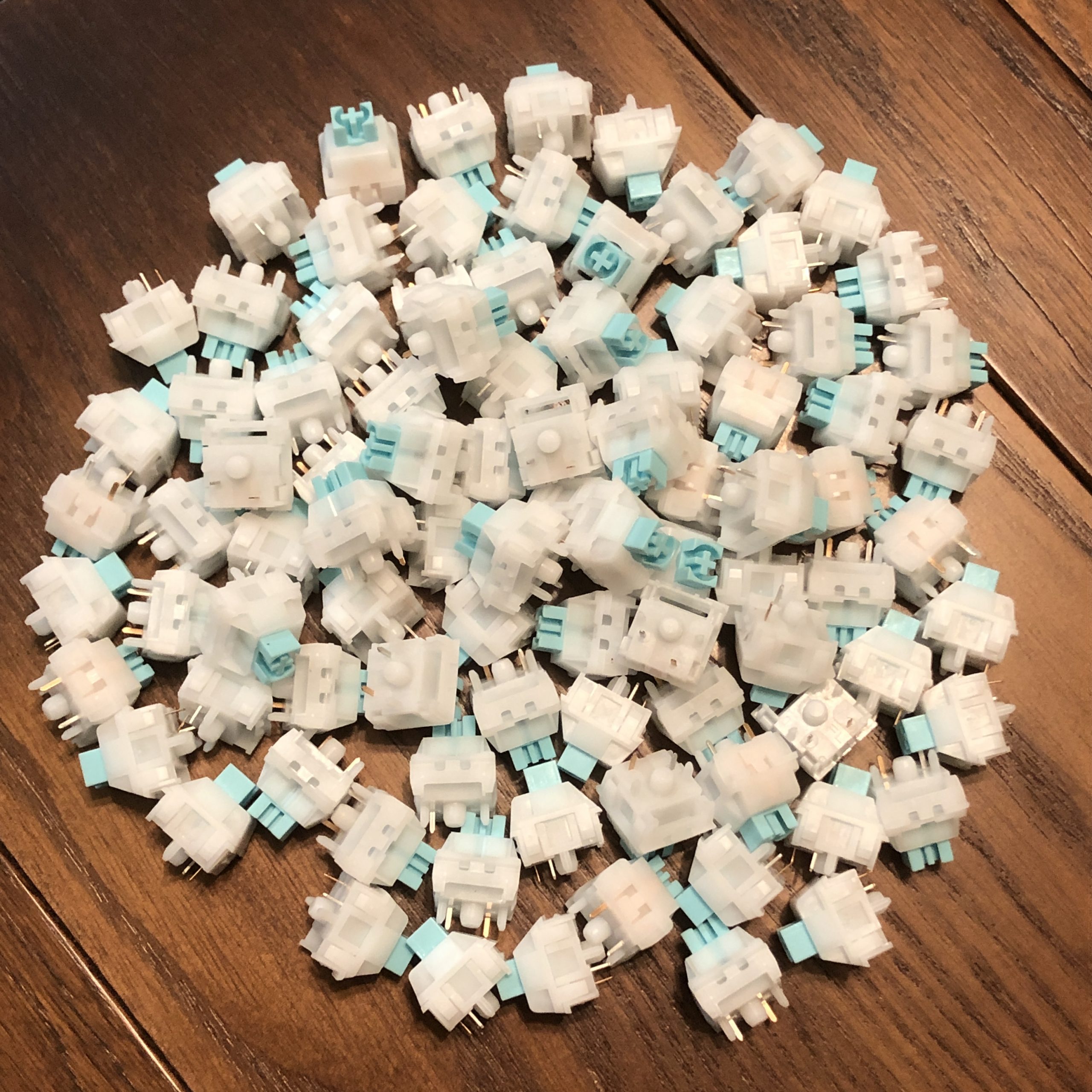
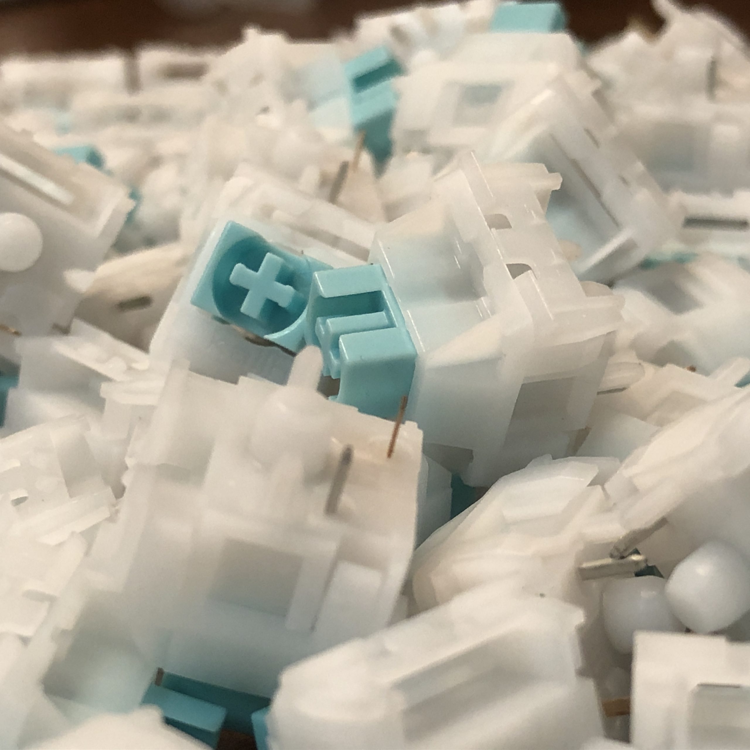
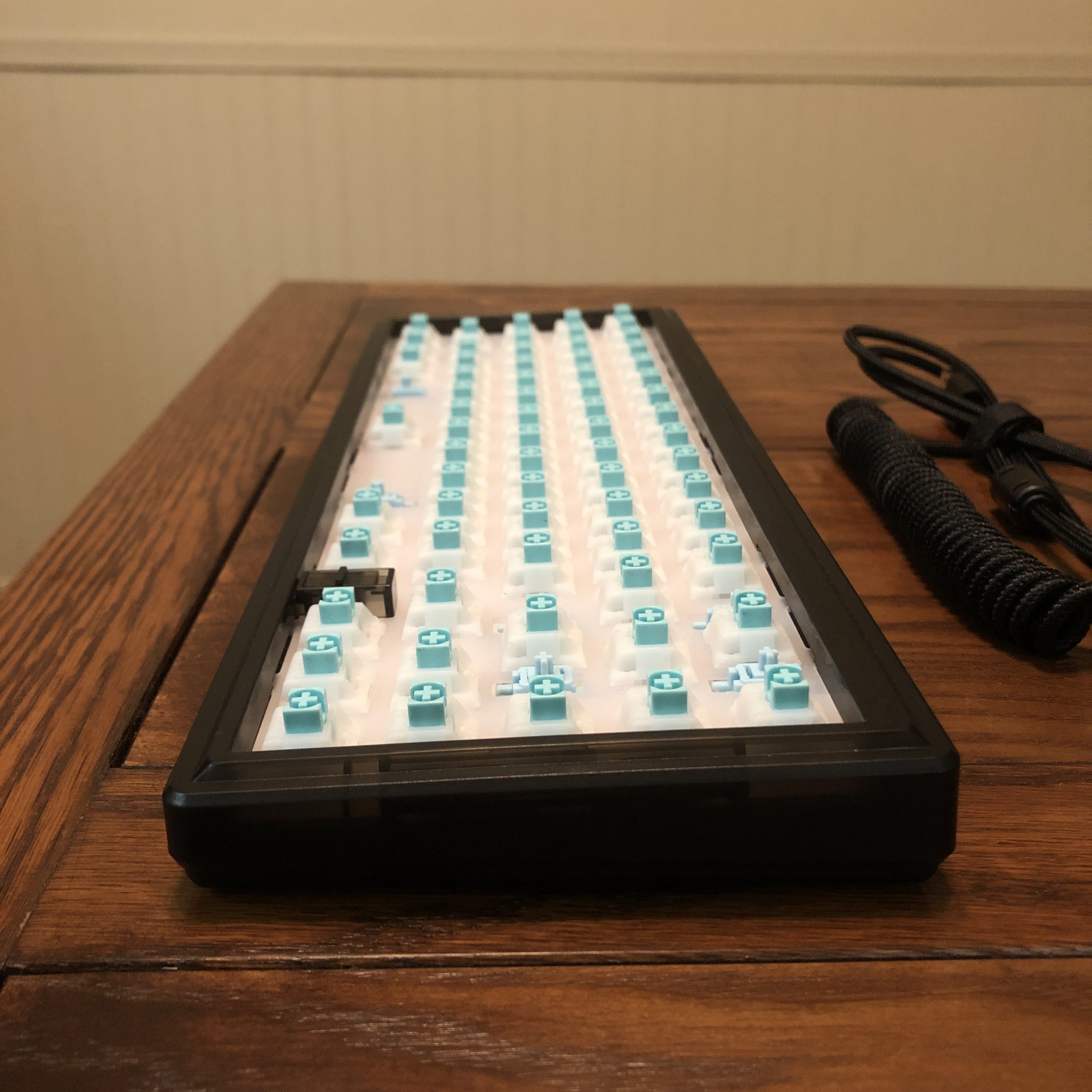
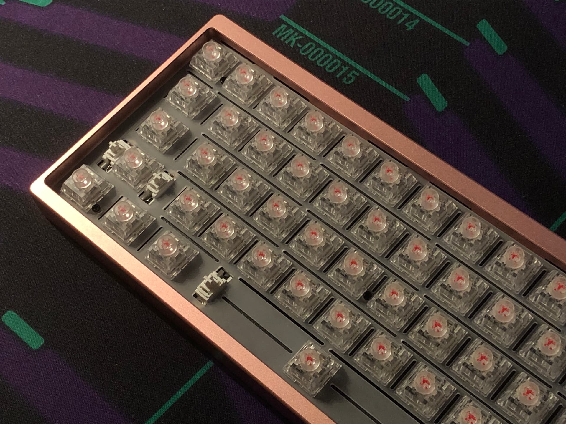
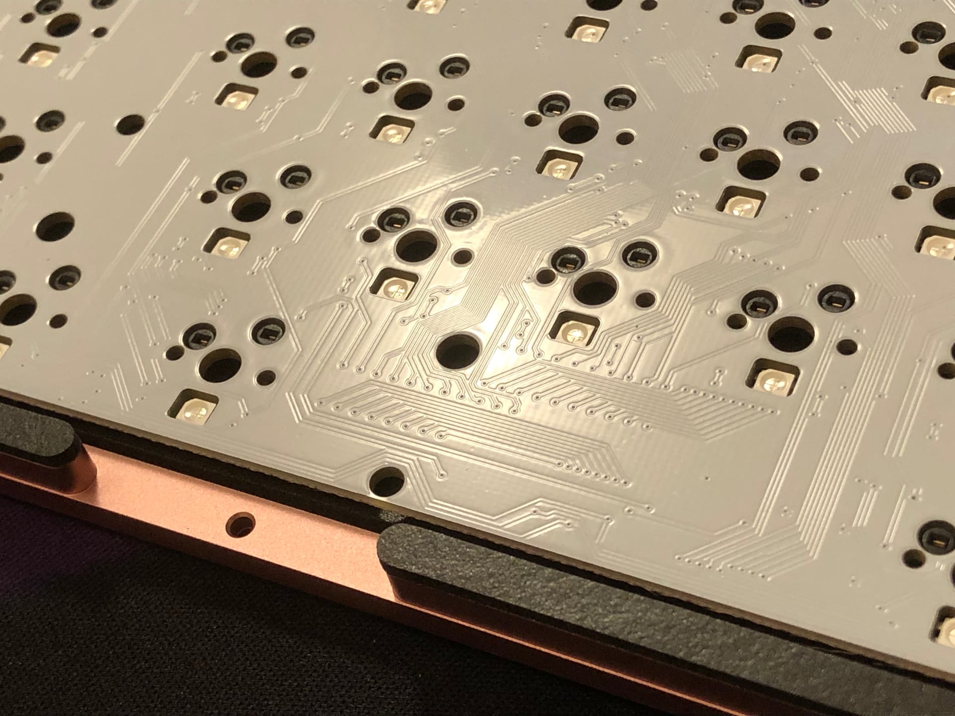
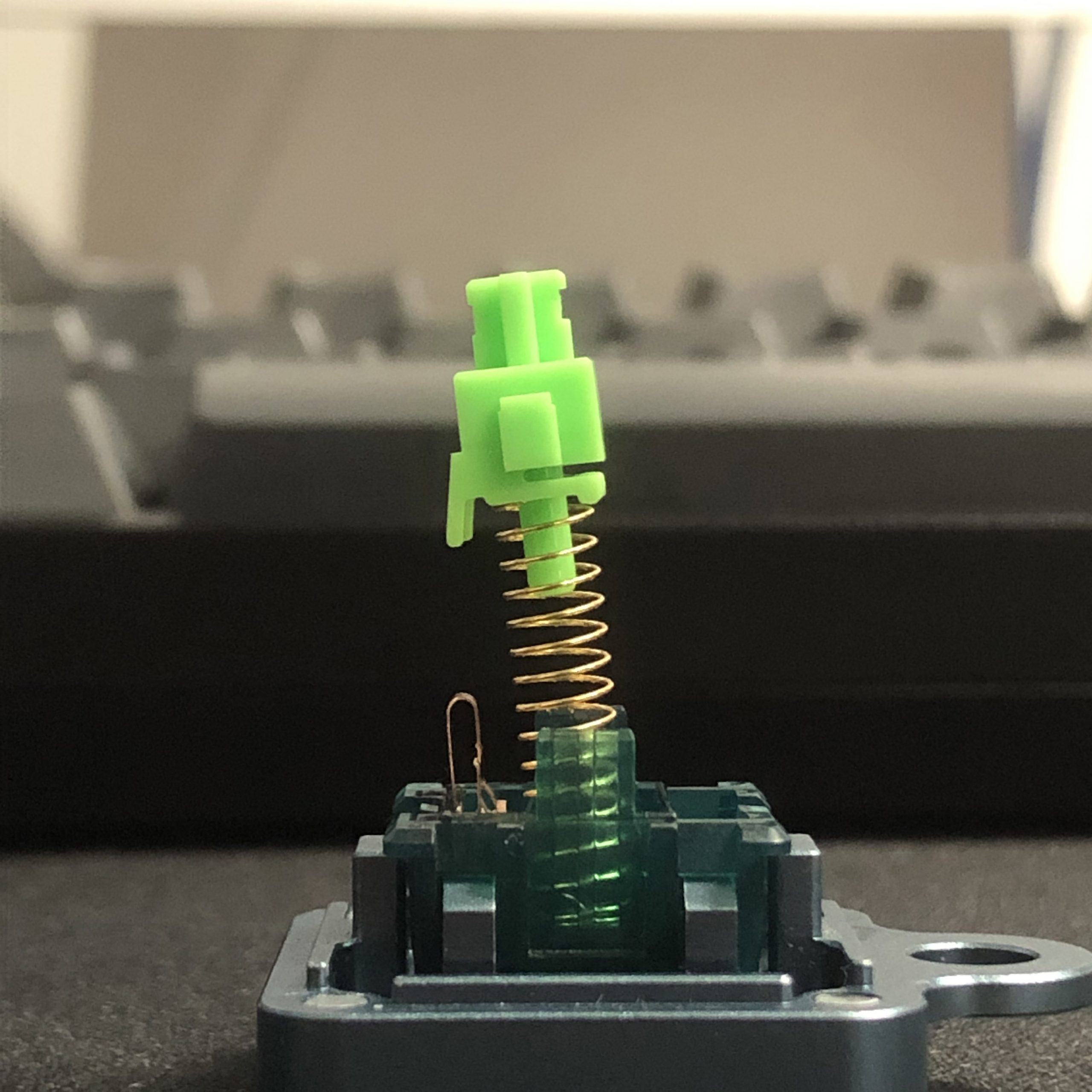
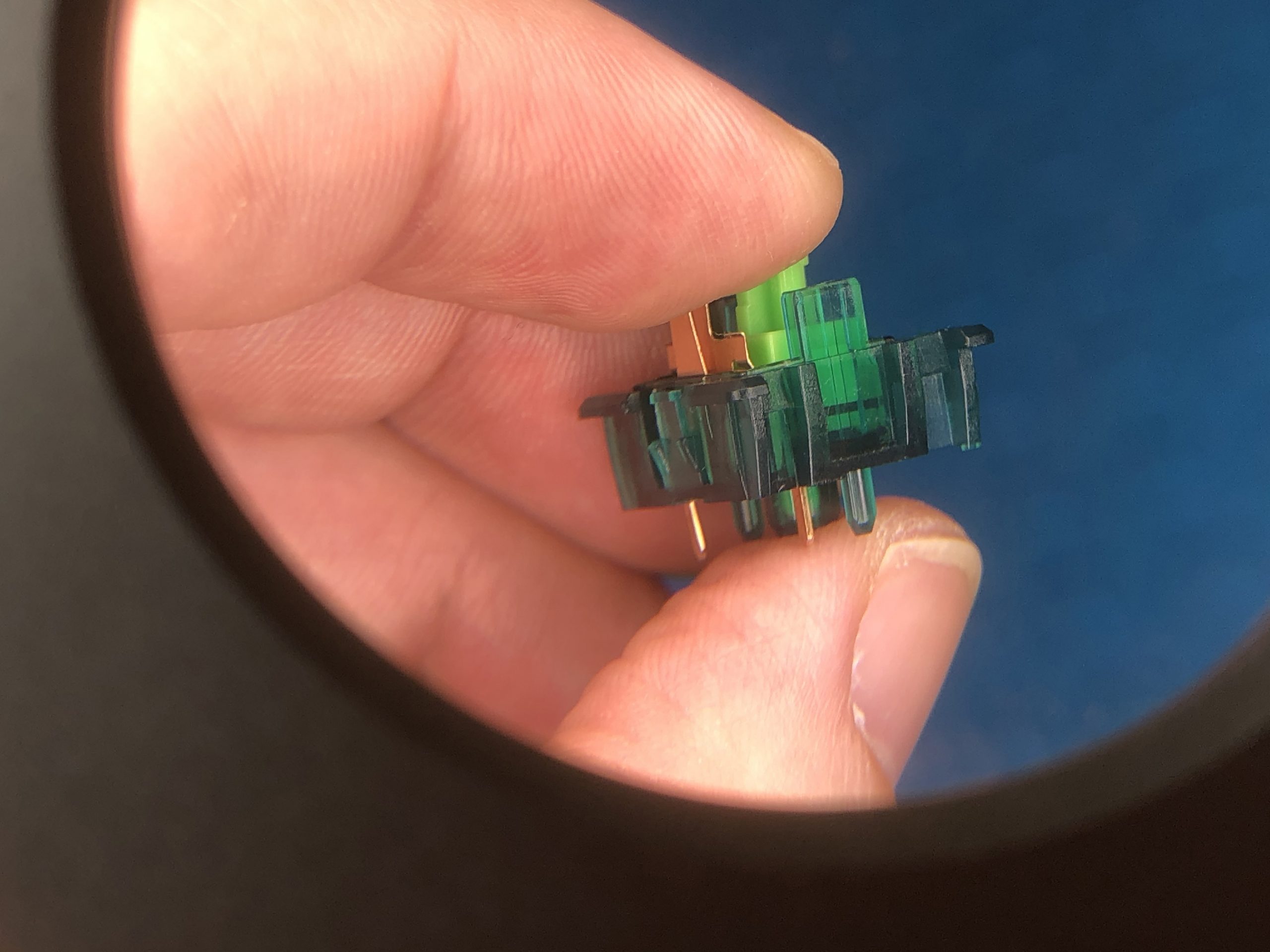
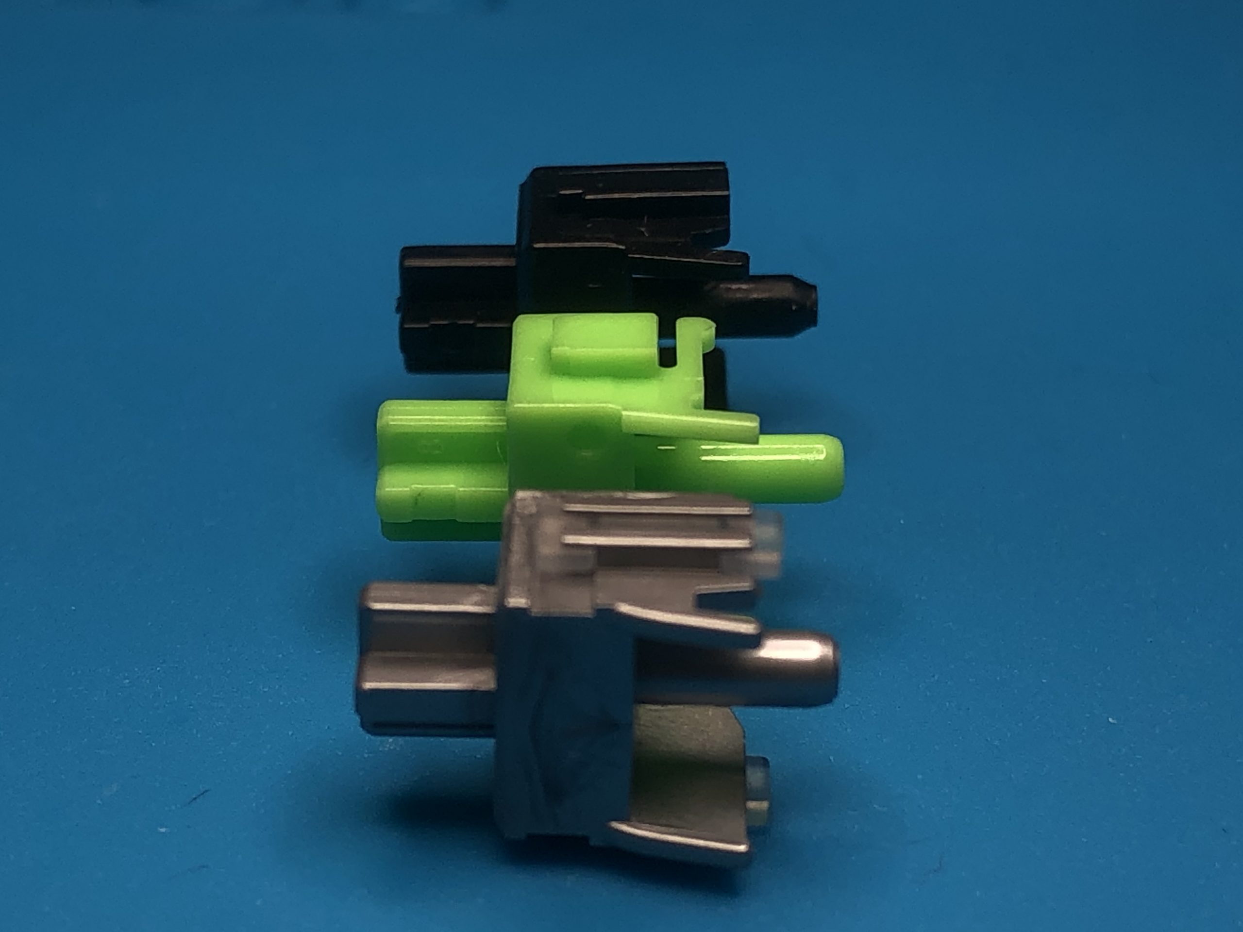
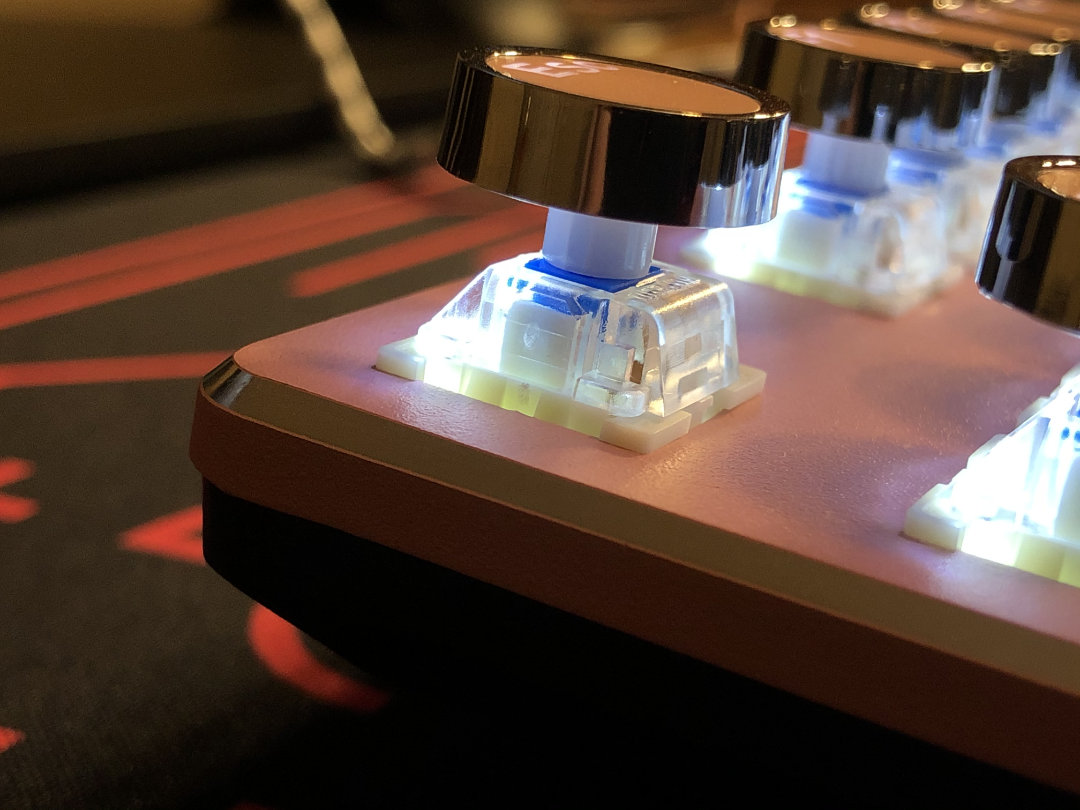
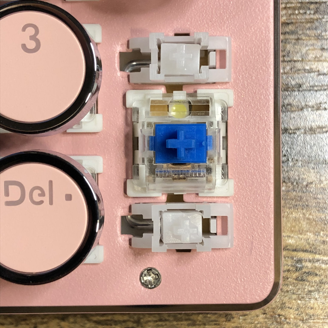
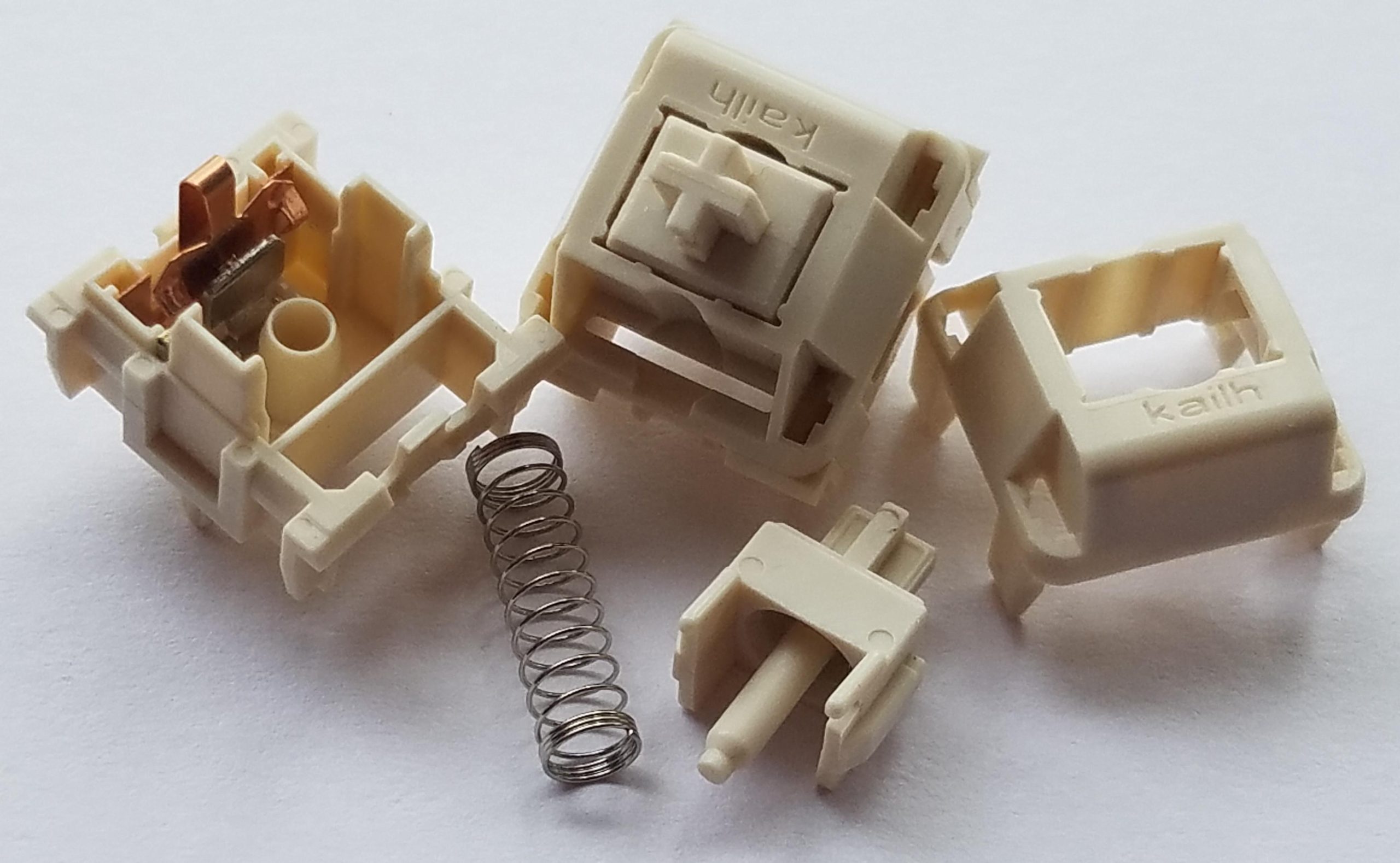
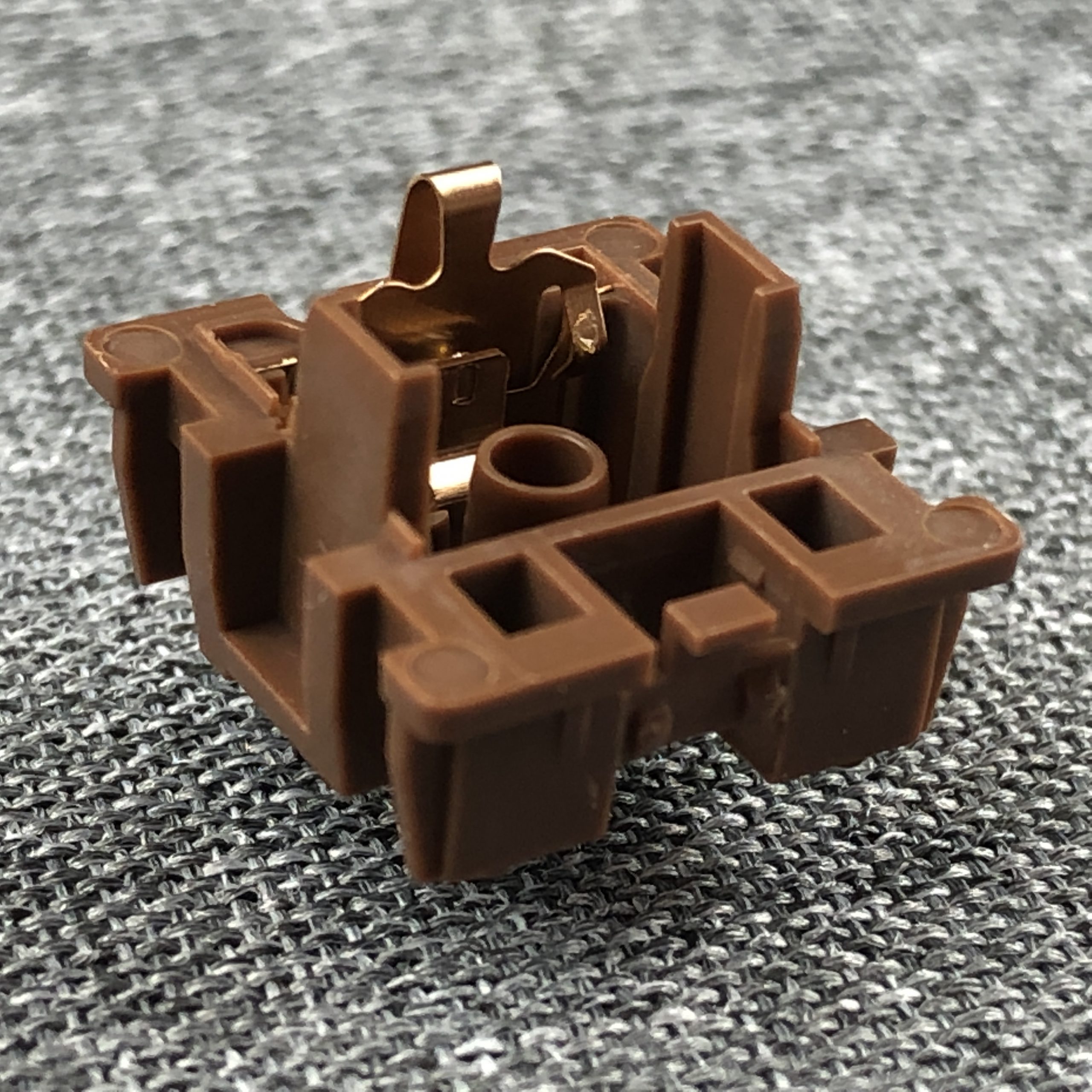
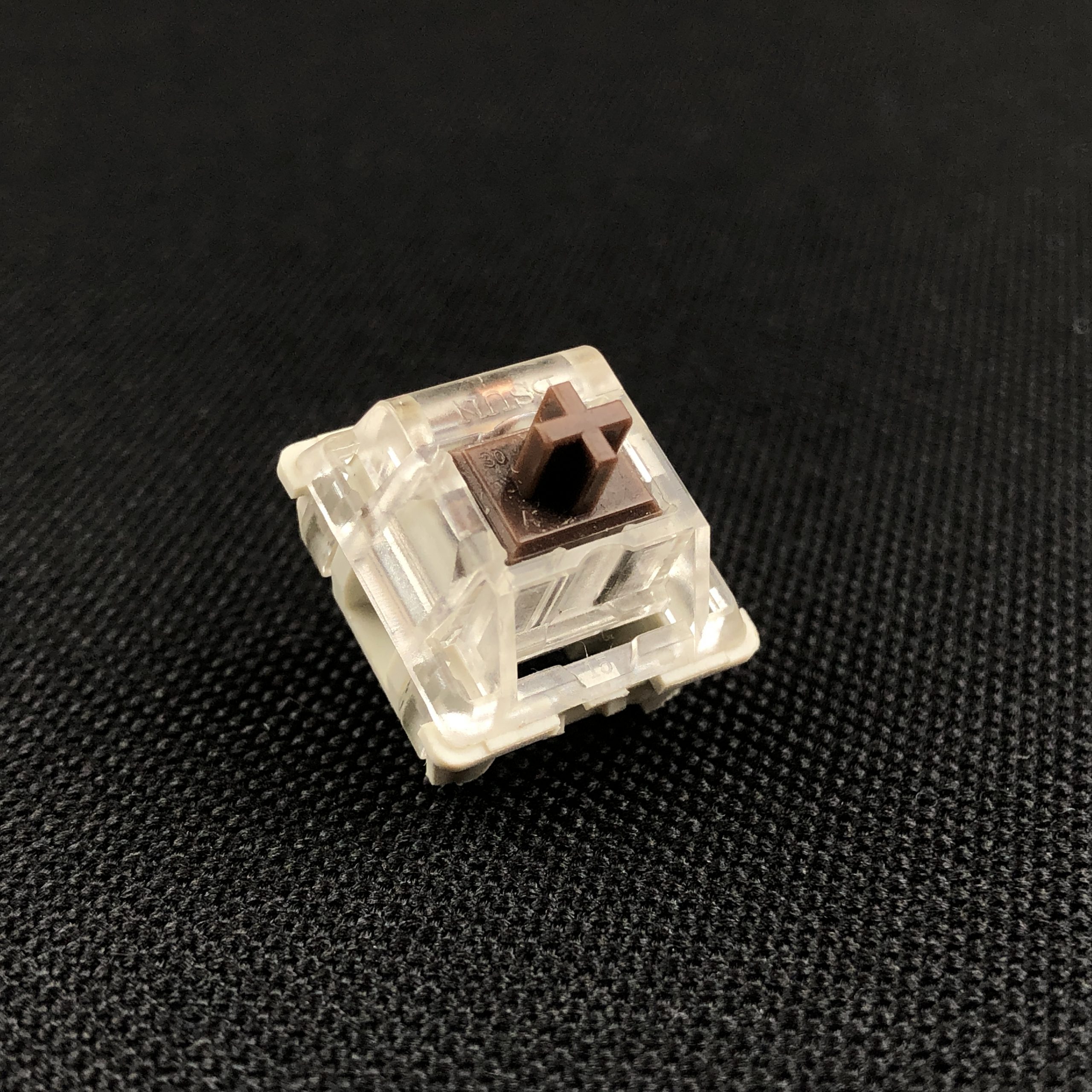
This is a great time to break-out some teardown photos:
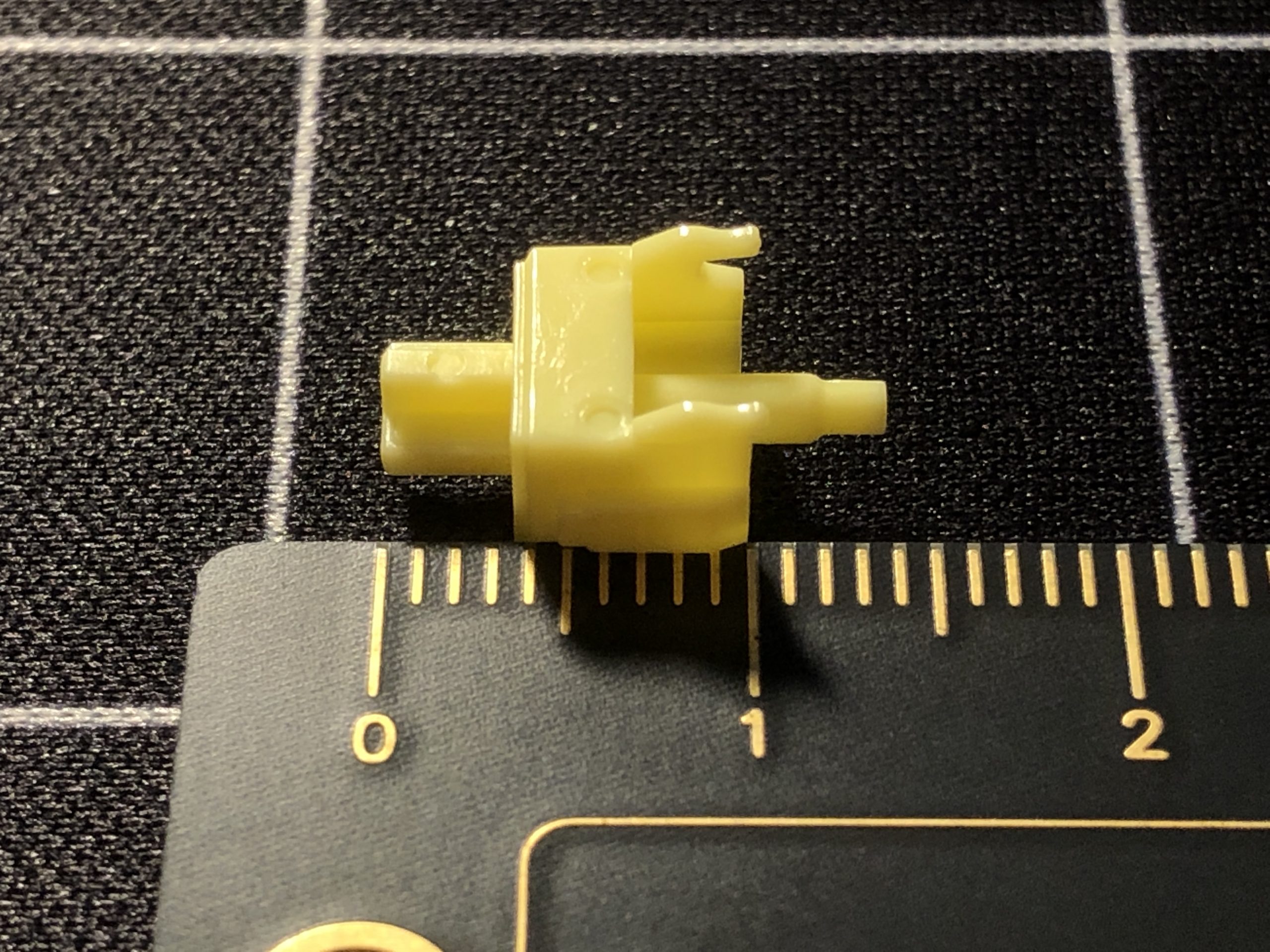
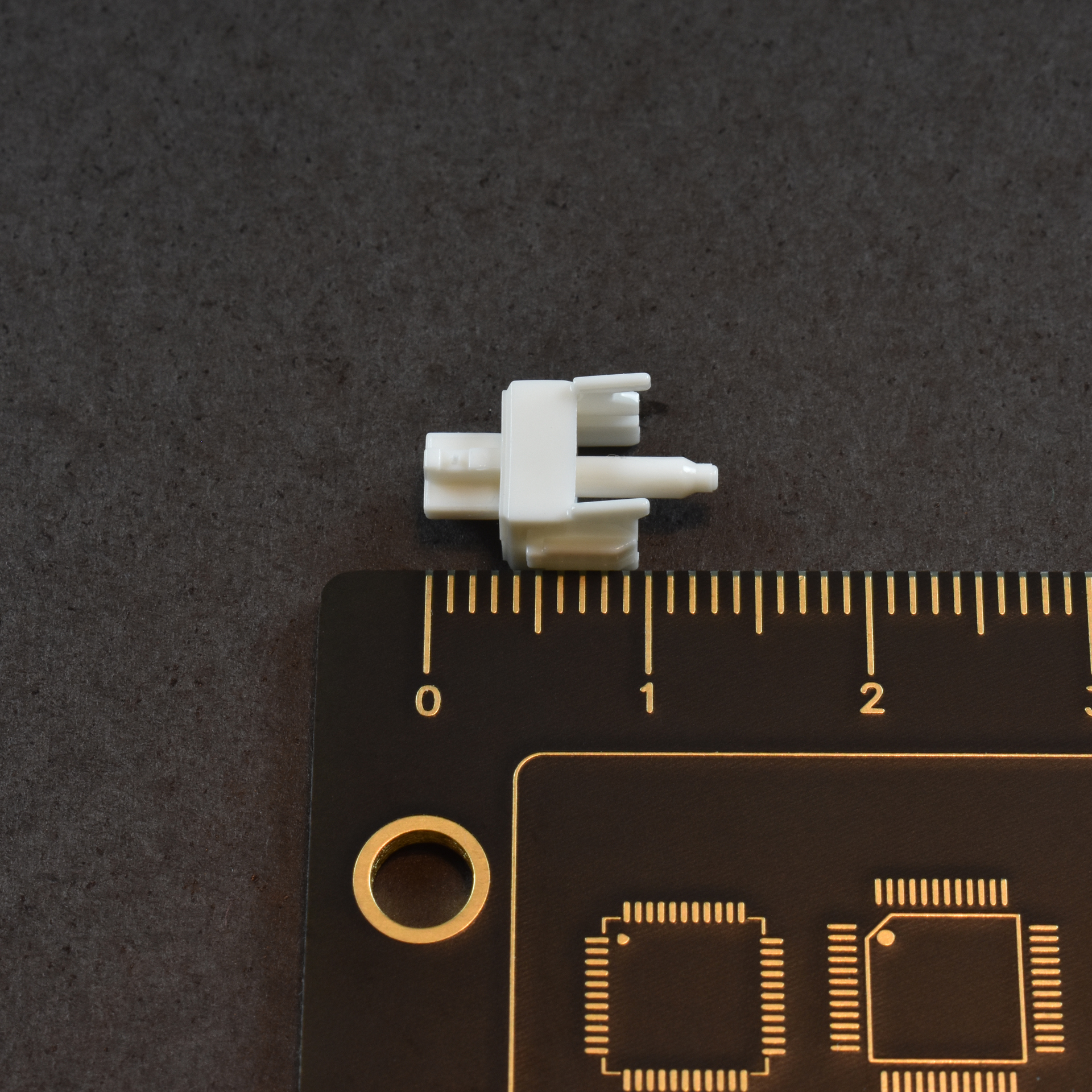
18mm
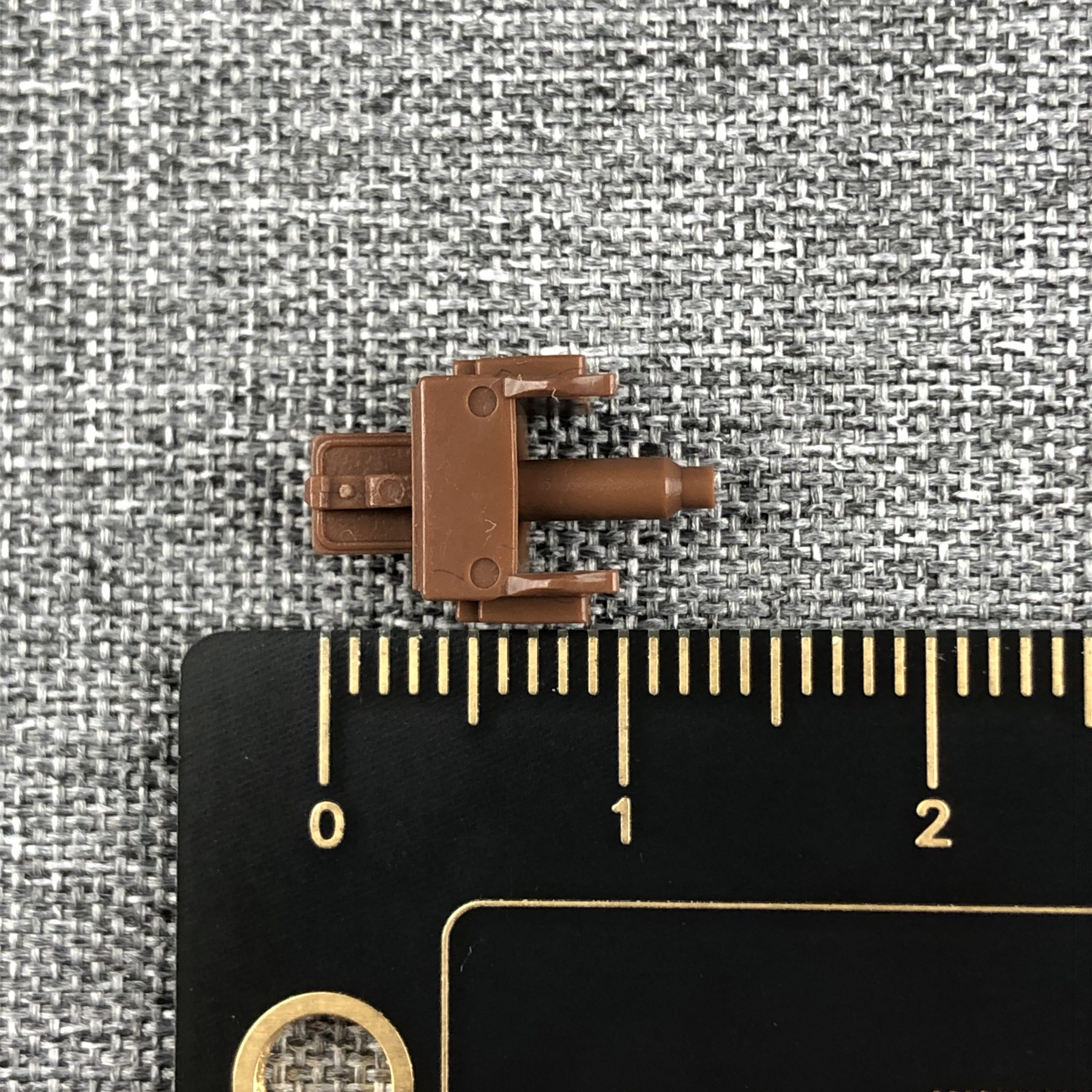
13, maybe 13.5mm
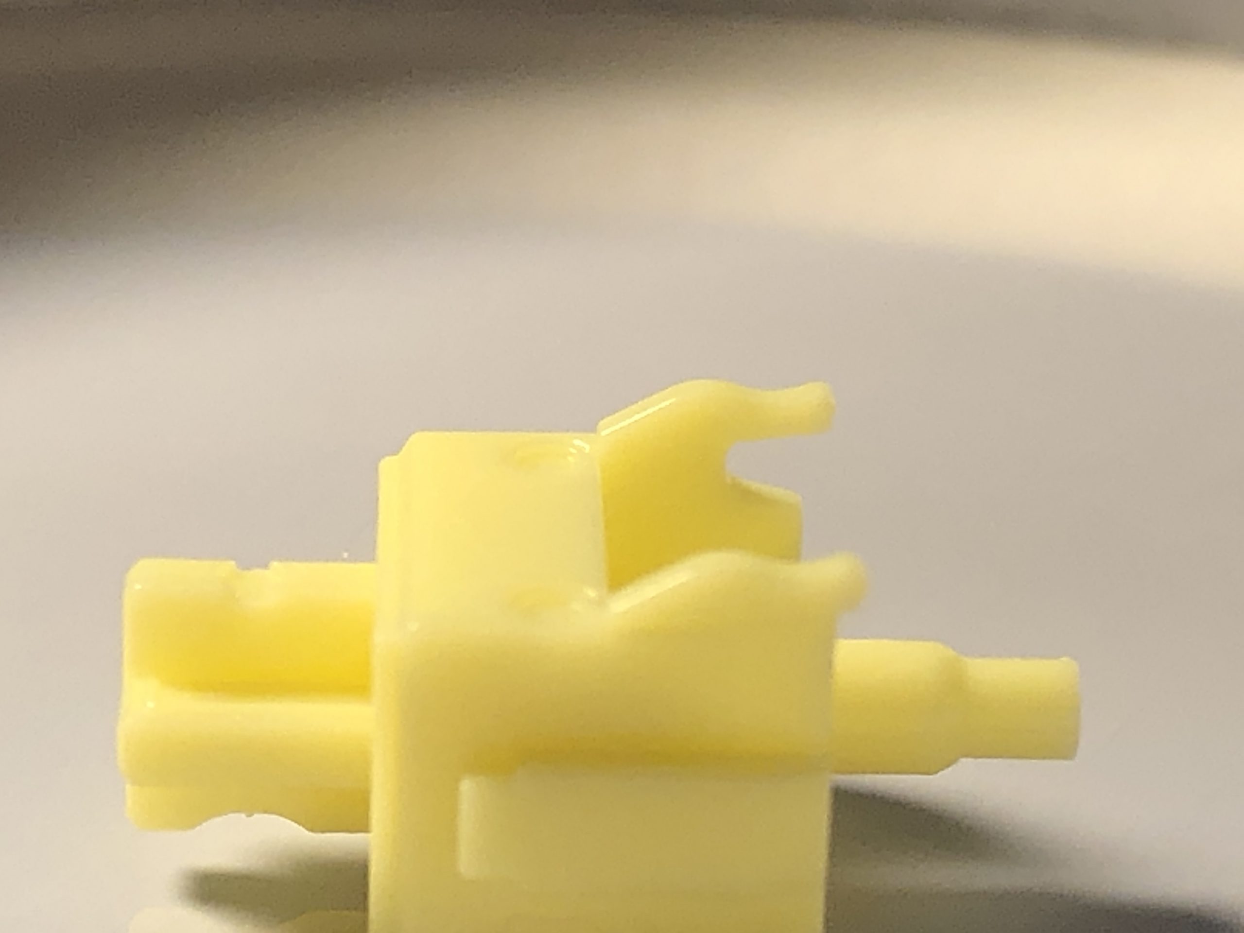
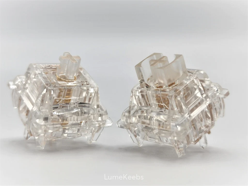
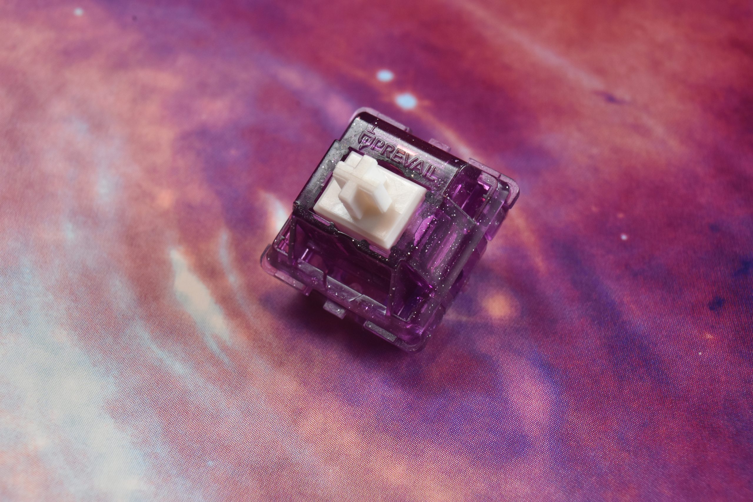
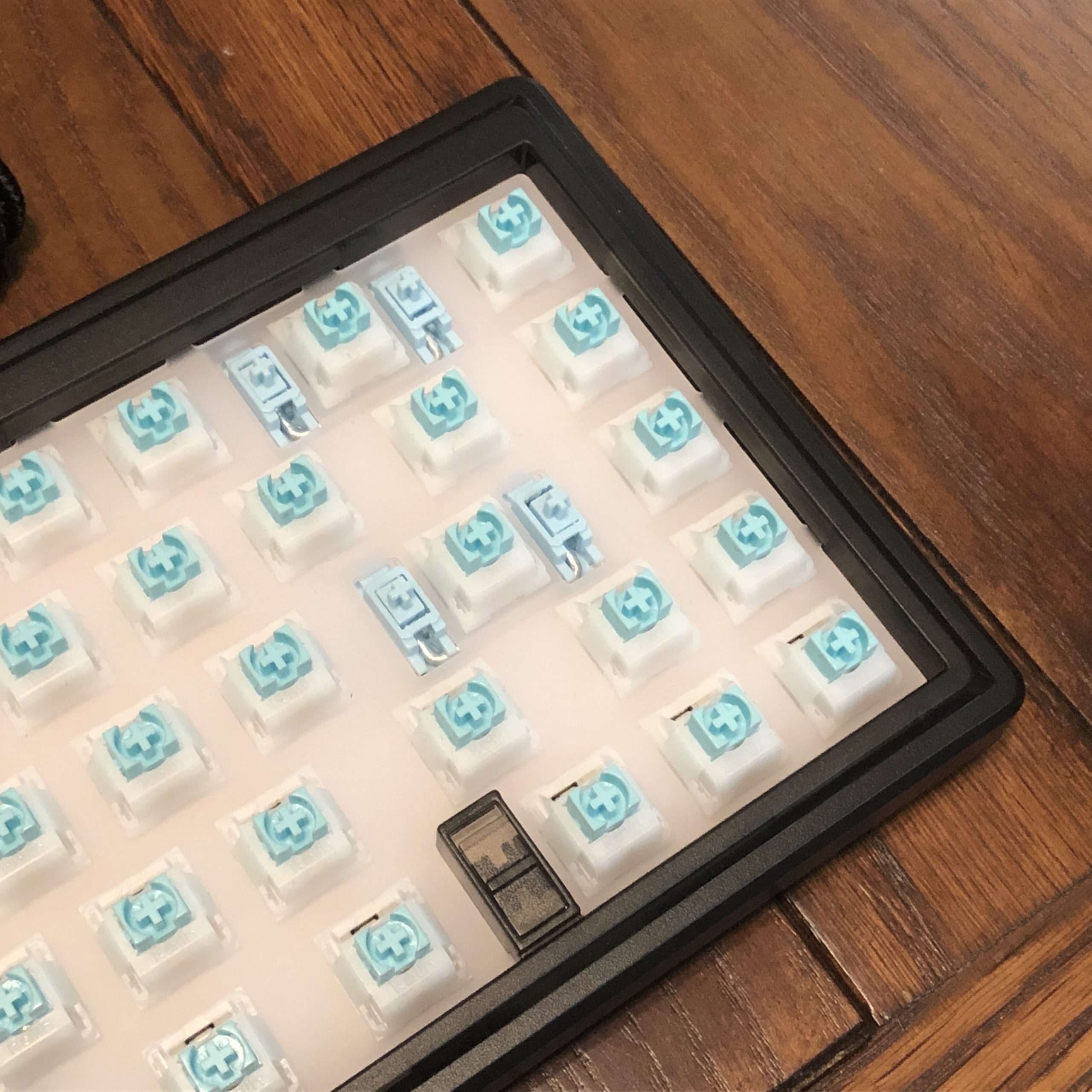
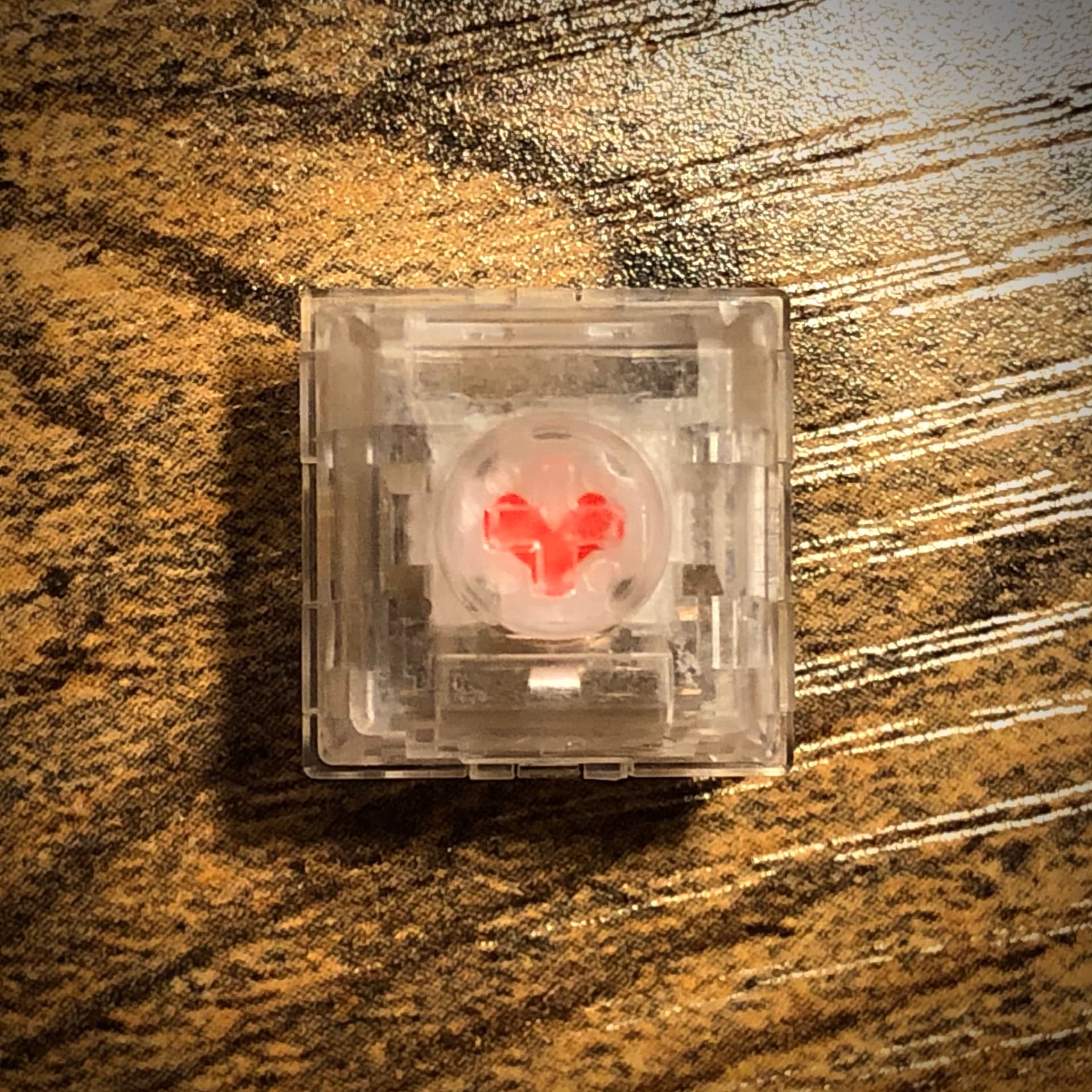
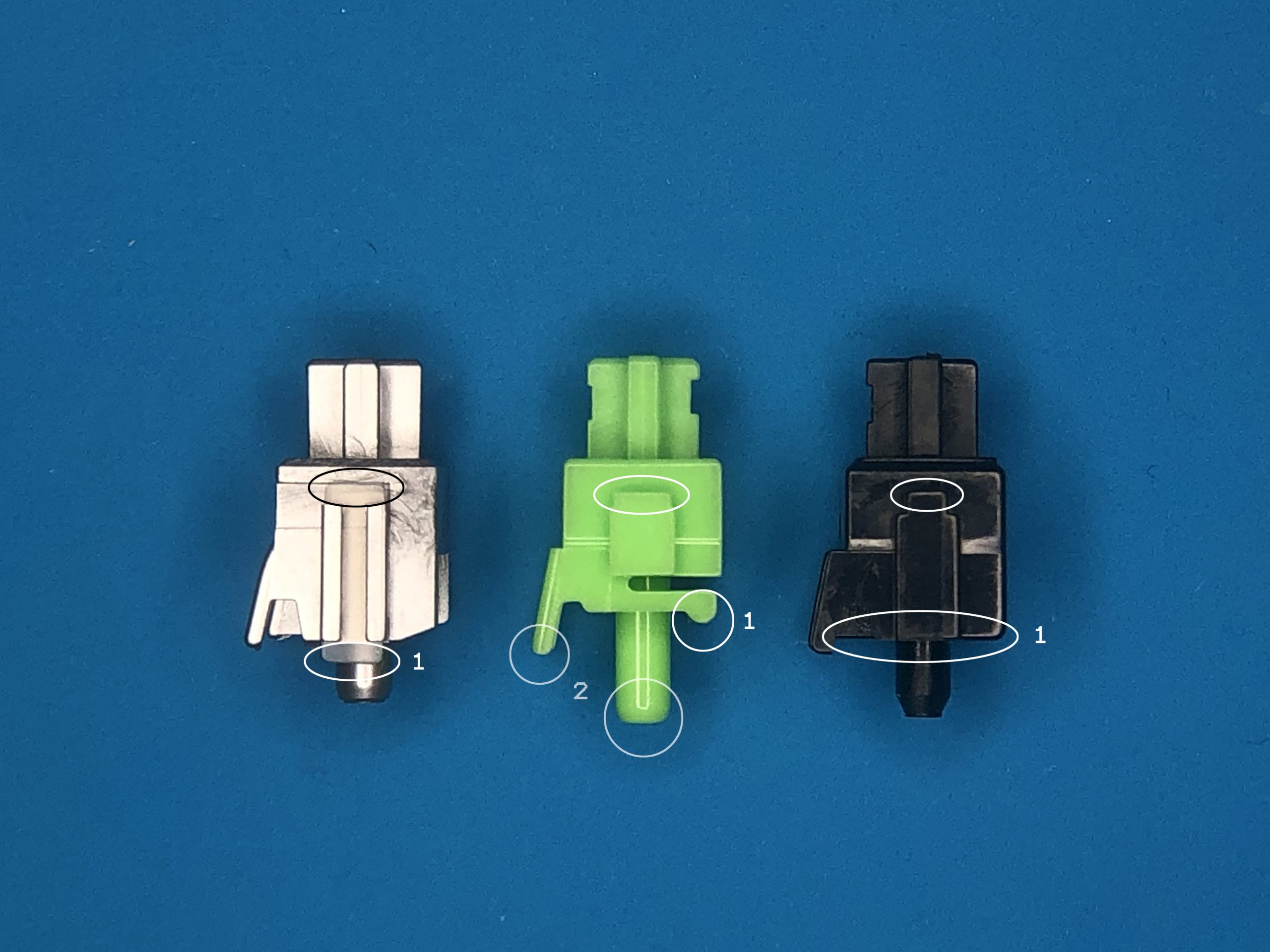
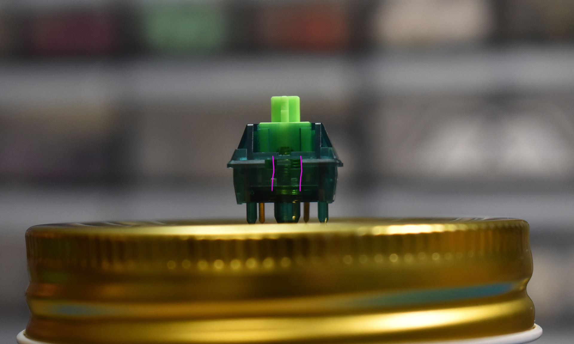
A close look at the bump profile of the Akko POM Brown stem
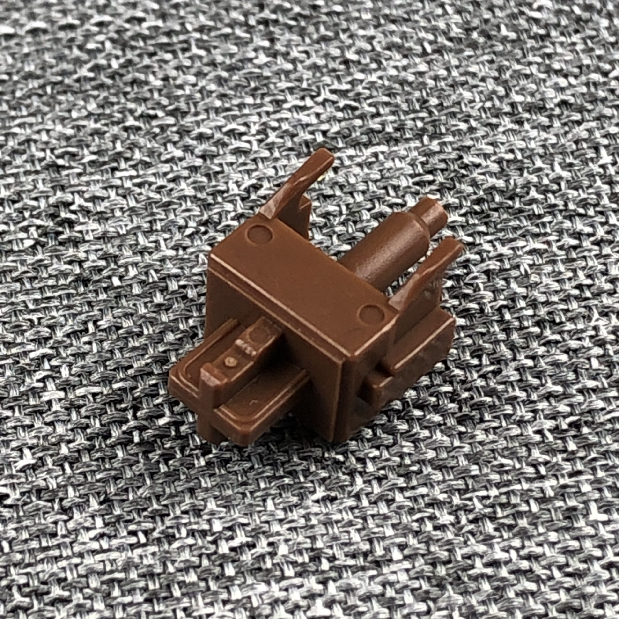
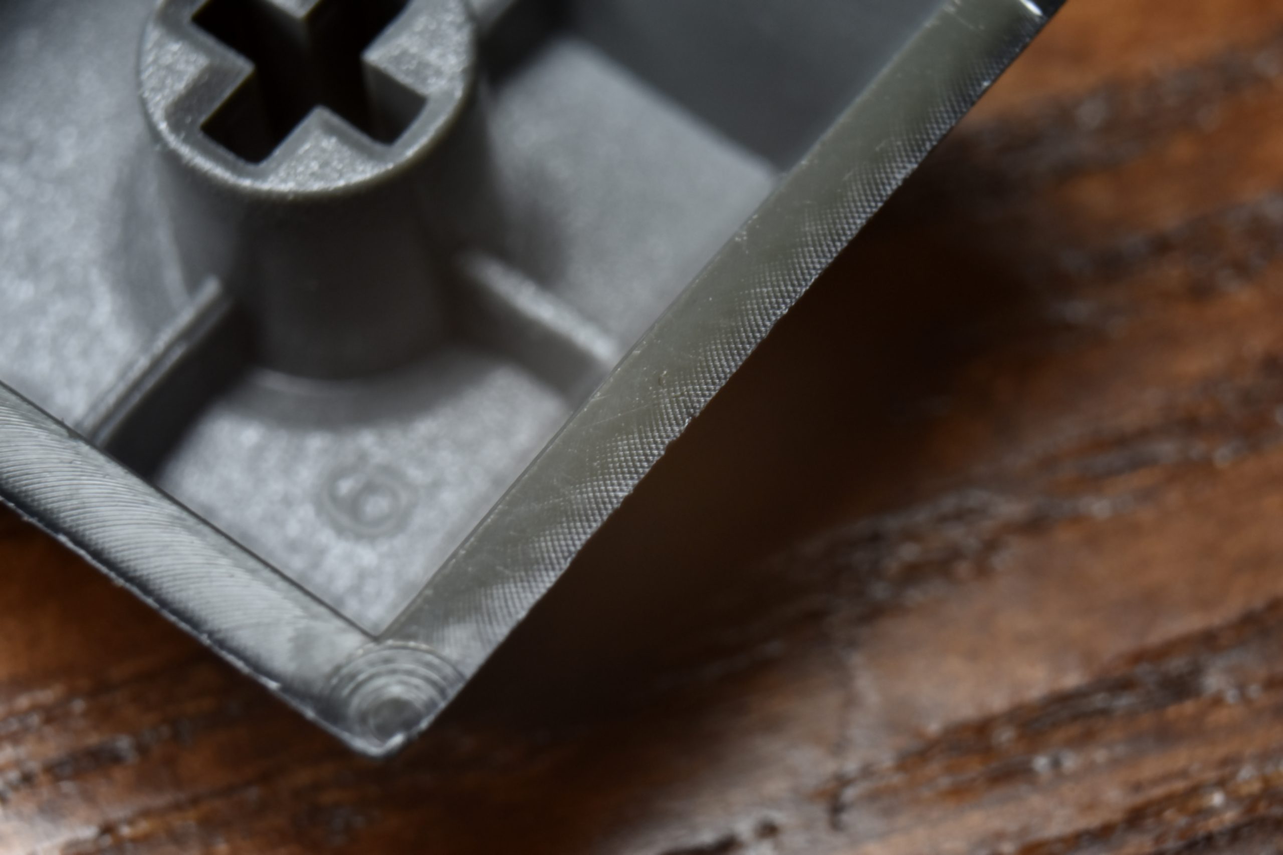
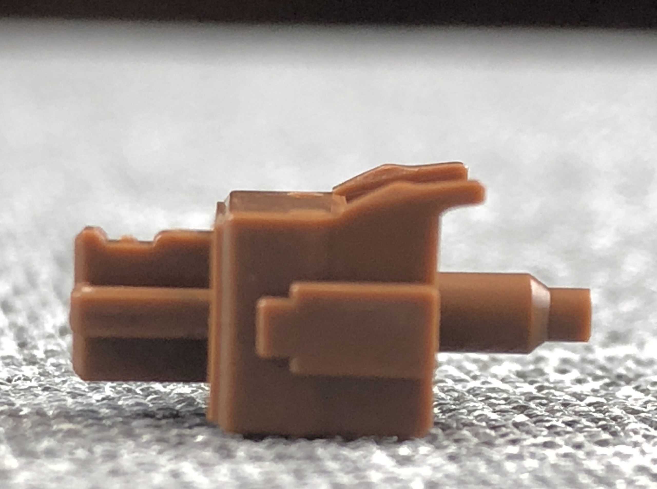
Another angle on the stem; you might be able to see how the bump portion of the stem rails narrow a bit in a sort of bevel; I suppose this reduces the surface-area in contact with the leaf, thus reducing friction. As far as I’m aware, this feature exists on all KTT-made tactiles.
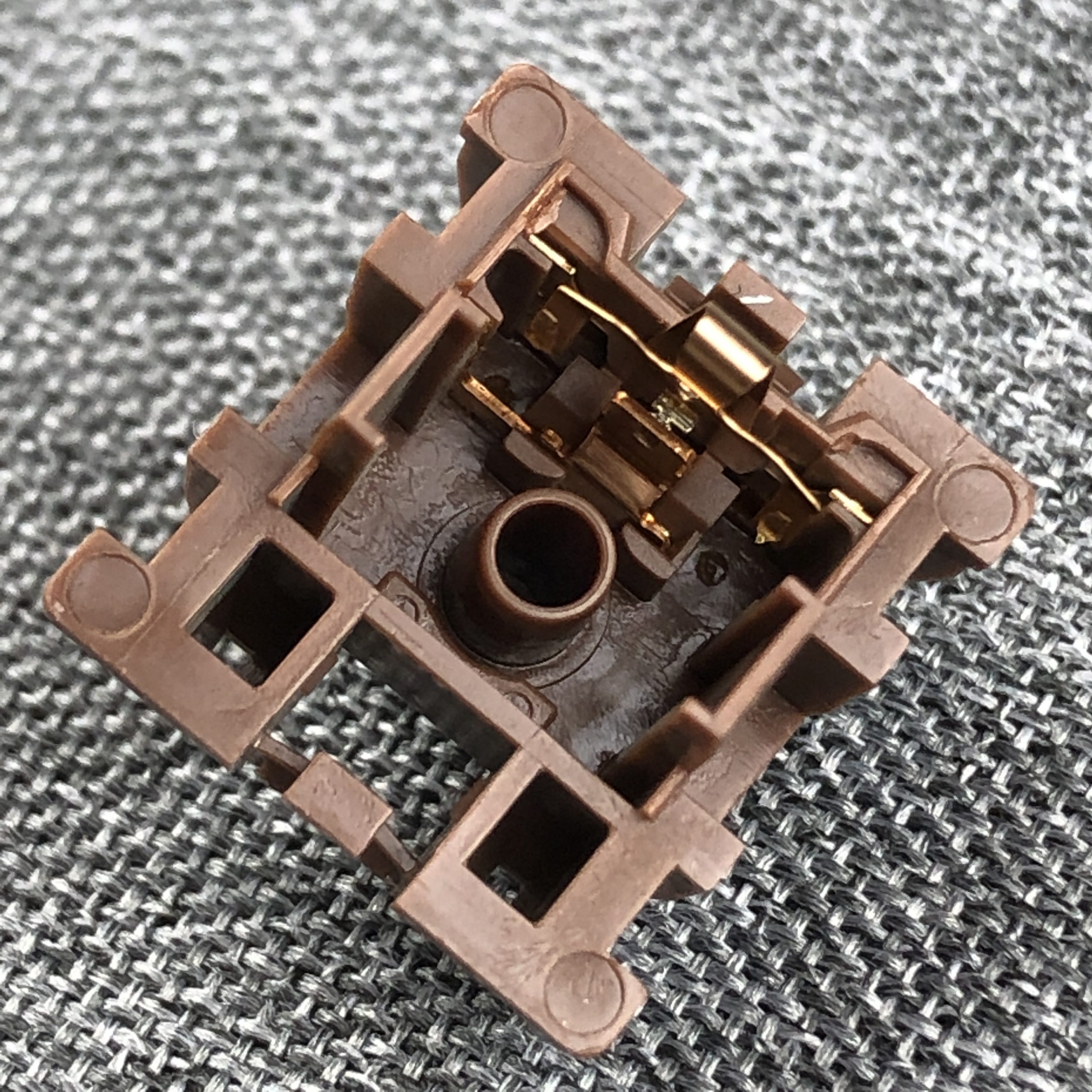
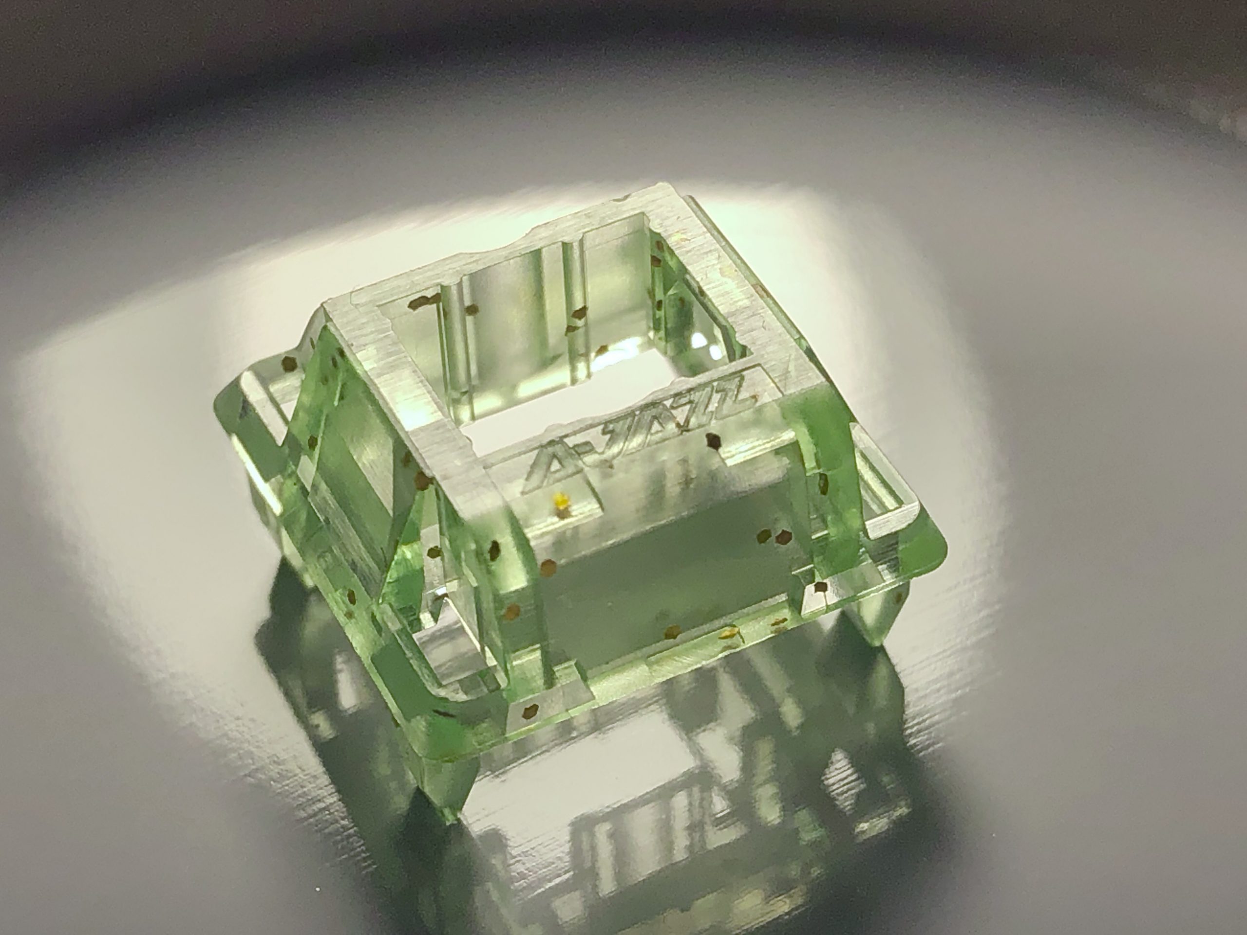
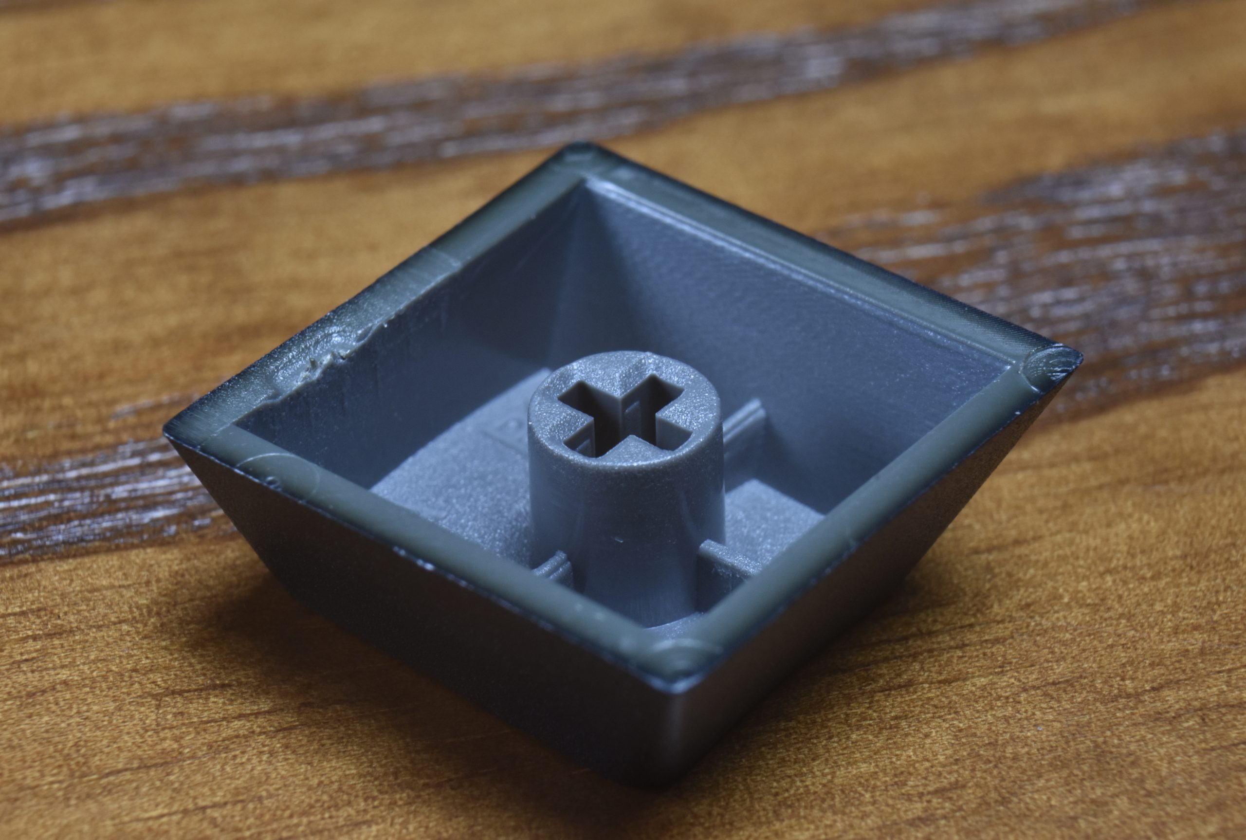
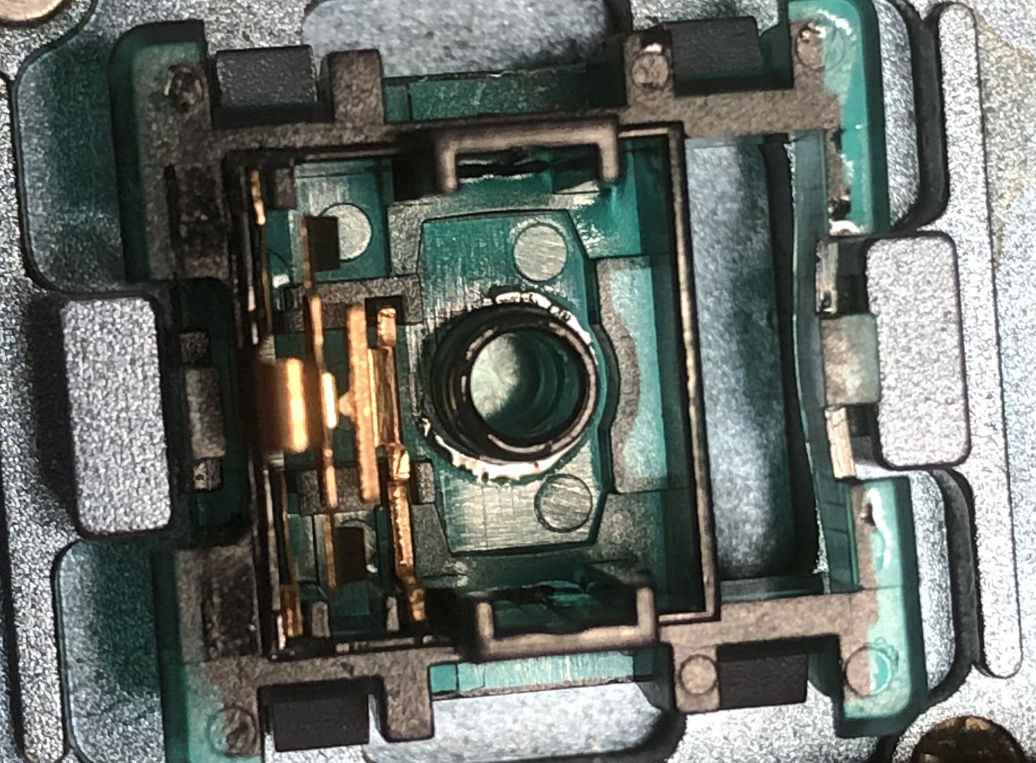
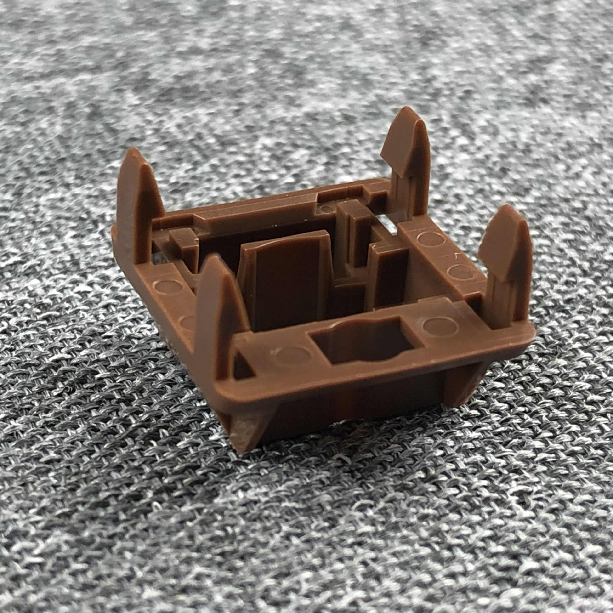
The bottom housing, more or less straight-on
Another angle; note the little dab of grease on the leaf where it touches the stem.
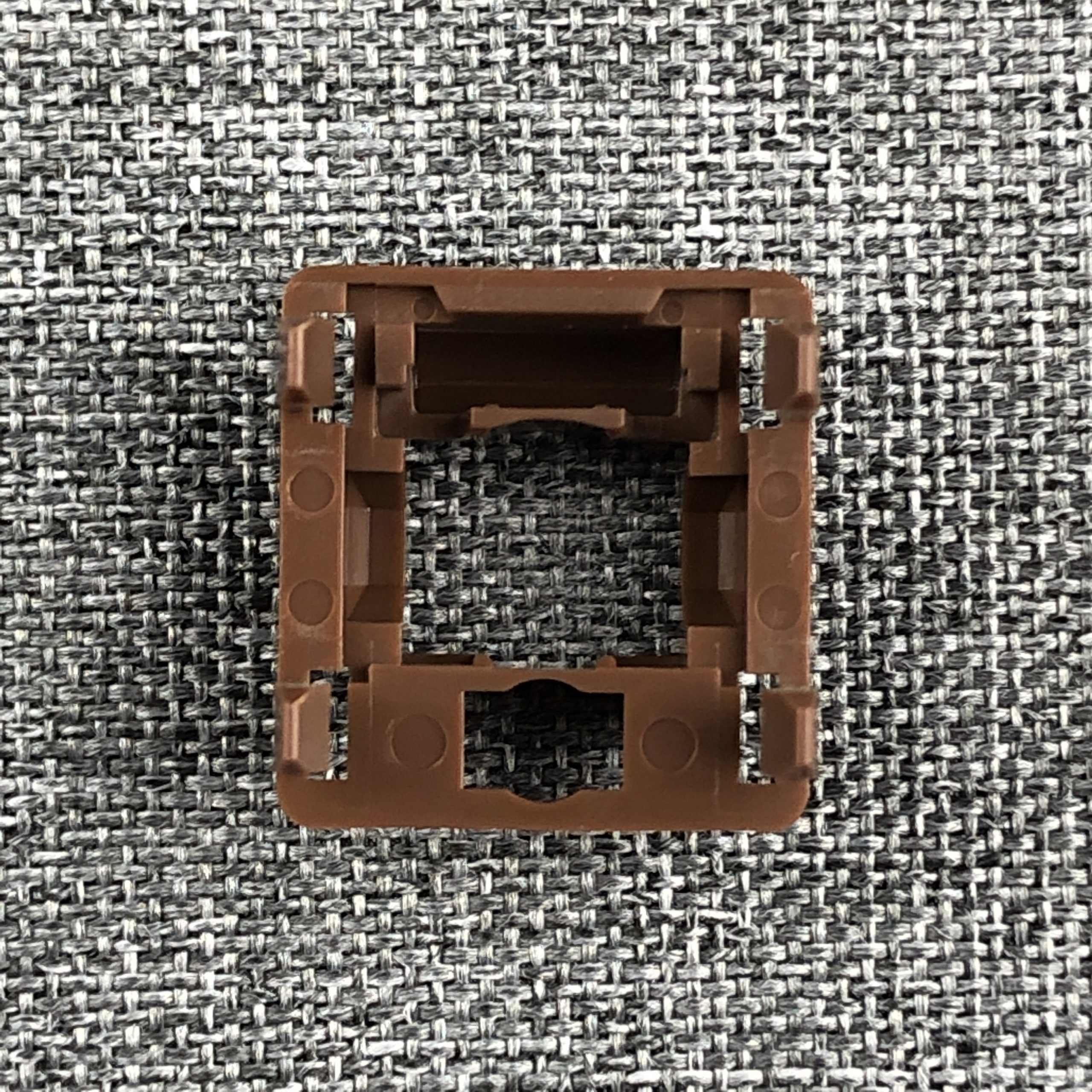
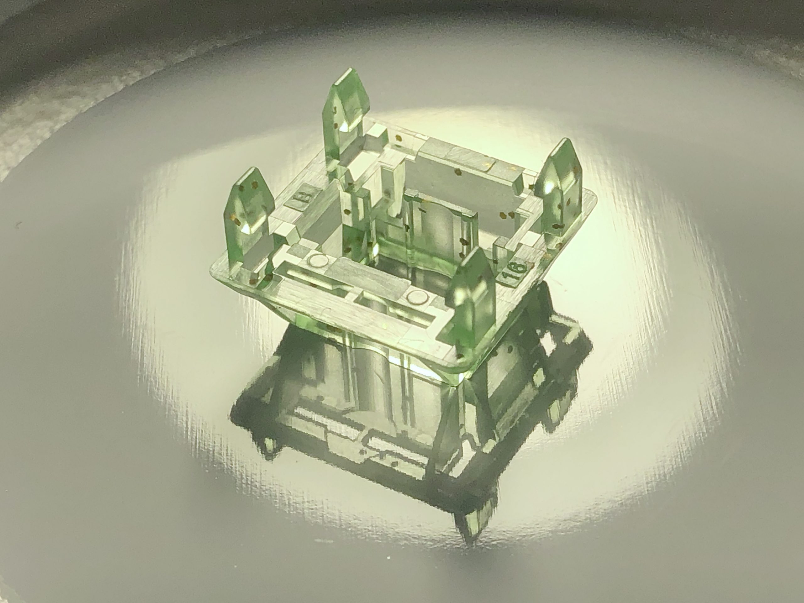
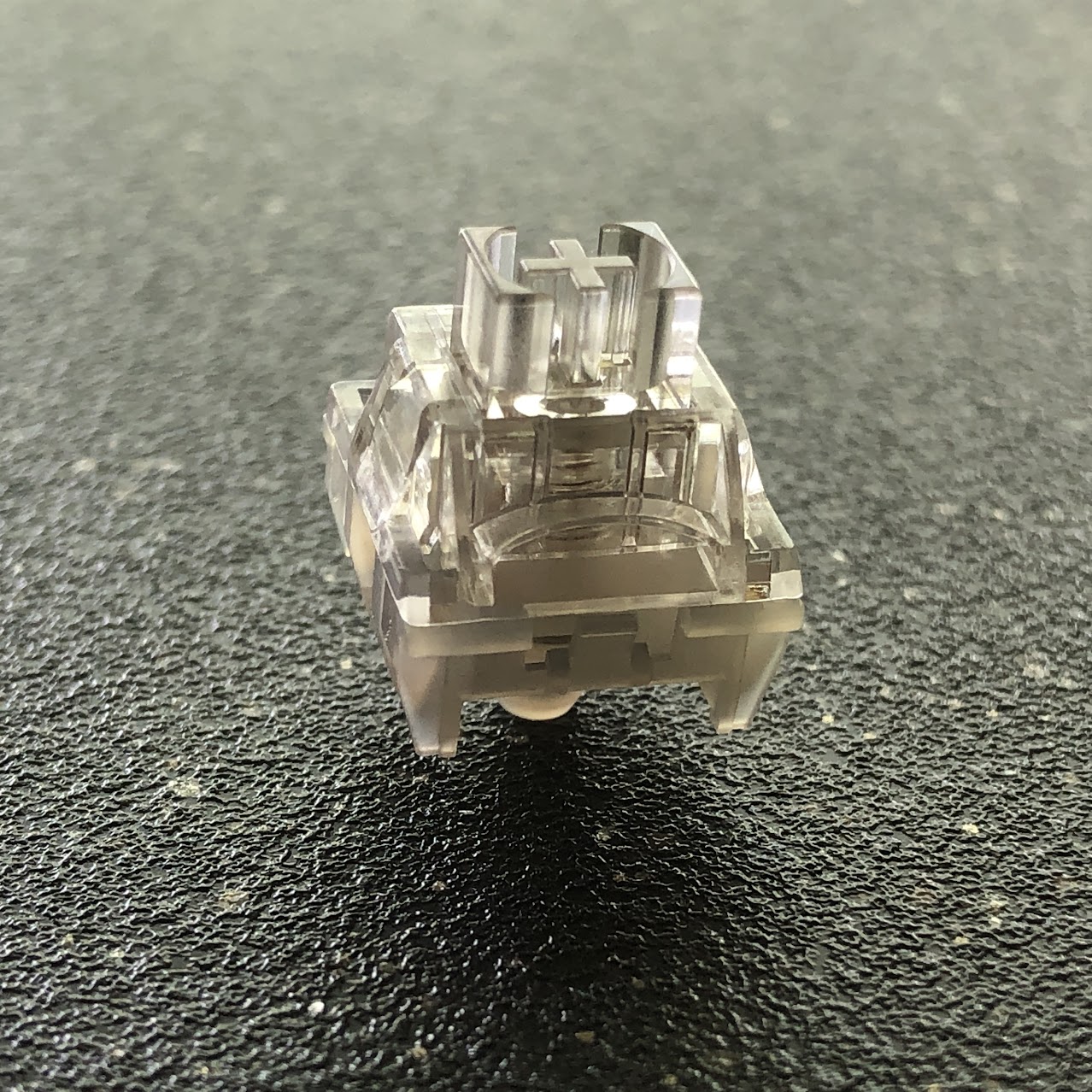
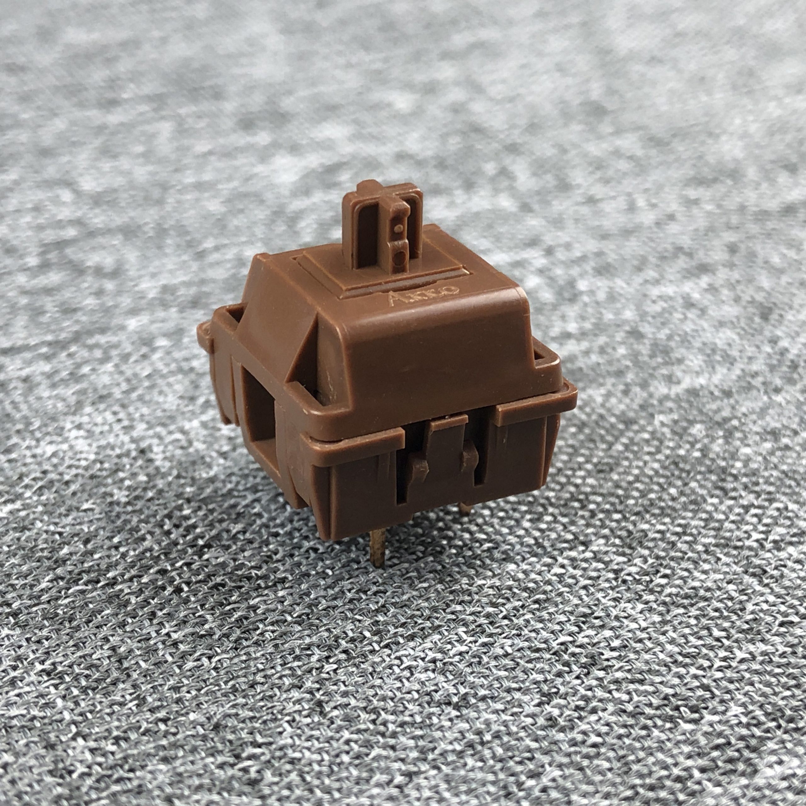
The top housing from above
From another angle
Reliability & Caveats
This is a section where I talk about functional reliability, and consolidate any other caveats that may have come up in any other sections into a list of suggestions for potential improvement.
Consistency:
If there’s any significant inconsistency here, I haven’t noticed it. There might be an occasional housing top not quite as tight as the rest, a spring a little more jiggly than its neighbors… but I’m grabbing at straws. I’ve got nothing to write here and that’s a good thing. A-.
Functional Reliability:
I’ve been using these for well over a month, and I can’t say I’ve experienced a single issue with them. Every single rare extra letter I can attribute to my own nerves and/or over-caffination. These get a clean A+ from me for their flawless track-record and excellent off-center stability.
Other Caveats:
These are three-pin, plate-mount switches – so they aren’t going to be a good choice for a plate-less build. They aren’t the best for surface-mounted LEDs, but do have a little square window so they aren’t the worst, either. That’s about it. These get a solid A- on compromise.
Suggestions for improvement:
Genuinely, all I’d ask for is a 5-pin option.
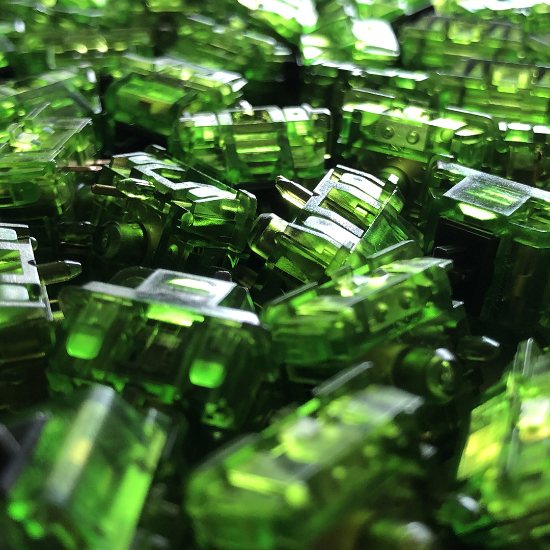
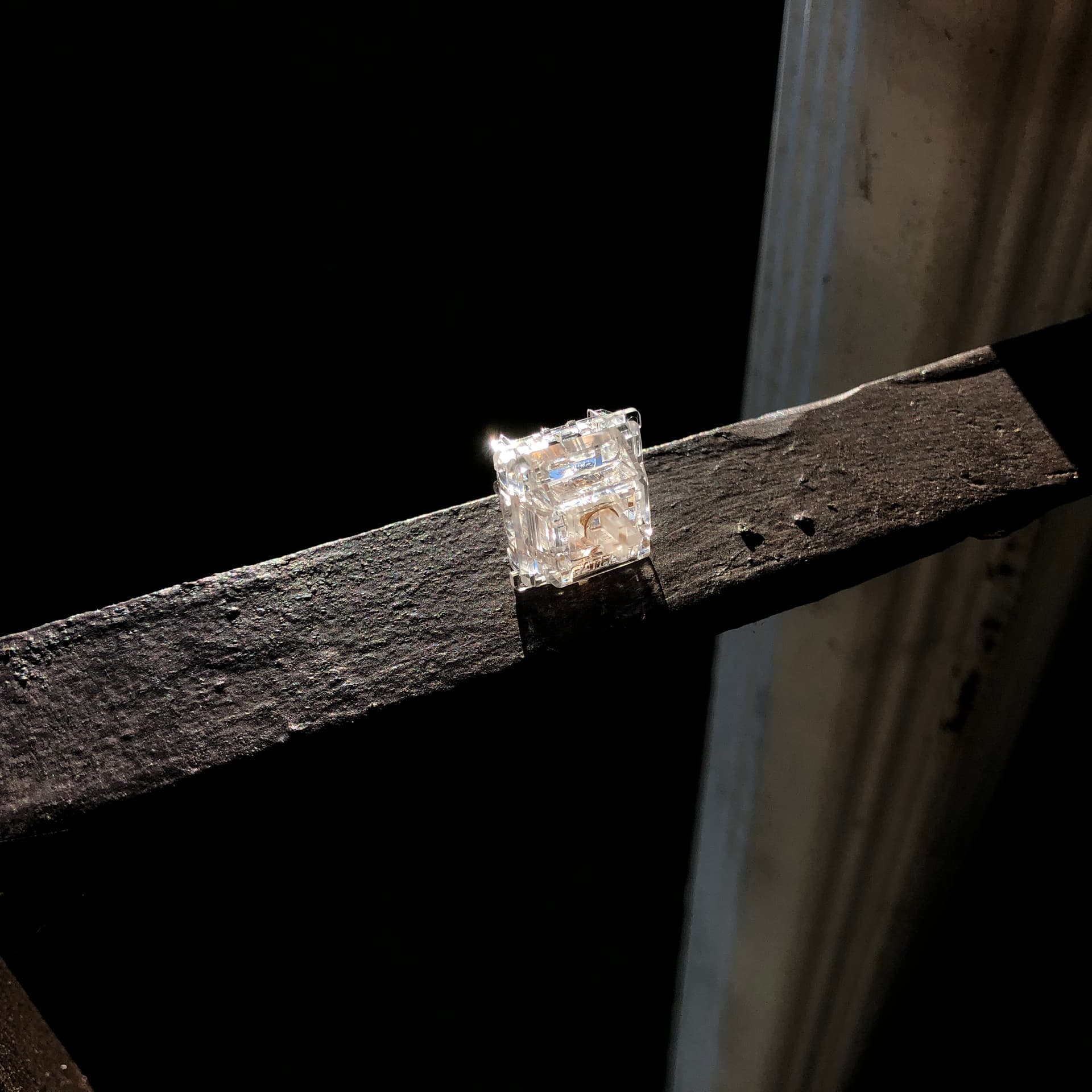
Another look at this tasty bon-bon of a brown
Value
At around 50 cents per switch depending on where you get them, these are priced comparably to Cherry MX Browns and land pretty middle-of-the-road. For the stock quality on-offer, especially in the category, I think these easily earn a solid A for value.
Comparisons
I haven’t included this as its own section in most of my reviews so far, and I have this switch, where comparison is especially relevant, to thank for reminding me to include it moving forward. How could I not have a section comparing the (visually) brownest Brown to at least a few other Browns? I have force-curve graphs for some of these, but not all – for those that I do, I’ve included an overlay comparison like with the classic MX Brown above.
Akko POM Brown recap comparison notes:
While they have the characteristic “snickity” sound of MX-pattern light tactiles, they are notably free of ping, ring, and rattle. In fact, these are some of the most clean-sounding light tactiles I’ve yet used. They have a sharp, fairly high-pitched clack. While I don’t consider them harsh in the POM plate build I’m using, it’s easy for me to imagine folks who don’t prefer brighter sounds in their boards to be put-off by these.
Also of note for this comparison: the bump profile on POM Browns is somewhere in between the fully-centered traditional brown, and the topped-out T-shaped “negative” bump of switches like the Ink Kangaroo or BOX Royal. With a bump this light, though, that distinction doesn’t stand out as much as it might on those aforementioned examples.
BRB, gonna eat some chocolate
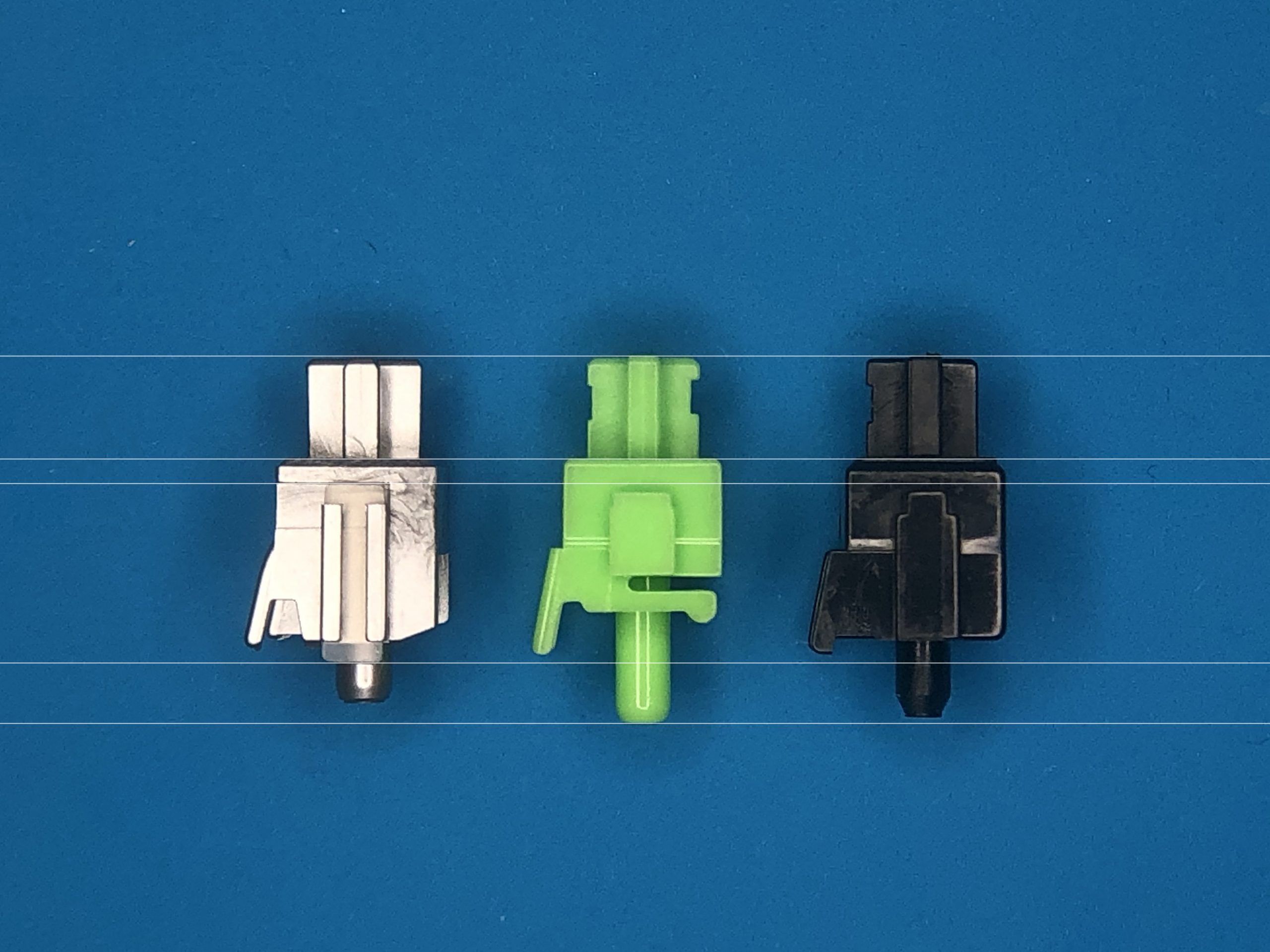
Comparison to other browns:
Cherry Brown: The literal format-setter for MX light tactiles. Compared with the APB, these have a less definite bump that’s more towards the middle, more scratch, a lot more metallic noise, and a slightly less-hard bottom-out. Also less stable.
This is an RGB version, salvaged from an ASUS number pad.
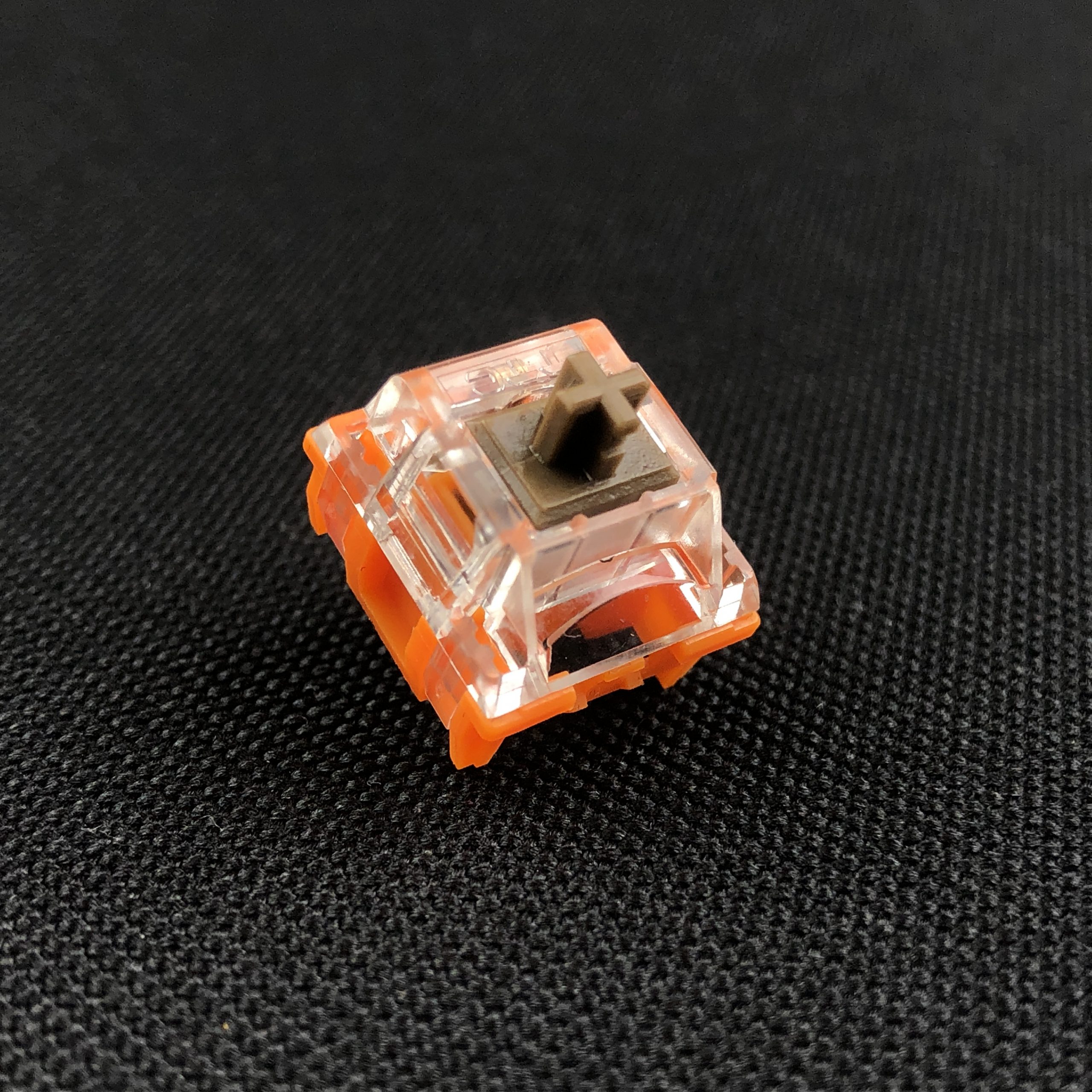
Orange: Cherry MX Hyperglide Brown – I used this version here since it’s the one currently being made and sold. Note the “notch” near the beginning of the bump; I believe this is intentional to give a more confirming feedback, but I think it may also make them feel a bit more crunchy or noisy.
BSUN Brown: A typical clone. Similar to the Cherry, but a little chunkier throughout. That is, a little heavier and with a more clearly-pronounced tactile bump. Comparable scratch and grain, but notably less metallic noise. (That said there is an occasional crinkle from one of the metal parts.) Compared with the APB; more scratch, less stability, more pronounced tactility lower in the key travel, deeper clack, less clean. I only have a sample or two of these but get the sense they’d be pretty satisfying when tuned, but in stock form feel unrefined next to the POM Browns.
I got this sample from SwitchOddities.com
Gateron Brown (standard): The classic clone. Compared with the APB, these also have a less definite bump, if more-so than Cherry’s, and only due to less adjacent noise in the travel. Same story with scratch; this one lies between the Akko and Cherry offerings. These are also a little less stable than the Akkos, but these days, more than the Cherries.
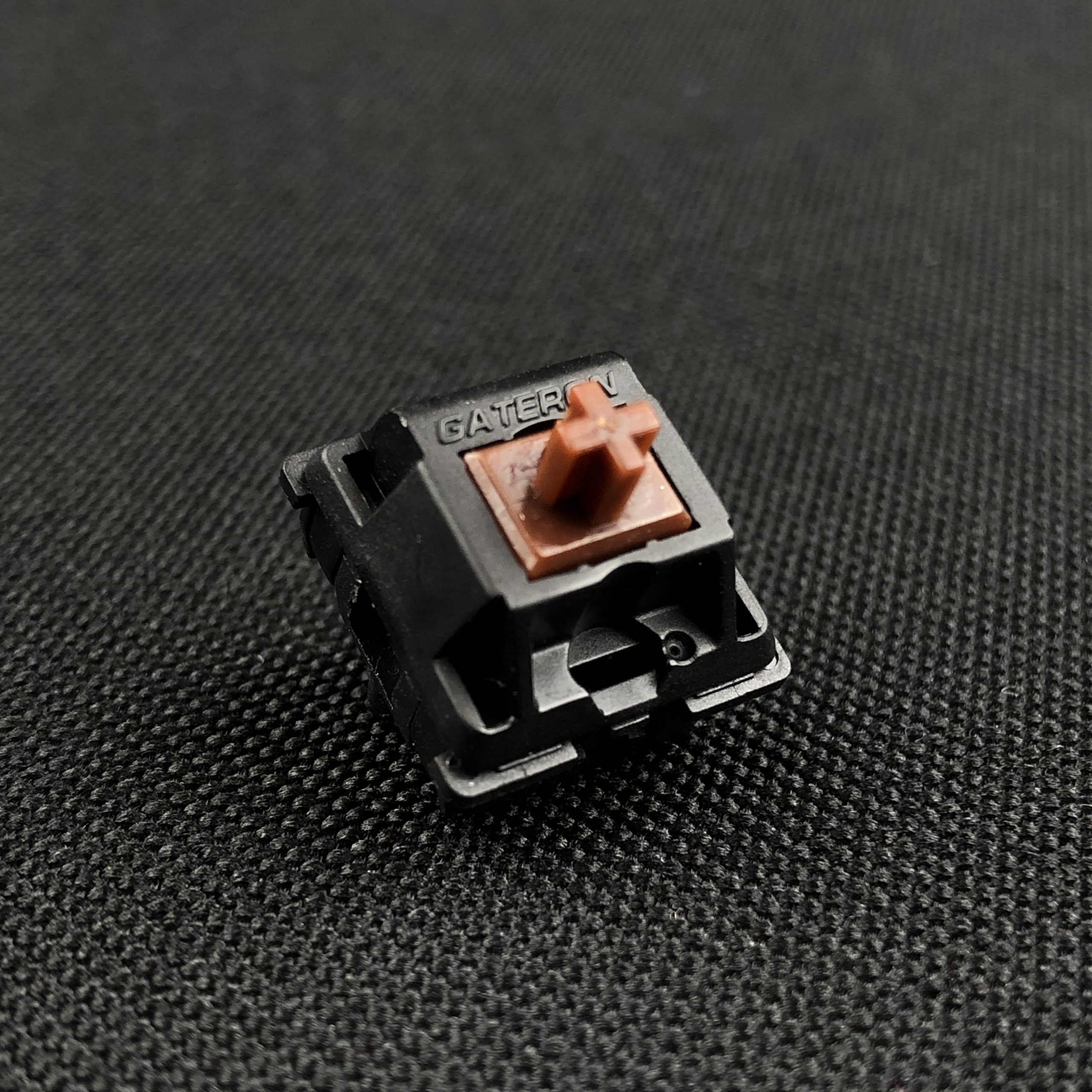
The basic all-Nylon version
Gateron G Pro Brown: The classic clone upgraded. This is only one of two browns on the list with any qualities I’d call “better” than the Akko: notably perceived smoothness. The Akkos are plenty smooth, but these feel buttery without any harshness. This has a slightly less definitive bump than the Akko despite its more abruptly steepening curve. It also has more wobble and a more muted bottom-out. Like the other more traditional browns, this one has a centered bump – though it’s worth noting it starts later than Cherry’s.
Green: Gateron G-Pro 2.0 Brown – I used a 1.0 for my testing comparison, but only have a graph for the 2.0 – close enough!
There’s an occasional odd metallic report from these, but on the whole they are comparably clean to the Akkos. Maybe a bit less consistent but also less sharp overall. Put another way, they feel softer. Honestly a little too ethereal for me and my modestly clumsy fingers, but seem like they’d be a delight for light tactile enjoyers. Aside from an old MX Brown board, this is the only switch on the list I currently have in a full board besides the POM Browns.
Version 1 – the new ones have even better lubing and a condenser lens instead of a slot for the LED.
Greetech Brown: A generic clone. Pretty similar to the Cherry it’s copying, if even more noisy when stock. These aren’t bad switches, but in stock form are inferior to POM Browns in just about every way. Lots more scratch, more wobble, definite spring-rattle, less clean overall. The bump is a little more pronounced but still mild. Like Cherry, these have lots of tuning headroom – but need that tuning to be worth putting in a nice board, where APBs are above average right from the box. (Also, they come in a box.)
¯\_(ツ)_/¯
Kailh BOX Brown: The brown re-interpreted. This one is middle-of-the-road in many ways, except when it comes to cleanliness and complexity. That is, the higher moving part count makes for more “information” in the feel and sound. There’s not as much scratch or ping as you’d get from a stock Cherry, but there are more sounds being made by the switch at once overall, mostly the pusher against the stem and housing. I think this makes these feel extra “mechanical” – and while I wouldn’t call this noise objectively bad by any stretch of the imagination (I actually quite like it), I also can’t call it “clean” – so Akko still gets the point there.
See what I mean about “complex”? Actually a graph for the 2.0 version, but I don’t think the tactility as too different. Another thing of note here; the tactile peak is significantly heavier than the spring weight, but is also very early in the travel, so might not necessarily force a bottom-out.
Like the APBs, these have “negative” tactility, also called a top bump or T-shaped bump. Also worth noting: these are less consistent than Akko POM Browns in pretty much every way – so if that matters to you, these are not the move. BOX switches also tend to have just a hair of resting cap twist, which I’m pretty sure is a flaw in the design or manufacturing process.
This one has a black bottom, having come from a hotswap OEM board, but is otherwise the same as any other BOX Brown.
Reccazr KU Brown: Easily the biggest outlier on the list that isn’t a completely different design like the BOX, even including the non-browns below. Like the BOX (and unlike the APB), this switch has negative tactility – meaning bump starts right at the top, and you push through it to start the switch moving. It probably has the most full / deep sounding clack on the list. It performs similarly in terms of smoothness and wobble to the APB being from the same factory, but the tactile event on this flavor of brown is more punchy than most anything else mentioned in this review.
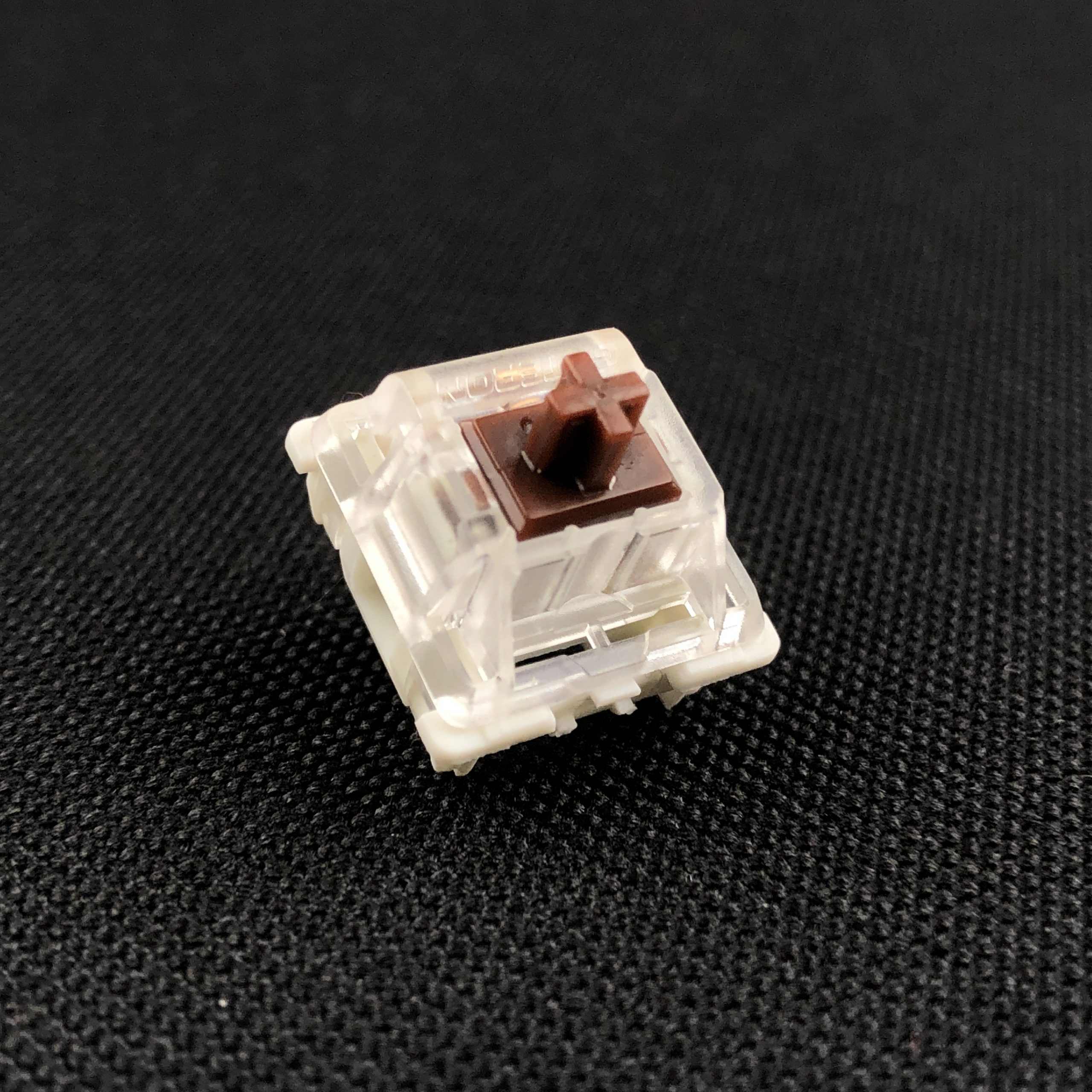
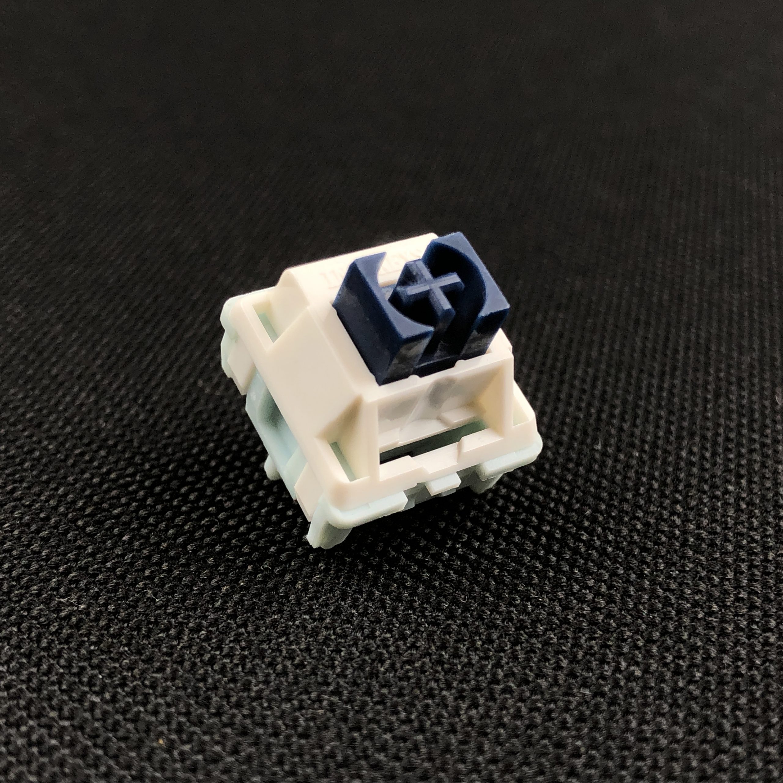
Tan: KTT R. KU Brown. These are almost the same save for the first bit of travel, and that changes a lot. This is an excellent illustration comparing negative tactility vs something closer to standard.
I’d place it comfortably in “medium” territory, if on the light side of it – there are plenty of tactile bumps out there that dwarf this one, but not in the world of “browns”, and definitely not the APB. I happen to think this is a fantastic switch in general and is on my short list of samples I want a full set of, but my recommendation of it will always come with the asterisk that it’s a different experience compared with the otherwise fairly same-y field of brown switches that more or less aim for the same light tactile experience.
I don’t know how to say it, either.
TTC Gold Brown V3: The aspirational clone. A fairly familiar brown with lots of tuning potential, but fairly dreadful stock performance when it comes to cleanliness. Harsh and rattly out of the bag, these will reward the hard work and patience of lubing. A thick oil or thin grease on these will give you a buttery light tactile you’ll want to use all day.
Gold, baby.
TTC Gold Brown Pro (V4): The ascendant clone. Evolution of the Gold Brown V3; essentially a pre-tuned version with further revised tooling. In very sparse company with the G Pro Browns, the Gold Brown Pros aren’t only similar in-name – they’re both competently pre-tuned light tactiles with very good if not quite perfect performance from the factory. If you like the cleanliness and top-bump of the Akko POM Browns but wish the collisions were less harsh, this is a great stock light tactile option.
I like these.
Comparisons to other light tactiles:
Invokeys Blueberry Chiffon (un-lubed version): The hipster adjacent. While I also consider these to be exceptional light tactiles alongside APBs, they still sit a notch below in my personal ranking system – at least when it comes to the un-lubed version. The bump is extra crisp and discrete with the IBCs (and it’s in the middle), but it’s not as clean.
Light but very crisp and well-balanced with the spring. Noisy when unlubed, but the whole point of that version is for people to lube their own.
Shorter than most MX bumps, but not sharp like a click-bar or anything. In their dry state, these things are understandably straight up *noisy*, owing mostly to ping – probably the farthest thing from “clean” on this list. They are, however, quite stable – on-par with the Akkos if not better.
Aflion made these.
KTT Mallo: The older sibling. KTT is the manufacturer for Akko POM Browns, and I’ve also known them as a manufacturer that makes above-average light tactiles that generally have a single flaw, leaf noise. I’m happy to report that APBs have all but completely eliminated that noise while retaining everything else I loved about the Mallos, which are otherwise fairly similar. The Mallos, of course, don’t have housings made of POM. These are similar-feeling to POM Browns, but are a little more metallic and less clean.
Inspired by Peeps!
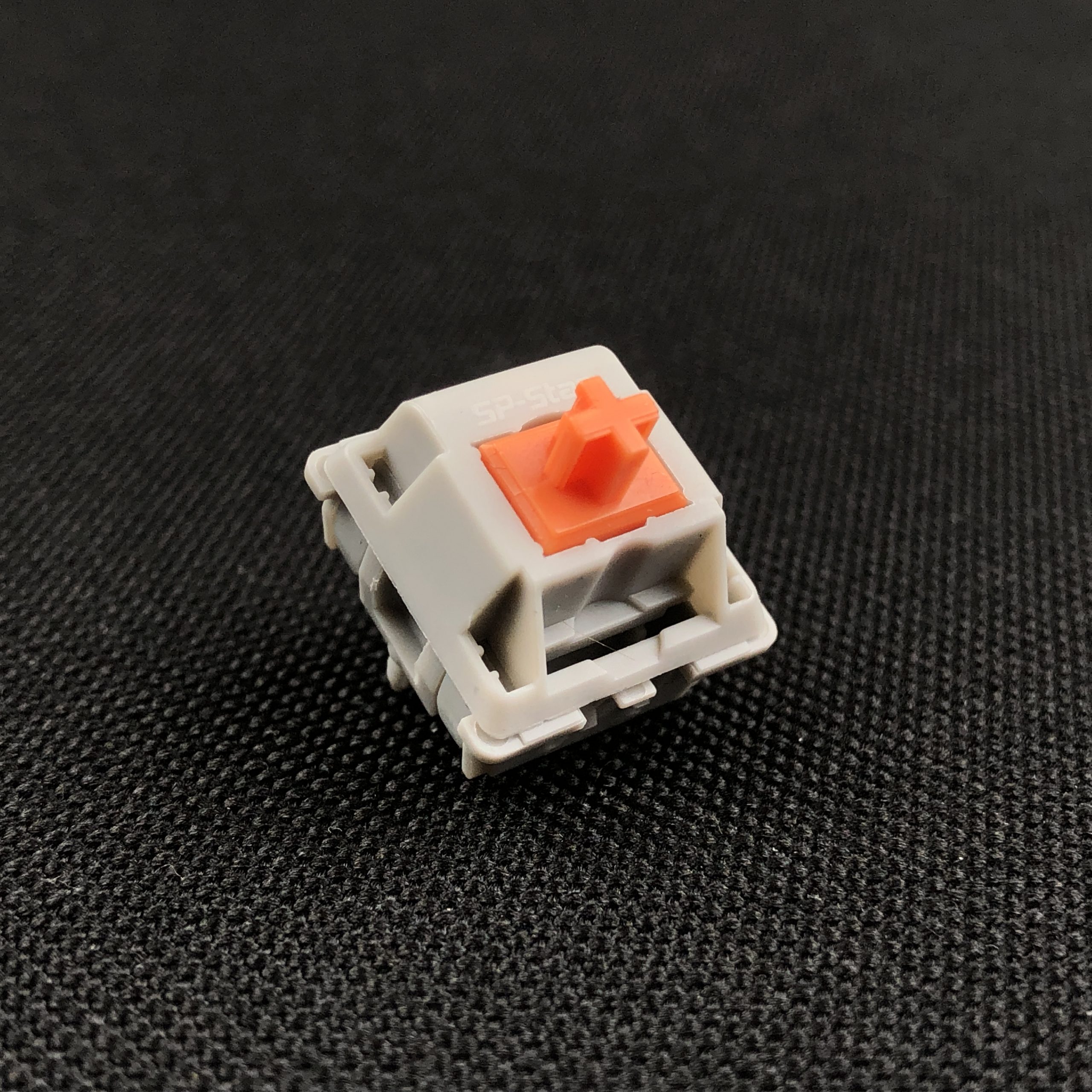
SP Star Meteor Orange (gray housing): Slightly heavier and more pronounced than some of the other browns – in similar territory to the BSUN, not as much as the Reccazr. Still closer to a typical brown in weight and intensity than most tactiles around these days. All-Nylon like the standard Gateron and Greetech above, but more smooth and clean than either – and in fact most on the list. You get some Nylon grain and some ring on harder bottom-outs, but the switch is notably light on errant noises like rattle, crunch, or crinkle. Thanks to its much deeper, more calm sound signature, I think I might actually prefer these to the APBs.
These are really nice.
Section Dinkus
While that was a lot of browns, that wasn’t even close to all of them. The topic of browns deserves at least one of its own articles; that in mind, I tried to stick to popular or otherwise common examples that readers may have encountered before – or that may appear in one of the increasingly common sample testers offered for sale by various keyboard vendors. The Akko Pom Brown is at once an exemplary and an outstanding example among its umber brethren.

Image credit: Gordon Johnson on Pixabay.com
Recap & Conclusion
An overview
It’s familiar with enough distinction to stand apart. It’s smooth with subtle weighting and tactility. It has a sharp, clean clack. I don’t know if I can pick a favorite brown switch, but if I had to, Akko POM Browns would be on the short list. It’s an exceptionally clean light tactile available at a refreshingly standard price. If you’re in the market for a brown or a light tactile in general, these are definitely worth considering.
Aesthetics: A
Sound: A
Smoothness: A+
Overall Stability: A
Housing Fitment: A
Cap Fitment: A+
Off-Center Performance: A+
Weighting / Balance: A
Familiarity: B+
Consistency: A-
Reliability: A+
Compromise: A-
Value: A
Overall subjective score: A+
I’d been wanting to try these since they came out, and once I did, I didn’t want to take them out of my tester board. But life must go on, there are other switches to test! Very much as a new favorite, Akko POM Browns go back on my shelf… for now.

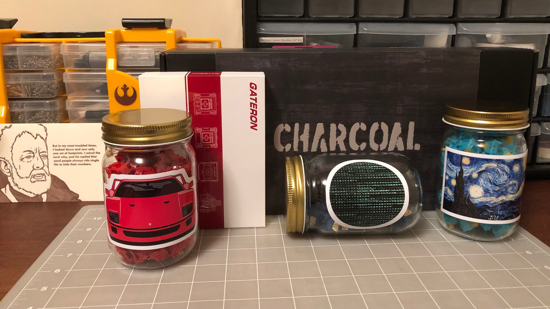
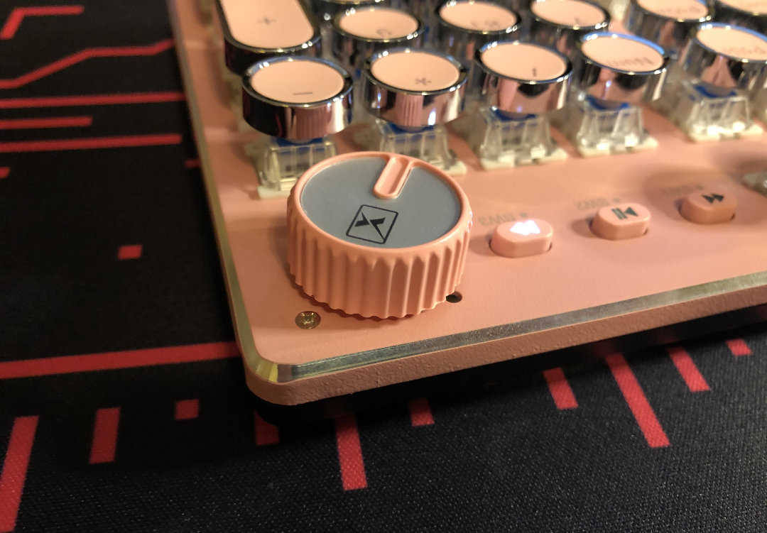
How I store these when not in-use
The light weight takes a little acclimating for me, sometimes repeatedly – but these have to be some of the most pleasant to use light tactiles right out of the box I’ve tried.
Alright! That’s all I have to say about the Akko POM Browns for today. Thanks so much for reading, and have a good one!