Who is This For ep. 1 • Xinmeng X9VR Keyboard & Mouse Bundle


Word-up: All the links in this article are affiliate ones that I only want you to use if you’re genuinely curious about or interested in what’s behind them. Disclosures and formalities accounted-for, let’s get right into it!

Oh, yeah.

Welcome to the first in my new series of review articles I’ve decided to call Who is This For? – today we’ll be looking at a full-size pre-built mechanical keyboard and mouse bundle, graciously provided for review by MechDIY.com – even after I said they could expect my honest opinion, positive or negative. High-five for being a good sport! I’ve spent a bit over a week with the pink peripherals as daily-drivers, and I’m happy to share my thoughts about them.

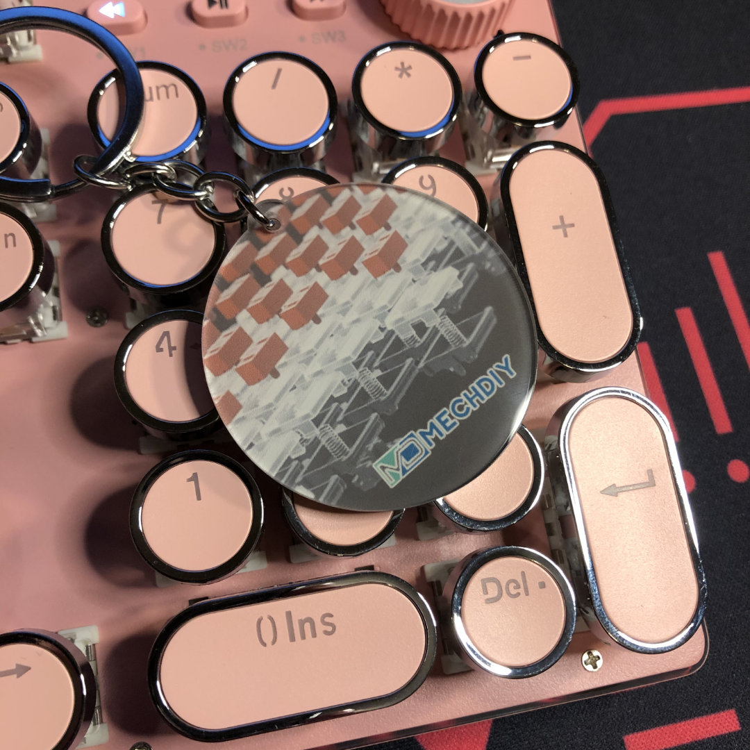
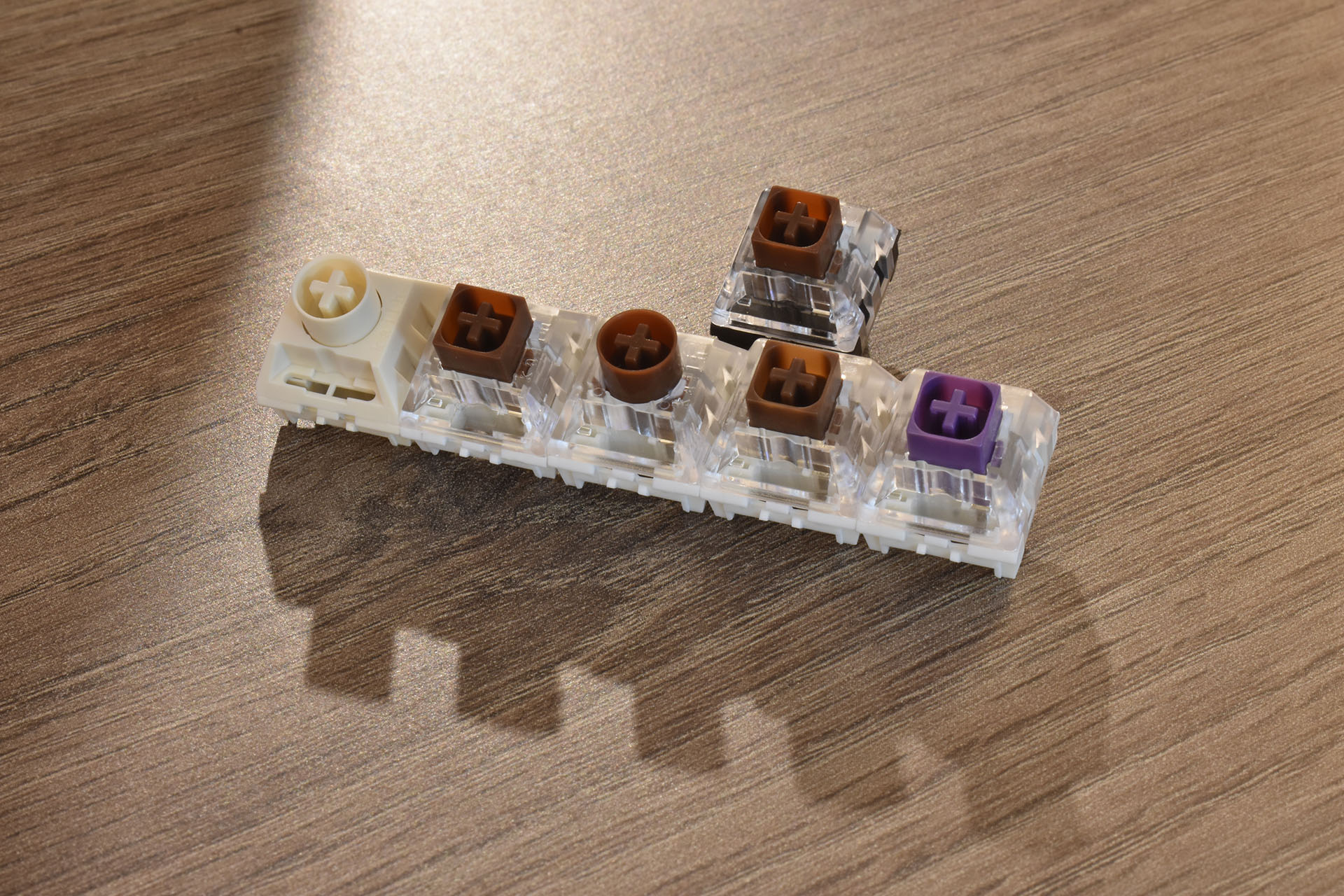
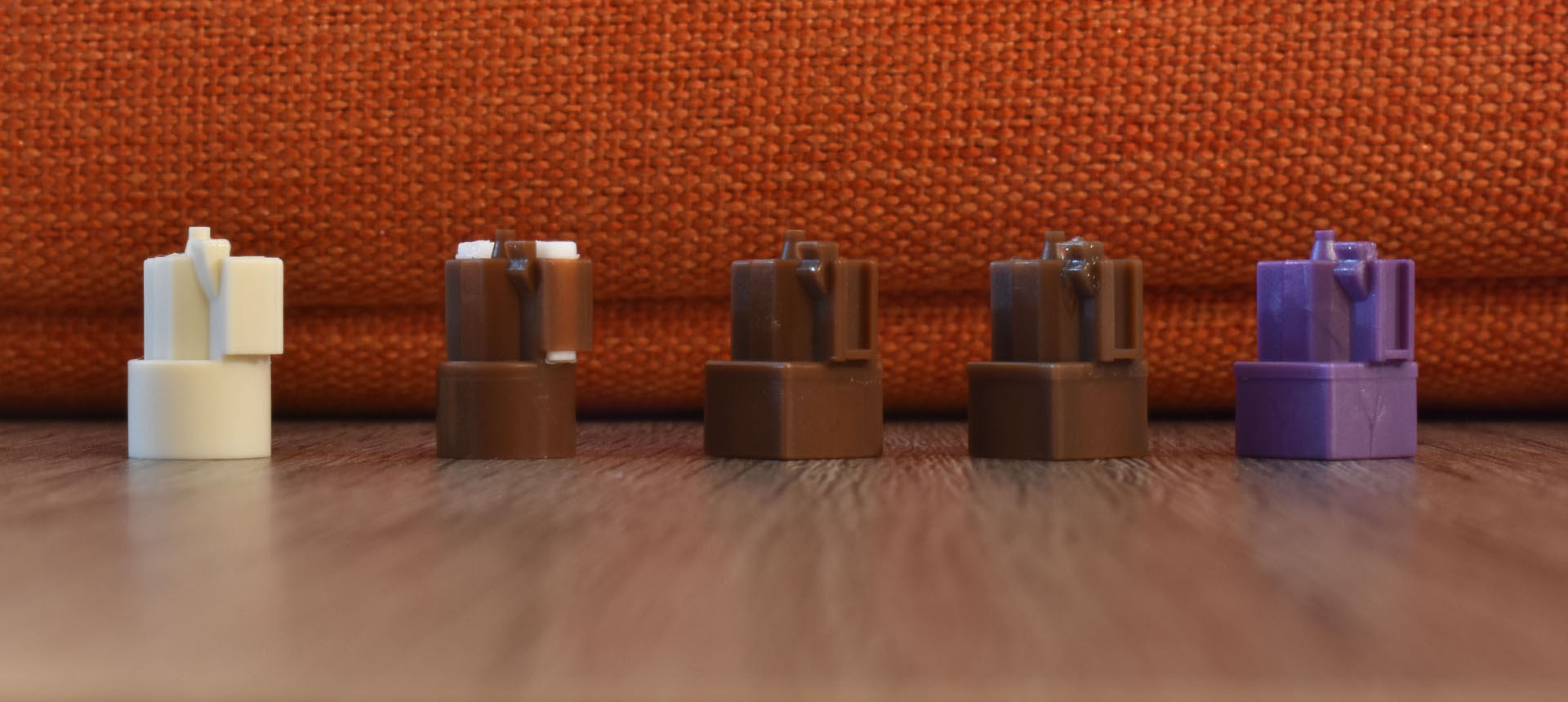
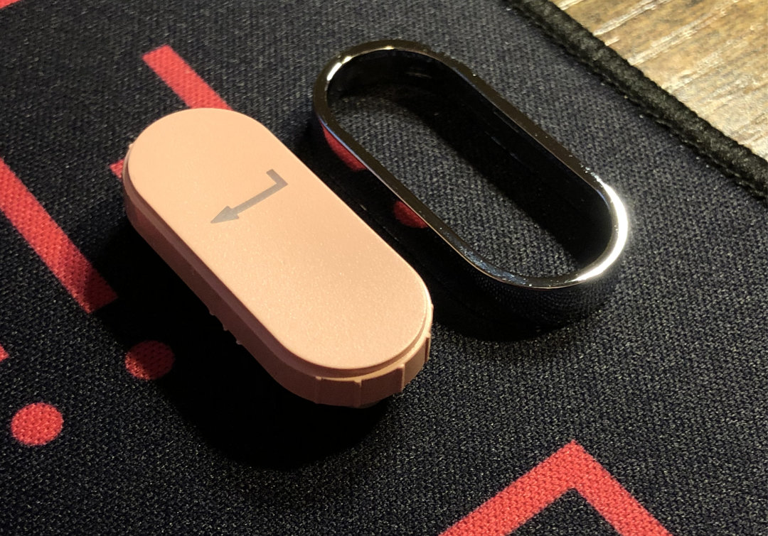
A neat little promo keychain, showcasing some Kailh Chocs. Thanks again to MechDIY, today’s enablers – er, sponsors!

I’m going to take a look at the mouse first, since this is a keyboard focused website, and I have quite a bit more to say about that part of the package.
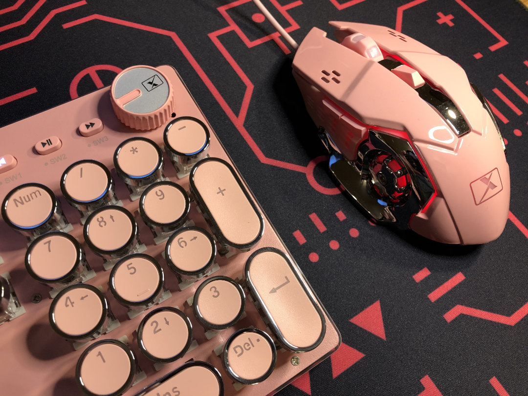
The Mouse:

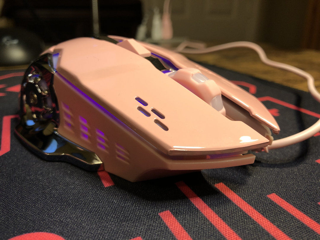
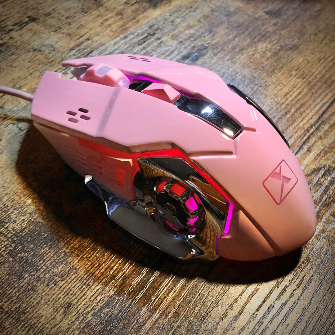
Autobots, roll out! …to the nail salon!

For a pack-in, it’s surprisingly suitable as a gaming mouse. The aesthetic is a mashup of Michael Bay and Mary Kay – perfect for D.va mains and the most fabulous Transformers. It has a color-matched cable with a branded USB-A plug and a glossy finish; available in dream-house pink or baby blue. It also has a readily accessible DPI switch right behind the scroll wheel, which itself is just as stylized as the rest of the mouse.

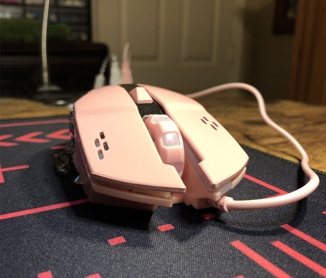
The wheel might be the highlight of this mouse.

Speaking of scroll wheels, this one is quite nice. It has plenty of texture with raised rubber covering the plastic in alternating ridges. The wheel has mild but clear indexing as it turns. It’s easy to scroll with being a nice, large wheel with just enough resistance. The middle-click is crisp, but not harsh, and the same is true of the right and left buttons. If you’ve ever used Kailh’s red gaming mouse switches, these are decidedly more gentle.

There are forward and back buttons to the side; the travel is a little springy, but actuation is crisp. The buttons stick out plenty to feel them, and they are close together – the value of which comes down to preference. For comparison, my Ducky Secret M is also a 5-button mouse, but its forward and back buttons are farther apart, and shaped differently from each-other. On the Xinmeng, the two buttons are one shape, split down the middle. This makes the forward button more quickly accessible, but perhaps easier to mistake for the rearward one.

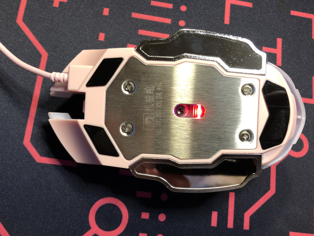
I let out a small guffaw when I saw the bottom of this mouse – maybe I just didn’t expect to see material overkill here.

It has a good weight towards the bottom thanks to a metal plate. There are wide winglets at the bottom your fingers can rest on, and it has at least an ergonomically-inspired, ambidextrous shape. The forward and back buttons are only on the left, though.

I figured this thing for a party favor, but honestly, I quite like it. Don’t get me wrong – I think its hideous – but it feels nice to use. I’m sure the skates are cheap, but they work well enough. It may not be competitive equipment by any stretch – but it’s a better mouse for gaming than plenty I’ve used.

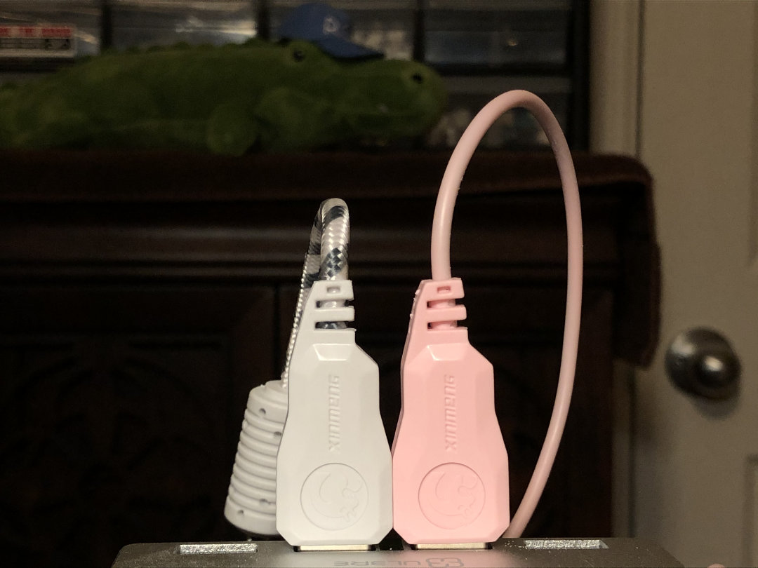
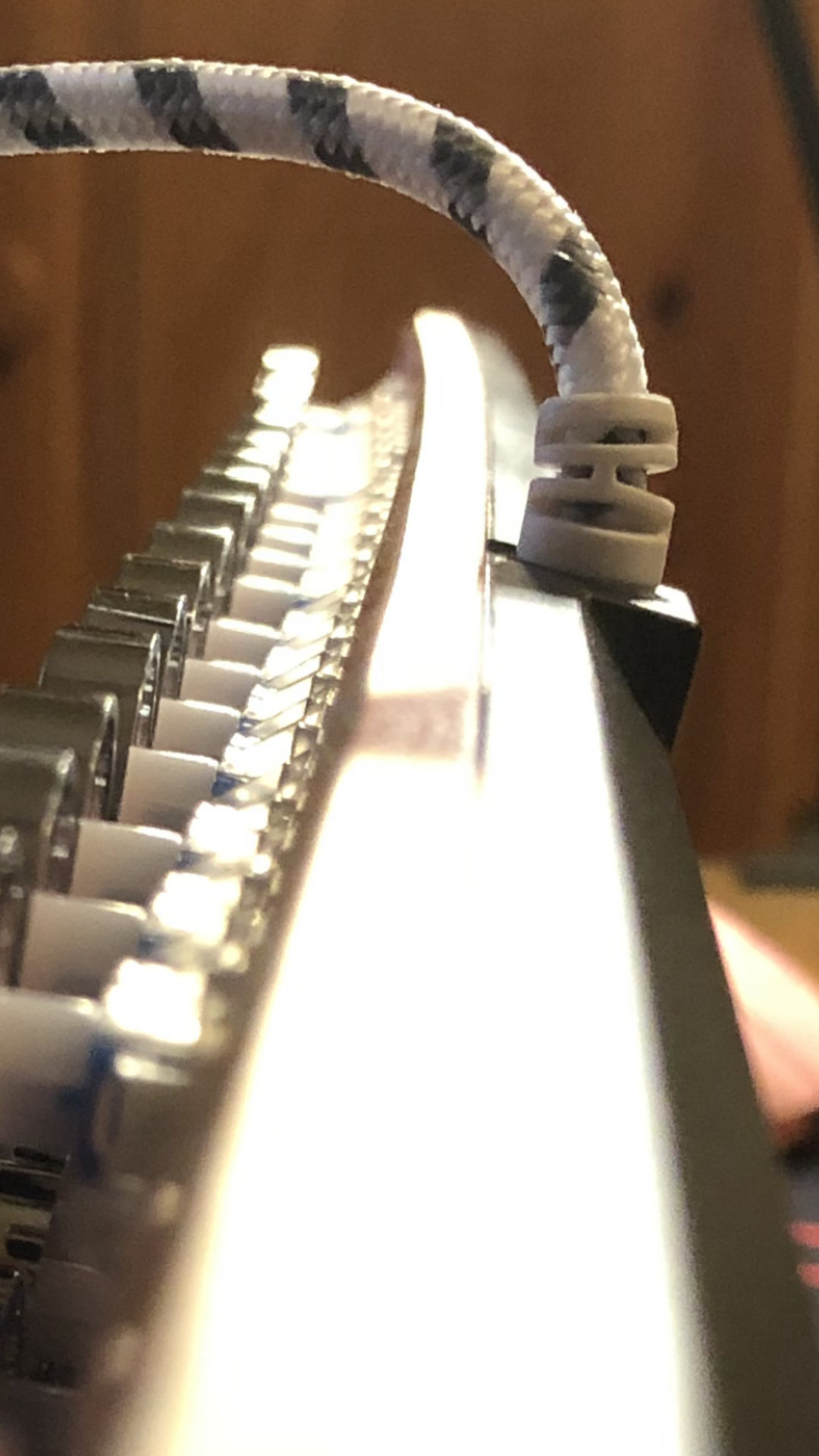
The USB ends for each peripheral are branded and match in shape, but not color; the keeb has the white one with the striped braided cable.

While the keyboard was easy enough to feel-around, and did come with a limited manual, the mouse didn’t have one – and I so far haven’t found one online. I figured out how to turn the RGB rainbow demo on and off, so far that’s it. Holding the DPI button will toggle the lighting. Seems there would be some kind of control if it has RGB capability, but I haven’t found it yet.

It won’t make you a champion, but it’ll get the job done.

To sum it up, this is a perfectly good mouse that matches the keyboard in color and no other way whatsoever. The aesthetic styling is about as far apart between the two as it could be, but at least they are color-coordinated.

Now that we have that mildly-curious pack-in covered, let’s take a look at this keyboard.

The Keeb:

Were you born in the wrong decade but can’t leave behind your all pink everything? This one’s here for you, baby.

Intro & Aesthetic Impressions

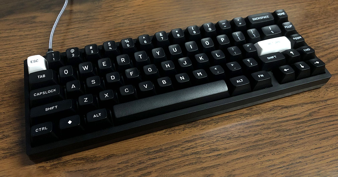
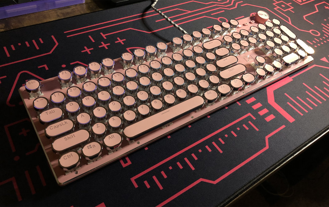
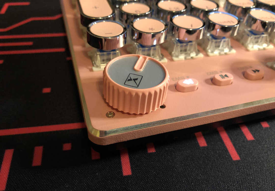
Obvious stuff out of the way first, what we have here is a full-size layout with three media buttons and a knob-with-clicker. The switches have the LED slot facing North, and have white SMD LEDs underneath, driven by a wide array of select-able effects. The knob can be switched between two modes, one of which controls the lighting, with the other controlling volume and other media functions. More on that a bit later.

Shiny. Clicky. Pink.

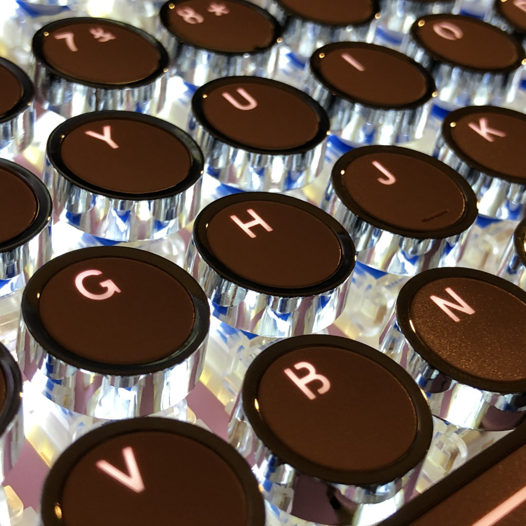
The defining quality of this board is its aesthetics; 2010’s tech with a *heavy* coat of Art Deco filtered through Mary Kay with a spritz of kawaii. Ye-olde type-writer style keys in a uniform profile with circular and pill-shaped footprints. A flat* top shell that doubles as a mounting plate, making for an out-board mounted look for the switches – I think this is actually an appropriate choice for the aesthetic, if it was a conscious choice.

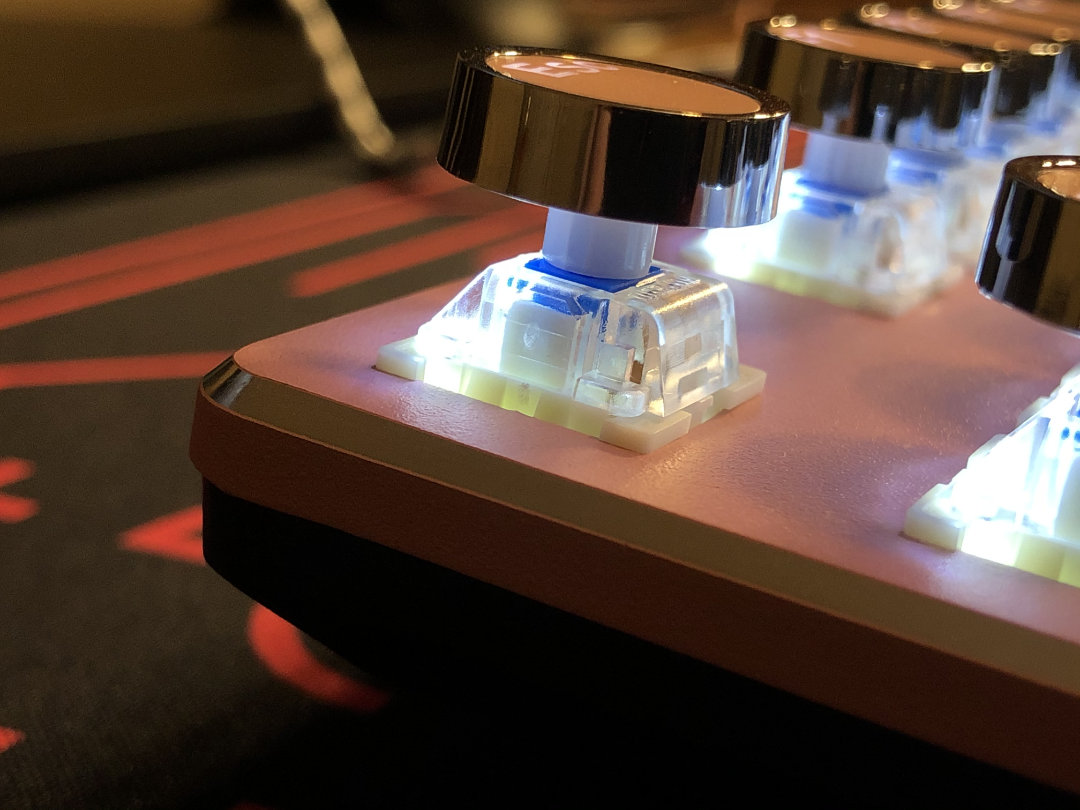
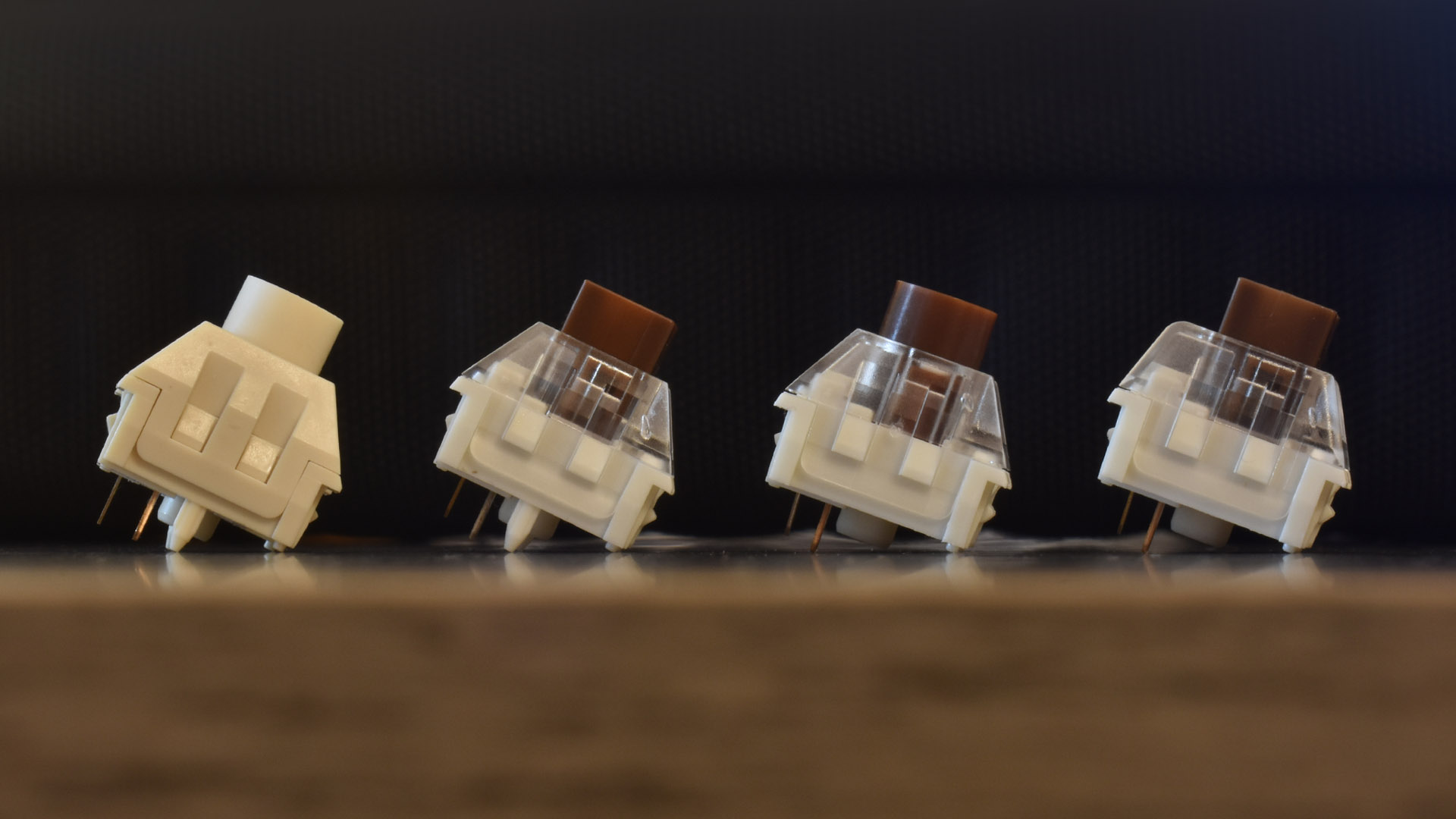
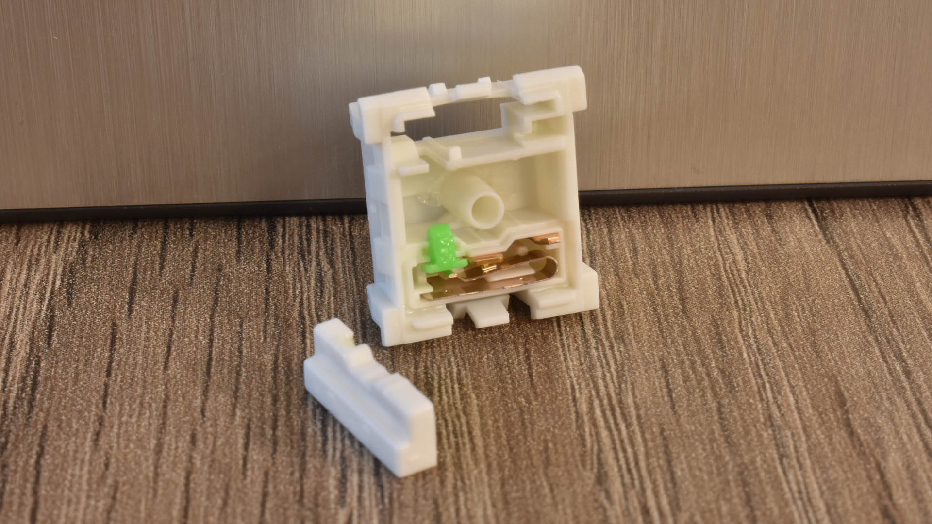
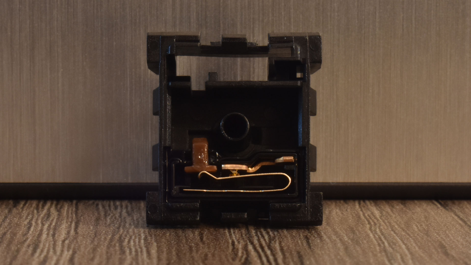
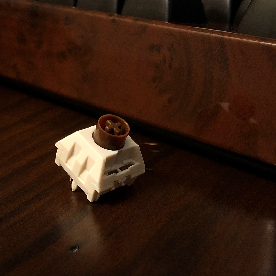
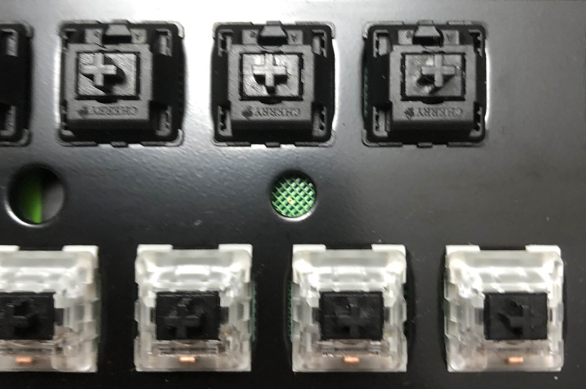
The crunchy workhorse, Outemu Blue – topped with a very shiny hat.

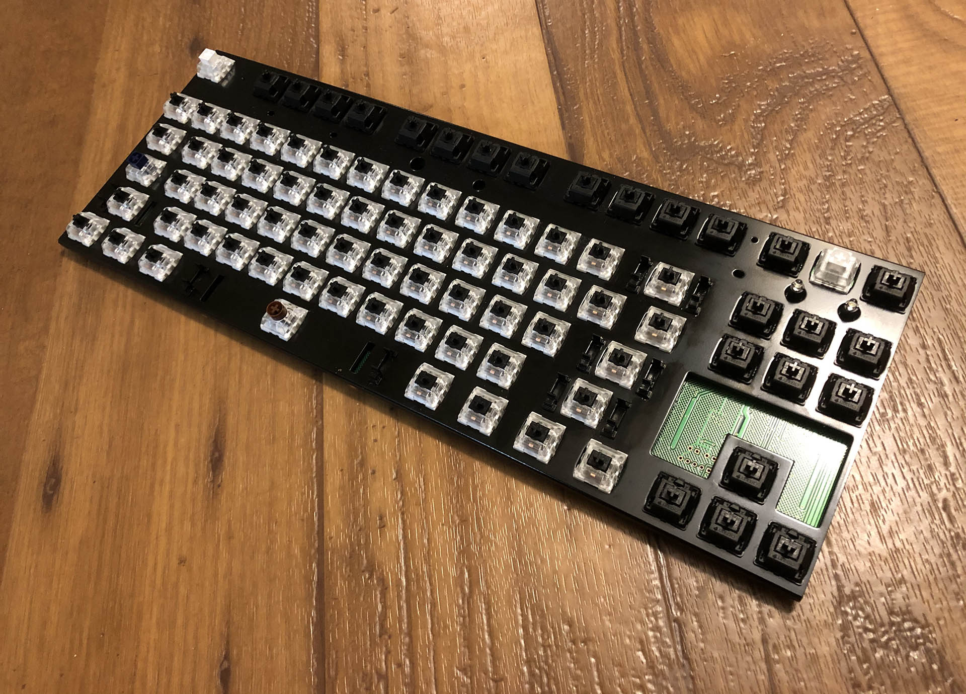
Overall the keeb’s frame is quite thin, with a fairly flat plastic bottom shell. While this keeb basically looks like a pink GMMK with a knob, it’s quite a bit more flexible than one. *In fact, it looks like this particular one has a curve to it, with more of a bend on one side. I’m guessing this happened at least in some part during shipping. I’ll take a shot at flattening it back out.

A trip through the postal system is not for the faint of heart, or frail of frame.

Bridging into the subject of functionality from aesthetics, this keeb also has per-switch back-lighting, accomplished with surface-mounted LEDs. All of the lights (including the lock indicators) are a cool white. With the shiny silver rings of the stock keys, this makes for a fairly dazzling display. This would look right at home on the desk of a beautician or kawaii-aesthetic streamer, and brings to mind images of makeup and vanity mirrors as much as vintage typewriters.

It is pretty fabulous.

So – aesthetically speaking, who is this for?

I’d say, those aforementioned fans of kawaii and steam-punky retro seeking a keyboard to match the look of their lifestyle.

It most definitely is not for any keyboard enthusiast – unless they collect that sort of thing, or are writing a review like this one. By nature of this being a keeb community article, I’m sure at least a few of you are having a cheeky giggle at the sight of this thing – there’s more for you when we get to the sound – but this is a genuinely cool product for some folks. My sister, for example – she’s a Harley ridin’ Mustang drivin’ skip-second-gear kinda lady – and her first words upon seeing this keyboard were,

She meant it, too. I agreed to let her take the keys when I install different ones for the follow-up. Awesomely-bad word-art courtesy of cooltext.com.

I think it’s this dichotomy of love-it-or-hate-it that makes this keeb a perfect candidate to kick-off this series. Onward!

Functions:

Aside from the keys and the color, the most noticeable thing about this keeb is the inclusion of a knob in the top-right corner. To the left of the knob are three multi-function buttons that also double as lock-light indicators. Between the broken English in the manual and just playing around, I was able to familiarize myself with the functions in a few minutes. Here’s how it works:

The cluster has two modes; lighting control and media control. Long-pressing the knob switches between the two modes, which are indicated by a pair of white LEDs around the top-left and bottom-right of the knob. When the lights are illuminated, the cluster is in lighting control mode, and when the lights are off it is in media control mode.

IT’S GOTTA GNAWB, BREAU, (deuude)

In lighting control mode, turning the knob adjusts the lighting brightness, and quick-pressing it cycles through lighting animations. Tapping each of the three buttons to the left will select one of three pre-set lighting configurations.

In media control mode, turning the knob adjusts the volume, and quick-pressing it mutes and un-mutes the sound. In media control mode, the three buttons to the left have the media functions labeled on them; ⏮ for previous, ⏯ for play / pause, and ⏭ for next. If you have a media player open, these controls will likely work with it.

In either control mode, the LEDs under each of the three buttons are lock-light indicators: the left ⏮ button indicates Number Lock, the middle ⏯ button indicates Caps Lock, and the right ⏭ button indicates Scroll Lock.

In combination with other keys, the FN key also controls both media and lighting functions as well as a Windows-key lock for those high-stakes gaming sessions.

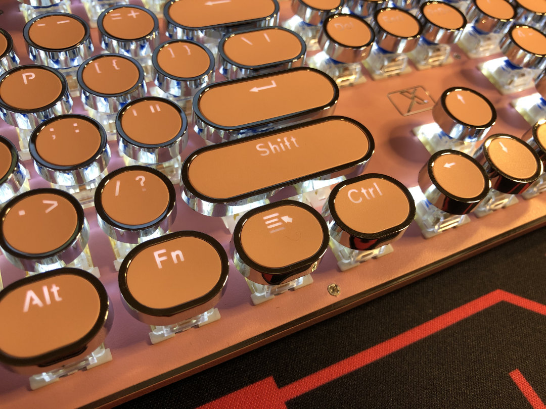
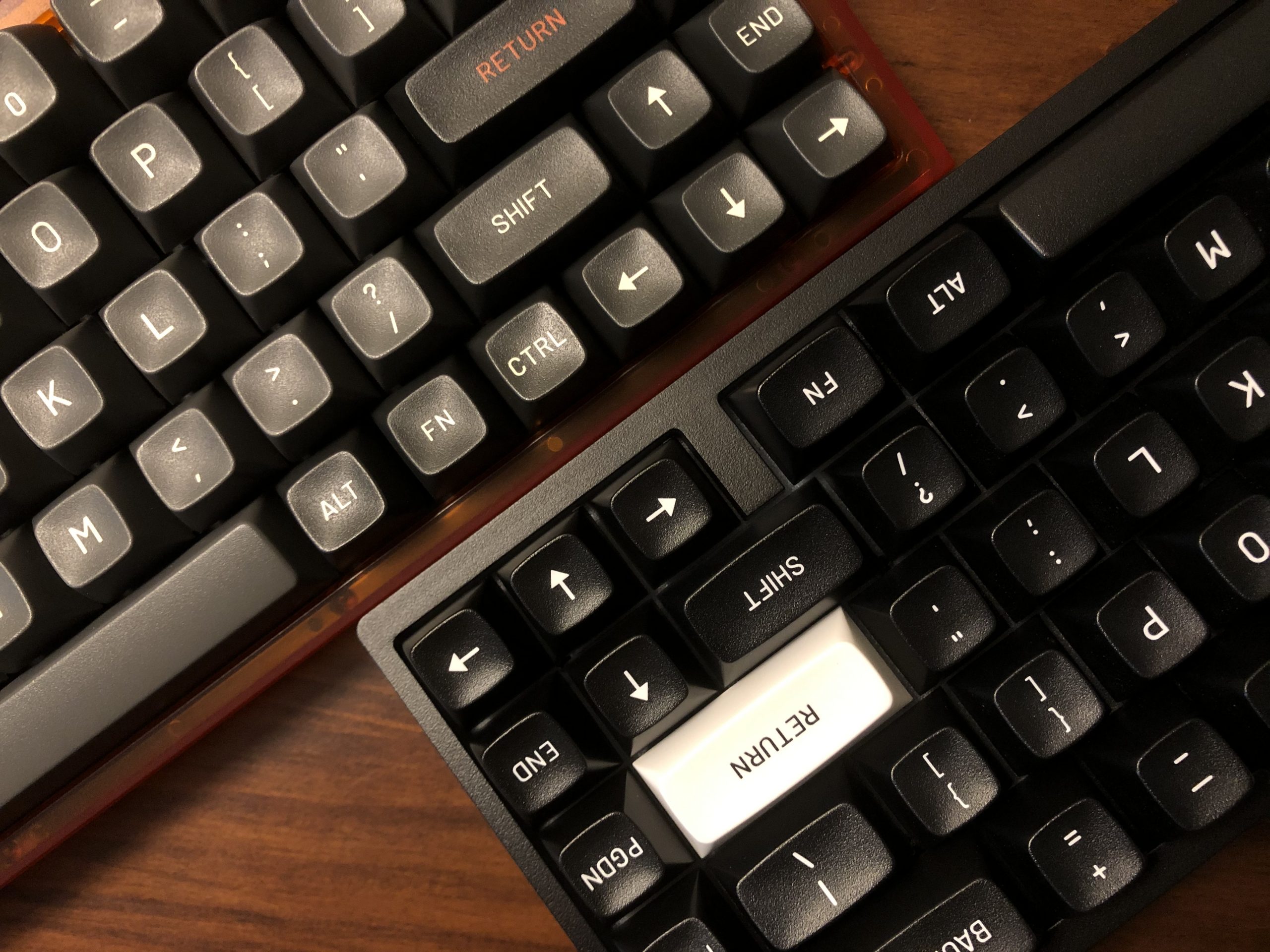
That’s the FN (or function layer) key, between the right Alt and Menu keys.

Under the umbrella of functionality, let’s get into who this keyboard will be useful for, which gets its own little section:

Use-cases:

  • Typing: Not the best, but plenty functional and even satisfying if you don’t mind lots of sound.
  • Gaming: Just fine for solo casual fun, but not great for voice-chat and definitely not for competition.
  • Display: Potentially awesome; as part of an ensemble, this keeb could be the missing piece of kit.

Sound:

Sound is going to be a polarizing feature of this one; I’d put it comfortably in the “love it or hate it” category, alongside the aesthetics.

I think it sounds like a family of gnomes, clogging atop corn-flakes in the bowl of a small steel drum. Have a listen:

This is a clicky-switch board, which I’d say fits given the typewriter-inspired keycaps. In fact, this keeb does sound remarkably similar to an old mechanical typewriter, which Cherry Blues and their cousins were originally designed to emulate. In that way, I’d call the sound of this board successful. Overall, it’s crunchy and noisy, but far from the loudest keyboard I’ve ever used.

There’s also quite a bit of ping and ring to the sound of this keeb. In terms of the typewriter theming, I’d say this is alright – and its at least vaguely reminiscent of venerable vintage mechanical keyboards like the IBM Model M when it comes to the ring. Enthusiasts of today have honed-in on tuning the sound, but back then keyboard users might lament that the thing isn’t loud enough – some keyboards of the day even had little electric hammers inside to slap the case – to make typists migrating from typewriters more comfortable, of course. While the keys of the X9VR are significantly lighter in weight than any mechanical (read: un-powered) typewriter, it still does a surprisingly good job of giving the user a typewriter-like experience.

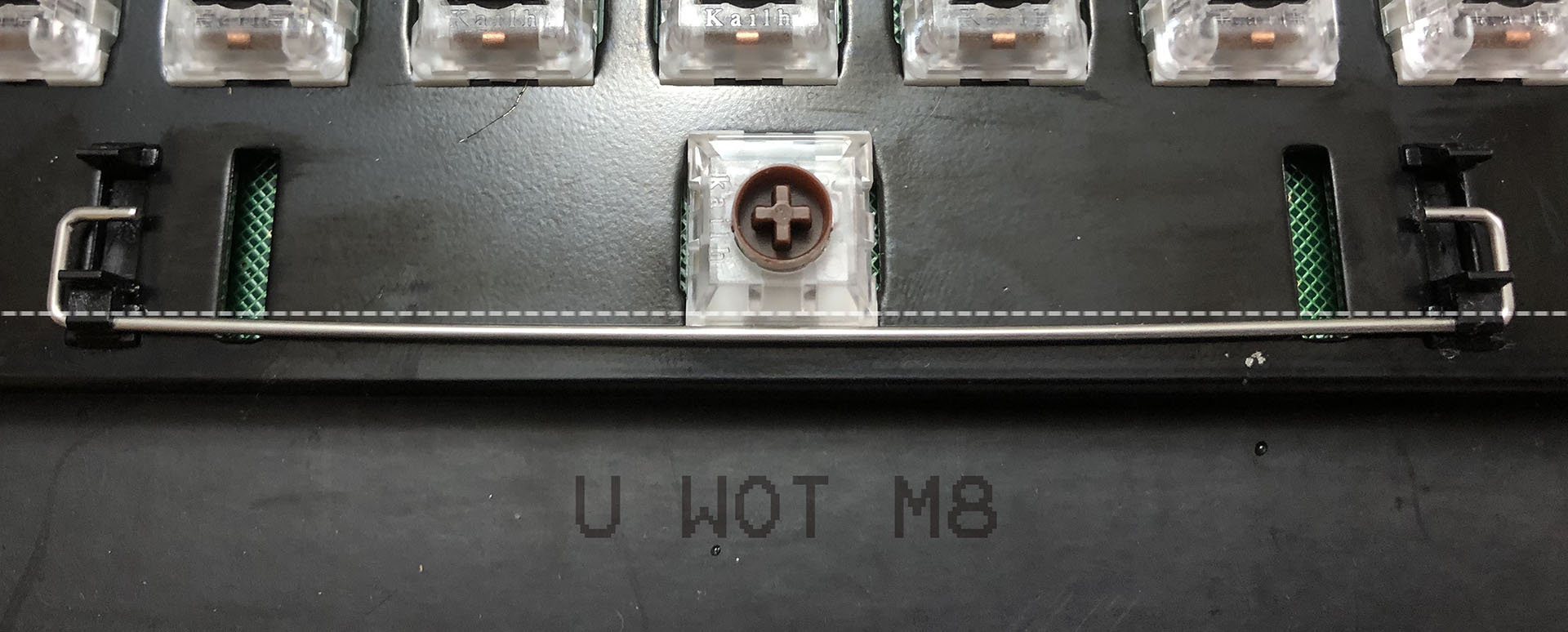
This has nothing to do with sound but the rings are friction-fit and removable. Isn’t that neat?

Now, when it comes to the enthusiast community, I don’t think any one of them would be interested in this board from a sound or feel perspective. It uses click-jacket clone blues, which tend to be at the very bottom of a custom keeb builder’s switch list. The stabilizers rattle like a bag of small dry bones. What would really make an enthusiast wince, though, is that PING. This might be the most pingy mx-compatible keyboard I’ve ever used, and that’s something of an accomplishment. This goes right past “that’s kinda pingy” and comfortably into “is that a buckling spring keeb?” territory.

So – when it comes to sound, who is this keyboard for? Well – all that stuff I just mentioned means folks looking for a clean sound won’t even want to be in the same room as this thing – but folks who really love the retro aesthetic and the sound that comes with it will have nothing but fun using the X9VR.

Stay tuned for my follow-up video where I take-on the challenge of tuning this keyboard for, among other things, sound.

Feel:

There’s not a whole lot to say about feel here – it’s a clone blue board, and it feels like one. It’s pretty light. Between the lack of rubber on the flip-out feet and the bend in this one’s case, it won’t stay put on a hard surface. On a deskmat, though, it does just fine. I’ve used the X9VR to write the majority of this review.

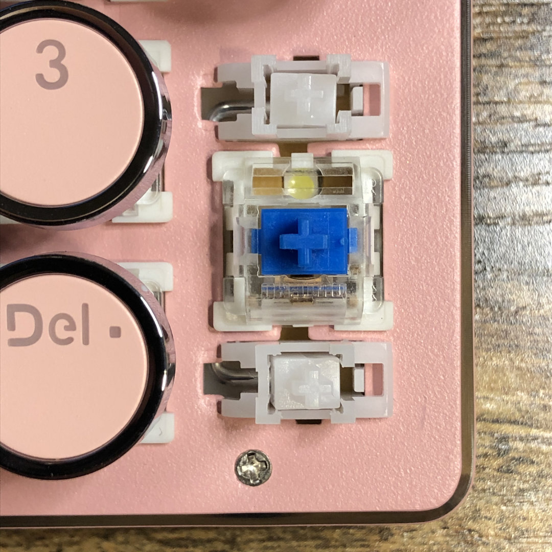
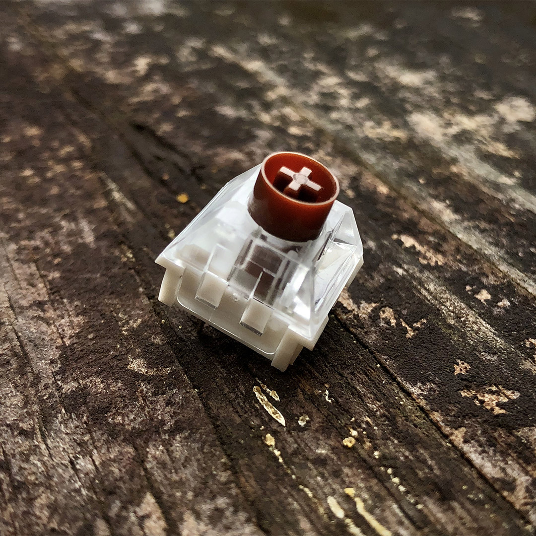
Outemu blues, rando stabs. Nothing fancy, but gets it done.

If you’ve never used a “blue” switch before, “blue” comes from Cherry’s original color-coding for their first clicky switch. Many other manufacturers follow the same color-coding conventions that they do, though with the advent of color-coordinating with switches this is becoming less common. Blues in general have a satisfying “tactile event” just before actuating – at least, I found it really satisfying before I spoiled myself with hand-lubed switches – but that’s another topic altogether. Suffice to say that if you’re typing on the thing that came with your Dell and wish it was a bit more crisp, you might really appreciate some blues like the ones populating this keeb.

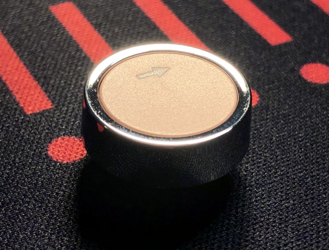
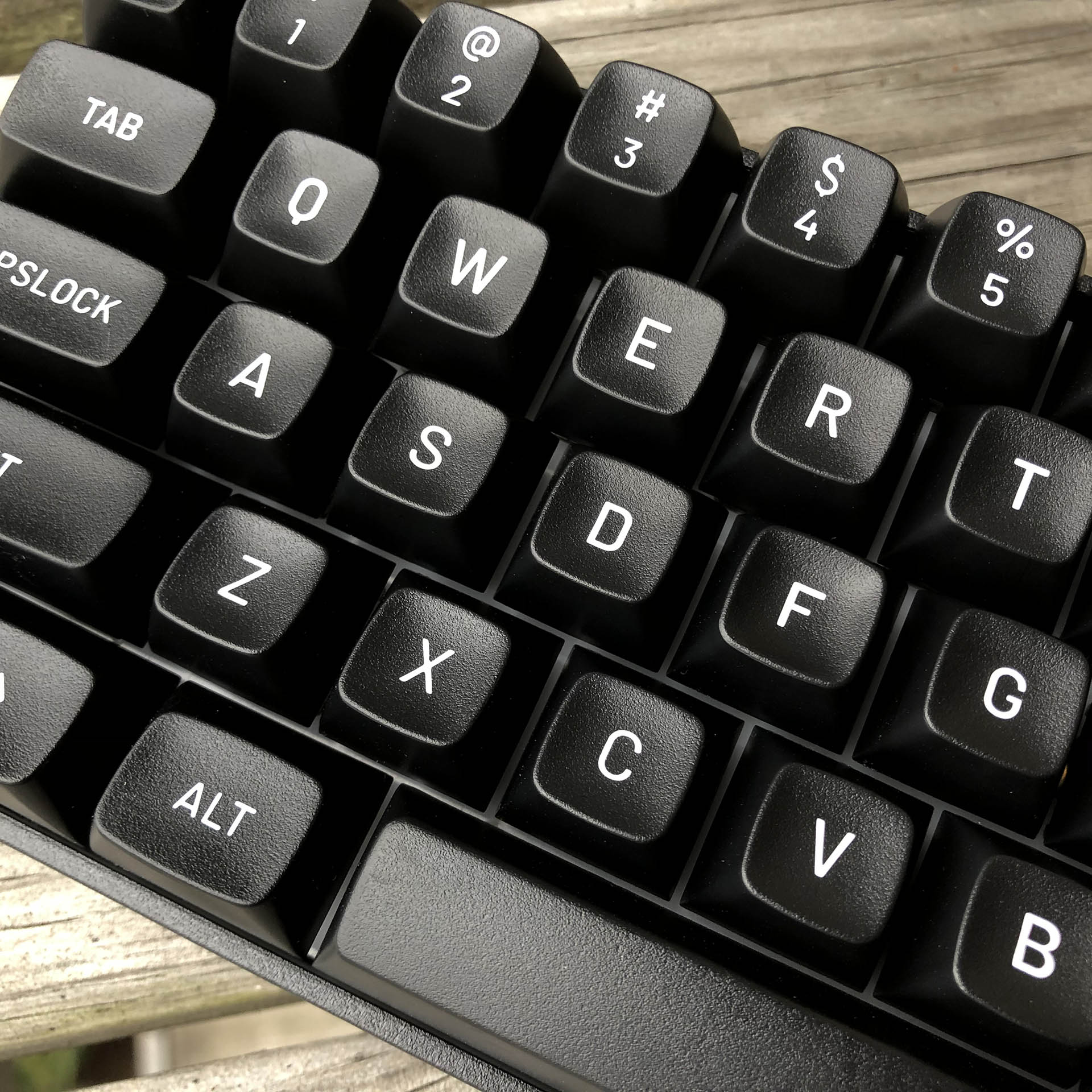
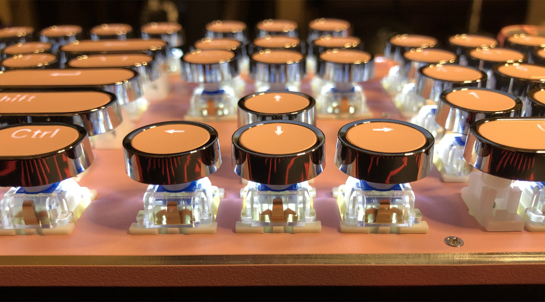
A close look at one of the MX-mount vintage-typewriter-inspired keys.

Probably the most unique aspect of this keeb’s haptics would be the keys themselves. While they’ve been around for some time and are easy to find if you’re looking for them, these typewriter style keys aren’t exactly super common, so most keeb enjoyers probably haven’t tried them yet. I can tell you that I find them surprisingly more usable than I expected them to be when it comes to touch-typing. They have traditional homing nubs, and the rings around each cap actually do a decent job helping ones fingers find their way around. Unlike the drastically angled typewriters that tended to have keys resembling these, this keyboard has a completely flat typing profile, with feet providing an optional angle.

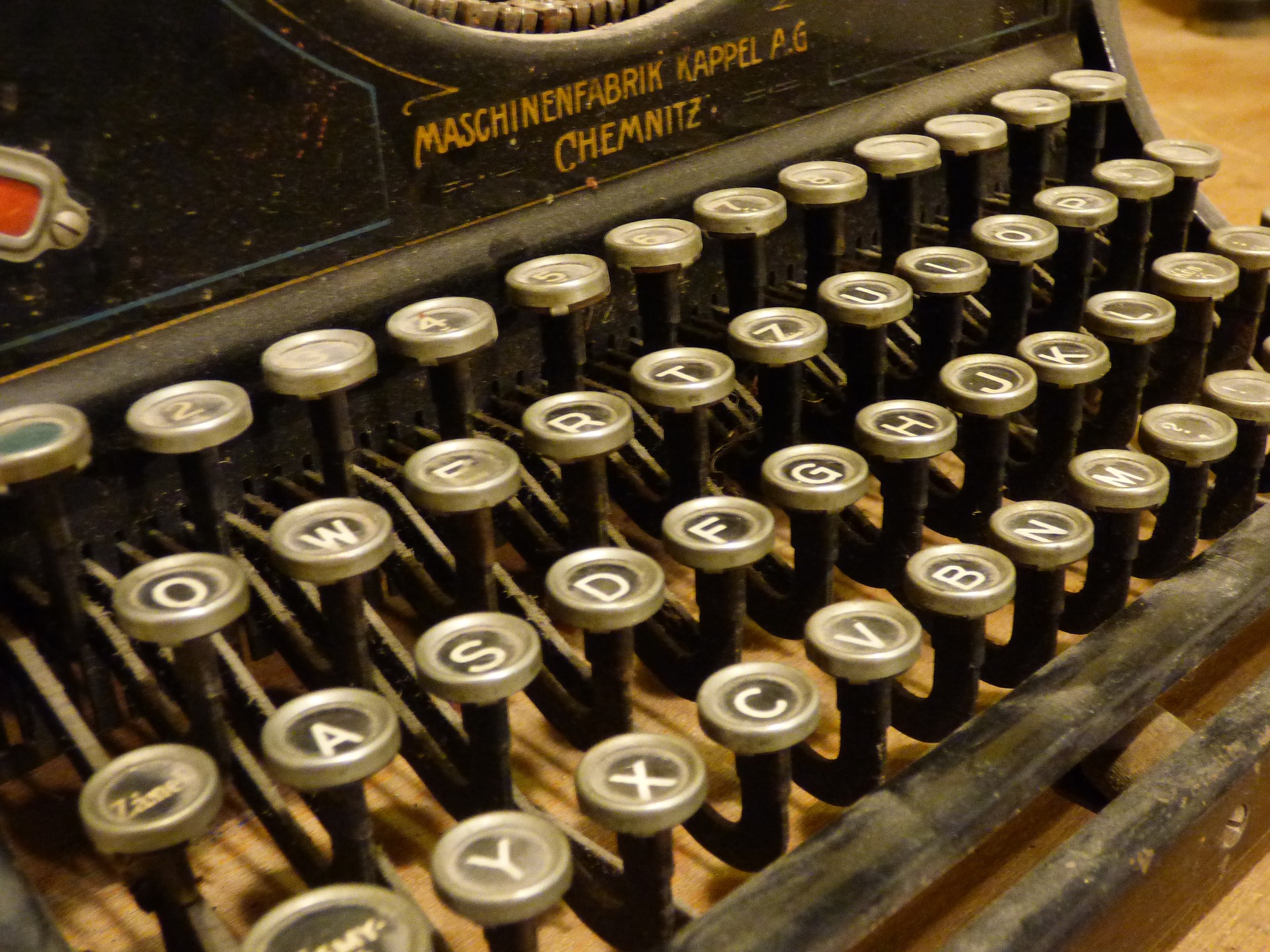
An old QWERTZ typewriter with heavy, lever-action keys and a very steep incline between the rows. At least when it comes to the keys, this is the sort of thing today’s keeb calls-back to. • Photo by Tomasz Mikołajczyk.

So – when it comes to the typing feel, who is this for?

Like with the sound, when it comes to feel this keyboard is here for retro fans. Want to feel like you’re using hand-crafted, stylish, and archaic technology without all that would actually entail? Well – the X9VR might be worth a look for you.


Value & Conclusions:

Priced at eighty American Bacon Shares, this keyboard-and-mouse combo is comfortably less than anything in the custom keyboard universe, but a fair sight more than the cheapest basic gear. I guess this would be a mid-range kit in the prebuilt gaming keeb world – it might be on the expensive side for someone shopping purely for color. For those seeking a full-sized board with the shiny typewriter look in pink (or baby blue), I think this checks enough boxes to be worth the price of admission.

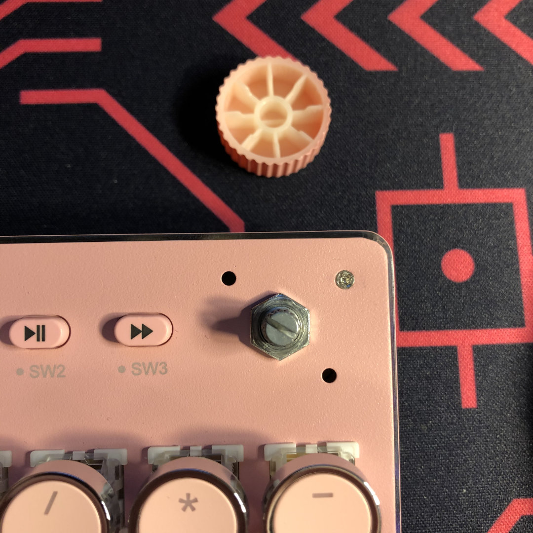
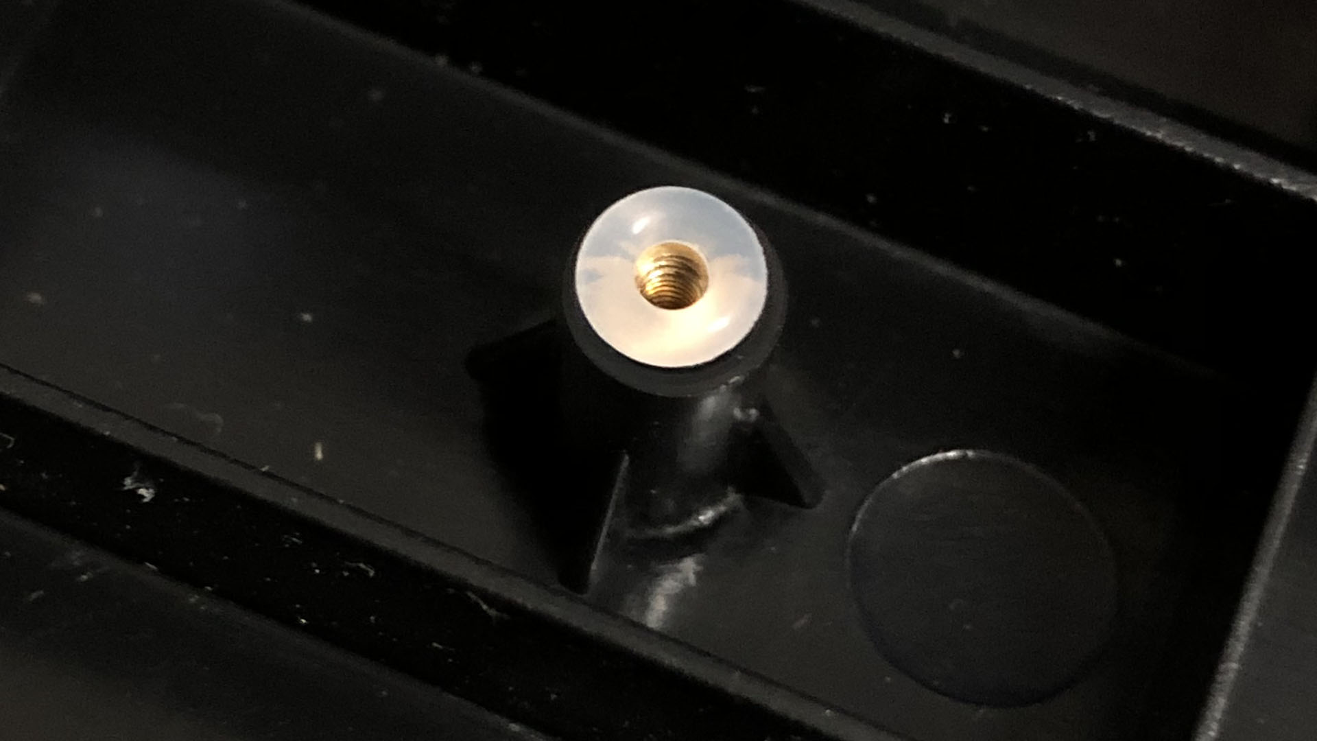
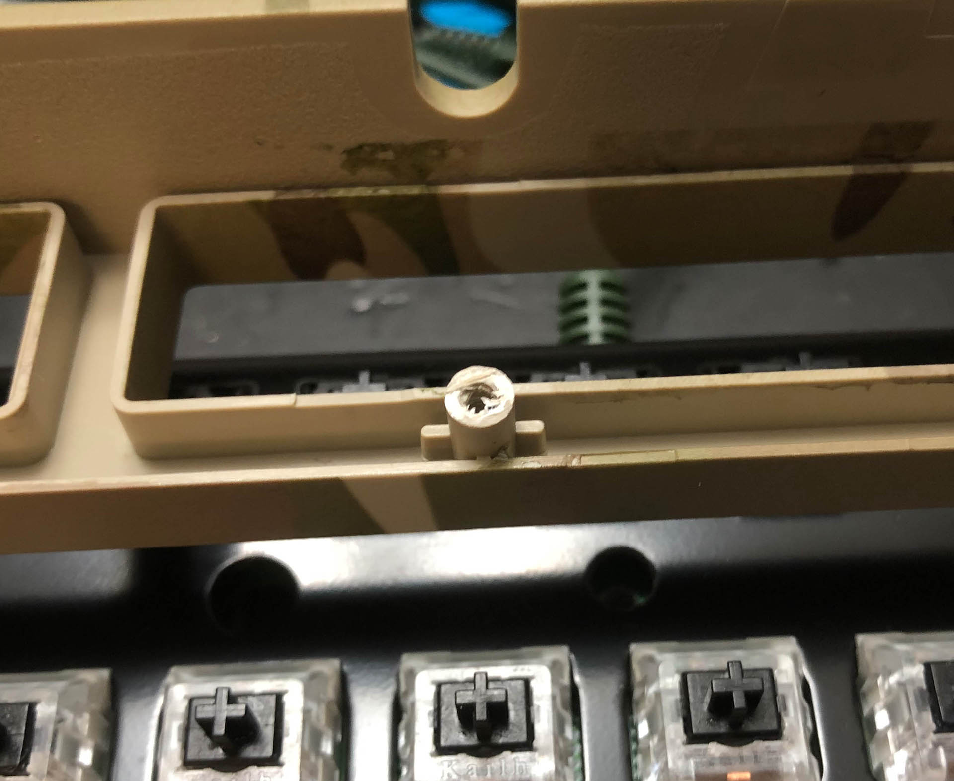
Under the knob – here you can easily see where the mode indicator LEDs are; the two small holes on either side of the rotary encoder.

Recommendations for Improvement:

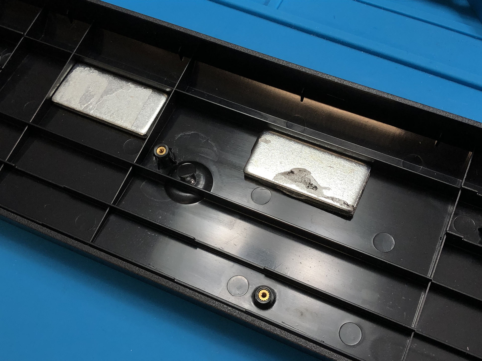
Were I to try to improve this product on a commercial level, I think the biggest change I’d make would be with the box it ships in – it’s not quite sturdy enough to properly protect the keyboard in transit. While the keyboard is plenty durable for years of use, it didn’t fare that well in shipping. The mouse is good but not a fit for the bundle aesthetically. Beyond that, I would add rubber ends to the flip-out feet of the keyboard, and maybe a multi-lingual reference card for the mouse functions.

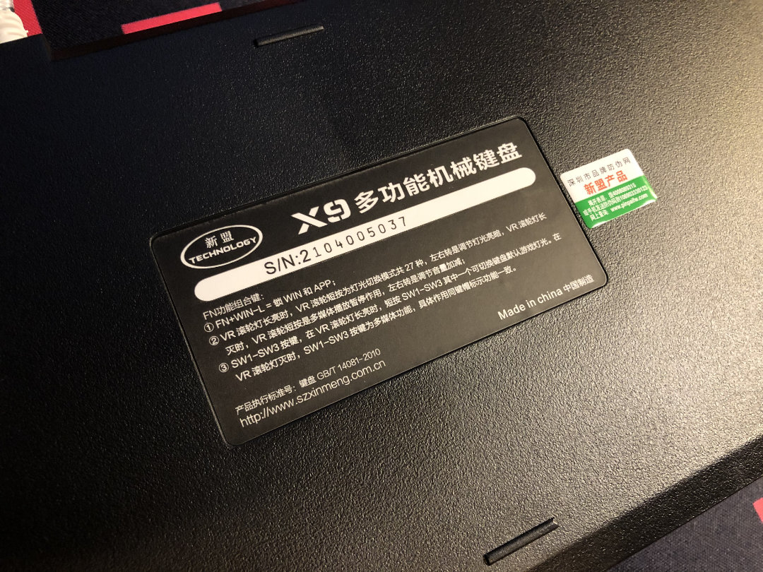
I’d be lying if I said I could read any of this, and full disclosure, I may not even have the name of this product quite right – but I think you got the idea.

This is a section where I’d normally talk about how to improve the sound and feel, but at least for the market this kit appears to be aiming for, I think it does just fine with its crunchy, crispy qualities.

That’s all I have to say about the Xinmeng X9VR keyboard and mouse kit for today. Stay tuned for a follow-up about modding this keyboard. Thanks again to MechDIY.com for providing this keyboard for review, and thank you very much for reading.

Whatever you’re typing on today, remember to enjoy it!

Originally posted April 2021

Earlier this month, Keebtalk user keyliber posed the question, Why Keyboards?

He invites us to share our own reasons thusly:

This is a place to share reasons why keyboards are not in fact useless so you can justify spending more for your keyboard than your PC and having more GMK keysets than you have fingers.

I’m about to ramble something fierce because I’ve been asked why I like my favorite thing, but before I do here’s the most important bit I have to say: having reasons you can identify for enjoying your hobby is great – but you don’t need justification.

If you enjoy it – you enjoy it! Knowing why might help you get more into it or get the most out of it, but yeah. If someone asks me why I have more currency in colored plastic squares than my car, I’ll say SUCH IS MANGO! and exit stage right.

Fig. 1 – Mango

Now… about keyboards.

I used to work with a guy that had a massive sneaker collection, mostly limited editions in really wild colors. He often wore ones coordinated with his uniform. Had a display wall for them and everything. When he asked me about keyboards, I said, well – it’s a lot like your shoes, man – and he got it.

wait not like that

Aside from what’s already been said about how much time a lot of us spend using this kind of input device both for work and play, I do have some other reasons.

I enjoy human-interface machines in general, and am fascinated with the variety and the reasons for it. Before keyboards, it was bikes. I got really into all the possibilities within limitations, and experimented with different builds based on ideas (and subsequent lessons).

Frankenswitches were a natural progression from frankenbikes.

Before, I wouldn’t have guessed that there’s as much variation with keyboards as with bikes – but there really is, and that has only been growing over time (and quickly). I get the sense this is a great time to be getting into keebs.

Inspirational. In its own way…

Until I got an especially bad one (seen above), I don’t think I’d ever considered a keyboard in any way other than you kind of need one to use the computer. When the extra crap one came along, I started looking into what might be better…

[ enter: rabbit hole ]

With keyboards as with bikes before, I take specific enjoyment in helping people find the right device for them. If I see it make some kind of positive difference, that’s the biggest win – so once I discovered how much aesthetic and functional customization was possible with keyboards, I was in for the long haul.

I’m still a relatively new builder, but after seven or so builds for other people I’ve already tried and learned a few things I never would have otherwise – that’s something fun that keeps me engaged. Easy builds are relaxing. Others can be exercises – or challenging puzzles – either way, I’m having fun.

I also just really enjoy typing.

I have some mild nerve damage that doesn’t effect much these days, but it does make writing kind of slow and awkward – but typing! It’s so much more natural and effortless feeling for me compared to writing by hand.

Extra points if you know who this nice lady is.

Even before the nerve stuff, there has always been neuro stuff – let’s just say that typing makes it so much easier to actually get my thoughts down before they evaporate. And the tactility! The sound. It’s like a fidget thing I can fidget with while also being productive.

But you know what my favorite part is? You folks. Like just about everything, the best part is the people you meet through it.

I love this hobby.

Originally posted February 2021

As I sit down to write the first article for my new website about mechanical keyboards, I reflect on what my priorities have been in the mechanical keyboard space thus far. When I began, I went pretty much as cheap as possible, just so I could see what the fuss was about without too much commitment. Heh…

Sold under many names, the sticker on the back says “EasternTimes Tech I-500”

My new VicTsing EasternTimes Tech TOMOKO Amazon Spicy Fried Chicken Biscuit TKL was the best darn keyboard I’d ever used, and its crunchy blue switches were just so satisfying after the slippery, flexible, gummy mush that had inspired me to buy the thing in the first place. “If the lowest-end is this good,” I thought, “I can’t wait to see where it goes from here.”

And here we are.

Only in the past few months have I genuinely been dipping my toes in the high-end custom realm (switches excluded). For most of my journey so far, I’ve been focused on the lower-to-middle-end; if only because any true middle-market was at worst a scarce and barren space, and at best boring – at least in the West. Its few interesting examples often significantly flawed, missing the mark, or surrounded by a haze of unpalatable drama.

Thankfully, that’s no longer the general state of things. In fact, I think we’re seeing something of a middle-market renaissance here in early 2021.

NK65EE “Fire” with Tangerines

The most obvious herald of this is of course the NovelKeys NK65EE, or Entry Edition. While certainly not cheap at $95 bare-bones, it’s extremely competitive when it comes to features and quality in the price range – at least, for the moment. While for a brief time it appeared this board held absolute dominance in this emerging higher quality middle-market, many competitors have risen to fill the adjacent space – and that’s awesome.

NK65EE & KBD67L, with MT3 Susuwatari and White on Black respectively

There’s the TKC Portico, Idobao ID series, the newer generation of Keychrons, the GMMK Pro, and my personal favorite, the KBDFans KBD67L, or Lite.

Every one of these options offer features that used to be the exclusive domain of high-end, low production run customs. No mistaking, these aren’t high end, low production run customs – but they’ll get you much closer for your dollar (each in their own ways) than most anything that came before them. I think this is generally good not just for the hobby, but for the casual consumer who just wants a really nice keyboard (and not a new hobby).

A closer look at MT3 keycaps on the KBD67L

Now, for what a “high end” gaming keyboard from Big Box cost just a year or two ago, you can get a big heavy aestheticc wedge – or a nuanced mounting system that reduces fatigue – or some really dope switches that feel better than anything in the store.

A sea of Kiwis

This also appears to be having the effect of bringing prices down in the adjacent market of gaming keyboards. Thanks to the rise of streaming in general and TaeHa x Tfue specifically, there are a lot of former Logitech, Razer, and Steel Series customers hopping on NovelKeys.xyz for those sweet scratchy Creams – and an NK65 while they’re at it. I guess that means the Big Box brands are having to respond in the only way they can at the moment. Small violins for them, another boon for the consumer.

From the ready availability of smooth, middle-priced JWK’s to the meteoric rise of Gazzew’s boutique line of tweaked Outemu switches, the middle-market for switches has been flush lately as well. Maybe a little too flush. But hey – it beats having to pick between Cherry Reds and Kailh Reds and what the hell is a Holy Panda?

Gazzew is blowin’ up like bubble gum, and rightfully so. Seen here, a collection of his “Bobagum” silent linear switches.

We’ve got silent switches that aren’t awful, and don’t cost an arm and a leg. Even Hall-effect and optical switches are making a real come-back. We’ve got Gateron Caps bringing linear Thock to the masses, low-profile switches that aren’t the devil’s bottom, and even color-matched stabilizers and special edition switches for popular keysets. The middle-market for keycaps is still a fairly iffy place – but there’s gold in them there hills if you have patience and persistence.

An over-exposed shot of my KBD67L at work

Say all of that to say;

Whether you’re in for the long-haul or just passing-through, there’s never been a better time to get your hands on a mechanical keyboard.

Originally posted June 2021

Ah, Frankenswitching. For the neophyte, it is playground and pitfall alike. For many experts, it lies somewhere between begrudged annoyance and trivial pursuit. So why on Earth do I fool with it so much? Well – I’m here to give you fine folks an answer.

While some part of my monkey-brain would get satisfaction out of finding some miracle combo like the Holy Panda and being the first to claim it, this is not what keeps me cracking switches open late into the night.

FOR SCIENCE!

As much light-hearted jest is in that comment, it’s also true. The other side of the Holy Panda discovery is the tidal-wave of innovation and new interest it brought to the hobby. Think of how many good switches we have now as a result – whether they be strong tactiles seeking to imitate directly, more mild tactiles that take cues from the divine ursidae, or even the slew of new linears featuring longer stem poles chasing that distinctive sound. (These may have a more direct linage to other linear frankens, but I still believe it’s the HP hype that brought them attention – how many linears have been sold with a tagline something along the lines of, “like a Holy Panda, but linear!”

The Holy Panda is basically The Beatles of frankenswitching.

Illustration by @wintheart and commissioned by Qlavier.

Most obvious example out of the way, I can think of a few more that have had a positive influence on subsequent commercially-available products;

  • Ergo Clears (quite a few good switches have come from chasing this one’s properties)
  • Zykos (mad expensive – but they inspired a new and very promising upcoming switch)
  • UHMWPE Creams (not great in and of themselves IMO, but now we have Hippos!)
  • Holy Bobas (I think it’s safe to assume these begat the much-beloved U4Ts)

The thock-tastic “Holy Boba” – supplanting the Holy Panda on more than a few builds these days thanks to its less harsh sound and feel.

I think this is what keeps me coming back to kit-bashing switch parts together; not only does it help me learn about the donor switches and switch dynamics in general, it also holds the alluring promise of bringing further innovation to the “official” side of things. I may find combinations that I really like, and I’ll happily describe them and extol their virtues – but I’m also all-too happy to see them made redundant by a singular product that isn’t so difficult or expensive for enthusiasts and casual clackers alike to obtain.

Another Holy Panda alternative, this time using an Ink Blue housing to pair with the Halo stem – I call these “Heisenbergs” because it’s fun. If you love the strong tactility of the HP but wish it felt a little more smooth and refined, this might be the frankenswitch for you.

So, for those of us who enjoy experimentation and/or are obsessively curious, frankenswitching can be a rewarding, albeit expensive practice. I sincerely do not recommend it for everyone – as there’s a genuinely good chance one might end up pouring quite a bit of dosh into a theory that sounds great and turns out underwhelming, leaving one with a bunch of expensive parts they don’t actually enjoy. On the other hand, I do like seeing the small but dedicated community of frankenswitchers churning away and discussing what’s good and what’s garbage – as I believe this is beneficial to the community as a whole in multiple ways:

1.) As mentioned before, lots of great switches have come from emulating expensive or elusive franken recipes.

2.) Lots of knowledge about switches in general is permeating through the community as a result of the experimentation.

3.) The buzz generates plenty of sales, giving some of our favorite vendors and manufacturers more capital to work with and thus more resources to improve and expand.

Gazzew U4 stem in an Ink Yellow housing with a generously lubed TT MP 68g spring; I call these “Lemon Lushes” because if there’s a theme I like more than animal names, it’s dessert names. Nice and soft with a snappy, tart tactility. (Alas, may not work with newer Ink housings.)

In addition, once in a blue moon myself and others will indeed stumble upon a novel and/or somewhat unique and positive combination – and whether or not it actually ends up influencing any manufacturer choices, the discovery leaves the door open and, in the mean time, provides an avenue for curious experimenters to share in the enjoyment and discussion of such a discovery.

“Deadpools” come to mind; I think there’s at least one upcoming switch out there chasing the acoustic properties of this one, if not directly, certainly in general. Long pole linears, specifically of the very thocky variety, are becoming less of an odd-ball as time goes on – and I think it’s a safe bet to say that commercial attempts at such a switch won’t be plagued with un-intended down-sides such as a lack of leaf retention, which make Deadpools challenging to work with and nearly impossible to use on a hot-swap board, for example.

A “Deadpool”, also known as a “Gazzew-ron Pro Burgundy” consists of a Gateron KS-3 Polyamide bottom, a Gazzew Boba top, the extra-long-pole Kailh Pro Burgundy stem, and a spring of your choice. Despite the aforementioned pitfalls, this remains one of my very favorite frankens.

So, while it may be a bit irritating to see post after post about untested theories, assumptions of striking gold, or – one that I’m totally guilty of – unintuitive, uninformative naming schemes; I think it’s quite worth it for the overall resulting positives. Besides; for folks like myself, there’s plenty of fun to be had – and that’s reason enough for me.

Originally posted March 2021

The five-ish switches we’ll be focusing on today.

This article is part five-way showdown, part commentary on the Box line in general. The main focus here is around the various iterations of Browns in the series, and not a comprehensive overview of the line as a whole. It’s not an exhaustive examination – as there are still details I’ve ear-marked for exploration – though I think you’ll find here an illuminating inspection of our Boxy boys from Kaihua.

NovelKeys_ Box Cream

I’m not sure I’ve seen any other product in this space carry the kind of lasting negative cloud that BOX switches have, after their first production run damaged quite a few people’s keycaps. Word on the street is that the thicker stem spec was requested by another company Kaihua sold to, who were using the first run of BOX switches as OEMs in their boards. Apparently this detail was overlooked when they started producing the switches for commercial release, and the altered spec made it out into the wild, unfortunately claiming many an expensive keycap.

Like any company that isn’t completely beyond hope, Kaihua quickly moved to correct the issue and re-tooled the switches – but the damage was done – not just to all those keycaps, but to the reputation of the BOX line itself. I think this is pretty unfortunate, because in and of themselves, BOX switches represent some of the most significant innovations in the MX compatible space in some time. I suppose that’s part of taking risks – sometimes they pay off, sometimes they don’t. That said, I think the line is far from a bust or even a wash for the Kailh brand, despite the fact that potential keyboard buyers are asking about cap-breaking stems to this day. Even with that ever-present cloud, BOX switches do still manage some amount of love in the community.

Qlavier’s visual commentary on the early Box situation.

In what appears to me at least in part a move to distance the line from this reputation, all of the new Box switches of-late use a new stem and top housing shape. Still called “BOX” switches and still featuring the eponymous semi-sealed contact box, the switches traded out the square stem most folks reasonably thought the switch was named after for a circular one instead. While I believe the primary benefit of this shape is an immediate and obvious change from the one everyone associates with dead keycaps, I do see another possible adjacent function it could be serving.

Silent Box Brown

The reader may or may not be aware that all of the latest circular-shroud BOX switches (i.e. last year’s silents and this year’s Creams) have a more tapered, trapezoidal-shaped housing when compared to classic MX-compatible switches, including V1 and V2 BOXes. This shaves-off some un-used space and plastic, but more importantly negates the interference issue that arises between Cherry profile keycaps and North-facing keyswitches. Noice!

Here you can see the side-profile shapes. From left to right; Box Cream, Art Box Brown, Silent Box Brown, Classic Box Brown

A lesser-known detail is that this tapered housing *did not* debut with the BOX Silents, but with a much more obscure line of BOX variants exclusive to the Korean market known as Art BOXes. These versions feature a number of changes from the classic BOX line besides the tapered housing. They still have the classic square-shrouded stem, but they have a supposedly better lube job and 5 pins – another “new” BOX feature that debuted in the Western market with the recent Creams. It seems these apparently objectively better switches were commissioned from Kaihua by a company called Archon – and I have rarely seen them anywhere but their own site, and a proxy seller. That gives me a strong hunch that Archon has or had some degree of exclusivity to the design changes they requested.

Thanks to :3ildcat for making me aware of these! After some poking around, I found a proxy-seller website called Harumio that sells these and all sorts of other Korean-market items for us Westerners to enjoy. They carry the Art Box switches as well as aftermarket springs for the Box line.

Only once Kailh released the Silent BOX line quite some time later did the tapered housing make an appearance in the Western market – but it was distinct from the Archon one, still having only 3 pins and the new, circular-shrouded stem – and of course the silencing dampeners. Also featuring the circular shroud but omitting the dampeners is the new BOX Cream linear switch – and as far as I can tell, it uses a POM version of the Archon Art Box bottom. See, each time some aspect of the Art switches show up somewhere else, they are accompanied by some other significant aspect that distinguishes them from the Art line. All of that looks like tip-toeing around a license agreement to me, but that’s pure speculation on my part.

It’s not the first time I’ve speculated about this sort of behavior from Kailh – here’s a post on KeebTalk about that.

Now – for the switches themselves. You came here for a showdown, and that’s what you’re going to get.

Tonight, our contenders include:

  • The Classic:
    V2 Box Brown
  • The Snappy Sibling:
      Silent Box Brown
  • The Gangnam Hipster:
      Art Box Brown
  • with The Special Guest:
      NK Box Cream
  • and The Door Guy:
      NK Box Royal

From left to right; Box Cream, Art Box Brown, Silent Box Brown, two Box Browns, and a Box Royal. The white-housing classic Box Brown is a bit older; I belive it’s still a V2, but it has a differently colored brown stem compared to the other three. The one with the black bottom is newer and comes from a Hexgears Impulse, but is otherwise identical.

For the objective section of this overview, I’ll be comparing some apples-to-apples aspects of the various Boxes.

First, relative spring weight:

Now – different sources claim different weights for these switches, but they’re all within a reasonable ballpark – so let’s call it a bottom-out of between 50 and 55 grams. Pressing the switches stem-to-stem, all of our contenders save one share a comparable enough weight as to be indistinguishable. The odd one out is the Silent Box Brown, with both a stronger tactile leaf and main spring than their other brown siblings. Only the Royal has a stronger tactile event and spring weight – and only just.

Cream, Art, (Older) Classic, Royal, Silent

Pure speculation: I think Kaihua chose a stronger spring and tactility for the silent version of the Box brown to offset the loss of impact from bottom-out in terms of the switch’s character. For many users, the strongest sensation from a brown switch is the bottom-out, with the tactile event more of a gentle confirmation on the way. The silent switches sacrifice this satisfying clacking sensation in lieu of a more subtle sound signature, but to keep them from losing their overall tactile impression, the confirmation has been enhanced to an assertion.

As far as I can tell, both the silent and classic Box Browns have the same stem bump – and get this – it looks like the Box Royal might have the same one, too. This all leads me to believe that any given Box’s tactility comes down to the leaf.

Silent Box Brown on the left, Box Cream on the right

The bottom housing color can vary, as can the little plastic plunger, but the top lid of the box itself is always white. The plunger seems to loosely but not definitively correlate with tactility; the SBB’s stronger leaf is noted with a green plunger – but the Royal’s even stronger tactile leaf has the same brown plunger all the rest of the switches discussed here have.

Art (same as Classic), Silent, Royal

I don’t have any precision measuring tools, and this may have been discussed elsewhere – but I do have some images you can see and judge for yourself. Above you’ll see the Art Box Brown, Silent Box Brown, and Box Royal stems lined-up. Below is a gif showing a close-up comparison between the regular Brown and Royal stems. The are at slightly different angles, but I think you get the idea:

Are all Box tactile stems the same? Maybe. I’d say at least most of them are.

Focusing on tactility; while I once believed Art Box browns to have a slightly stronger leaf than standard ones, further testing reveals this to be an artifact of the mild but notable inconsistency of Box switches. On average, the standard and Archon varieties of Box Browns have the same spring and leaf weighting. So – we have the standard and Art varieties with the most mild tactility, and with a fair bit more we have the Silent Box Brown and Box Royal with similarly strong if not identical amounts thereof – and of course, the Cream has none at all.

Cream, Silent, Art, (Older) Classic, Royal

The Art Box claiming a better lubing job might bear-out; note the older Box Brown stem with a big glob of grease, while the newer Art Box stem has just a sheen on the tactile leg. The Royal is somewhere in-between, with a less zealous application of grease. The Silent stem looks almost dry. It’s hard to see in the photos, but the Box Cream stem has a fairly generous application of clear grease on the leg.

An open Box with an open box

This is a great time to mention that the majority of Box switch parts are interchangeable in much the same way traditional MX parts are. With the exception of the circular and square shroud stems and top housings not being cross-compatible, literally everything else is. So, for example, you can take the top half of a Silent Box Brown, and combine it with the bottom half of a Box Royal to pair even stronger tactility with the sound and feeling of the dampened stem.

A closer look inside the magic box; here you can see the plunger and contacts. Looking up-top, you’ll see the characteristic bend of this switch having been stored in a switch tester (or plate otherwise too thick to engage the clips) for some time.

You can swap the silent stem into the housing of a Box Cream, which yields a switch with the tactility of a regular Box Brown, the dampened feeling of a Silent Box, the deeper sound of the Box Cream housing, and the much more clean and quiet report of the Box Cream spring.

I call this combination “Cookies and Cream” – because why not?

One thing I’ve yet to mention that affects the square-stem varieties of switches is inconsistent resting position, frequently including some degree of right-ward twist. As far as I can tell, the circular-stem versions don’t appear to have this problem.

Of all the varieties discussed today, I think my personal favorite is the Cookies and Cream frankenswitch – but for the stock ones, it’s a hard choice between the satisfyingly poppy Silent Box Browns and the balanced, if boney-feeling Box Creams. I’ve been a fan of the Box lineup since it first came on the scene, and I’m glad to see Kaihua continuing to bring further innovation to the line despite early missteps. I’m also glad to see NovelKeys getting in on those 5-pin bottoms, quieter springs, tapered housings, and twist-free stems. On the surface, they might seem like just another Box Black – but all the subtle improvements make the Box Cream a genuine step forward in my book.

How about you – what’s your favorite Box? Maybe the line isn’t for you? Shoot me an email, hit me up on Instagram, or say hello on Keebtalk – I’d love to know what aspects of the box family you folks would like to see me cover next. Cheers!

Originally posted March 2021

  • Client: Programmer & Help Desk
  • Budget: $200
  • Core goal: Satisfying Silence for Work
  • Form-factor: 60%

Very quiet, strong tactility, and some very nice keys. If you’re interested, come along and take the journey with me.

When one of our company’s new IT guys mentioned he wanted a good keyboard, I started asking him the keeb questions, narrowing-down layout selection first. He really didn’t hesitate, and went straight for 60% after seeing the usual suspects.

Not the exact switches, but you get the idea.

I gave him a 12-switch tester to try, and again he didn’t take long to hone-in on his favorite, a frankenswitch based around the Gazzew U4 stem and a linear leaf. He liked that it was quiet while also having the big bump, but he passed up other silent switches with the same stem and a stronger tactile leaf that weren’t as smooth or quiet.

Our enabler’s – er, client’s switch of choice; a progressive silent tactile I call Lemon Lush.

Noting that he’d picked the single most expensive frankenswitch I think I’ve put together so far, that’s when I asked about budget. After giving him a feel for what exists in some different brackets, he went for $200. Later that day we were discussing priorities, and he said it seemed like switches were the most important part for a budget keyboard that doesn’t suck, and I generally agree.

I’d also observed his typing – he’s pretty heavy-handed, and punctuates his lines with a purposeful THONK of the Return key. With this and his other priorities in mind, I went about researching and selecting potential parts. Focusing on switches, his favorite of the 12 had a 68g progressive spring and an Ink housing – both couldn’t come along for the ride with this budget, so those nuanced springs got the cut in light of our friend’s heavy typing style.

Taking custom springs out of the equation and accounting for a heavy-handed typing style, Black Ink U4s fit the bill.

I first went for BSUN Panda springs because I have a ton of them, but they really didn’t feel right with the U4 stem. Not bad – but not complimentary to all that potential in the U4. I was already using Ink Black housings, so I gave those springs a try instead – and they were a much better fit with Gazzew’s stem.

“Great,” I thought, “this will be an easy, straightforward build. Having just done a full-size with a vinyl wrap, this little guy will be a piece of cake!” …You know where this is going.

For stabilizers, I’d first started with some random screw-ins I had on-hand, but I just couldn’t get them to sound decent; I went with Durock V2 stabs after that. I also tried to use the pre-cut heat-shrink sleeves with both, and had not-so-good results. I’m going to give them another chance with some Cherry stabs, but I’m pretty sure those were the culprit for some quite heinous key-twist with these others. In fact, what I thought was the sound of stab rattle turned out to be the right shift key striking the adjacent ones!

The one part of building that still gives me trouble is getting stabs to both sound and feel good on a silent build – I got these to an acceptable balance, and the owner loves them – but I know there’s more potential in there – so improve I must. • As a funny aside: in five years of messing around with keyboards, working on this one was only the second time ever, and the first time during a build that I had a stab wire pop out – and it was with these Durock V1s. I blame the interaction between these stab inserts and the sleeves. And maybe because I was rushing. Okay, it was mostly the rushing… patience generally wins in this hobby.

One thing I did notice about the Durocks that they had in common with the randos; they do seem to allow for more twist than I’d prefer. I do think it was the heat-shrink pushing on the inserts that actually caused the twisting, but there is a lot of North/South play when the inserts are at the top of their travel. I got rid of the sleeves on most if not all the stabilized keys, and that did alleviate the twist enough to stop the striking.

Lubing and filming; Krytox GPL 205g0 and Deskeys gaskets.

With switches sorted (and soaking up a good chunk of the budget), I went for a GH60 rev. C PCB, a basic plastic case from KBDFans, and a slightly mis-cut POM plate I had as an extra. When I’d converted the cut file to a different format, some of the holes for the PCB screws moved a bit – but POM is really soft. A little coaxing with some hand tools, and I could access the screws.

Something I learned that day: soft, slick plates are hard to work with when the only thing holding them in place are the clips on the switches! I’ll tell you right now – I fully built this keyboard no less than three times until I was satisfied with both the stabs and the plate. I got a method down, though – and one I would only use on a really soft plate like this, as opposed to what one might normally do when assembling a small tray-mount solder board.

Third attempt now – I started in one top corner, and worked my way down like a Space Invader – each time making sure to both hold the switch flush with the PCB and keep the plate supported in the right places so it wouldn’t fall off the switches.

Don’t let it drop…

Oh, yeah – it did. A few times. I managed to pop it back into place with a couple toothpicks and a small hook tool. Once I finally had the “sandwich” together, I gently, awkwardly let it down into the tray and sighed a great sigh of relief when the plate stayed in place. In the two previous iterations, I’d used the burger-mount mod – that is, putting small o-rings on either side of the PCB mounting holes. It’s really quite tricky to install with stock screws, and extremely finicky when dialing-in the necessarily gentle tension on those screws. I ended up using plastic stab washers to help in a few places with slots instead of holes, which did make a difference.

Squishy borgar – also known as 5mm x 2mm x 1.5mm silicone o-rings.

Speaking of making a difference, holy wow does this mod do something. I was expecting a change, but not so much of one – this cheap tray mount keyboard was now more suspended and bouncy than my plastic gasket mount poly-plate whatever thing. Granted – it’s finicky and likely high maintenance, and it doesn’t have the nuance of an edge-mount system – but it’s so bouncy! For this build… maybe too bouncy. The silent stems made by Outemu, including Gazzew’s, all have relatively soft, large feet compared to most others. Combined with these and a super soft plate… Definitely too bouncy – and likely too high-maintenance for someone that just wants a reliable keyboard – so the next assembly was a bit less brow-moistening sans o-rings.

Seen here, a plate-screw with one o-ring and a plastic stab washer that I used for the slotted holes. It’s easy to see how much thread-space these take up before compression. If you want to try this legitimately transformative mod, do yourself a favor and grab yourself some longer screws ahead of time.

This is a fun time to mention that I stole two lead weights from a GMMK fullsize to weigh this board down a bit, since it used such a light plate and case. I put them in place with some double sided tape, and placed some cheap foam over them.

Not the prettiest guts – but functional. Such is ballin’ on a budget.

I did have a bit of an oops moment when I realized the GH60 uses USB mini, which is genuinely archaic at this point. I’m personally a fan of it, at least over micro, but I understand that most people aren’t, and there are good reasons for that besides just being old. The clipping mechanism is in the port instead of the cable, so when the clip wears out, you need to solder on a new port or get a new PCB – unlike pretty much any subsequent USB connector iteration. Ah well – the budget for the Ink housings came from the $20 I saved there, so it’s not all bad.

I threw in one of the USB mini cables I’ve been hoarding for years; they have nice minimal aluminum ends and a very flexible “braided” cable between. I mean really flexible. Like cooked spaghetti. Perfect for PS3 controllers! I wish I could find a USBC or micro cable like that. Anyway…

Glancing back to the budget for a moment – after everything else was set and balanced, I had enough left for a modest but nice to use keyset. When we talked about it, IT guy decided, aw heck it – let’s just go for some really nice keys. He’d been a fan of minimal black themes so far, so I showed him a handful of WOB sets in different profiles. After trying a some, he settled on MT3 for striking a good balance between being actually usable and having lots of retro flair. I agree; I’ve been daily-driving my MT3 WOB set since I got it months ago. This selection of course blew the budget by an almost comical 25%, but would you look at those DISHES?

Looking past the dust I’m currently too tired to photoshop out of this image, one can see the delicious deep-dish texture of ABS MT3.

I topped-off the board with a logo sticker and some silicone bump-on feet since the included rubber pill-shaped ones didn’t fit in their assigned grooves on the case. Assembly complete (or so I thought), I handed the board over and went on with my work. The next day I asked how the keyboard was treating him, and he said, “I LOVE the switches, but with the tall keys I need more angle.” No problem, I said – and it really wasn’t – but I did make another silly goof and bought laptop-sized feet before picking up a selection of various bump-ons. He picked the largest ones, both for being the tallest, and for being the softest; made of sorbothane rather than silicone. He put those in the back and ditched the small front feet altogether.

I don’t have a good sound test, or one that includes the smooshy sorb feet, but I took one with my phone sitting on my desk at work. First, some other silent switches in the same environment for comparison, Silent Box Browns:

And here’s our build with the Black Ink U4s:


I love the sharp, clean look of a simple white-on-black build.

And with that – the board was finally complete, the customer satisfied – and I could allow some satisfaction for myself, as well.

Originally posted January 2021

  • Client: Blue-collar retiree
  • Budget: N/A (gift)
  • Core goal: get this man a better keeb, STAT
  • Form-factor: TKL

If Bass Pro Shops sold a keyboard, it might look something like this. Deer, meet headlights.

My interests being what they are, I’m always looking for places a new keyboard could settle-in. After my sis and her husband both helped me move and recover from surgery, I felt like the least I could do was hook them up with a good keeb. After the fruitful if uninteresting search for a pink, clicky keyboard for my sister, I had a bit more opportunity to play around when it came to her husband.

He has an old early 2000’s desktop machine he uses for email and light browsing – it even still has the 4:3 CRT monitor. I bet most of you know what else it has – a beige, rattly mushbox of an OEM keyboard. Now there’s an experience I can improve with plenty of wiggle-room.

Our “customer” today is an outdoorsy country fellow who enjoys the simple life. Having retired not too long ago, he spends a little more time at home, mostly working on his truck – a very clean late 80’s / early 90’s GMC dually pickup in metallic cool green. I think I have just the perfect spare case for this fellow.

Not his truck, but you get the idea. (Image from Lethal Weapon, 1987)

Every keeb client is different; some like to be really involved and choose the parts themselves with technical advisement from the builder, and some just throw out some general criteria and let you go nuts. Since this one was a surprise, it was a mixture of freedom and reservation; while no specific requirements were in the way, I also wanted to make sure the final product was accessible to someone who had no interest in learning a new peripheral.

A close-ish look at the PCB we’ll be using for today’s build.

Hearing from my sis that he didn’t use the numpad much, TKL was an easy choice for two reasons. One, it’s familiar and thus accessible – satisfying the limitation. Two, I have lots of spare TKL parts – taking advantage of the wiggle room. Perfect!

I have three or four Costar-type chassis laying in the closet in various states of assembly. The plate, PCB, and bottom shell I used for this build come from a KBParadise V80; think a Filco or CoolerMaster, with lesser build quality but an absurdly-wide selection of switch options. When I was in the market for a silent keyboard around three years ago, it was the most available keyboard I could get with Cherry Silent Blacks that wasn’t cartoonishly overpriced.

Since the point here is to upgrade the typing experience from a cheap dome board, it was time to pull out the FR-301 and go brrrrrrrr about 175 times. Oh, I kid, I kid – sort of. I knew I wanted the stems for frankenswitching, and I knew the housings were good for other things too, so I had plenty of reasons to harvest these. But what will go in their place?

Something straightforward, no-nonsense, and readily available: Unholy Pandas.*

What’s an “unholy panda”? Here, the clear ones with the black stems. Generally, the leftovers from assembling Holy Pandas; a Halo housing with a Panda stem – which itself is a bog-standard linear, in this case from BSUN.

While you aren’t likely to find anyone in the custom community seeking these out, they’re actually quite passable linears, fully capable of both sounding and feeling good. Personally, I prefer using Halo True springs in them, which provide a “fast” progressive curve. Starting light and quickly getting heavy, they can offer a very bouncy experience – but they can also be tiring if you jump straight to them from a typical dome sheet – so I don’t think that’s the right spring for our casual enjoyer of keys.

Again reaching for something both approachable and readily available, I went with 60g BSUN Panda springs. While these often get used in Holy Pandas, I tend to use something else for those – so I have a ton of these left-over. Being used for linears in the first place, they do a great job filling that role here. For lube, I bagged the springs with 106 and brushed the stems and housings with 205g0. Paired with the thin single-layer ABS caps that shipped with the V80, I think these switches ended up sounding quite nice.


*About that asterisk up there. I used Unholy Pandas for all the alphas and mods, but I did this build during a rare, small window of time where I didn’t have Halo housings out the wazoo – so the F-row and navigation cluster got some of the harvested Cherry housings instead. More or less, those sound like Cherry Blacks – no complaints there.

The fully-assembled “sandwich” – now complete with previously missing stabilizer inserts.

Since I already had a mixture going on, I figured, why not be a little creative? Modern keyboards don’t use actual locking switches for things like caps or scroll lock, but I bet our rugged man of the world here has used more keyboards like that than not – so I decided to emulate the experience by giving click-bar switches to the locking keys. I thew one on the ESC, too – just for a little satisfying emphasis in use. While the thin caps make linears sound a bit like pleasant rain on a fiberglass roof, I wouldn’t say the same about the space bar – so I used a Silent Box Brown to dampen it down to a level more comparable with its neighbors. (I also find Kailh’s Silent Box dampening pads quite pleasant to bottom-out on, so perfect for an otherwise noisy space bar.)

This is how the KBParadise V80 ships; with the wrong kind of stab wire, bent against the switch. Mmm, extra friction… Technically speaking it functions, but come on!

Keyswitch quirks all covered, a brief mention about the stabilizers; they’re Costar. While I’m sure at least a few of you unconsciously furrowed your brow just now, they can be a great choice for builds that won’t see much in the way of key or switch swapping. Like any other type, they aren’t all created equal – and the ones left on this board when I started this project were on the cheap side. I ordered a few fresh ones complete with the actual right kind of wire for the spacebar (lol wtf, KBP) and had an easy enough time installing them. A little grease (and maybe some cloth tape shims) in the right spots, and (good) Costar-style stabs can be pretty easy to make quiet with their smaller part count and general lack of plastic-on-plastic contact. (That’s right – these stabs only need ONE kind of lube. LUXURIOUS!)

Ah, much better. I’m honestly not sure if this wire would have worked with the previously installed North-facing Cherry housings, but it does just fine with the “ambidextrous” Silent Box housing.

I mentioned before having the perfect case for this build – that being the top shell of a Filco Majestouch 2 Camouflage R (or MJ2R for short). I originally bought that board because I wanted a Filco that had media controls, and back then, I wasn’t comfortable installing something like a replacement controller. I’d quickly put the Camo’s plate and PCB into a different case, and placed the Camo shell in a box where it stayed for years.

Installing the case on a similar but distinct keyboard wasn’t exactly plug-and-play, but thanks to both keebs being derived from a similar template, it was easier than you might think. Physically, it takes three mods to install a Filco top shell onto a KBParadise bottom half;

1.) Remove a standoff here…

2.) Trim this one down a bit…

… because if you don’t, this happens.

3.) Drill a hole in the PCB here; this is where you’ll be anchoring the case to the rest of the build, supplementing the front and back clips and friction-fit.

Having the plate attached makes this a bit easier, since it makes the hole placement pretty obvious.

A look at the hole from the other side; no traces were harmed in the modding of this keyboard.

And that’s it! I used a fairly similar procedure to install a Turtle Beach Impact 500 into a YMDK full aluminum enclosure intended for a Filco MJ2.

The Camo’s stock keycaps – Eeeeewwww

I also used the green rubberized cable that originally came with the Camo, because why not – and the stock V80 “Retro” keys I mentioned earlier fit quite well with the color scheme. They’re a two-tone sandy beige, and I actually like them with the camo print a bit better than the white-on-light-olive keys with dark-olive mods it was originally paired with. They had a pretty cheezy weathered stencil font, and also had sub-legends that didn’t match the PCB I was using, so going with the V80 keys was an easy choice.

Here’s the full case in all of its hydrodipped glory, adorning the now heavily-modded V80:

With its new aesthetic, I think this board might look more at home on a desk in a hunting lodge, rather than behind the counter at an Army surplus store.

And with that, the Country Living keeb is complete. Time to start up the fire pit-and crack open a PBR.